TikTok Brand Colors: How Neon Pink and Cyan Capture Gen Z
· Coloracci Team
The App That Redefined Social Media Color
TikTok didn't just change how the world consumes video — it changed how brands think about color. In a social media landscape dominated by blues (Facebook, Twitter, LinkedIn) and gradient warmth (Instagram), TikTok arrived with a palette that felt like a neon sign in a dark alley: electric, youthful, and impossible to ignore.
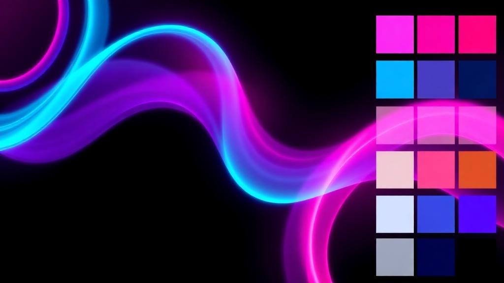
The platform's signature colors — Cyan (#25F4EE), Red/Pink (#FE2C55), and Black (#010101) — represent a deliberate departure from every convention in tech branding. This isn't corporate. This isn't safe. This is Gen Z.
The Exact TikTok Brand Color Palette
| Color Name | Hex Code | RGB | Primary Usage |
|---|---|---|---|
| TikTok Cyan | #25F4EE | 37, 244, 238 | Logo accent, UI highlights |
| TikTok Red/Pink | #FE2C55 | 254, 44, 85 | Logo accent, like button, notifications |
| TikTok Black | #010101 | 1, 1, 1 | Primary background, logo base |
| White | #FFFFFF | 255, 255, 255 | Text, light mode background |
The 3D Glitch Effect: Color as Identity
TikTok's logo is one of the most distinctive in tech — a musical note rendered in white with cyan and red/pink offset shadows that create a stereoscopic 3D glitch effect. This isn't just aesthetic — it's deeply meaningful:
Why the Glitch Works
- Cultural relevance — Glitch art emerged from internet culture, the same culture TikTok serves
- Motion suggestion — The offset colors create an illusion of vibration, suggesting the constant movement of video content
- Depth perception — Cyan and red are near-complementary colors that create chromatic aberration, a real optical phenomenon
- Memorability — The double-image effect is unlike any other social media logo, creating instant recognition
The Science of Cyan + Red/Pink
The cyan-red combination isn't random. These colors sit on opposite sides of the color wheel, creating maximum visual tension. In color psychology:
- Cyan (#25F4EE) signals technology, futurism, and digital coolness — it's the color of screens, holograms, and sci-fi interfaces
- Red/Pink (#FE2C55) triggers excitement, passion, and urgency — it's the color of hearts, notifications, and viral moments
Together, they create a visual energy that perfectly mirrors TikTok's content: fast, emotional, and addictive.
Dark Mode-First Design Philosophy
Unlike most social platforms that launched with light interfaces and added dark mode later, TikTok was designed dark-first. The primary background is near-black (#010101), and there's a strategic reason:
Why Dark Mode Dominates
- Content-first display — Dark backgrounds make videos pop, putting creator content center stage
- Reduced eye strain — Users spending hours scrolling experience less fatigue
- Battery efficiency — On OLED screens, dark pixels use less power — important for mobile-heavy usage
- Neon color amplification — The cyan and pink accents glow against dark backgrounds, creating that signature TikTok energy
- Nighttime usage — TikTok's peak usage hours are evening and night; dark mode feels natural
This dark-first approach influenced an entire generation of app design. Dark mode design is now expected rather than optional, and TikTok helped drive that shift.
How Neon Colors Capture Gen Z
TikTok's color choices aren't arbitrary — they're precisely calibrated for the Gen Z demographic (born 1997–2012):
The Psychology of Neon for Young Users
- Anti-corporate signaling — Neon colors feel rebellious compared to the blues and whites of "adult" platforms like LinkedIn or Facebook
- Gaming culture connection — Cyan and pink are dominant colors in gaming aesthetics, RGB lighting, and esports branding
- Nostalgia with a twist — The neon palette echoes 80s and 90s aesthetics (retrowave, vaporwave) that Gen Z romanticizes
- Social identity — Using TikTok's colors in content signals membership in the platform's culture
Color in Content Creation
TikTok's influence extends beyond its UI into the content itself:
- Duet and Stitch borders use the signature colors to frame collaborative content
- Effect filters often incorporate cyan and pink glitch aesthetics
- Text overlays default to high-contrast neon options
- Trending sounds visualizers use the brand palette
TikTok vs. Social Media Competitor Colors
| Platform | Primary Colors | Hex Codes | Psychological Target |
|---|---|---|---|
| TikTok | Cyan + Pink + Black | #25F4EE, #FE2C55, #010101 | Energy, youth, rebellion |
| Gradient (orange→purple) | #F58529→#8134AF | Creativity, warmth, expression | |
| YouTube | Red + White | #FF0000, #FFFFFF | Urgency, attention, entertainment |
| Snapchat | Yellow + White | #FFFC00, #FFFFFF | Happiness, spontaneity, fun |
| Twitter/X | Black + White | #000000, #FFFFFF | Minimalism, information |
| Blue + White | #1877F2, #FFFFFF | Trust, reliability, community |
TikTok's palette is the most visually aggressive in the category — and that's intentional. In a crowded app store, standing out with color is a survival strategy.
TikTok's Influence on Broader Color Trends
TikTok hasn't just used neon colors — it's popularized them across design:
Trends TikTok Accelerated
- Dark mode as default — Apps across categories now launch dark-first
- Neon accents in branding — Startups increasingly use cyan, pink, and purple neon palettes
- Glitch aesthetics — The chromatic aberration effect appears in everything from music videos to corporate presentations
- High-contrast UI — The success of bright colors on dark backgrounds influenced UI design broadly
- Color as cultural signal — Gen Z identifies platforms by color more than logo shape
The "TikTok Aesthetic" in Design
Designers now reference a "TikTok aesthetic" that includes:
- Neon cyan and pink on black backgrounds
- Glitch and distortion effects
- Bold, sans-serif typography
- Vertical-first layouts
- Gradient transitions between cyan and pink
What Designers Can Learn from TikTok
Lesson 1: Break Category Conventions
Every social platform before TikTok used blue, or at minimum, corporate-safe colors. TikTok proved that breaking color conventions can become your strongest differentiator.
Lesson 2: Design for Your Audience, Not Your Industry
TikTok's colors weren't chosen because they're "good social media colors" — they were chosen because they resonate with Gen Z culture. Know your audience's aesthetic language.
Lesson 3: Dark Backgrounds Amplify Bold Colors
If your brand uses vibrant accent colors, consider dark backgrounds as your primary surface. The contrast creates energy that light backgrounds can't match.
Lesson 4: Color Can Suggest Motion
The glitch offset in TikTok's logo creates an illusion of movement without animation. Consider how color placement can imply dynamism in static designs.
Practical Tips
- Use TikTok's palette as inspiration for youth-oriented brands — pair cyan (#25F4EE) with pink (#FE2C55) on dark backgrounds
- Try Coloracci's AI palette generator to explore neon color combinations that maintain accessibility
- Test neon colors at multiple sizes — they can be overwhelming in large areas but perfect as accents
- Consider the glitch effect for logos targeting digital-native audiences
- Always check contrast ratios — neon on dark can be accessible, but neon on white often fails WCAG standards
TikTok's color strategy proves that in the attention economy, safe colors are the riskiest choice. Sometimes, the boldest palette wins.