Spirited Away Color Palette: Deconstructing Its Iconic Colors
· Coloracci Team
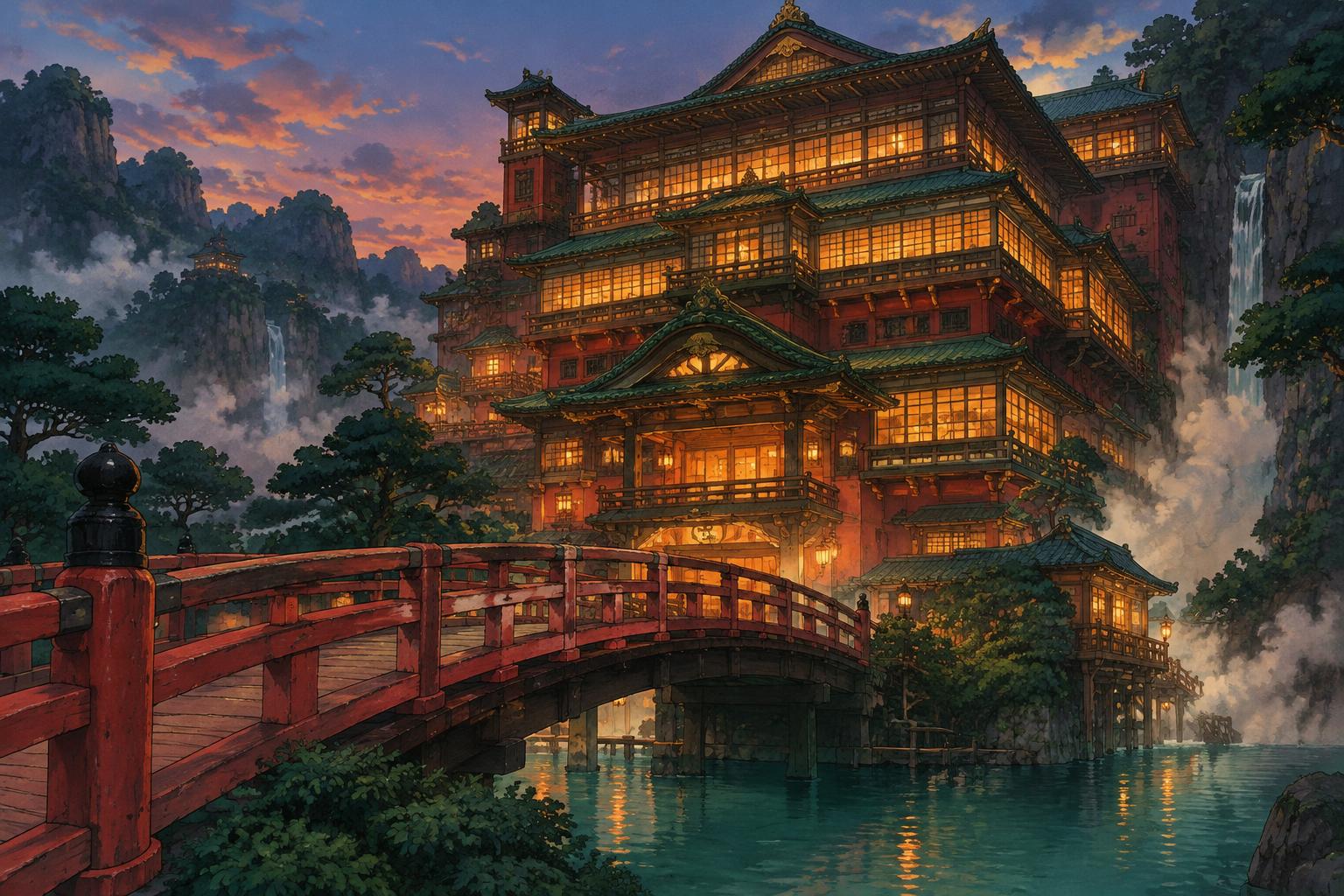
Aburaya's red bridge is a piece of wayfinding that makes you hold your breath. In Hayao Miyazaki's film, released in Japan on July 20, 2001, Chihiro must cross it without breathing to avoid discovery. The Spirited Away color palette turns that ordinary architectural object into a tense threshold: warm painted rails pull the eye forward while the unfamiliar world beyond promises both shelter and danger. A designer could hardly ask for a sharper demonstration that an inviting color need not communicate safety.
This is why the film deserves more than a collection of attractive reds and greens. Its colors organize work, appetite, memory, pollution, and moments of unexpected tenderness. The bathhouse overwhelms through density; Haku's pale dragon form separates through lightness; the train journey makes emotional room by reducing visual competition. The transferable lesson is not “use Japanese red.” It is to design relationships that change as the viewer's situation changes.
How the Spirited Away Color Palette Builds Two Worlds
The familiar world at the beginning does not disappear through a single fantastical color filter. Roads, trees, stone, and abandoned-looking buildings establish material continuity. As the spirit world becomes active, illumination, crowds, food, and architectural details alter that familiar ground. The strange becomes persuasive because it retains recognizable surfaces while changing their intensity and behavior.
The bathhouse is particularly effective. Red wood, green architectural details, warm interior light, and dark surrounding space make it a destination before the viewer understands its rules. Its brightness is not morally reassuring: this is a workplace controlled by Yubaba, with hierarchies, contracts, and appetites. Color attracts Chihiro and the audience into a system whose hospitality has conditions.
Miyazaki directed the film, but a visual system of this scale is collaborative. Michiyo Yasuda is credited with color design; Yoji Takeshige's background-art work and art direction contribute to the environments that hold those colors. Character color, background painting, compositing, and lighting relationships need to cooperate. Treating every hue as a spontaneous choice by one auteur misses the production discipline behind the apparent naturalness.
For designers, distinguish the color of an object from the color of its appearance. A red rail in sunlight and the same rail beside lanterns at night will not look identical. Its identity survives through neighboring colors, outline, material, and repetition. An interface or illustrated identity can use the same principle: keep recognizable roles consistent without demanding that every scene or surface remain chromatically frozen.
The Spirited Away Color Palette: Eight HEX References
The following exact HEX codes define editorial sRGB reference swatches, not official Studio Ghibli production specifications. They are analytical approximations selected to discuss visible color families, not documented samples from a named restoration or frame. Transfers, exposure, screen calibration, and scene lighting change apparent color. The names and meanings are our descriptions, not statements of the filmmakers' declared intentions.
| Item | Color | Hex | Name | Meaning |
|---|---|---|---|---|
| Bridge and bathhouse wood reference | Deep warm red | #B63D32 | Threshold Vermilion | Attraction, passage, and the pressure of entering a new system |
| Bathhouse illuminated windows reference | Golden amber | #E6AD55 | Lantern Gold | Activity, appetite, and concentrated interior warmth |
| Night architecture and silhouettes reference | Deep blue-indigo | #283849 | Spirit-Night Indigo | Enclosure, distance, and a dark structure around luminous details |
| Vegetation and roof-color reference | Muted forest green | #496C57 | Roof-and-Forest Green | Material continuity between constructed and living environments |
| Haku's mane reference | Soft blue-green | #73AAA3 | River Jade | A cool identity cue associated with movement and the river story |
| Haku's pale body and steam reference | Warm off-white | #EEE8D7 | Steam Ivory | Lightness, separation, and relief from crowded color |
| Flooded landscape reference | Low-chroma blue-grey | #94B5BF | Sea-Train Blue | Spaciousness, reflection, and a quieter emotional register |
| Chihiro's bathhouse workwear reference | Muted coral pink | #D88987 | Workwear Coral | A human-scale focal note within the institution's larger palette |
Eight swatches are a vocabulary, not eight equal portions. The bathhouse family emphasizes Vermilion, Lantern Gold, and Indigo. The river-and-train family relies more on Jade, Ivory, and Sea-Train Blue. Workwear Coral can remain a small character cue in either discussion. Separating these families prevents the common mistake of forcing an entire feature film into one flat brand palette.
Our accompanying images are original illustrative studies, not film stills or evidence of exact production colors. Use the references to explore relationships, and return to the film itself when analyzing a particular shot.
The Red Bridge: A Color That Marks a Boundary
Threshold Vermilion #B63D32 sits between the instant force of bright red and the material weight of brown. It can feel painted, handled, and architectural rather than abstractly alarming. On a bridge, repetition matters: rails and posts carry the color through perspective, forming a visual route. The viewer reads a direction as well as a hue.
Chihiro's breath-holding crossing supplies the tension. Red does not independently mean danger or welcome; the action and location give it both possibilities. Red-painted elements also belong to a broader Japanese architectural vocabulary, but it would be reductive to assign one universal sacred meaning to every red object in the film. Here the strongest evidence is what the bridge does: it separates spaces and controls passage.
Translate this into editorial or interaction design by giving one warm color a boundary function. It might identify section openings, a selected navigation destination, or a decisive step in a sequence. Do not scatter it across every decorative detail. Repetition becomes informative when readers can learn the rule, and confusing when the same accent alternately means ornament, selection, error, and success.
Bathhouse Gold: Hospitality with an Appetite
Lantern Gold #E6AD55 appears most luminous when surrounded by Spirit-Night Indigo #283849 or darker warm wood. Its effect depends on relative value and area: a small illuminated window can command more attention than a large medium-toned wall. Darkness frames the light instead of merely making the whole composition gloomy.
The bathhouse's warmth is complicated by consumption. Chihiro's parents become pigs after eating the unattended food; No-Face's escalating appetite later disrupts the institution. These events prevent an uncomplicated reading of warm color as comfort. A visually appetizing environment can also express excess, transaction, or loss of restraint. The narrative changes what the attractive surface means.
For a publication, exhibition, or illustrated campaign, reserve amber for concentrated activity: a window, a key image detail, an important data point. Retain a dark structural field and quieter supporting surfaces. If every element glows, illumination stops carrying hierarchy. Equally, avoid turning this into a generic “gold equals luxury” formula; in this film, warmth belongs as much to labor and hunger as to spectacle.
Haku: Identity Through Lightness and Cool Color
Haku's dragon form offers a different kind of visibility. A pale body and green-blue mane distinguish him from darker or warmer surroundings. Steam Ivory #EEE8D7 and River Jade #73AAA3 model that relationship: the former provides broad lightness, while the latter concentrates identity along a smaller contour. It is a useful example of recognition without maximum saturation.
His river identity gives the cool family narrative significance, but green is not a universal code for virtue. The polluted river spirit and Haku's remembered connection to a lost river make water an ecological and emotional subject, not just a relaxing blue background. Clean, dirty, remembered, and inhabited water can require very different color treatments inside the same story.
Designers can borrow the pale-mass-and-cool-edge strategy for an illustration, diagram, or motion identity. Let a light silhouette establish separation and place a restrained accent where it reinforces form. Check how the silhouette behaves on both pale and dark backgrounds. A contour that works against Indigo may disappear against Sea-Train Blue; recognition is a relationship, not an intrinsic property of Jade.
The Spirited Away Color Palette Changes on the Train

The train journey changes the film's visual tempo. Broad water and sky replace the bathhouse's stacked rooms, patterned surfaces, and bustling activity. Cool, softened fields give figures and small interior details more room. Emotional distance is created through reduced competition, not by simply removing all warm color or draining the image into grey.
Sea-Train Blue #94B5BF is useful because its lowered chroma can occupy a substantial area without shouting. A trace of Lantern Gold or Workwear Coral becomes noticeable within that quieter envelope. Negative space is doing part of the work: color feels different when it extends across an uninterrupted horizon than when it is divided into dozens of windows and signs.
The sequence invites interpretations of transition, solitude, and growing independence. Those are readings of its rhythm and narrative placement, not a scientific claim that blue produces maturity. For a designer, the practical move is a deliberate change of density. After a demanding information section, use a simpler composition, fewer competing accents, and a more restrained field to create an actual pause.
Comparing Color Stories Without Flattening Their Context
The Wes Anderson color palette offers a productive comparison. Anderson's environments often make institutional order visible through symmetry, repeated objects, and tightly bounded color families. Spirited Away's bathhouse also uses repetition, but its layered architecture and movement produce a more crowded, shifting hierarchy. Similar palette discipline can serve different spatial and emotional systems.
Our Día de los Muertos color palette analysis provides another comparison: luminous accents, darker grounds, and meaningful materials can work together without becoming interchangeable cultural symbols. An ofrenda's marigolds and papel picado belong to practices of remembrance. Aburaya's red rails and amber windows belong to a specific fictional environment. Visual resemblance does not establish shared meaning.
This distinction protects the quality of your own work. Borrow a compositional principle—warm activity against cool distance, a repeated threshold accent, a pale silhouette—not a claim to represent Japanese culture or Mexican traditions with a few swatches. Material, ritual, location, and narrative explain why a color matters. A mood board should begin that investigation, not substitute for it.
Practical Takeaways: Build Roles, Then Test the Palette
Start with a narrative sentence. “An inviting institution with demanding rules” calls for a different allocation than “a reflective journey toward independence.” Select the bathhouse family or the water family accordingly. If your concept cannot be expressed without listing colors, you may have a collection of preferences rather than a working color system.
Build a small role-based prototype. For a bathhouse-inspired editorial spread, use Ivory for readable space, Indigo for structure, Vermilion for section entrances, and Gold for a few highlighted details. For a quieter illustrated sequence, let Sea-Train Blue dominate, give Jade a supporting role, and introduce Coral sparingly. These are original design exercises, not reconstructions of specific frames.
Check hierarchy without hue. Convert the prototype to grayscale and look at the actual reading order. A red heading and a green panel may have similar lightness despite their apparent chromatic contrast. If important elements merge, adjust value, scale, placement, or outline before adding another saturated color. The film's textured images cannot be reduced to flat swatches without losing useful separation cues.
Separate expression from accessibility. Test every real text/background pair with the Coloracci contrast checker. WCAG AA normally requires 4.5:1 for ordinary text and 3:1 for large text. Jade, Coral, and Gold are not automatically readable text colors on Ivory. Use labels, shapes, and focus indicators so selected states and warnings never depend on hue alone.
From Screen Reference to a Print Specification
Enter a reference such as #B63D32 or #73AAA3 into the Pantone Finder to explore nearby catalog colors. Treat any digital comparison as a starting point, not an official Spirited Away Pantone match. The film is not a spot-ink specification, and RGB display appearance cannot guarantee a result on coated paper, uncoated stock, fabric, or painted wood.
Shortlist candidates, compare current physical samples under the intended viewing conditions, and proof the final material. Record the selected Pantone system and suffix rather than writing an ambiguous number alone. A red that feels luminous on a screen may become heavier on absorbent stock; a softened blue may shift in a warm exhibition light. Preserve the intended relationship, not a promise that one conversion can reproduce every medium.
Conclusion: A Palette That Knows When to Breathe
Spirited Away's visual strength lies in change. Vermilion marks a crossing, amber concentrates activity, pale ivory and jade distinguish a river-linked character, and blue-grey space allows the story to breathe. Their meanings arise through objects, illumination, composition, and events. No isolated swatch can carry the entire film's emotional or cultural world.
Turn the analysis into a color study: choose either the bathhouse or river family, assign each color a clear job, and explore print candidates with the Pantone Finder. Compare other cinematic systems in the Movie Color Palettes hub, then test your own arrangement for hierarchy and readability. Borrow the discipline of an evolving visual story—not just its most photogenic red.
Sources and Interpretation Notes
Studio Ghibli's official Spirited Away page confirms the director and Japanese release date and provides film images for visual reference. The Nausicaa.net film FAQ supplies additional release context; this retrospective on Chihiro's train journey is critical interpretation rather than production documentation. HEX values, descriptive names, design exercises, and proposed emotional readings in this article are Coloracci's editorial analysis, not an official studio palette or evidence of authorial intent.