Día de los Muertos Colors: Palette, HEX Codes & Symbolism
· Coloracci Team
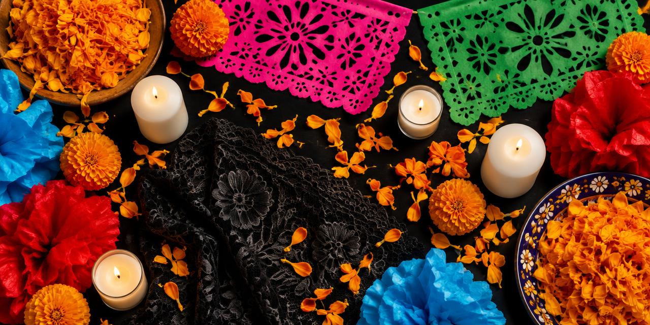
Every year on the night of November 1, families across Mexico lay a path of orange petals from the street to the family altar. The flower is the cempasúchil, the Mexican marigold, and the belief behind it is surprisingly practical: its color and scent are bright enough for the dead to follow home. Few cultures have trusted a single color with a job that important. That is the starting point for understanding the Día de los Muertos color palette — a system of hues that is not decoration first, but navigation, memory and invitation.
For designers, this palette is a masterclass in high-saturation color that still feels meaningful rather than loud. Marigold orange, papel picado pink, sugar-skull white, mourning black, green, red and sky blue coexist on one altar without chaos, because each color has a role. In this guide we break down each shade with exact HEX codes, the symbolism behind it, and how to use it respectfully in branding, editorial and product work.
Where the Día de los Muertos Color Palette Comes From
Día de los Muertos, celebrated on November 1 and 2, is a syncretic tradition. Its roots reach back to pre-Hispanic Mesoamerican rituals — including Aztec observances dedicated to Mictecacihuatl, the lady of the underworld — that honored the dead with flowers, food and offerings. When Spanish Catholicism arrived in the sixteenth century, those rituals merged with All Saints' Day and All Souls' Day. The result is a celebration that treats death not as an ending to be feared but as a relationship that continues.
That worldview explains the palette. A European mourning tradition would reach for black, grey and deep purple. Día de los Muertos reaches for the brightest pigments available, because the goal is to create a welcoming, celebratory atmosphere for visiting spirits. Color is hospitality. An altar, or ofrenda, that looks joyful tells the dead they are wanted.
The palette also reflects material culture. Marigolds grow abundantly in autumn. Tissue paper for papel picado is cheap and comes in vivid dyes. Sugar skulls are molded from white sugar paste and decorated with colored icing. Candles, textiles and painted clay add the rest. In other words, the colors are not an abstract brand guide invented by a committee; they emerged from flowers, paper, sugar and wax, which is why they feel so organic together.
If you want to see how this compares with other festival palettes, our breakdown of the colors of Holi shows another celebration where pigment carries spiritual meaning — but with a very different emotional register.
The Día de los Muertos Color Palette: HEX Codes and Meanings
Below are the seven core colors, expressed as screen-ready HEX values. Treat them as analytical references that capture the typical saturation of altars and papel picado, not as an official standard — there is no governing body for a folk tradition.
| Item | Color | Hex | Name | Meaning |
|---|---|---|---|---|
| Marigold petals | Orange | #FF9A00 | Cempasúchil | Guides spirits home; the sun, life and warmth |
| Papel picado | Pink | #FF007F | Papel Picado Pink | Celebration, joy and festivity |
| Sugar skull base | White | #FFFFFF | Calavera White | Purity, hope and the soul |
| Mourning cloth | Black | #000000 | Luto | Grief, the underworld and respect |
| Banners, leaves | Green | #00A859 | Hopeful Green | Hope, nature and the continuity of life |
| Candles, flowers | Red | #FF0000 | Passionate Red | Blood, life force and love for the departed |
| Paper, painted details | Blue | #0077C8 | Sky Blue | Sky, water and serenity |
Cempasúchil Orange (#FF9A00)
The anchor of the whole system. #FF9A00 is a warm, saturated orange that leans toward yellow, echoing the petals of the Aztec marigold, known in Nahuatl as cempohualxochitl, "twenty-flower." In practice it is the color with the most visual weight on any ofrenda: petal paths, arches of flowers, crosses laid on graves. Symbolically it stands for the sun and for life, and its intensity is literally meant to be seen from the other side.
For designers, #FF9A00 behaves beautifully against black and deep purple, and it passes as a large-area background better than a pure red would because its high luminance keeps it cheerful rather than aggressive.
Papel Picado Pink (#FF007F)
Mexican pink — rosa mexicano — is one of the most distinctive colors in the country's visual identity, and #FF007F captures its electric energy. On papel picado, the perforated tissue banners strung above altars and streets, pink signals celebration. The banners also carry meaning through material: tissue paper is fragile, flutters in the wind and fades, a gentle reminder of how brief life is.
Pink and orange side by side is a combination many Western designers would avoid. Here it is iconic. The two hues are analogous-adjacent warm colors, and together they produce a vibration that reads unmistakably as festive Mexico.
Calavera White (#FFFFFF) and Luto Black (#000000)
White and black form the structural frame of the palette. The calavera, or sugar skull, begins as white sugar paste; white represents purity, the soul and hope. Black, luto, is the color of mourning and the underworld. It shows up in lace, in clothing worn by La Catrina figures, and in the backgrounds of many prints.
What matters for designers is the role these two play: they are the neutrals that let five saturated hues coexist. A calavera is a white canvas decorated with every other color in the palette. That is a useful model. White and black create the rests between the loud notes.
Hopeful Green (#00A859)
#00A859 is a clear, medium green that appears in papel picado, painted details and the foliage woven into flower arches. It carries associations of hope, nature and youth, and it also connects the celebration to the Mexican flag. Green is the palette's cooling agent: on a field dominated by orange and pink, a touch of green prevents the composition from overheating.
Passionate Red (#FF0000) and Sky Blue (#0077C8)
Red represents blood and life force — and by extension, love for the people being remembered. Red candles, red cockscomb flowers (terciopelo) and red icing on sugar skulls all appear on altars. Blue, rendered here as #0077C8, is less dominant but important: it reads as sky and water, and in some regions blue is associated with the purification of the soul. Water is traditionally placed on the ofrenda so visiting spirits can quench their thirst after the journey.
Want the print equivalents? Paste any of these values into our HEX to Pantone converter to find the nearest Pantone swatch with a Delta E score, which is essential if you plan to produce physical goods.
How the Colors Work Together on an Ofrenda
Understanding individual meanings is only half the story. The real lesson of the Día de los Muertos color palette is how it is distributed.
Orange dominates by volume. On a traditional altar, marigold easily covers the largest surface area. It is the "primary" color in a brand-system sense.
Pink and purple provide the secondary layer. Papel picado hangs above, often alternating pink, purple, orange, green and blue sheets. Purple, while not in our seven-color core, often appears as a companion to pink and in some interpretations signals grief and mourning.
White and black structure the composition. Candles, sugar skulls, embroidered tablecloths and lace offer neutral ground.
Red, green and blue are accents. They appear in smaller doses: a candle, a leaf, a ribbon, a painted line on a skull.
Color theorists would recognize this as a loose 60-30-10 structure, even though no one designed it that way. It is also why the palette photographs so well: the eye has somewhere to rest (the neutrals), a dominant field (orange) and a rhythm of accents (everything else).
There is also a strong layering logic. Vertical height on the altar often represents different levels — earth, heaven and the underworld, in many regional traditions — and the colors shift as you move up: petals and earthy offerings near the floor, bright papel picado floating on top. For a designer, that is a useful hierarchy principle: saturated, lighter elements at the top pull attention upward.
The Día de los Muertos Color Palette in Contemporary Design
In the last decade, the palette has traveled far beyond Mexico. Film, fashion, packaging and social campaigns have all borrowed marigold and Mexican pink. That popularity brings two responsibilities.
First, context matters. The colors carry spiritual meaning tied to remembering real people who have died. Using them for a generic "fiesta" sale without acknowledging the tradition flattens that meaning. The comparison with other cultural systems is instructive; our guide to color meanings across cultures and flags shows how the same hue can signal celebration in one country and mourning in another. Día de los Muertos is unusual because it deliberately blends both feelings in one palette.
Second, accuracy matters. Many commercial interpretations desaturate the palette into pastel "boho" tones or push everything toward neon. The authentic look sits in between: bold, sunlit, slightly imperfect, the way tissue dye and flower petals actually look.
Brands that use the palette well tend to do three things: they keep marigold orange as the hero, they collaborate with Mexican artists or reference real crafts such as papel picado and alebrijes, and they avoid turning the calavera into a Halloween horror symbol. Día de los Muertos is not Mexican Halloween; the skull here smiles.
Practical Takeaways for Designers
- Lead with #FF9A00. Make marigold your dominant field or hero element. It carries the cultural signal more reliably than any other hue.
- Pair pink and orange confidently. #FF007F next to #FF9A00 is the signature pairing. Separate them with a thin line of white or black if you need legibility.
- Use black as a stage, not a mood. A #000000 background makes the saturated colors glow and evokes candlelit night altars without feeling somber.
- Keep accents small. Red #FF0000, green #00A859 and blue #0077C8 work best as 5-10% accents — ribbons, icons, borders, illustration details.
- Check contrast. White text on #FF9A00 fails WCAG AA for body copy. Use black text on orange and pink, or reserve white-on-color for large display type.
- Plan for print early. Screen-bright pink and orange often fall outside the CMYK gamut. Convert to Pantone spot colors before producing packaging or posters, and proof physically.
- Add texture. Flat vector color feels sterile. Perforated patterns inspired by papel picado, subtle paper grain or petal shapes bring the palette back to its material roots.
- Respect the meaning. Reference real traditions, credit artists, and avoid using the calavera or ofrenda imagery as generic spooky decoration.
A Starter Palette You Can Copy
For a web or social campaign inspired by the celebration, try this balanced five-color set:
- Background: #000000 (Luto Black)
- Primary: #FF9A00 (Cempasúchil)
- Secondary: #FF007F (Papel Picado Pink)
- Accent: #00A859 (Hopeful Green)
- Highlight: #FFFFFF (Calavera White)
Swap green for #0077C8 if the brand needs a cooler, calmer accent, or add #FF0000 sparingly for calls to action. Because orange and pink are both high-chroma, give them breathing room: generous black or white margins do more for this palette than any additional color.
Conclusion: A Palette Built to Be Seen
The Día de los Muertos color palette is one of the rare color systems where every hue has a job. Marigold guides, pink celebrates, white and black frame memory and mourning, and green, red and blue add hope, love and serenity. It turns grief into hospitality through color — and that is exactly why it resonates with designers far beyond Mexico.
Use it boldly, but use it knowingly. Start with the seven HEX codes above, respect the proportions of a real ofrenda, and translate the colors carefully for print.
Ready to build your own palette from these shades? Convert any of them into print-ready spot colors and explore matching combinations. Try the HEX to Pantone Converter →