Purple Violet in the Modern Kitchen: A 2026 Color Trend Guide
· Coloracci Team
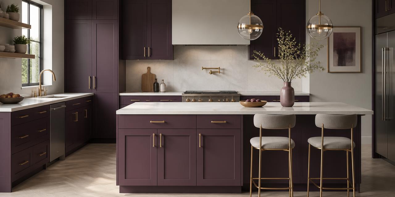
The Short Answer
If you are asking what are the best applications for purple violet in a modern kitchen, the honest designer's answer is four: lower cabinetry, the island, a full-height pantry or tall-unit run, and small accent moments such as bar stools, glassware and open-shelf styling. Purple violet is an exceptional anchor color and a poor ceiling color. Put it below eye level, keep the upper half of the room light, and the result reads as tailored rather than theatrical.
The workhorse values are Purple #6B4E9E, Dark Purple #35063e, Indigo #4b0082, Mauve #e0b0ff and Thistle #d8bfd8. Those five swatches cover every application below, from a matte aubergine island to a tinted-plaster wall that barely registers as purple at all.
Purple is the last of the "difficult" colors to reach mainstream kitchens — green arrived in 2019, terracotta in 2022, and violet is having its moment now. The reason it took longer is simple: purple is the only hue with no natural equivalent in traditional kitchen materials. There is no purple wood, no purple stone in common use, no purple metal. Every gram of it is a deliberate decision, which is precisely why it signals confidence when it works, and costume when it does not.
The Exact Shades of Purple Worth Specifying
| Color name | HEX | Character | Best kitchen use |
|---|---|---|---|
| Thistle | #d8bfd8 |
Pale, gray-dusted lilac | Walls, plaster, ceiling washes |
| Mauve | #e0b0ff |
Light, luminous, slightly cool | Glass, textiles, styling accents |
| Purple | #6B4E9E |
Balanced mid-violet, gray-leaning | Islands, lower runs, pantry doors |
| Indigo | #4b0082 |
Deep, blue-shifted, saturated | Accent doors, feature cabinetry |
| Dark Purple | #35063e |
Near-black aubergine | Full cabinetry, tall units, bases |
Two technical notes worth more than any mood board. First, light reflectance matters more than hue. #d8bfd8 bounces light; #35063e absorbs almost all of it. A kitchen finished entirely in the latter needs roughly double the task lighting you would plan for a white scheme. Second, undertone direction decides your metals. #4b0082 leans blue and prefers chrome, nickel and black steel. #6B4E9E and #35063e carry red and brown, which is why brushed brass and unlacquered warm gold sit so naturally against them.
A third value is worth adding for anyone specifying paint rather than film or laminate: purple is notoriously unstable under artificial light. A violet that looks composed in daylight can swing decisively pink under 3000K LED, or turn a flat, bruised gray under anything cooler. Sample boards are not optional here — they are the whole job.
What Are the Best Applications for Purple Violet in a Modern Kitchen?
1. The island as a standalone object
This is the highest-return use of the color and the one I recommend first to nervous clients. Paint the island Dark Purple #35063e or Purple #6B4E9E, keep the perimeter cabinetry cream or soft gray, and finish the island top in a pale quartz or honed marble. The island becomes a piece of furniture rather than joinery, which is exactly the effect modern kitchens are chasing.
It is also the most reversible decision in the room. An island is typically ten to fifteen percent of your cabinet area — repainting it later is a weekend, not a renovation.
2. Lower runs with light uppers
The classic two-tone split, and structurally the most reliable. Bases in #6B4E9E, uppers in cream #F5F0E8 or open shelving in pale oak. The eye reads the light band at eye level as the room's true color, so the space stays bright while the violet supplies weight at floor level. This is where the 60-30-10 rule earns its reputation: roughly 60% light neutral, 30% purple, 10% metal and accent.
3. Full cabinetry in near-black aubergine
Reserved for kitchens with genuinely good natural light — ideally two exposures, or one large south- or west-facing window. #35063e across every door reads almost black from across the room and reveals its violet only up close and in daylight. It is the most sophisticated version of this trend and the least obviously "purple," which is why it ages well.
Requirements are strict: matte or micro-textured finish, pale worktops and splashback, and layered lighting — under-cabinet strips, in-cabinet strips, and pendants. Skip any of those and the room turns cave-like by four in the afternoon.
4. The tall-unit or pantry accent
A single bank of full-height doors in Indigo #4b0082 against an otherwise neutral kitchen. Low cost, high impact, and it concentrates the saturation into one vertical plane where the eye can enjoy it without fatigue. Particularly effective in open-plan layouts where the kitchen needs one visual event to hold its own against a living area.
5. Soft-tint walls and plaster
The quietest application, and increasingly the most requested. Thistle #d8bfd8 on walls or a limewash finish behind open shelving barely registers as purple — it reads as a warm gray with something going on underneath. Pair it with white cabinetry and pale timber and you get a kitchen that looks expensive without looking decorated.
6. Accents only
Mauve #e0b0ff in bar stool upholstery, a run of hand-glazed tile, colored glass pendants, a violet-washed splashback. Zero structural commitment, full seasonal flexibility. For renters and anyone specifying a kitchen they may sell within five years, this is the correct answer.
Colors That Go With Purple: Five Reliable Partners
Warm Gold #C9A84C — the essential one. Gold's yellow-orange sits near opposite violet on the wheel, producing contrast that reads as luxury rather than clash. Use brushed or unlacquered, never high-polish, and confine it to hardware, tap, and pendant frames. The same near-complementary logic underpins violet's dominance in high-end identity work, explored in depth in our guide to purple in luxury branding.
Soft Gray #CBCCC6 — the modernizer. Gray strips purple of its historical associations and pushes it contemporary. Best as the perimeter cabinetry or wall color when the island carries the violet. Choose a gray with a faint green or warm cast; a blue-gray will fight an indigo-leaning purple.
Cream #F5F0E8 — the breathing room. Warm enough to belong to violet's red side, light enough to reset the eye. Ceilings, trim, upholstery and worktops all live here. Avoid pure white #FFFFFF: it is too cold and drains the warmth straight out of #35063e.
Blush Pink #F1D4D4 — the tint cousin. Same red base, far higher value. Blush softens a dark purple kitchen and is the reason a Mauve #e0b0ff accent never looks out of place next to aubergine doors. Effective in small doses: a tile run, a linen blind, ceramics.
Green #8F9779 — the sophisticated surprise. Muted sage or olive is close to violet's true complement territory but desaturated enough to whisper. Olive bar stools against #6B4E9E cabinetry is one of the best-looking combinations available in kitchens right now, and it brings in the botanical warmth that pure purple schemes lack.
Four Complete Purple Kitchen Ideas
Aubergine and Brass (Luxury Modern)
- Cabinetry: Dark Purple
#35063e - Worktops and splashback: Cream
#F5F0E8 - Hardware and tap: Warm Gold
#C9A84C - Accent: Blush Pink
#F1D4D4ceramics
Proportion: 45% purple, 40% cream, 15% metal and accent. Requires 2700–3000K lighting throughout. This is the palette in the image at the top of this article, and the most photographed version of the trend.
Violet Island, Gray Field (Contemporary Family)
- Perimeter cabinetry: Soft Gray
#CBCCC6 - Island: Purple
#6B4E9E - Worktops: Cream
#F5F0E8 - Accent: Green
#8F9779stools
The safest entry point. Overall brightness stays high, the island does all the work, and the olive seating keeps the scheme from feeling corporate.
Indigo and Oak (Warm Minimal)
- Tall units and pantry: Indigo
#4b0082 - Base and wall units: Pale oak veneer
- Walls: Thistle
#d8bfd8 - Metals: Black steel or brushed nickel
Indigo's blue bias wants cool metals and warm timber to balance it. The Thistle walls are the trick here — they tie the indigo back into the room so it reads as intentional rather than isolated.
Mauve and Cream (Light and Airy)
- Cabinetry: Cream
#F5F0E8 - Walls: Thistle
#d8bfd8 - Tile and textiles: Mauve
#e0b0ff - Grounding accent: Purple
#6B4E9Ebar stools
The high-key version, and the right call for a north-facing or compact kitchen. It shares its structural logic with light coastal schemes — see our coastal kitchen color palette guide for the same approach executed in blues.
The Psychology: Why Violet Reads as Expensive
Purple carries the heaviest historical baggage of any hue. Tyrian purple was, for roughly two thousand years, the most costly pigment on earth — extracted in microscopic quantities from sea snails and restricted by sumptuary law to emperors and senior clergy. The dye is long obsolete; the association is permanent. Purple still says this was chosen deliberately and it was not cheap.
In a kitchen that translates into three specific readings.
Authority and quality. Deep violets are consistently rated among the most "premium" colors in perception research. Against gold hardware and stone worktops, #35063e performs the same job navy does in menswear: it takes ordinary materials and makes them look considered.
Creativity and individuality. Violet sits between red's energy and blue's calm, which is why it dominates the creative sector. In a domestic kitchen it signals a household that does not default to the showroom option. Our longer piece on violet color psychology traces how the same wavelength drives innovation branding.
Calm and interiority. Lighter violets — Thistle, Mauve — are among the most restful tints available. They lower perceived stimulation, which matters in a room that is otherwise all hard surfaces and task activity. This is why pale purple works beautifully in breakfast nooks and banquette seating.
The one caution: purple is also the hue most associated with the artificial, from grape candy to cleaning products. Saturation is what separates the two readings. Muted, gray-loaded and near-black violets read as luxury; bright, clean, high-chroma violets read as novelty. Stay on the muted side of the family and the kitchen will still look right in 2036.
Practical Takeaways
Sample at three times of day. Paint an A2 board, not the wall, and move it around the room. Judge it at 9am, 3pm and 9pm under your actual bulbs. Purple shifts more between daylight and lamplight than any other hue.
Use 2700–3000K lighting. Cooler temperatures pull the red out of violet and leave it flat and grayish. Add under-cabinet lighting as standard with any purple below #6B4E9E in value.
Choose matte or micro-textured finishes. Gloss purple creates hot specular highlights that fracture the color and, frankly, dates instantly. Matte lacquer, supermatte foil or micro-textured laminate all hold the depth.
Keep the worktop quiet. Pale quartz, honed marble, or a cream composite. A busy veined stone competes with violet cabinetry and both lose.
Lock one purple and derive from it. Thistle, Mauve and Purple can coexist because they are tints of the same family — but mixing #4b0082 and #6B4E9E in the same run looks like a batch error. Pick your primary, then build tints and shades from it.
Check contrast on labels and signage. If you are specifying a commercial or rental kitchen, #35063e against cream clears WCAG AAA for body text comfortably. #6B4E9E against white is borderline for small text — verify before printing anything.
In small kitchens, invert the ratio. Purple as the 10–30%, never the 60%. A galley kitchen in full aubergine is a corridor at night.
Data Table: Purple Violet Kitchen Palette at a Glance
| Item | Color | Hex | Color Name | Psychological Meaning |
|---|---|---|---|---|
| Full cabinetry / tall units | ■ | #35063e |
Dark Purple | Authority, luxury, quiet confidence |
| Island or lower run | ■ | #6B4E9E |
Purple | Creativity, individuality, balance |
| Accent pantry doors | ■ | #4b0082 |
Indigo | Depth, intuition, focus |
| Tile, glass, textiles | ■ | #e0b0ff |
Mauve | Softness, imagination, lightness |
| Walls and plaster | ■ | #d8bfd8 |
Thistle | Calm, refinement, restfulness |
| Hardware and tap | ■ | #C9A84C |
Warm Gold | Prestige, warmth, value |
| Worktops and trim | ■ | #F5F0E8 |
Cream | Space, clarity, ease |
| Perimeter cabinetry | ■ | #CBCCC6 |
Soft Gray | Restraint, modernity, neutrality |
| Ceramics and blinds | ■ | #F1D4D4 |
Blush Pink | Warmth, approachability, romance |
| Stools and botanicals | ■ | #8F9779 |
Muted Sage Green | Renewal, balance, groundedness |
Conclusion
So, what are the best applications for purple violet in a modern kitchen? Put it low, put it on one object, and keep everything above eye level light. An island in #35063e, lower runs in #6B4E9E, a single pantry bank in #4b0082, or walls washed in #d8bfd8 — each of those works, and none of them requires the whole room to commit. Add warm gold hardware, a cream worktop, and one muted green or blush accent, and you have a scheme that will still look deliberate in a decade.
The color rewards restraint and punishes saturation. Stay in the muted, gray-loaded end of the purple family, get the lighting warm, and specify matte.
Ready to build your own version? Drop your chosen violet HEX into the Coloracci palette generator and it will generate mathematically harmonious tints, shades and complements around it — then export the whole scheme as CSS variables or Tailwind tokens in a single click.