Coastal Kitchen Color Palettes: Create a Light & Airy Oasis
· Coloracci Team
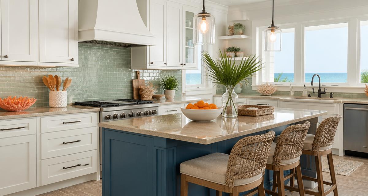
The Direct Answer: The Best Color Palette for a Coastal Kitchen
The best color palette for a coastal kitchen is a four-part base of Crisp White (#F7F7F2), Sandy Beige (#E5DCC3), Seafoam Green (#93C5BE) and Ocean Blue (#1B6CA8), grounded with Navy Blue (#243A52) on cabinetry or an island and lifted by a small dose of Warm Coral (#E8A87C) in accessories. That ratio — roughly 60% white and sand, 25% blue-green, 10% navy, 5% coral — is what separates a genuinely light and airy coastal kitchen from a nautical theme park.
Coastal kitchens fail for one predictable reason: people choose the colors of the ocean without choosing the proportions of the shoreline. Stand on any beach and look around. You are surrounded overwhelmingly by pale sand and bright sky-washed white; the blues and greens are a band in the distance; the coral, the shells, the rust of a beached buoy — those are pinpricks. Replicate that hierarchy indoors and the room reads as light-filled and relaxed. Invert it and you get a dark, themed kitchen that feels smaller than it is.
This guide gives you the exact HEX codes, four ready-to-build coastal kitchen color schemes, the color psychology behind each hue, a reference data table mapping every kitchen surface to a color, and the practical application rules designers use on real beach house kitchen projects.
The Six Core Colors: Exact HEX Codes and How to Use Them
Ocean Blue — #1B6CA8
A mid-saturation, slightly greyed blue that reads as water rather than as primary blue. This is the single most recognizable coastal hue and the one most often used incorrectly. Ocean Blue is a statement color: put it on an island, a run of lower cabinets, a painted range hood, or a glazed tile backsplash — never on all four walls of a small kitchen, where its saturation will absorb light.
Because #1B6CA8 sits close to the middle of the lightness scale, it holds its character under both daylight and warm LED lamps, which is why it outperforms lighter powder blues that turn grey after sunset.
Seafoam Green — #93C5BE
A soft, desaturated blue-green — the color of shallow water over pale sand. Seafoam is the quiet workhorse of coastal kitchen color schemes. Its low saturation means you can use it generously: a full backsplash, upper cabinetry, a painted pantry, or an entire small kitchen's walls without any risk of visual heaviness.
Seafoam is also the bridge hue. It contains both the blue of the water and the green of dune grass, so it makes Ocean Blue and Sandy Beige look intentional together rather than accidental.
Sandy Beige — #E5DCC3
The grounding neutral. #E5DCC3 is a warm, low-chroma beige with a faint yellow-green undertone that mirrors dry beach sand. This is the color that keeps a coastal kitchen from tipping into cold, and it is the one most often skipped by homeowners who go straight from white to blue.
Use it on countertops (quartz with warm veining), on flooring, on woven textures — rattan pendants, jute runners, oak stools — and on walls where you want warmth without color commitment.
Crisp White — #F7F7F2
Not pure white. #F7F7F2 has the faintest warm-grey cast, which stops it from reading as clinical against natural light. Pure #FFFFFF next to sand and seafoam looks blue-tinged and slightly sterile; this softened white looks like sun-bleached shiplap.
This is your volume color: ceilings, trim, upper cabinets, shiplap, and — in kitchens under about 150 square feet — the walls too.
Navy Blue — #243A52
The anchor. Every light and airy kitchen palette needs one deep value or the whole scheme floats. Navy #243A52 is the coastal answer to charcoal: it provides the contrast a room needs to feel designed, while staying inside the marine story.
Apply it to base cabinets, an island, window frames, or a single painted dresser. Paired with unlacquered brass or aged bronze hardware, navy is what gives a beach house kitchen its sense of permanence.
Warm Coral — #E8A87C
The energy. #E8A87C is a soft, sun-washed coral-apricot rather than a hot orange, and it sits almost directly opposite Ocean Blue on the color wheel. That near-complementary relationship is why a single coral element — a bowl of fruit, a stack of ceramics, a linen roman shade — makes the blues in the room look bluer and the whites look cleaner.
Keep coral under 5% of the visible surface area. It is a spice, not an ingredient.
Four Complete Coastal Kitchen Color Schemes
Scheme 1 — Classic Hamptons: White, Navy, Sand
- Cabinets: Crisp White #F7F7F2
- Island: Navy Blue #243A52
- Countertop: Sandy Beige #E5DCC3
- Backsplash: white subway or zellige with warm grout
- Accent: Warm Coral #E8A87C in textiles
The most resilient and resale-friendly of the coastal kitchen color schemes. High value contrast between white and navy creates architectural clarity; the sand countertop stops the pairing from feeling corporate.
Scheme 2 — Light & Airy Mediterranean: Seafoam, White, Oak
- Walls and uppers: Crisp White #F7F7F2
- Lower cabinets: Seafoam Green #93C5BE
- Open shelving and floors: warm oak
- Countertop: Sandy Beige #E5DCC3
- Accent: Ocean Blue #1B6CA8 in glazed ceramics
The lightest of the four schemes and the best choice for small or north-facing kitchens. It borrows its logic from Mediterranean coastal color palettes — sun-bleached surfaces, natural wood, and a single saturated glaze color for depth.
Scheme 3 — Deep Water: Ocean Blue Dominant
- Lower cabinets and island: Ocean Blue #1B6CA8
- Uppers, ceiling, trim: Crisp White #F7F7F2
- Countertop and floor: Sandy Beige #E5DCC3
- Hardware: unlacquered brass
- Accent: Warm Coral #E8A87C
For kitchens with abundant natural light and high ceilings. Ocean Blue at this scale reads confident rather than heavy — provided the uppers, ceiling and countertop stay pale. If your kitchen has one window or less, use Scheme 2 instead.
Scheme 4 — Modern Coastal Monochrome: Tonal Blues
- Walls: Seafoam Green #93C5BE
- Cabinets: Ocean Blue #1B6CA8
- Island: Navy Blue #243A52
- Counters and trim: Crisp White #F7F7F2
- Textures: linen, rope, unfinished oak
A tonal, analogous scheme built entirely from the blue-green family, stepping down in lightness from seafoam to navy. Analogous palettes are inherently harmonious, which is why this is the most sophisticated of the beach house kitchen colors — but it demands texture. Without woven, wood and stone materials, tonal blue reads flat.
Color Psychology: Why This Palette Feels Like a Vacation
Blue and green lower physiological arousal
Blues and greens are the most consistently calming hues in environmental psychology research. Short-wavelength cool colors are associated with measurably lower heart rate and self-reported stress in interior settings, and blue in particular carries near-universal associations with trust, stability, and openness — the reasons it dominates both healthcare interiors and corporate identity. If you want the deeper mechanics behind why #1B6CA8 and #243A52 do what they do, our breakdown of the psychology of blue in design covers the cultural and neurological evidence.
In a kitchen — statistically the most activity-dense, highest-stimulus room in a home — that calming effect is not decorative. It counterbalances noise, heat, clutter and motion.
White expands perceived volume
High-reflectance surfaces bounce light onto adjacent planes, softening shadow boundaries. When shadows are soft, the brain has fewer cues to judge where a wall ends, and the room is perceived as larger. This is the entire mechanism behind light and airy kitchen palettes. #F7F7F2 has a light reflectance value in the high 80s — bright enough to expand the space, warm enough to avoid the blue cast that pure white throws in cool northern light.
Sand grounds the scheme
Warm, low-chroma earth tones read as natural and stable. Sandy Beige gives the eye a resting point between the reflective white and the saturated blue, and prevents the "swimming pool" effect that afflicts kitchens built from blue and white alone.
Coral supplies warmth and appetite cue
Warm oranges in the coral family are gently appetite-stimulating and socially energizing — useful in a room built around food and gathering. Because #E8A87C is desaturated, it adds warmth without the aggression of a true orange.
Coastal Kitchen Palette Reference Table
| Item | Color | Hex | Color Name | Psychological Meaning |
|---|---|---|---|---|
| Island / feature cabinetry | Blue | #1B6CA8 | Ocean Blue | Trust, depth, openness, calm focus |
| Backsplash / upper cabinets | Blue-green | #93C5BE | Seafoam Green | Tranquility, renewal, gentle balance |
| Countertops / flooring | Warm neutral | #E5DCC3 | Sandy Beige | Grounding, natural comfort, stability |
| Walls / ceiling / trim | Off-white | #F7F7F2 | Crisp White | Spaciousness, cleanliness, clarity |
| Base cabinets / window frames | Deep blue | #243A52 | Navy Blue | Authority, permanence, quiet confidence |
| Accessories / textiles | Soft orange | #E8A87C | Warm Coral | Energy, warmth, sociability, appetite |
Practical Takeaways for Designers and Homeowners
1. Fix the ratio before you pick the paint. Aim for 60% white and sand, 25% seafoam and ocean blue, 10% navy, 5% coral. Every failed coastal kitchen I have audited broke this ratio in the same direction — too much saturated blue, too little neutral.
2. Test your blues against your light orientation. North-facing kitchens receive cool, indirect light that pushes blues toward grey and can make Ocean Blue look muddy; in those rooms weight the scheme toward Seafoam and Sandy Beige and reserve #1B6CA8 for a small, well-lit surface. South-facing kitchens can carry Scheme 3 at full strength. The same orientation logic applies to adjacent rooms — see our guide to cool blue color combinations for living rooms if the kitchen opens onto a living space.
3. Use one warm metal. Unlacquered brass, aged bronze or brushed gold. Cool chrome next to seafoam and navy makes the palette feel like a bathroom. Pick one and repeat it in at least three places.
4. Texture carries coastal more than color does. Shiplap, rattan pendants, honed rather than polished stone, linen roman shades, woven counter stools, unfinished oak shelving. A white-and-blue kitchen with slab cabinets and polished quartz reads modern, not coastal. The same colors with texture read like a beach house.
5. Choose warm grout. Bright white grout against seafoam tile creates a grid of high-contrast lines that fragments the wall visually. A sand or greige grout lets the tile field read as one soft plane.
6. Extend the palette to hardware and appliances thoughtfully. Panel-ready appliances in Crisp White or Navy keep the light and airy effect intact. A large stainless run in a small coastal kitchen introduces a fifth, uninvited neutral.
7. Buy sample pots, and paint them on board, not wall. Move two-by-two-foot painted boards around the kitchen across a full day. Seafoam in particular shifts significantly between morning and evening light.
8. Anchor with one deep value, always. If budget prevents navy cabinetry, get the anchor elsewhere: a dark island stone, black-framed windows, a navy runner, or a single navy-painted door. Without a deep value, light and airy becomes washed out.
Adapting the Palette to Your Kitchen Size
Small kitchens (under 120 sq ft). Run Crisp White on walls, ceiling and uppers; Seafoam on lowers; Sandy Beige counters. Skip Ocean Blue as a large field and place it in the backsplash tile. Navy stays in hardware or a single stool.
Medium kitchens (120–250 sq ft). Scheme 1 or Scheme 2 at full strength. This is the sweet spot for a navy island with white perimeter cabinetry.
Large open-plan kitchens. Scheme 3 or Scheme 4. Big rooms can absorb saturation, and tonal blue schemes need scale to show their gradation. Carry Sandy Beige into the adjacent living area so the transition feels continuous.
Common Coastal Kitchen Color Mistakes
- Nautical over coastal. Red, primary navy and rope motifs together produce a theme, not an interior. Warm Coral is the only red-family color in this palette, and it stays at 5%.
- Cold whites. Pure #FFFFFF against seafoam and sand reads blue and slightly institutional. Stay with #F7F7F2 or a similar softened white.
- Too many blues. Three blues is a scheme; five is noise. Ocean Blue plus Navy is enough, with Seafoam as the blue-green bridge.
- Forgetting the warm accent. A kitchen built only from cool hues will feel serene in photographs and slightly unwelcoming in person. Coral, or a warm wood tone, is not optional.
- Matching the counter to the cabinet exactly. Coastal palettes rely on soft tonal steps. Identical values across two adjacent large surfaces flatten the room.
Build Your Own Coastal Kitchen Palette
The six colors above are a proven starting point, not a rule. The right coastal kitchen palette for your home depends on your light orientation, your flooring, your existing countertop, and the view — if you have one — that the kitchen frames.
Drop #1B6CA8, #93C5BE, #E5DCC3 or #243A52 into the Coloracci palette generator to build harmonies, tints and shades around your anchor hue, check contrast between cabinet and countertop values, and export the finished scheme as HEX, RGB or CMYK for your painter, cabinetmaker or renderer. Then use the Pantone Finder to translate each HEX into a matchable Pantone reference before you order tile, stone or custom cabinetry — it is the fastest way to make sure the seafoam you approved on screen is the seafoam that arrives on site.
Coastal design is not about copying the sea. It is about copying the light.