Psychology of Mustard Yellow in Modern Design: Why This Retro Shade Dominates 2025
· Coloracci Team
Last month, a client came to me frustrated. "I want yellow," she said, "but not that yellow. You know? The screaming, look-at-me yellow."
I knew exactly what she meant. She wanted mustard yellow.
That conversation stuck with me because it perfectly captures what makes mustard yellow so special in modern design. It's yellow that grew up. Yellow that went to therapy. Yellow that doesn't need to shout to be noticed.
What Makes Mustard Yellow Different?

Here's the technical difference: regular yellow sits at maximum saturation and brightness. It's RGB(255, 255, 0) – pure, unadulterated color screaming at your eyeballs.
Mustard yellow? It's muted. Desaturated. Usually hovering around
Think of it like the difference between someone yelling and someone speaking with quiet confidence. Both get your attention, but only one makes you want to listen.
In nature, mustard yellow shows up in autumn leaves, actual mustard seeds (obviously), aged gold, and that perfect moment when sunlight hits wheat fields at 5 PM. It's warm but not aggressive. Energetic but grounded.
The Psychology Behind Mustard Yellow

Standard yellow triggers immediate psychological responses: optimism, energy, attention. It's the color of warning signs and highlighters for good reason – it demands to be seen.
But mustard yellow does something more nuanced. It keeps yellow's core traits (warmth, energy, optimism) while adding layers of sophistication and nostalgia. Here's what I've observed after using it in dozens of projects:
Trust and stability: The muted tones make mustard yellow feel more reliable than its brighter cousin. Where bright yellow can feel flighty or temporary, mustard feels settled. Established. Like it's been here a while and plans to stay.
Retro nostalgia: Mustard yellow peaked in the 1970s as "harvest gold." Every kitchen appliance, every station wagon, every living room wall. It fell out of favor in the 80s and 90s (too dated, too "mom's house"), but around 2015, designers started bringing it back. That nostalgia is now a feature, not a bug.
Tempered optimism: Regular yellow is "everything is amazing!" Mustard yellow is "things are pretty good and I'm cautiously hopeful." In an era of anxiety and uncertainty, that feels more authentic.
Earthy sophistication: The brown undertones connect mustard yellow to earth tones and natural materials. It pairs beautifully with wood, leather, and stone in ways that neon yellow never could.
Mustard Yellow in 2024-2025 Design Trends
The color has exploded across multiple design disciplines:
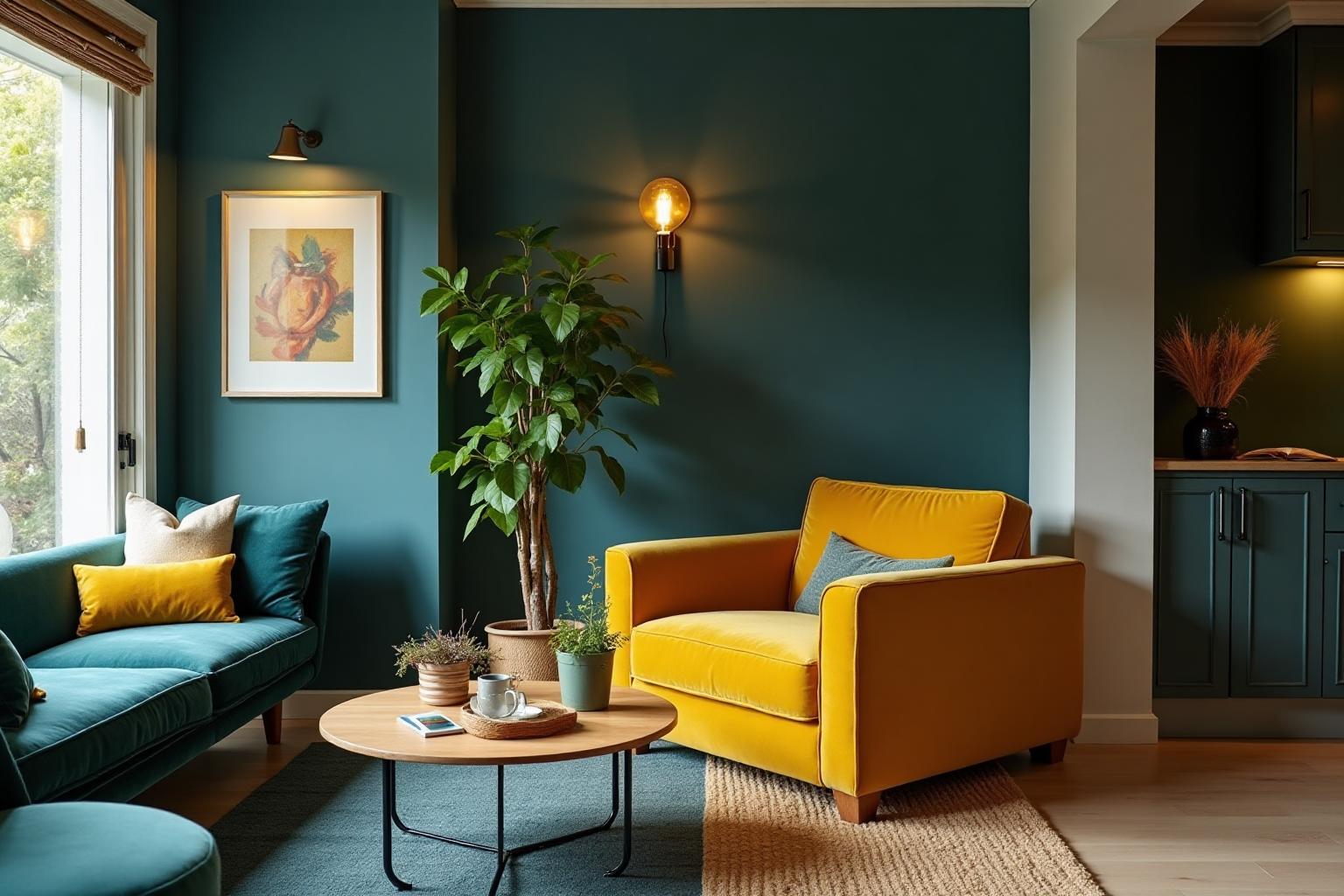
Interior Design: Walk into any modern furniture showroom and you'll see it. Mustard velvet sofas. Accent walls. Throw pillows scattered across grey couches. The combination of mustard with charcoal grey and navy blue has become the unofficial palette of "stylish but approachable" home design.
Fashion: Fall/Winter collections have embraced mustard yellow as a staple. It photographs beautifully (especially on Instagram), works across different skin tones, and signals "I know what I'm doing" in a way that bright yellow never could.
Digital Design: On dark mode interfaces, mustard yellow works as a highlight color without the eye-searing intensity of pure yellow. It's readable, attention-grabbing, and doesn't trigger accessibility nightmares. Many tech companies have started using
Branding: Companies wanting to signal innovation while staying grounded have gravitated toward mustard yellow. It's bold without being reckless.
Brands Using Mustard Yellow Successfully

Let's talk about brands that get it:
Timberland: Their wheat-colored boots aren't technically mustard, but they live in the same family. That golden-brown-yellow combination signals durability and outdoor authenticity.
CAT (Caterpillar): Construction equipment in that distinctive CAT yellow (
National Geographic: Their yellow rectangle is iconic. It's optimistic (exploration! discovery!) but professional enough for serious journalism.
DHL: Similar to CAT, they use a yellow that's energetic but trustworthy. You want your package delivery to be exciting but reliable, right?
The pattern here? Mustard yellow works for brands that need to balance energy with credibility. It's the sweet spot between "fun startup" and "boring corporate."
How to Use Mustard Yellow Correctly
After working with this color for years, here's what I've learned:
Color Combinations That Work:
Mustard + Navy Blue: Classic. The depth of navy makes mustard pop without competing. Think
with . Mustard + Charcoal Grey: Modern and sophisticated.
against creates just enough contrast without drama. Mustard + Forest Green: Earthy and grounded.
with feels organic and natural. Mustard + Cream: Subtle and warm.
on backgrounds creates a low-contrast, cozy feel.
When to Avoid It:
Mustard yellow isn't universal. Skip it when:
- You need a light, airy, youthful feeling (use brighter yellows or pastels)
- Your audience skews very young (kids respond better to primary colors)
- You're designing for healthcare or medical contexts (yellow can trigger caution/warning associations)
- Your brand is ultra-modern and futuristic (mustard reads retro, not sci-fi)
Mustard Yellow and Accessibility
Here's where mustard yellow earns points over regular yellow: contrast.
Pure yellow (
Mustard yellow shades like
That said, always test your specific shades. Use our Color Contrast Checker to verify your choices meet accessibility standards.
For buttons and interactive elements, I typically recommend:
- Mustard yellow backgrounds with white or very dark text
- Sufficient padding and size for easy tapping/clicking
- Alternative indicators beyond color alone (icons, underlines, etc.)
The History of Mustard Yellow: Death and Resurrection
The rise and fall and rise again of mustard yellow tells a fascinating design story.
The Golden Age (1960s-1970s): "Harvest Gold" was everywhere. Refrigerators, ovens, cars, wallpaper, carpet. It represented optimism and modernity. The future was going to be warm and earthy, apparently.
The Dark Times (1980s-1990s): Harvest gold became synonymous with "outdated." People literally ripped out perfectly functional appliances because that yellow-brown color screamed "old." It became the punchline of design jokes.
The Resurrection (2015-Present): As millennials and Gen Z started making design decisions, that 70s nostalgia transformed from cringe to cool. Vintage became aspirational. Suddenly, mustard yellow wasn't your mom's mistake – it was retro-chic.
The same color, different context. That's the power of cultural perception.
What changed? I think we collectively decided that optimism doesn't have to be naive. That warmth doesn't have to be uncool. And that sometimes, the old ways got something right.
Try Mustard Yellow in Your Next Project
If you're designing anything right now – a website, a room, a brand identity – consider giving mustard yellow a shot.
Start small: an accent, a button, a throw pillow. See how it changes the feeling of the space or design. Notice how it interacts with your other colors.
Want to explore mustard yellow palettes specifically designed for your project? Try our Fibonacci Color Generator with
For web designers, run your mustard yellow choices through our AI Website Designer to see how they work across full layouts with real typography and spacing.
The Bottom Line
Mustard yellow is yellow that doesn't need to prove anything. It's confident enough to be muted. Bold enough to be noticed. Sophisticated enough to be taken seriously.
In a design landscape exhausted by bright, aggressive colors competing for attention, mustard yellow offers something different: warmth without aggression, energy without anxiety, optimism without naivety.
That client who couldn't articulate what she wanted? We built her a brand around
Sometimes you don't need the loudest yellow in the room. Sometimes you just need the right one.
Ready to explore mustard yellow for your design? Check out our color tools to start creating palettes, testing accessibility, and seeing your ideas come to life.