The Vibrant Soul of Mexico: A Guide to Its Color Palette — Mexican Colors Traditional Palette
· Coloracci Editorial
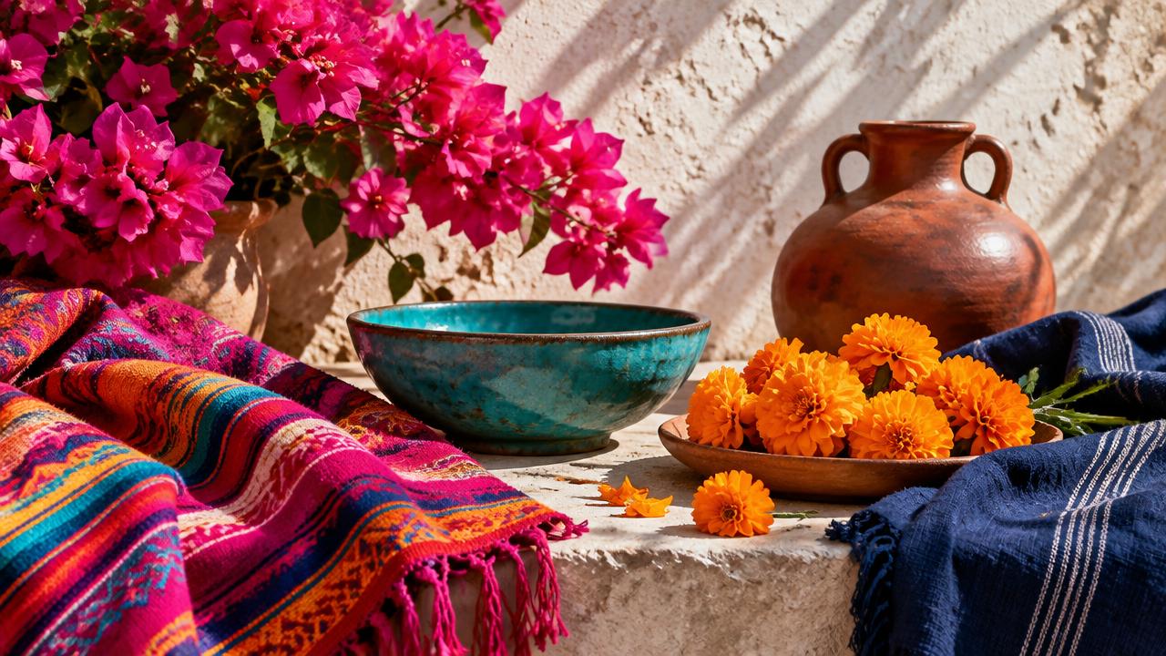
On May 6, 1949, Mexican fashion designer Ramón Valdiosera presented a collection in New York whose blazing bougainvillea pink prompted an enduring name: rosa mexicano. That single runway moment is a useful entry into the Mexican Colors Traditional Palette because it reveals something designers often miss. Mexican color is not simply “bright.” It is color made public—carried through dress, flowers, clay, food, civic symbols, architecture and ritual—and its power comes from relationships between hues, not saturation alone.
There is no single official national palette beyond regulated symbols, and Mexico’s regional traditions are far too varied to compress into eight universal swatches. Oaxaca’s clays, Puebla’s ceramics, Maya textiles, northern desert landscapes and Mexico City modernism each speak differently. The eight colors here are therefore a designer’s map, not a claim of cultural completeness. Their HEX values translate material references into usable screen colors; they do not pretend that a flower, mineral, dye bath or hand-fired vessel has one immutable digital code.
What unites the palette is a willingness to let colors meet at full strength. Rosa Mexicano #E4007C can sit beside Cempasúchil #F9A825 without a beige intermediary. Azul Añil #22226B can frame Turquesa #00A0B0, while Barro #9B442A gives the eye an earthen place to rest. The result is high contrast with cultural memory—a far more useful principle than the vague instruction to “make it festive.”
Mexican Colors Traditional Palette: Eight HEX Codes and Meanings
The palette begins with a crucial distinction: color names describe histories and associations, while HEX codes describe emitted light on a screen. #E4007C is a practical digital interpretation of rosa mexicano, not a pigment formula owned by every craft tradition. The same caution applies to the flower gold of cempasúchil and the variable blues produced by indigo vats. Use these values as calibrated starting points, then test them in the actual medium.
| Item | Color | Hex | Name | Meaning |
|---|---|---|---|---|
| 1 | Vivid magenta-pink | #E4007C | Rosa Mexicano | Modern Mexican identity, confidence, visibility and celebration |
| 2 | Golden orange | #F9A825 | Cempasúchil | Memory, seasonal ritual, warmth and a path of welcome |
| 3 | Deep violet-blue | #22226B | Azul Añil | Dyed textiles, depth, continuity and skilled handwork |
| 4 | Saturated green | #006847 | Verde Bandera | National identity; historically linked to independence |
| 5 | Strong crimson | #CE1126 | Rojo Bandera | National identity; historically linked to union in the 1821 tricolor |
| 6 | Blue-green | #00A0B0 | Turquesa | Precious material, water, sky, ornament and protection |
| 7 | Fired earth | #9B442A | Barro | Clay, land, utility, warmth and the maker’s hand |
| 8 | Clear yellow | #FCD900 | Amarillo | Light, commerce, food, paper decoration and visual energy |
Rosa Mexicano: a twentieth-century color with older visual roots
Valdiosera did not discover a new wavelength in 1949. He gave an internationally legible name to an intense pink already visible in bougainvillea, sweets, toys, textiles and vernacular decoration. That makes rosa mexicano a fascinating act of design authorship: a modern label built from observed material culture. Its legacy appears in fashion, graphic identity and the monumental colored planes associated with Mexican modernism.
For designers, #E4007C is not a “feminine accent” by default. At high chroma it behaves more like a signal color. It advances visually, remains assertive at small scale and can make dark indigo feel deeper. Pair it with #22226B for controlled tension, or with #F9A825 for a hotter, more public rhythm. Avoid softening it automatically into blush; doing so erases the chromatic confidence that gives the hue its identity.
Flag green and red: history before shorthand
The green and red of Mexico’s flag are widely given modern popular meanings—hope for green and the blood of national heroes for red—but the tricolor’s original 1821 framework was different. The Army of the Three Guarantees associated green with independence, white with religion and red with union among the population of the new nation. Meanings evolve, but design writing should separate original context from later interpretation.
The digital values Verde Bandera #006847 and Rojo Bandera #CE1126 are useful approximations, not statutory HEX specifications. In a composition, they carry immediate civic weight when used together. If a project is not about the Mexican state, separating them or reducing their proportion can prevent an unintended flag reading. Cultural fluency includes knowing when a familiar combination becomes more specific than the individual colors.
Material Origins of the Mexican Colors Traditional Palette
The most reliable way to understand this palette is to stop imagining a row of paint chips. Mexican color often begins as matter: petals laid into a path, fermented indigo absorbed by fiber, insects transformed into cochineal dye, mineral glazes fused to clay, or earth shaped into vessels and walls. Material changes color. Gloss makes turquoise flash; wool makes indigo absorb light; rough stucco scatters pink into the sun.
Cempasúchil: color as a path
The Mexican marigold, Tagetes erecta, ranges from yellow to dense orange. #F9A825 captures its golden-orange center of gravity. During Día de Muertos, cempasúchil is valued for more than visual warmth: petals and fragrance are traditionally used to guide returning spirits toward an ofrenda. Color here is directional and temporal. It appears in season, marks a route and participates in remembrance.
That context matters when translating marigold into branding. A designer can borrow its warmth and visibility without turning every orange composition into Día de Muertos imagery. If the celebration itself is the subject, study the fuller Día de los Muertos color palette, where paper, candlelight, flowers and darkness create a specific symbolic system. Cempasúchil should not become a generic “fiesta orange” detached from its living use.
Indigo: depth produced through process
Azul Añil #22226B represents the darkest register of indigo rather than a single historical formula. Indigo was used in Mesoamerican textile traditions before colonization and became a major product of New Spain. Dye concentration, fiber, oxidation and repeated immersion can move the result from clear blue toward near-navy. That variation is part of the craft, not inconsistency.
In palette structure, indigo performs the job that black often performs in Western brand systems: it creates depth, holds typography and gives brighter hues something to push against. Yet it is more chromatically alive than neutral black. Place #E4007C, #FCD900 or #00A0B0 against it and each appears more luminous. This dark–bright opposition is one reason the palette can remain intense without becoming visually flat.
Turquoise, clay and the intelligence of surfaces
Turquoise materials held value in Mesoamerican ritual and elite objects, including mosaics made from multiple blue-green substances. Turquesa #00A0B0 condenses that varied material field into a contemporary blue-green. In later ceramic and architectural settings, related cool hues also create a striking counterpoint to sun-warmed walls and fired earth.
Barro #9B442A is equally broad. Mexican clay traditions include red, buff and black wares; there is no single national terracotta. This HEX value represents an iron-rich fired-earth note that works as a chromatic anchor. It connects the brilliant colors to touch, weight and land. Pair turquoise and barro and the contrast is complementary in spirit—cool water against warm earth—without becoming synthetic.
The brighter Amarillo #FCD900 has a less singular origin story. It appears across flowers, foods, market signs, painted façades and cut-paper decoration. Its usefulness lies in illumination. Unlike marigold, which leans orange and ceremonial, this yellow reads as direct light. Use it sparingly near white because its edges can disappear; against indigo, it becomes one of the palette’s clearest accessibility-friendly signals when contrast is properly tested.
Architecture, Textiles and the Logic of High Contrast
What can look “too much” on a small mood board often makes sense at architectural or textile scale. Mexican modernists such as Luis Barragán demonstrated that a saturated wall is not merely a colored object: it is a device for shaping sunlight, shadow, sequence and emotion. A pink plane changes throughout the day. A turquoise surface can imply coolness beside dry earth. Color becomes spatial rather than decorative.
Textiles create contrast differently. Woven geometry fragments intense hues into repeat, allowing the eye to average small areas while preserving energy at a distance. A designer translating this logic into a website should not copy motifs without context. Instead, borrow the structural lesson: alternate scale, create rhythm and let one dark color organize several bright ones.
The palette also challenges the idea that sophisticated color must be desaturated. Its sophistication comes from hierarchy. On a façade, one hue may dominate while another appears only in a door or tile edge. In embroidery, many colors can coexist because outlines and repeated geometry create order. In an ofrenda, black space and candlelit shadow make orange and pink legible. Saturation succeeds when composition provides boundaries.
Food adds another register. Chile red, maize yellow, avocado green, hibiscus crimson and glazed ceramic blues create temporary tablescapes where color signals freshness, heat, ripeness and hospitality. These associations are sensory rather than fixed psychological laws. A green sauce and a green flag share a hue family, not an identical meaning. Good analysis follows the object, occasion and community before assigning symbolism.
This is why comparisons with other high-chroma traditions can be productive when they avoid collapsing cultures together. The Indian color traditions guide also examines saturated festival, textile and sacred colors, but the materials, histories and symbolic rules differ. Contrast between traditions helps designers see that “vibrant” is not a universal style category; it is an outcome produced by particular practices.
Using the Mexican Colors Traditional Palette in Contemporary Design
Respectful application starts with purpose. Are you designing for a Mexican cultural institution, a food product with a specific regional origin, a travel campaign, or a brand that simply admires bold color? The answer determines how much cultural specificity you can responsibly claim. Color inspiration is broad; claims of authenticity require collaboration, research and ideally Mexican creative leadership.
1. Build hierarchy before harmony
Do not divide all eight colors into equal stripes. Choose roles. A practical digital system might use #22226B across 55 percent of the composition, #9B442A or a warm off-white across 25 percent, #E4007C across 12 percent and #F9A825 across the final 8 percent. The exact ratio can change, but unequal distribution gives the palette a voice.
For a lighter editorial system, reverse the value structure: use an unbleached-paper neutral as the field, indigo for type, barro for secondary rules and one vivid hue for navigation. The palette remains recognizably connected to its source without turning every screen into a festival poster.
2. Use pairings with distinct jobs
- Rosa Mexicano #E4007C + Azul Añil #22226B: expressive and contemporary; useful for fashion, arts and editorial identities.
- Cempasúchil #F9A825 + Barro #9B442A: warm and material; appropriate for craft storytelling and food packaging.
- Turquesa #00A0B0 + Rojo Bandera #CE1126: energetic opposition; best with generous neutral space.
- Verde Bandera #006847 + Amarillo #FCD900: fresh and highly visible, but potentially civic or sporting depending on context.
- Indigo #22226B + Amarillo #FCD900: the clearest dark–light pair for wayfinding and calls to action.
3. Design for medium, not just screens
HEX values are RGB instructions. They will not move unchanged into coated stock, cotton, ceramic glaze or exterior paint. Fluorescent pinks and clean turquoises are especially vulnerable to gamut shifts. Start with the screen reference, then use the HEX-to-Pantone converter to identify a nearby production color. Treat the result as a shortlist, not a contract: verify with current physical swatch books, proofs and material samples under the intended light.
Texture should influence the final specification. Indigo on wool looks darker and softer than the same measured color on glossy laminate. Barro gains meaning through a matte, irregular surface; printing it as a perfectly flat brown may feel lifeless. When possible, let the material carry part of the palette instead of simulating every quality with ink.
4. Protect legibility
High saturation does not guarantee high contrast. Pink on red, turquoise on green and marigold on yellow may vibrate while failing accessibility requirements. Use dark indigo for body copy, reserve adjacent bright hues for large shapes, and test every text/background pair at its real size and weight. Color can remain culturally expressive while interfaces remain readable.
5. Avoid the souvenir effect
The fastest way to flatten Mexican color is to combine every familiar sign at once: papel picado, skulls, cactus, sombrero, marigolds and flag colors. That creates a bundle of export clichés rather than a considered identity. Choose one grounded source—perhaps a regional textile structure, a clay process or the light behavior of a colored wall—and build from it. Specificity is more respectful and usually more original.
Conclusion: Color as Living Practice
The vibrant soul of Mexican color does not reside in brightness alone. It lives in the way #E4007C announces a surface, #F9A825 marks memory, #22226B records the labor of dyeing, #00A0B0 cools fired earth and #9B442A returns the composition to matter. Green, red and yellow add civic, commercial and luminous registers—but their meanings change with context.
For designers, the strongest lesson is not permission to use more color. It is an invitation to make color carry structure, material and history. Start with the eight HEX values, establish hierarchy, check contrast, proof the real medium and research the cultural setting behind every reference.
Ready to translate the palette into production? Begin with one anchor hue, build a controlled four-color system, then use Coloracci’s HEX-to-Pantone tool to explore physical-color matches before you brief a printer, fabricator or brand team.