Is Color Real? How We See a World That Isn't There
· Coloracci Team
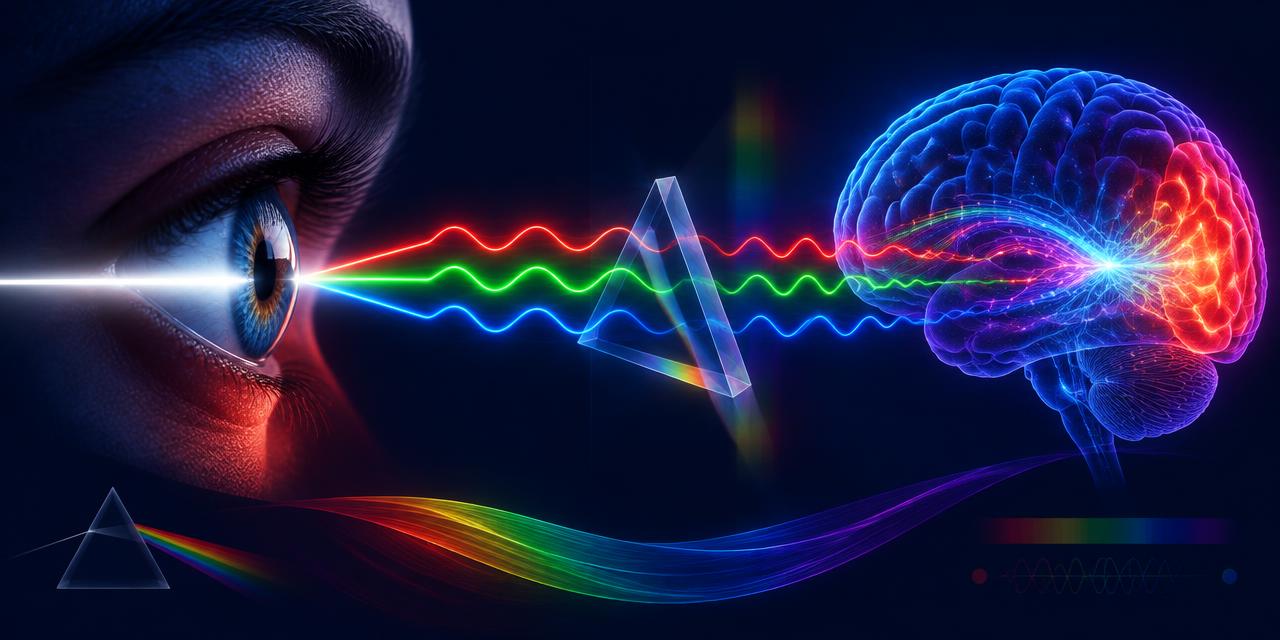
In February 2015, a single photograph of a lace dress broke the internet. Millions of people looked at the same pixels and saw white and gold; millions of others saw blue and black. Both groups were looking at identical light — and both were absolutely certain they were right. The dress was eventually confirmed to be blue and black, but the argument revealed something far stranger than an optical illusion: color is not a property of the dress at all. So is color real? The honest scientific answer is one of the most fascinating stories in perception — and one every designer should understand, because it changes how you think about every swatch, screen, and proof you will ever approve.
The short version is this: wavelengths of light are real, measurable, and objective. Color is what your brain does with them. The red of a stop sign does not live in the sign. It lives in you.
Is Color Real? The Short Answer Is Both Yes and No
Physicists and philosophers have argued about this for centuries, and the modern scientific consensus lands somewhere elegant in the middle. Objects in the world have real, physical properties: they absorb some wavelengths of light and reflect others. A lemon's skin reflects light peaking around 570–580 nanometers. That reflectance profile is a fact of the physical world, measurable with a spectrophotometer whether anyone is looking or not.
But "yellow" — the vivid, warm, unmistakable experience of yellow — is not in the lemon, and it is not in the light. Light of 580 nanometers is not yellow in the way that a kilogram is heavy. It is simply electromagnetic radiation of a particular wavelength. The yellowness is constructed by a visual system: three types of cone cells, a cascade of neural comparisons, and a brain that renders the final experience. No visual system, no yellow.
Isaac Newton understood this as early as 1666, when his prism experiments at Cambridge showed that white light could be separated into a spectrum and recombined. He wrote that "the rays, to speak properly, are not coloured" — the colors are sensations produced in the mind. Three and a half centuries of vision science have only sharpened that insight. So is color real? The physical stimulus is real. The experience is a construction. Both statements are true at once, and holding them together is the key to understanding everything from the dress to your own monitor.
The Physics: Wavelengths Are Real, Color Is the Translation
Visible light is a narrow slice of the electromagnetic spectrum, roughly 380 to 700 nanometers. Within that band, wavelength correlates with the color a typical human observer will report — and this is where design and physics genuinely meet, because the correlation is reliable enough to build industries on.
| Item | Color | Hex | Name | Meaning |
|---|---|---|---|---|
| Long-wave light (~700 nm) | 🟥 | #FF0000 | Pure Red | The longest wavelengths we see; L-cones respond most strongly |
| Long-to-mid light (~580 nm) | 🟨 | #FFFF00 | Spectral Yellow | L- and M-cones fire together at near-equal strength |
| Mid-wave light (~530 nm) | 🟩 | #00FF00 | Pure Green | M-cones dominate the retinal signal |
| Short-wave light (~450 nm) | 🟦 | #0000FF | Pure Blue | S-cones dominate; the shortest visible wavelengths |
| Red + blue light mixed | 🟪 | #FF00FF | Magenta | No single wavelength exists — the brain invents it |
| All wavelengths together | ⬜ | #FFFFFF | White | Full-spectrum stimulation reads as no color at all |
Notice the fifth row. Magenta has no wavelength. It is what your brain produces when red and blue receptors are stimulated together without green — a perception with no corresponding point on the spectrum. We explore that story in depth in Magenta: The Color That Doesn't Exist, and it is the cleanest proof that color is something the visual system manufactures rather than something it merely receives.
It is also worth noting what the table leaves out. Black (#000000) is not a wavelength either — it is the perception of an absence, an area reflecting or emitting far less light than its surroundings. Even "nothing" is an active interpretation.
Three Cones and a Brain: How Trichromacy Manufactures Color
The human retina carries three types of cone photoreceptors, each tuned to a different band of the spectrum. S-cones peak in the short wavelengths (around 420–440 nm, perceived as blue-violet), M-cones in the medium band (around 530–540 nm, green), and L-cones in the long band (around 560–570 nm, which actually peaks in yellow-green, not red — despite the common shorthand of calling them "red cones").
Here is the crucial part: each cone type is colorblind on its own. A cone can only report how much light it absorbed, not what wavelength that light was. A photon of 580 nm and a mixture of 540 nm and 620 nm can produce the identical response in an M-cone. This principle, known as univariance, means the raw signal from any single cone carries no color information at all.
Color emerges only from comparison. The visual system computes differences between cone channels — L minus M gives the red-green axis, and (L+M) minus S gives the yellow-blue axis. This opponent-process architecture, first proposed by Ewald Hering in the 1870s and confirmed physiologically a century later, explains why we never perceive a "reddish green" or a "yellowish blue": those are opponent pairs, and a single signal cannot be positive and negative at once. It is also why there are exactly four unique hues — red, green, yellow, and blue — from which all other color experiences are mixed perceptually.
Then the brain goes further. The signals leaving the retina are still just numbers. The final experience — the redness of red, rendered in vivid detail — is assembled in the visual cortex, influenced by memory, context, expectation, and the surrounding scene. By the time you "see" a color, your brain has already made dozens of interpretive decisions on your behalf.
Color Constancy: Your Brain Quietly Rewrites the Scene
If color were a direct readout of wavelengths, the dress would never have gone viral. The reason it did is a mechanism called color constancy — the brain's ability to keep an object's perceived color stable even when the light falling on it changes dramatically.
Consider a white sheet of paper. At noon under a blue-ish sky, the light it reflects is physically dominated by short wavelengths. At sunset, the same paper reflects light dominated by long, warm wavelengths. A spectroradiometer would record two completely different signals. Yet you see the paper as white both times, because your brain estimates the illuminant — the color of the light source — and subtracts it. You do not see the light that reaches your eye; you see your brain's best guess about the surface that produced it.
The dress was a perfect storm for this mechanism. The photograph was ambiguously lit, so different brains made different unconscious assumptions about the illumination. Discount a cool, bluish illuminant and the dress reads as white and gold. Discount a warm, yellowish one and it reads as blue and black. Neither group was broken; they were running the same software with different assumptions. Color constancy is a feature — it lets you recognize a friend's red jacket at noon and at dusk — but it proves that what you see is a model, not a measurement.
For designers, this has a concrete implication: the same HEX value is not the same color experience. A swatch of #FF0000 on a dark interface feels different from the identical value on a white page, under warm office lighting, or next to a saturated orange. Simultaneous contrast, surround effects, and adaptation all shift perception. The code is fixed; the color is negotiated.
Qualia: The Private Nature of Color Experience
Philosophers have a word for the subjective feel of experience: qualia. The redness of red — not the wavelength, not the cone signal, but what it is like to see red — is the classic example. And it raises a question science cannot currently answer: is your red the same as my red?
This is the "inverted spectrum" thought experiment, traceable to John Locke in the seventeenth century. We can both point at a ripe tomato and agree it is red. We both learned the word "red" for whatever tomatoes, stop signs, and #FF0000 look like to us. But nothing in that agreement proves the private experience behind the word is identical. Your red could be what I would call green, and neither of us could ever detect the difference, because every behavioral test — naming, matching, sorting — would come out the same.
Modern neuroscience has not resolved this, but it has added texture. We know that the ratio of L-cones to M-cones varies enormously between individuals with normal color vision — from roughly 1:1 to more than 10:1 — without obvious differences in color naming. We know that color vocabulary shapes perception: languages carve the spectrum differently, and speakers of languages with more basic color terms can discriminate boundary colors faster. Even the "same" brain changes its color rendering with age, as the lens yellows and filters out short wavelengths.
The practical takeaway is humbling. When you specify #0000FF for a brand, you are specifying a stimulus, not an experience. The experience is generated privately, inside each viewer, and it is not guaranteed to match yours.
Is Color Real If We Don't All See It? Deficiency and Super-Vision
The strongest evidence that color is a construction rather than a property is that the construction varies. Roughly 8 percent of men and 0.5 percent of women have some form of color vision deficiency, most commonly a shift or loss in the L- or M-cone pathway. A deuteranope looking at #FF0000 and #00FF00 does not see "worse" versions of your red and green — they see a genuinely different world, one in which those two stimuli are nearly the same color. Their perception is not an error; it is the correct output of a different system.
At the other extreme sit tetrachromats — people, almost always women, with four functional cone types instead of three. Where a trichromat sees one continuous green in a summer leaf, a confirmed tetrachromat may perceive distinct hues that the rest of us cannot name. The artist Concetta Antico, the best-documented case, describes seeing shimmering violets and pinks in a grey pebble. We tell that story in Tetrachromacy: Seeing a Hundred Million Colors. Her world is not decorated with extra color; it is built from more color.
And beyond humans, the variation becomes almost comic. Mantis shrimp carry twelve or more spectral receptor types. Many birds see ultraviolet patterns invisible to us. Bees navigate by floral markings that exist only in UV. None of these creatures is seeing the "true" colors and none is seeing false ones. Each is running a different rendering engine on the same physical world. There is no God's-eye color palette — only species-specific constructions.
What This Means for Designers: Practical Takeaways
Color is a relationship between a stimulus and a viewer — and you only control half of it. Design for that reality.
Specify stimulus, expect variation. A HEX code like #FF0000 fixes the light a screen emits, not what a viewer experiences. Test palettes on real devices, in real lighting, with real users — including users with color vision deficiency. Roughly one in twelve men will not see your red-green distinction the way you do.
Never encode meaning in color alone. If an error state is only "the red one," a deuteranope may miss it entirely. Pair color with icons, labels, or texture. This is not just accessibility compliance — it is an acknowledgment that color perception is not universal.
Respect context effects. Color constancy and simultaneous contrast mean a swatch never appears in isolation. A neutral grey (#808080) shifts warm or cool depending on its surround. Evaluate colors in the final composition, not in a palette vacuum.
Bridge screen and print deliberately. Screens emit light; paper reflects it. The same "color" is a different physical event in each medium, and your brain's constancy mechanisms treat them differently. When a brand color must survive the jump from RGB to ink, use a dedicated matching workflow — our Pantone Finder tool maps digital values to their closest standardized print references so the translation is intentional rather than accidental.
Remember that even "objective" color is a convention. sRGB, HEX, Pantone — these are agreements about stimuli, not discoveries of nature's palette. They work because human visual systems are similar enough, most of the time, for the agreement to hold. Design inside the convention, but never mistake it for the phenomenon.
Conclusion: The World Is Colorless, and That Is Wonderful
So, is color real? The wavelengths are real. The reflectances are real. But the crimson of a sunset, the blue of the dress, the green of a summer leaf — those are performances, staged by three cone types and a hundred billion neurons, rendered fresh for every observer. The world outside your head is, in the strictest sense, colorless. The color is the gift your visual system adds.
Far from making color less important to design, this makes it more so. You are not arranging properties of objects; you are composing inputs to a perceptual system — one that is powerful, idiosyncratic, and different in every viewer who encounters your work. The best color designers have always understood this intuitively. Now you know the science behind the intuition.
Ready to work with color as it actually is — a bridge between physics and perception? Find the closest print match for any digital value with our Pantone Finder, or explore more of the science on our blog.