Tetrachromacy: Seeing a Hundred Million Colors — The Super-Vision Explained
· Coloracci Team
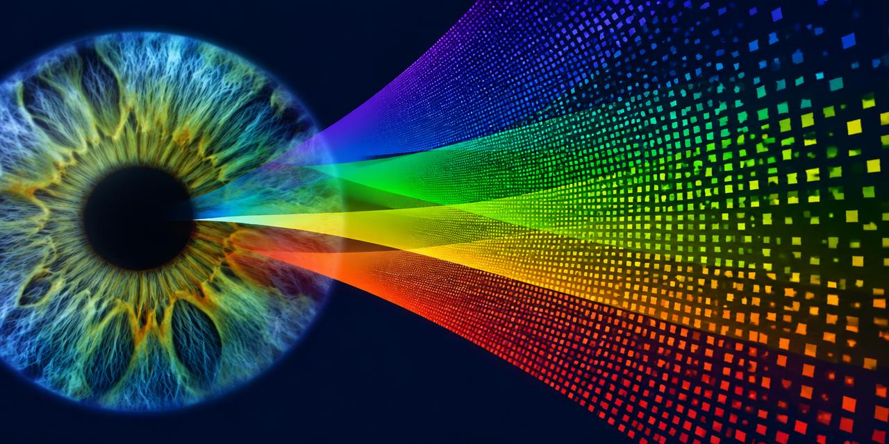
In 2010, a research paper in the Journal of Vision described a woman known only by a lab code: cDa29. Across a battery of color-matching tests at Newcastle University, she did something no other participant managed. Where ordinary observers saw two identical mixtures of red and green light, she consistently saw two different colors. After two decades of searching, vision scientist Gabriele Jordan and her colleagues had found the first strong behavioral evidence of a functional human tetrachromat. That discovery is the heart of Tetrachromacy: Seeing a Hundred Million Colors — the idea that a small number of people may carry a fourth color channel and, in theory, distinguish around a hundred times more colors than the rest of us.
For designers, this is more than a biology curiosity. Every HEX code you ship, every Pantone swatch you approve, and every gradient you tune is built for a three-channel eye. Understanding the fourth channel tells you exactly where your color decisions are robust — and where they are quietly built on assumptions.
What Tetrachromacy Actually Means
Most humans are trichromats. The retina contains three types of cone cells, each tuned to a different band of wavelengths:
- S-cones peak around 420 nm (short, violet-blue)
- M-cones peak around 530 nm (medium, green)
- L-cones peak around 560 nm (long, yellow-green, reaching into red)
Your brain never sees wavelengths directly. It compares the relative response of those three cone types and turns the ratios into color. Because there are three inputs, every color you perceive can be described with three numbers — which is precisely why screens use RGB and why a HEX code has three pairs of digits.
A tetrachromat has four distinct cone types. In humans, the fourth type is usually an extra variant sitting between the M and L cones — often called an anomalous L-prime or M-prime cone. Its sensitivity peak differs from its neighbors by only a few nanometers, but that small offset adds a new dimension to the comparison the brain can make.
The distinction that matters most is between genetic and functional tetrachromacy:
- Genetic tetrachromats carry the genes for four cone types.
- Functional tetrachromats have brains that actually use the fourth signal to discriminate colors.
Many people in the first group are not in the second. Having the hardware does not guarantee the neural wiring to exploit it. That is why cDa29 was so remarkable: she was one of 24 women in the study carrying the relevant genes, and the only one whose perception clearly behaved like a four-channel system.
Tetrachromacy: Seeing a Hundred Million Colors — Where the Number Comes From
The "hundred million" figure is a theoretical estimate, not a measurement, and it is worth understanding how it is derived.
Researchers commonly estimate that a trichromat can distinguish roughly 100 distinct steps of variation along each cone-comparison dimension. Three dimensions give approximately 100 × 100 × 100 = 1 million discriminable colors. Add a fourth dimension with a similar resolution and the arithmetic becomes 100⁴ = 100 million.
The logic is elegant, but real vision is messier:
- The extra cone overlaps heavily with its neighbors, so its signal is weak compared with a genuinely new channel.
- The brain's opponent-color pathways evolved for three inputs; a fourth signal has to share that circuitry.
- Discrimination varies with lighting, surface texture, and viewing size.
So the honest statement is this: a functional tetrachromat can reliably tell apart some colors that look identical to everyone else, especially in the red-orange-green region of the spectrum. Whether that adds up to exactly 100 million distinct experiences is unknowable — but the added dimension is real.
Who Can Be a Tetrachromat?
The genes for the M and L cone pigments sit on the X chromosome. Because women have two X chromosomes, a woman can carry a normal L gene on one and a shifted variant on the other. Through a process called X-inactivation, different cone cells express different copies, producing four cone populations in a single retina.
This has a striking consequence: the mothers and daughters of men with red-green color deficiency are the most likely candidates. The same genetic variation that removes a dimension of color for a son can add one for his mother. Estimates of how many women carry four cone genes range widely — figures around 12% are often cited — but functional tetrachromacy appears to be far rarer.
Men, with a single X chromosome, essentially cannot become tetrachromats through this route.
Tetrachromacy: Seeing a Hundred Million Colors in the Real World
Beyond the laboratory, the most famous case is Concetta Antico, an Australian-born painter based in San Diego who has been studied as a probable tetrachromat. Her paintings of eucalyptus leaves, water, and shadow are filled with violets, limes, and oranges where most viewers expect uniform greens and greys. She describes seeing a cascade of color in a plain pebble path.
What makes her work useful to designers is not that we can see what she sees — we cannot, because our screens and eyes are both trichromatic. It is that she makes chromatic variation visible by exaggerating it into ranges we can perceive. Her palettes are a translation, not a recording.
The animal kingdom offers context too:
- Birds are typically tetrachromats with a UV-sensitive cone, seeing plumage patterns invisible to us.
- Many fish, reptiles, and insects have four or more photoreceptor types.
- Mantis shrimp have 12–16 photoreceptor types, yet a 2014 study found they are worse than humans at fine color discrimination. More receptors do not automatically mean better color vision — processing matters as much as hardware.
A Tetrachromat's Test Palette: Colors Near the Fourth Channel
The colors below are chosen to sit in regions where an extra L/M variant cone would plausibly add discrimination, plus control colors for comparison. These are illustrative screen colors, not a diagnostic test — a monitor cannot reveal tetrachromacy because it only emits three primaries.
| Item | Color | Hex | Name | Meaning |
|---|---|---|---|---|
| Leaf midtone | #6B8E23 | Olive Drab | Where a tetrachromat may see gold and teal undertones in "plain" foliage | |
| Spring shoot | #9ACD32 | Yellow-Green | The M/L overlap zone where the fourth cone adds the most information | |
| Sunset band | #FF7F50 | Coral | A red-orange range where subtle metamers split apart | |
| Metamer pair A | #D2691E | Burnt Orange | Classic Rayleigh-match territory: red plus green mixed to look orange | |
| Metamer pair B | #CD853F | Peru Tan | Looks close to A for trichromats under some lights; the gap widens for four channels | |
| Shadow violet | #7B68EE | Medium Slate Blue | The hidden violet Antico paints into shadows | |
| Stone grey | #8A8D8F | Pebble Grey | A "neutral" that may read as tinted to a sensitive observer | |
| Control | #FF00FF | Magenta | A brain-built, extra-spectral color — a reminder that all color is interpretation |
That last row links back to a related idea we explored in why magenta isn't a real color: color is a construction of the visual system, not a property stamped on light. Tetrachromacy simply shows that different visual systems can construct different results from the same photons.
Why Your Screen Cannot Show Tetrachromat Color
Here is the key technical limit. A display creates every color by mixing three primaries — red, green, and blue. A tetrachromat viewing an sRGB monitor still receives only three independent light sources. Two colors that are identical in RGB are physically identical light, so no observer can tell them apart.
Tetrachromat discrimination shows up with real-world spectra: pigments, dyes, foliage, skin, fabrics. Two paints can be engineered to look identical to a trichromat (a metamer) while reflecting different wavelength curves. A four-cone eye can catch the difference.
This is the same reason print and screen disagree so often. As we cover in our guide to Pantone vs. HEX, a HEX code describes light from three emitters, while a Pantone ink is a physical pigment with its own spectral curve. Two materials matched perfectly for one observer, one light source, or one camera can drift apart for another.
Metamerism: The Designer's Real Lesson
Tetrachromacy is an extreme example of something every designer encounters: observer metamerism. Even among ordinary trichromats, cone sensitivities vary slightly between individuals and with age as the eye's lens yellows. A fabric swatch and a printed brochure can match for you and mismatch for your client.
Practical signs of metamerism in your workflow:
- Brand colors that match under studio LEDs but split apart in daylight
- Packaging that looks consistent in photos but not on the shelf
- Two approvers disagreeing about whether a sample is "on brand"
- A green paint chip that looks olive to one person and khaki to another
Practical Takeaways for Designers
You will probably never design specifically for tetrachromats, but the concept sharpens several habits.
1. Specify physical colors with physical standards. For anything printed, dyed, painted, or manufactured, a HEX code is not enough. Define a Pantone or equivalent reference, then use a tool like the Coloracci Pantone Finder to find the closest match to your digital color and hand off both values together.
2. Approve samples under multiple light sources. Check critical materials under daylight, warm tungsten, and cool office light. If a pair of materials drifts, they are metamers for your eyes — and they will drift more for other observers.
3. Don't rely on subtle hue differences to carry meaning. If two UI states differ only by a slight shift in yellow-green, many users won't see it — and a few will see it more strongly than you intended. Pair color with labels, icons, or contrast changes.
4. Treat the yellow-green and red-orange ranges carefully. These are the zones where individual color vision varies most, in both directions: color-deficient users lose discrimination, and some carriers gain it. Brand colors in these areas deserve extra testing.
5. Design rich, layered palettes for natural subjects. Antico's work is a reminder that foliage, stone, and shadow are never a single flat color. Building palettes with warm and cool undertones — a violet in the shadow, a gold in the green — produces imagery that feels alive to every viewer.
6. Remember the screen is a compression. Everything shown on a display is a three-channel approximation of a far richer spectral world. Photography, texture, and material choice restore some of that richness where pure flat color cannot.
Myths Worth Correcting
- "Online tests can tell you if you're a tetrachromat." They cannot. RGB screens emit three primaries, so any image-based test is limited to trichromatic information. Real testing uses precisely controlled spectral light and genetic analysis.
- "All tetrachromats see 100 million colors." Most genetic carriers show little or no measurable advantage. Functional tetrachromacy appears rare.
- "Tetrachromats see ultraviolet." Human fourth cones are usually variants in the red-green range, not UV receptors. Birds are the UV specialists.
- "More cones always mean better color." The mantis shrimp proves otherwise. Neural processing is what turns receptor signals into rich perception.
What Tetrachromacy Teaches About Color Systems
Every color model designers use — RGB, HEX, HSL, CMYK, even CIELAB — rests on the assumption of a standard three-cone observer defined by the CIE in 1931 and refined since. That assumption works remarkably well for most people most of the time. Tetrachromacy shows us its edges.
The takeaway is not that color systems are broken. It is that color is a relationship among light, material, and observer. When one of those three changes — a new light source, a new substrate, or a different eye — the same specification can produce a different experience. Strong design systems anticipate that variation by specifying physical standards, testing across conditions, and never letting a single subtle hue carry critical meaning.
Conclusion
Tetrachromacy: Seeing a Hundred Million Colors is one of the most intriguing ideas in color science. A tiny number of people, almost all women, carry a fourth cone that can split colors the rest of us see as identical. The famous hundred-million figure is theoretical, and functional cases like cDa29 are rare, but the science is solid — and its lessons apply to every designer.
Your palettes are built for an average observer on a three-primary screen. The real world is spectral, variable, and personal. Specify physical colors with physical references, test under multiple lights, and give your palettes the layered richness that nature — as seen through a tetrachromat's eyes — always has.
Ready to turn screen colors into reliable physical standards? Open the Coloracci Pantone Finder to match any HEX code to its closest Pantone, or build a harmonious scheme with our AI Color Palette Generator.