Magenta: The Color That Doesn't Exist
· Coloracci Team
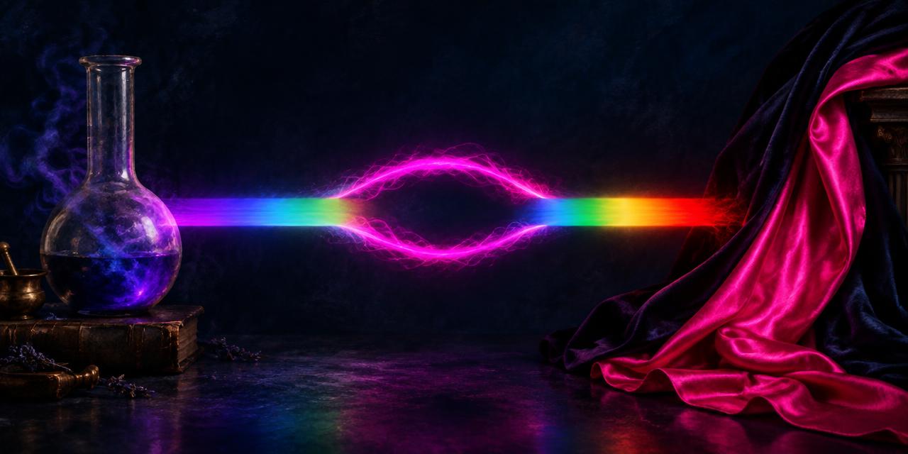
On June 4, 1859, French and Sardinian forces defeated the Austrian army near a small Lombardy town called Magenta. That same year, a Lyon chemist named François-Emmanuel Verguin patented a synthetic aniline dye of a startling reddish-purple hue. He named it after the battle — and in doing so, gave the world a word for a color that, strictly speaking, does not exist in nature at all. The impossible color magenta is one of the great paradoxes of visual science: every screen you own can display it, every printer relies on it, and yet no single wavelength of light will ever produce it. It is a color your brain invents.
The Impossible Color Magenta and the Missing Wavelength
To understand why the impossible color magenta puzzles physicists, start with the rainbow. When Isaac Newton split sunlight with a prism, he revealed the visible spectrum: a continuous band of wavelengths running from deep violet (around 380 nanometers) to deep red (around 700 nanometers). Every spectral color — red, orange, yellow, green, blue, violet — corresponds to a specific wavelength. Magenta does not appear anywhere in that band. It is what color scientists call an extra-spectral or non-spectral color.
Your eyes contain three types of cone cells, roughly tuned to long (L, red-sensitive), medium (M, green-sensitive), and short (S, blue-sensitive) wavelengths. When red light at 650nm enters your eye, it strongly stimulates L cones. When blue light at 450nm arrives, it strongly stimulates S cones. When both arrive together — with little or no green light to stimulate the M cones — your visual system receives a signal combination that no single wavelength can produce: strong L, strong S, weak M.
The brain resolves this unusual signal by constructing a new percept: magenta. On the CIE chromaticity diagram, the spectral colors form a curved horseshoe, and the straight line connecting its two ends — red and violet — is called the line of purples. Every color on that line, magenta included, exists only as a mixture. It is real as a perception, a pigment, an ink, and a digital value like #FF00FF — but it is not a color of the physical rainbow.
1859: Fuchsine, the Accidental Dye
Magenta's material history begins with the birth of the synthetic dye industry. In 1856, the young English chemist William Henry Perkin had accidentally created mauveine while trying to synthesize quinine, launching the aniline dye revolution. Three years later, Verguin developed a related process that yielded a brilliant reddish-purple dye he called fuchsine, after the fuchsia flower it resembled.
The dye was an immediate commercial sensation. It produced vivid, saturated color on silk and wool at a fraction of the cost of natural dyes like cochineal. After the French-Sardinian victory at the Battle of Magenta in June 1859, the dye was renamed "magenta" — a piece of patriotic marketing that permanently attached a battlefield's name to a color. The original fuchsine dye, a deeper and more muted rose than modern electric magenta, sits near #A8375D in digital terms.
This origin story matters for designers because it established a pattern that repeats to this day: magenta-family colors are manufactured statements. They rarely appear in unaided nature at high saturation, which is precisely why they read as bold, artificial, and attention-demanding.
From Schiaparelli's Shocking Pink to Hot Pink
If the nineteenth century gave magenta its name, the twentieth gave it attitude. In 1937, the Italian couturier Elsa Schiaparelli launched her perfume Shocking in a bottle modeled on the actress Mae West's torso, packaged in a box of an audacious, electric pink she called Shocking Pink — approximated digitally as #FC0FC0. Schiaparelli described the color as "life-giving... a color of China and Peru, not of the West," and made it the signature of her house. It was a deliberate provocation: a color too loud for polite society, deployed as brand identity decades before "brand color" was a discipline.
The magenta family kept expanding through the century:
- Fuchsia
#FF00FF— named for the fuchsia plant's pendant flowers; in digital color, fuchsia and magenta are the same value, though the names carry different histories. - Hot Pink
#FF69B4— a warmer, redder member of the family that became a pop-culture staple from the 1970s onward. - Razzle Dazzle Rose
#FF33CC— a Crayola-named electric rose with a slight violet lean. - Rose
#FF007F— the pure midpoint between red and magenta on the RGB color wheel.
Each of these sits on or near the line of purples — every one is extra-spectral, a mixture rather than a wavelength. The entire hot-pink family is, in the spectral sense, imaginary. That has never stopped it from selling perfume, dresses, and album covers.
The Impossible Color Magenta's Digital Life as #FF00FF
Magenta's strangest afterlife is technical. In the RGB additive color model used by every screen, magenta is a secondary color: full red plus full blue, no green — #FF00FF. In the CMYK subtractive model used by every printing press, magenta is a primary: one of the three inks (with cyan and yellow) from which all other printed colors are mixed. Magenta is simultaneously impossible in the spectrum and indispensable in both dominant color technologies. Few colors hold that dual citizenship.
Designers also know #FF00FF by a less glamorous role: it is the universal "missing texture" color. Game engines and video software have long used pure magenta as a placeholder that screams "something failed to load," precisely because it almost never appears in real content. A color that doesn't exist in nature turns out to be the perfect flag for content that doesn't exist either.
Why the Brain Builds Magenta at All
The opponent-process theory of color vision offers a satisfying explanation for magenta's invention. The visual system does not pass raw cone signals upward; it re-encodes them into opponent channels: red versus green, blue versus yellow, and light versus dark. When red and blue light arrive together without green, the red-green channel is pulled hard toward "red" while the blue-yellow channel reports "blue" — a combination that corresponds to no spectral stimulus. The brain's solution is to interpolate across the gap: it treats the ends of the spectrum as if they were adjacent, effectively bending the linear rainbow into a circle. Magenta is the color of that seam.
This is why the color wheel — a circle — feels so natural to designers even though the spectrum is a line. The wheel only closes because perception invents the purples to join red back to violet. Every harmonious color scheme you have ever built on a wheel quietly depends on colors that have no wavelength. Magenta is not a bug in human vision; it is the feature that makes circular color harmony possible.
There is also a perceptual argument for magenta's salience. Because it sits at maximum distance from green — the hue that dominates foliage and therefore most natural visual environments — magenta provides the strongest possible figure-ground separation against the living world. Florists, pollinated plants, and warning-sign designers have all exploited this: a magenta object against greenery is about as visible as a colored object can be.
Magenta in Branding and Culture
The twentieth and twenty-first centuries turned magenta into a branding power move. Beyond Schiaparelli, the color became the signature of T-Mobile, whose parent company Deutsche Telekom trademarked its specific magenta (#E20074) and has defended it in court against insurers, rival carriers, and startups — treating a shade of pink as property worth litigating over. Mattel's Barbie built an empire on a neighboring pink, and the magenta-adjacent "millennial pink" wave of the 2010s proved the family's commercial durability across generations.
The cultural logic is consistent: magenta-family colors signal confidence, play, and a refusal to blend in. They are the colors of brands that want to be noticed first and categorized later. When you choose magenta for a client, you are not choosing a soft or safe option — you are choosing the color that perception itself had to invent, and that history of boldness is embedded in how audiences read it.
The Magenta Family at a Glance
| Item | Color | Hex | Name | Meaning |
|---|---|---|---|---|
| Electric Magenta | 🟣 | #FF00FF |
RGB Magenta / Fuchsia | The digital pure form: full red + full blue, zero green |
| Fuchsine | 🌺 | #A8375D |
Original 1859 dye | The muted rose of Verguin's aniline dye, named for the battle |
| Shocking Pink | 💗 | #FC0FC0 |
Schiaparelli pink | Couture provocation, 1937; brand color as manifesto |
| Hot Pink | 🌸 | #FF69B4 |
Hot Pink | Warmer, redder pop-culture pink |
| Razzle Dazzle Rose | 🎀 | #FF33CC |
Razzle Dazzle Rose | Electric rose with a violet lean |
| Rose | 🌹 | #FF007F |
Rose | Exact midpoint between red and magenta |
Practical Takeaways for Designers
Use magenta's artificiality as a feature. Because saturated magentas are rare in unaided nature, they read as intentional, energetic, and modern. That is why brands from T-Mobile to Schiaparelli chose them: the color itself signals "manufactured confidence."
Respect its contrast limits.
#FF00FFon white yields a contrast ratio of roughly 3.1:1 — failing WCAG AA for body text. For accessible text on light backgrounds, darken toward#A8375D-family tones or use white text on deep magenta backgrounds.Mind the gamut gap. Screen magenta (
#FF00FF) and print magenta (CMYK) are not the same color, and neither converts perfectly to a spot ink. Before specifying magenta across media, run your values through our HEX to Pantone converter to find the closest printable match — and read our guide on Pantone vs. HEX color systems to understand why no conversion is ever exact.Pair magenta with its spectral neighbors deliberately. On the color wheel, magenta sits opposite green — the very channel it lacks. Magenta-and-green pairings are maximally complementary and maximally loud; magenta with deep navy or charcoal reads sophisticated instead.
Explain the science honestly. Magenta is not "fake." It is a genuine, measurable perception — but one constructed by the visual system rather than carried by a single wavelength. For a deeper look at how physics and perception diverge, see our articles on structural color in nature and why magenta isn't in the rainbow.
Conclusion: The Color Your Brain Invented
Magenta's biography spans a Lombardy battlefield, a Lyonnaise chemistry lab, a Parisian couture house, and every pixel on your screen. It is a color with no wavelength, a dye named for a battle, a perfume box that scandalized Paris, and a primary ink in every printing press on Earth. The impossible color magenta is proof that color is not merely a property of light — it is a negotiation between physics and perception, and sometimes perception wins.
Want to work with magenta precisely? Try our HEX to Pantone converter to translate #FF00FF and its relatives into print-ready specifications, or explore our color tools to build palettes around the color that doesn't exist.