The Ultimate Guide to Interior Paint Colors for Craftsman Style Homes
· Coloracci Team
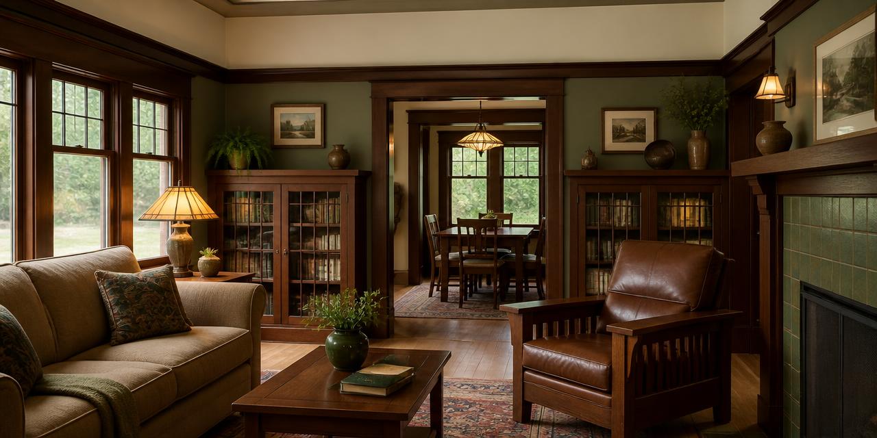
Interior Paint Colors for Craftsman Style Homes
The best interior paint colors for Craftsman style homes come straight out of the landscape outside the window: muted sage greens, russet browns, warm greiges, creamy off-whites and dusty blue-greens. If you want the short answer before the deep dive, start with Benjamin Moore Saybrook Sage HC-114 (#B5B6A8) on the walls, White Dove OC-17 (#F0EFEA) on the ceiling, and Russet (#8B5B41) or Perma-Brown (#604016) as your accent. That trio respects the quartersawn oak trim that defines the style, and it produces the grounded, welcoming atmosphere the Arts and Crafts movement was built on.
Craftsman interiors are not neutral boxes. They are wood-forward rooms — box beams, picture rails, built-in bookcases, wainscoting, mantels — and paint has a supporting role. Choose colors that argue with the wood and the whole room looks restless. Choose colors drawn from the same natural family and everything settles.
Why the Craftsman Style Color Palette Works
The Arts and Crafts movement was a deliberate reaction against Victorian excess and industrial mass production. Gustav Stickley and his contemporaries wanted honesty in materials: visible joinery, hand-hammered copper, unpainted oak, and colors that looked like they came from a field rather than a factory.
Three principles govern the craftsman style color palette:
- Low saturation. Every hue is muted, as if a drop of its complement has been mixed in. Nothing is pure or electric.
- Mid-range value. Craftsman walls sit in the middle of the light scale so that darker wood reads as the darkest element and the ceiling reads as the lightest.
- Warm bias. Even the greens and blues carry yellow or brown warmth, which is why a cool builder-grade gray always feels wrong in these houses.
Once you understand those three rules, choosing arts and crafts interior paint becomes a matter of picking the right member of a very consistent family.
The Core Craftsman Color Families (with Exact HEX Codes)
Sage Green — the signature Craftsman wall color
| Paint Color | HEX | Character |
|---|---|---|
| Benjamin Moore Saybrook Sage (HC-114) | #B5B6A8 | Muted gray-green; the default Craftsman living room |
| Benjamin Moore Guilford Green (HC-116) | #B9B89D | Slightly warmer, more yellow-green; sunny and vintage |
Sage is the color most people picture when they picture a Craftsman bungalow, and for good reason: green sits directly opposite the red-orange in oak and mahogany on the color wheel, so it makes the wood look richer without shouting. If you are building a whole scheme around this family, my guide to what colors go with sage green walls covers the accent pairings in depth.
Russet and Brown — the grounding accents
| Paint Color | HEX | Character |
|---|---|---|
| Benjamin Moore Russet | #8B5B41 | Deep reddish-brown; warm, earthy anchor |
| Bull Shot | #845422 | Saturated earthy brown with orange depth |
| Sandpaper | #A47C48 | Warm mid-tone brown; excellent for hallways |
| Perma-Brown | #604016 | Dark, rich brown for trim, doors and accent walls |
These are not colors for an entire open-plan floor. They are for the dining room, the den, the inside of a built-in cabinet, or a single accent wall behind a fireplace. Used in that focused way they behave like leather and cocoa — enveloping rather than heavy.
Greige — the versatile connector
| Paint Color | HEX | Character |
|---|---|---|
| Benjamin Moore Revere Pewter (HC-172) | #CBC6B9 | Warm greige; the safest whole-house neutral |
| Sherwin-Williams Morris Room Grey (SW 0037) | #A9A191 | Deeper historic greige from the Arts and Crafts archive |
Morris Room Grey is worth special attention: it comes from a documented historic collection and has the exact murky quality that reads authentic. Revere Pewter is its lighter, more forgiving cousin for rooms with limited daylight.
Off-Whites — never stark
| Paint Color | HEX | Character |
|---|---|---|
| Benjamin Moore White Dove (OC-17) | #F0EFEA | Soft creamy white; ceilings and painted trim |
| Pavlova | #D7C797 | Creamy warm off-white with visible gold; upper walls above a picture rail |
A pure blue-white ceiling over stained oak looks like a mistake — the contrast is too clinical. White Dove keeps the ceiling bright without breaking the warmth.
Dusty Blues and Blue-Greens — the quiet surprise
| Paint Color | HEX | Character |
|---|---|---|
| Sherwin-Williams Roycroft Pewter (SW 2848) | #787B75 | Muted gray blue-green; bedrooms, studies, cabinetry |
Roycroft Pewter comes from the same Arts and Crafts lineage as Morris Room Grey and works beautifully as a built-in or kitchen cabinet color against brass or oil-rubbed bronze hardware.
Four Craftsman Home Color Schemes That Work
1. The Classic Bungalow Living Room
- Walls: Saybrook Sage #B5B6A8
- Ceiling and painted trim: White Dove #F0EFEA
- Existing stained wood trim: left natural
- Accent (textiles, tile, art glass): Russet #8B5B41
- Metal: hand-hammered copper or antique brass
This is the reference scheme. It is what most restored bungalows converge on because the sage-to-oak relationship does the heavy lifting.
2. The Warm Neutral Whole-House Scheme
- Main walls: Revere Pewter #CBC6B9
- Feature areas: Morris Room Grey #A9A191
- Ceiling: White Dove #F0EFEA
- Accent: Sandpaper #A47C48
Choose this when you have wood trim in several different stains across the house — greige is undertone-agnostic enough to reconcile them. For a deeper look at coordinating paint with dark millwork, see best wall paint colors for dark wood trim.
3. The Moody Dining Room
- Walls above picture rail: Pavlova #D7C797
- Walls below picture rail: Perma-Brown #604016
- Trim: existing stained oak
- Accent: Guilford Green #B9B89D in upholstery and art
The two-tone wall divided by a picture rail is a period-correct move that most modern renovations skip. It makes an ordinary rectangular room feel designed.
4. The Quiet Study or Bedroom
- Walls: Roycroft Pewter #787B75
- Ceiling: White Dove #F0EFEA
- Built-ins: Perma-Brown #604016
- Accent: Bull Shot #845422 in leather and rugs
Muted blue-green plus dark brown is the most restful combination in the Craftsman vocabulary — low contrast, low saturation, high comfort.
The Color Psychology Behind Craftsman Interiors
The Craftsman palette is not just historically accurate; it is psychologically deliberate. These are natural interior colors, and the human response to them is measurably calmer than the response to saturated or high-contrast schemes.
- Green signals safety and restoration. Muted greens sit at the wavelength the eye focuses on with the least effort, which is why sage rooms feel physically relaxing rather than merely pretty.
- Brown communicates stability and shelter. Earth tones are associated with ground, wood and permanence — exactly the emotional register a Craftsman home is designed to produce. My broader earth tone color palette guide traces how these hues behave across branding and interiors.
- Warm neutrals reduce visual noise. Greige gives the eye a resting surface so that the joinery, tile and textiles become the visual event.
- Cream reads as generous rather than sterile. Warm whites carry connotations of candlelight and daylight; cool whites carry connotations of institutions.
- Dusty blue-green introduces introspection. Desaturated cool tones slow the room down, which is why they suit studies and bedrooms rather than social spaces.
Practical Takeaways for Designers and Homeowners
Test against the wood, not against the wall. Paint a large sample board and hold it directly beside your trim in morning and evening light. Oak shifts dramatically between daylight and lamplight, and your wall color has to survive both.
Let the wood be the darkest element. If your wall color is darker than your trim, the architecture disappears. Keep walls in the mid-range and reserve the deep browns for accents, wainscoting and cabinet interiors.
Respect the horizontal bands. Traditional Craftsman rooms are divided vertically: dark base (floor and wainscoting), mid-tone field (walls), light cap (frieze and ceiling). Following that hierarchy is the single fastest way to make a modern renovation feel authentic.
Do not paint original trim without thinking. Painted trim can work in a Craftsman home — White Dove on trim with Morris Room Grey walls is a legitimate scheme — but original quartersawn oak is irreplaceable. Paint the trim only where it has already been painted or where the wood is inferior.
Use metals as a fifth color. Copper, antique brass and oil-rubbed bronze are part of the palette, not hardware afterthoughts. They pull the warmth of the browns into rooms dominated by greens and greiges.
Match sheen to purpose. Matte or eggshell on walls (period-appropriate and forgiving on plaster), satin on trim, flat on ceilings. High-gloss anything reads as the wrong century.
Craftsman Interior Paint Colors: Reference Table
| Item | Color | Hex | Color Name | Psychological Meaning |
|---|---|---|---|---|
| Primary walls | Sage green | #B5B6A8 | BM Saybrook Sage HC-114 | Tranquility, natural restoration |
| Alternate walls | Warm green | #B9B89D | BM Guilford Green HC-116 | Optimism, vintage warmth |
| Whole-house neutral | Greige | #CBC6B9 | BM Revere Pewter HC-172 | Balance, quiet versatility |
| Historic neutral | Deep greige | #A9A191 | SW Morris Room Grey 0037 | Craftsmanship, authenticity |
| Ceiling and trim | Off-white | #F0EFEA | BM White Dove OC-17 | Openness, gentle light |
| Upper walls / frieze | Cream | #D7C797 | Pavlova | Comfort, generosity |
| Accent walls | Russet brown | #8B5B41 | BM Russet | Grounding, warmth, shelter |
| Deep accent | Earthy brown | #845422 | Bull Shot | Richness, natural depth |
| Mid accent | Warm brown | #A47C48 | Sandpaper | Approachability, earthiness |
| Trim / built-ins | Dark brown | #604016 | Perma-Brown | Permanence, gravitas |
| Cabinetry / studies | Dusty blue-green | #787B75 | SW Roycroft Pewter 2848 | Introspection, calm focus |
Bringing Your Craftsman Palette Together
Interior paint colors for Craftsman style homes succeed when they behave like a landscape: mid-tone greens and greiges as the field, browns as the earth, warm cream as the sky, and a single dusty blue-green as the water. Pick one wall color from the sage or greige family, one off-white for the ceiling, and one brown for the accent — then stop. Restraint is the most authentic Craftsman gesture there is.
When you are ready to test your combination, build it in the Coloracci palette generator — paste the HEX codes above, check the contrast between your wall color and your trim, and export the scheme before you buy a single sample pot. Seeing all five colors together on screen will tell you in thirty seconds what five trips to the paint store cannot.