What Are Impossible Colors and How Can You See Them?
· Coloracci Team
In September 1983, Hewitt Crane and Thomas Piantanida published a paper in Science with an unusually provocative title: “On Seeing Reddish Green and Yellowish Blue.” Their instrument was not a new pigment or a better monitor. It was a system that controlled how a colored boundary moved across the retina. Impossible Colors entered the laboratory as a question about the observer, not the object: could people experience hues that ordinary color vision seems to rule out?
For a designer, that is a more interesting proposition than another exotic swatch. You can specify a pixel perfectly and still misunderstand what someone sees. Adaptation, neighboring colors, luminance, and eye movements all contribute to the final experience. The controversial experiments expose that gap—and explain why a viral “forbidden color” image should never be mistaken for a reproducible brand specification.
What Are Impossible Colors? Start with the Opponent Channels
In the strict sense used here, impossible or forbidden colors are proposed percepts that combine opposing hue qualities within the same region: reddish-green or yellowish-blue. These names do not mean brown, olive, turquoise, or an alternating patchwork. They describe a claim that one area appears simultaneously to possess qualities normally treated as mutually exclusive.
The distinction matters because ordinary mixing is easy. Add red and green light on an RGB display and you can obtain yellow. Mix some red and green paints and you might obtain a muddy brown. Neither result establishes a hue that looks red and green at the same time. A yellow pixel is a familiar percept, not a loophole in vision.
Human eyes typically have three classes of cone photoreceptor, conventionally called L, M, and S for their sensitivity to longer, medium, and shorter wavelengths. Calling them red, green, and blue detectors is a useful shorthand, but their responses overlap substantially. There is no tiny red sensor that exclusively recognizes red pixels.
Later visual processing compares those responses. Opponent coding includes signals related to L versus M activity and S versus combinations of L and M activity, alongside luminance pathways. These physiological comparisons help explain perceptual opposition, although the relationship between neural signals and named hues is more complex than a three-slider diagram suggests.
Under ordinary conditions, a uniform hue can look reddish-yellow, as orange does, or bluish-red, as purple does. It does not ordinarily look reddish-green or yellowish-blue. That familiar asymmetry is the starting point—not proof that the brain simply refuses to receive certain wavelengths together.
From Ewald Hering to a Stabilized Retinal Boundary
In the nineteenth century, Ewald Hering developed an opponent account of color experience. His work addressed observations that a simple three-primary mixing story did not fully explain, including complementary afterimages and the structure of our hue descriptions. The modern understanding incorporates both cone-based trichromacy and subsequent opponent processing; these are different stages, not mutually exclusive theories.
Crane and Piantanida's 1983 experiment took a specific route around ordinary viewing. They used retinal stabilization to keep a shared boundary between differently colored areas from shifting normally across the retina. This is important because our eyes continually move, even when we believe we are staring steadily. Those movements help maintain boundaries and spatial information.
Under the experimental conditions, the border could disappear perceptually and the adjoining regions could fill in. Some observers described the resulting field using apparently incompatible hue terms. That is a report about a particular perceptual condition, not the discovery of a new wavelength or a fourth primary ink.
Later work did not produce a simple unanimous verdict. Billock, Gleason, and Tsou reported forbidden-color experiences for some observers in 2001 using equiluminant, retinally stabilized stimuli. Equiluminant means matched in perceived luminance, not merely assigned equal RGB numbers. Other observers reported patterns or changing spatial effects.
Hsieh and Tse challenged the interpretation in 2006, finding intermediate-color mixing during filling-in rather than genuinely forbidden hues. A responsible account therefore preserves the disagreement: unusual experiences are reported, but whether those experiences establish simultaneous opponent hues remains contested. A confident internet caption cannot settle a difficult psychophysical question.
Impossible Colors, Chimerical Colors, and Magenta Are Not the Same
“Impossible” has become an umbrella word for several very different effects. The fastest way to lose scientific accuracy is to put them all in one palette and pretend they have the same cause.
Forbidden opponent hues are the debated reddish-green and yellowish-blue reports. Their defining claim concerns simultaneous hue qualities in the same perceived region. Ordinary screen images do not reliably reproduce the carefully controlled laboratory conditions associated with those reports.
Chimerical colors are unusual afterimage experiences in which hue, saturation, or apparent brightness can seem incompatible with an ordinary surface. Stygian blue belongs here. Following adaptation to a yellow stimulus, a blue afterimage viewed against a dark background can seem unusually dark yet distinctly blue. It is not correctly defined as yellowish-blue: yellow is the adapting stimulus, not necessarily a simultaneous quality of the resulting percept.
Self-luminous afterimages can seem to glow against their surroundings without corresponding to a separately luminous object. The terminology describes appearance, not a new light source. “Self-luminous red-green” is not a standard, established hue specification and should not be presented as a reliably obtainable color.
Non-spectral colors include magenta, which has no single wavelength but is perfectly ordinary as a human percept and a screen color. #FF00FF is displayable RGB magenta. The absence of a single matching wavelength does not make it a forbidden opponent combination. Our explanation of why magenta is not a rainbow color covers this distinction in depth.
All four topics reveal that a color name can refer to a stimulus, a subjective experience, or a physical specification. Good analysis states which one is being discussed before attaching numbers to it.
Can You See Impossible Colors at Home?
You can observe adaptation and afterimages at home. You cannot assume that a screen demonstration has reproduced a disputed forbidden hue. That boundary is essential if you are sharing the exercise with readers, students, or clients.
Staring at red and immediately looking at green does not reliably reveal reddish-green. An ordinary red adaptation often produces a cyan-like complementary afterimage on a neutral field, not a pure green one. The perceived result depends on the adapting stimulus, background, duration, and observer. Switching from yellow to blue likewise does not demonstrate simultaneous yellowish-blue.
For a modest observation, choose a static colored patch at comfortable, moderate brightness and a neutral background. Look briefly at a small fixation point in the patch, then move your gaze to the neutral area. You may notice a faint complementary afterimage that fades. Notice its location, shape, and duration before deciding what to call it.
Keep the observation brief, without flashing animation or repeated prolonged staring. Stop if you feel discomfort, headache, or visual strain. Skip the exercise if visual stimuli trigger symptoms for you. Never use the sun, lasers, or intense lamps; this is not a reason to seek brighter exposure. Persistent visual symptoms warrant professional advice, not more experimentation.
A yellow adapting patch followed by a black background may produce a dark blue afterimage associated with Stygian-blue demonstrations. It is optional, variable, and not a diagnostic test. Seeing only a weak ordinary afterimage—or seeing nothing—is not evidence of defective vision. The scientifically useful observation is that appearance changes with visual history, not that everyone must discover an unnamed color.
Eight HEX References for Ordinary Stimuli, Not Forbidden Hues
There is no accepted HEX code that reproduces reddish-green, yellowish-blue, or Stygian blue itself for every viewer. HEX specifies an RGB signal; it does not encode your adaptation state, the observer's luminance match, or the eye-tracking conditions of an experiment.
The following references are therefore ordinary sRGB stimuli and backgrounds. They are useful for describing the ingredients of an observation or explaining additive display behavior. They are not a downloadable impossible-color palette, and their emoji markers are decorative rather than accurate color samples.
| Item | Color | Hex | Name | Meaning |
|---|---|---|---|---|
| Red stimulus | 🔴 | #FF0000 | sRGB Red | Ordinary red display primary; not reddish-green |
| Green stimulus | 🟢 | #00FF00 | sRGB Green | Ordinary green display primary; not a forbidden percept |
| Yellow stimulus | 🟡 | #FFFF00 | sRGB Yellow | Red-plus-green display signal; possible blue afterimage inducer |
| Blue stimulus | 🔵 | #0000FF | sRGB Blue | Ordinary blue primary; not yellowish-blue or Stygian blue |
| Dark background | ⚫ | #000000 | Display Black | Background reference, whose actual luminance depends on the screen |
| Neutral background | ⚪ | #FFFFFF | Display White | Reference field for observing ordinary complementary afterimages |
| Non-spectral comparison | 🟣 | #FF00FF | Electric Magenta | A real, displayable non-spectral color, not a forbidden hue |
| Complementary comparison | 🔹 | #00FFFF | sRGB Cyan | An ordinary cyan reference, not a guaranteed afterimage match |
Even these ordinary codes need context. A white field on a bright phone differs from the same code on a dim laptop. Display black is not an absolute absence of all light, especially on an LCD. If you move into physical production, the Pantone Finder can help explore reproducible printed colors—but it cannot assign a spot ink to an observer-dependent forbidden percept.
Why a Screenshot Cannot Capture the Experience
A screenshot stores the stimulus, not the experience that followed it. This is the core technical limitation behind many misleading social posts. A file can preserve red and green regions, their dimensions, and their digital values. It cannot preserve a viewer's adaptation, eye movements, or neural response.
Photography has the same limitation. Photographing a blue afterimage is not like photographing a blue butterfly; there is no corresponding blue patch in the scene for the camera to record. A diagram can explain the process, and artwork can evoke its strangeness, but neither is evidence that the depicted color reproduces the percept.
This also explains why increasing saturation or exporting to a wider-gamut format does not solve the problem. Display gamut concerns which physical light mixtures a device can emit. Forbidden-color claims concern how those stimuli are experienced under unusual viewing conditions. A larger set of RGB coordinates does not automatically unlock a new opponent-hue combination.
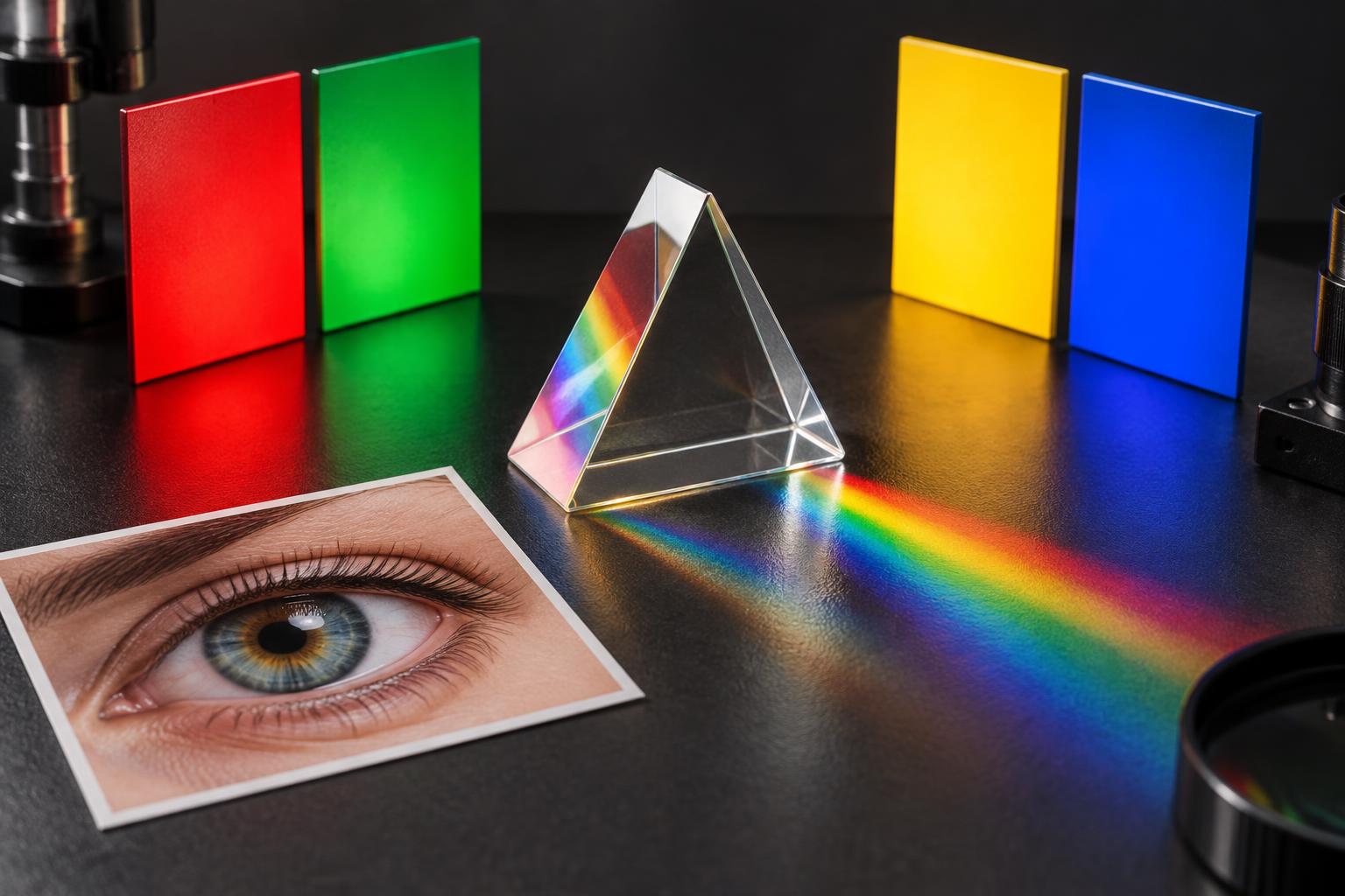
The cover illustration for this article shows ordinary visible stimuli and optical objects. It is a conceptual image, not an impossible-color sample or an archival photograph of the 1983 apparatus. That disclosure is part of accurate visual communication, not a footnote to ignore.
Related Phenomena: Four Cones and Structural Color
Tetrachromacy asks another question: can some people use an additional cone-pigment distinction to discriminate color differences unavailable to typical trichromats? Having a fourth pigment variant is not automatically proof of functional four-channel perception. The often-quoted hundred-million-color figure is theoretical, not a counted inventory of colors someone has demonstrated seeing.
Tetrachromacy therefore should not be sold as a shortcut to reddish-green. It concerns discrimination capacity and visual processing, rather than the same retinal stabilization experiment. Nor does a fourth human cone pigment imply ultraviolet vision.
Structural color in nature concerns yet another level: physical microstructures shaping reflected light through interference, scattering, or diffraction. A Morpho butterfly's blue is an optical phenomenon in the object. An afterimage is a perceptual phenomenon in the observer. Both can resist a simple swatch description, but for different reasons.
Keeping these levels separate makes an explanation stronger. Light, material structure, cone responses, and perceptual interpretation all matter. “Not a pigment,” “not a single wavelength,” and “not an ordinary opponent hue” are three different statements.
Practical Takeaways for Designers
Specify what can be reproduced. Keep production colors tied to documented digital values, physical samples, viewing conditions, and appropriate output profiles. Do not invent a HEX or Pantone equivalent for a percept that depends on adaptation.
Treat visual history as part of the interface. A large saturated field can influence how the next neutral or complementary screen appears. Test sequences, not just isolated mockups: onboarding, confirmation screens, and full-screen transitions can create very different viewing conditions.
Avoid turning a demonstration into an accessibility hurdle. No user should need to identify an afterimage to understand content or complete a task. Pair color with labels, shapes, or icons, and avoid forced flashing or intense full-screen exposures.
Separate evidence from metaphor. “Forbidden” is an excellent editorial hook but a poor product claim. Describe a demonstration as an afterimage observation unless its method and results actually support a stronger interpretation. Publish the stimulus values without claiming they reproduce the reported percept.
Assess ordinary contrast independently. Intense chroma is not equivalent to readable contrast. Evaluate text and backgrounds using established accessibility methods rather than judging which patch feels brighter after adaptation. A compelling illusion can coexist with an unusable interface.
Conclusion: The Observer Is Part of the Color System
Impossible colors do not supply a secret palette for your next identity project. They supply a more useful insight: color experience is an active construction, and ordinary color specifications describe only part of the process. The Crane–Piantanida reports remain fascinating precisely because they test the limits of that construction, not because they deliver a magical new RGB value.
For your next project, keep the curiosity and lose the overclaim. Explore reproducible physical references in the Pantone Finder, compare the science with magenta's non-spectral status, and label perceptual illustrations honestly. The best color expertise knows both how to specify a color and when a specification cannot capture an experience.
Research sources: Crane and Piantanida, 1983; Billock, Gleason, and Tsou, 2001; Hsieh and Tse, 2006; UNSW complementary-color and afterimage demonstrations.