Structural Color: Nature's Method for Creating Color Without Pigment
· Coloracci Team
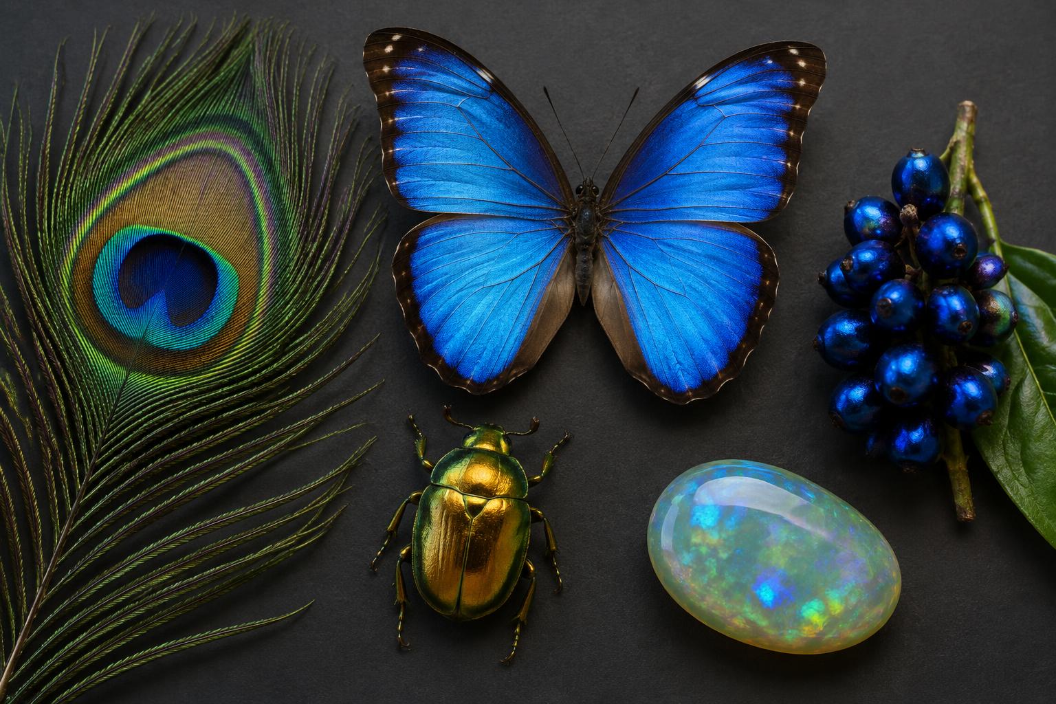
In 2012, researchers described the fruit of Pollia condensata as a natural pointillist painting: neighboring cells reflect different colors, producing a metallic blue berry without a blue pigment. For a designer, this is a startling introduction to structural color. Nature can create a brilliant surface not by adding a colorant, but by arranging transparent materials so that light does the coloring.
A peacock feather, a Morpho wing, and a precious opal interact with illumination and the viewer's position. That explains why a convincing photograph can become a disappointing flat swatch.
Here is structural color explained with examples, followed by six exact digital references and a practical specification workflow. The accompanying original AI-generated artwork is an editorial illustration, not a specimen photograph or scientific micrograph. The HEX values are equally interpretive: useful palette starting points, never measurements of an entire species or promises of iridescence.
How Structural Color Works: Architecture Instead of Dye
Pigment color begins with selective absorption. A colorant absorbs some wavelengths more strongly than others; the remaining reflected or transmitted light helps determine the appearance. Structural coloration begins with physical organization: tiny layers, ridges, pores, rods, or spheres influence how light waves travel and combine.
When reflected waves reinforce one another, certain wavelengths emerge strongly. When they cancel, others weaken. Depending on the structure, scientists describe these effects through interference, diffraction, coherent scattering, or photonic-crystal behavior. These are related optical descriptions, not interchangeable names for a single universal mechanism.
Visible-light wavelengths are roughly hundreds of nanometers long. Comparable structures can select visible colors even when their constituent materials are not blue, green, or gold. Change their spacing or organization, and the reflected spectrum changes. Color becomes a property of arrangement as well as chemistry.
The headline's “without pigment” means that the characteristic hue need not come from a matching colored pigment. It does not mean every example is pigment-free. Melanin can absorb unwanted light, improve saturation, or form part of the optical structure itself. Nature often combines architecture and absorption rather than choosing one exclusively.
Structural Color Examples: Six Objects, Different Optical Strategies
Peacock feathers: a photonic crystal in a barbule
The peacock's eye-patterned feather is a hierarchy of parts. The optical work happens within tiny barbules, not across one continuous painted surface. A 2003 study identified two-dimensional photonic-crystal organization: melanin rods arranged in a keratin matrix, with air contributing to the refractive-index pattern. Different structural dimensions help produce different reflected colors.
The familiar blues and greens can shift with viewing geometry. Melanin also matters as an absorber, so “the feather contains no blue paint” is more accurate than “the feather contains no pigment.” The luminous result depends on the relationship between material, arrangement, and light, not a mysterious blue substance hidden inside each strand.
Use #00529B as Peacock Cobalt, a deep blue editorial anchor. In a brand system, it can provide a stable base beneath brighter green or turquoise highlights. The transferable lesson is hierarchy: fine directional texture and localized flashes create richness without requiring every part of the composition to be equally saturated.
Morpho butterflies: blue built from scale ridges
Many blue Morpho butterflies carry ridged wing scales with fine, layered structures. These layers selectively reflect blue light; ridge arrangement and irregularities also affect how that reflection spreads. Research emphasizes the cooperation of regularity and irregularity, which helps explain an intense blue visible over a useful range of directions.
Morpho species differ, and their wings are not one uniform optical coating. Scale overlap, dark absorbing backgrounds, and viewing angle influence what you see. The butterfly's flash is therefore not adequately described as either a simple blue pigment or a universal rainbow sheen. Its particular architecture constrains the visual effect.
Our #0404B4 reference, Morpho Ultrablue, is a strongly saturated digital interpretation. Use it sparingly around a quiet neutral field, where it can become a decisive focal accent. A photograph's bright cyan reflection and a deep ultrablue swatch may both communicate aspects of the same wing; neither is its permanent, complete color.
Golden scarabs: metallic appearance without a gold coating
Chrysina resplendens looks as though it has been plated. Its cuticle instead contains helicoidal organization: material orientation rotates through the thickness, interacting with light in ways that produce a broad, gold-like reflection. The optics also involve circular polarization, a property that ordinary color swatches cannot communicate.
This is not simply the butterfly's blue mechanism repainted yellow. Specialized layered organization and its variation through depth support the beetle's metallic appearance. Scientific descriptions of this species include reflection of both handednesses of circularly polarized light. That behavior requires more information than hue, saturation, and brightness.
Choose #D4AF37, Scarab Gold, for an illustrative digital accent. It conveys a gold association but does not become metallic when printed as ordinary process ink. For packaging, distinguish three deliverables: a flat gold-colored graphic, a metallic ink or foil, and an angle-sensitive optical finish. They are different production decisions.
Blue jays: structural blue need not be strongly iridescent
A blue jay provides the crucial counterexample to “structural equals rainbow.” Its blue feathers involve a spongy, quasi-ordered arrangement of keratin and air within feather barbs. Coherent scattering reinforces a range of blue wavelengths, while the organization distributes the effect across directions rather than producing a strongly directional metallic flash.
An optical architecture can favor a color without functioning like perfectly aligned mirrors. Blue jays illustrate comparatively non-iridescent structural coloration. Calling their feathers a straightforward example of ordinary Rayleigh scattering misses the importance of nanoscale spatial correlations.
#0073CF, Jay Azure, is a bright illustrative blue suited to navigation accents or information graphics. Compared with Peacock Cobalt, it reads lighter and more open. That is an editorial comparison between our chosen swatches, not a biological ranking of the birds. The design lesson is that structural inspiration need not imply animated gradients.
Marble berries: a pointillist surface made of cellulose
In Pollia condensata, helicoidally arranged cellulose microfibrils in cell walls selectively reflect light. Differences among cells create a mosaic of reflected hues. The overall fruit reads metallic blue, but its surface contains tiny departures from that dominant impression—the reason researchers described it as pointillist coloration.
The berry demonstrates that color consistency at object scale can coexist with variation at cell scale. Neither a smooth gradient nor a pigment-based blue skin, its local differences strengthen a coherent identity.
Use #1F45FC, Marble Berry Electric, as the dominant digital signal, then introduce small neighboring blue-violet notes in illustration or surface texture. Keep those variations away from small text. Designers can borrow the relationship between a stable overall impression and granular detail without pretending that a screen reproduces cellulose optics.
Precious opal: silica spheres and moving color patches
Precious opal's play-of-color arises from ordered arrays of tiny silica spheres that diffract light. Sphere dimensions, ordering, illumination, and orientation affect which colors become visible. Different domains can produce distinct patches. Not every opal displays this phenomenon: common opal can lack the organization needed for a pronounced play-of-color.
An opal may combine a pale or dark body appearance with shifting spectral flashes. Those features need separate treatment in graphics. A soft background swatch describes the body impression, not its brightest optical event.
The supplied #A8C3BC is best named Opal Mist: a pale, muted green-grey reference, not a universal “opal blue.” Use it as a supporting field against stronger blues. That correction is valuable design analysis, not pedantry. Accurate naming stops a descriptive mineral association from masquerading as a standardized color measurement.
Structural Color and HEX: A Palette, Not a Physical Recipe
Each code below defines one sRGB display color. It does not encode angular change, polarization, reflectance spectrum, gloss, texture, or the microscopic structure responsible for the original appearance. These references are supplied editorial approximations; they have not been measured from the illustrated objects or calibrated specimens.
| Item | Color | Hex | Name | Meaning |
|---|---|---|---|---|
| Peacock feather barbules | Deep vibrant blue | #00529B | Peacock Cobalt | A stable anchor inspired by concentrated feather reflections |
| Morpho wing scales | Saturated ultrablue | #0404B4 | Morpho Ultrablue | A high-intensity focal accent inspired by a wing's blue flash |
| Chrysina resplendens cuticle | Gold-colored yellow | #D4AF37 | Scarab Gold | A premium material association, without actual metallic behavior |
| Blue jay feather barbs | Bright azure | #0073CF | Jay Azure | Clear directional emphasis without requiring iridescence |
| Pollia condensata fruit | Electric blue | #1F45FC | Marble Berry Electric | A vivid overall signal compatible with fine local variation |
| Precious opal-inspired supporting field | Pale green-grey | #A8C3BC | Opal Mist | A quiet body-color reference, not a spectral flash or universal blue |
Notice the palette's asymmetry. Four references compete in the blue family; Gold and Mist provide different functions. Combining all six at equal strength produces rivalry rather than sophistication. Choose one dominant blue, one supporting field, and one accent. Treat the remaining blues as alternatives or illustrations of the science, not mandatory brand colors.
The limitation parallels the distinction in Pantone vs. HEX: what designers need to know. A screen value specifies an encoded appearance under assumptions; a physical sample introduces materials and lighting. Even an excellent flat-color match cannot reproduce a feather's directional reflection or a scarab's polarized response.
Why Iridescence Is Not the Whole Story
Iridescence describes appearance changing with viewing or illumination angle. Structural coloration describes how color is produced. They overlap, but they are not synonyms. Peacock feathers and precious opals can show conspicuous directional effects; a blue jay's quasi-ordered structure supports a comparatively stable blue across many directions.
This distinction improves art direction. If the reference is a Morpho wing, a moving highlight may be meaningful. If the reference is a blue jay, forcing a rainbow sweep onto every surface can misrepresent the subject. Specify which quality you are borrowing: concentrated reflection, granular variation, angle dependence, or merely a useful hue family.
It also separates material optics from perception. Our tetrachromacy article asks how observers may distinguish light signals differently. Here, the central question is how the object generates those signals. An unusual surface does not require an unusual retina, and a different observer does not turn a static HEX code into a physical optical structure.
Practical Takeaways for Screens, Print, and Materials
For digital interfaces, keep the functional system flat. Use Jay Azure for a selected state or Peacock Cobalt for a large supporting field, then check contrast against the actual background. A luminous source object does not guarantee an accessible button. Reserve texture and changing highlights for illustration, where they cannot obscure labels or communicate status alone.
For editorial graphics, separate base color from the effect. A Morpho-inspired composition might have an ultrablue body, a lighter reflected region, and visible scale-like directionality. Those are three art-direction choices. Recording them separately makes the result easier to reproduce than a note saying “make it iridescent.” Label invented visualizations as illustrations, especially beside scientific explanations.
For packaging, approve the finish rather than its photograph. Scarab Gold printed with ordinary inks, applied as metallic foil, or produced with an interference-effect film can look radically different. Ask the supplier for samples on the intended substrate. Examine them under diffuse and directional light and tilt them through the angles customers will encounter.
For color matching, distinguish hue from behavior. Start with Coloracci's HEX-to-Pantone converter to explore nearby flat references. Its TCX-based digital candidates are not a specification for a metallic ink, foil, coated-paper PMS formulation, or optical coating. Confirm the relevant physical system with your supplier; never promise that one Pantone code recreates iridescence.
For sustainable-material claims, demand evidence. Some structural-color approaches may reduce reliance on particular dyes, but nanostructure fabrication, binders, substrates, durability, and end-of-life handling still matter. “Inspired by nature” is not a lifecycle assessment. Avoid presenting every structural coating as automatically non-toxic, permanent, recyclable, or environmentally superior.
A Specification Checklist That Survives Handoff
Begin by naming the source and the desired quality: “peacock-inspired directional blue” is more useful than “natural blue.” Attach a representative image, but state whether it is illustrative, photographed, or measured. If exact appearance matters, record the lighting and viewing conditions rather than letting a single attractive photograph stand in for them.
Next, separate digital fallback, physical color target, and surface finish. The fallback might be #00529B. The physical target should be an approved sample in the correct material. The finish description should cover gloss, texture, and any angular effect. Keeping these fields separate prevents a procurement team from purchasing flat blue paint for an iridescent brief.
Finally, define approval behavior. Must the object look consistent head-on, or should it change when tilted? Does the effect remain legible under retail lighting? Does rubbing, bending, or coating alter it? Structural color is a material system, so a professional handoff must specify what the surface does as well as how one image of it looks.
Conclusion: Design the Relationship, Not Just the Swatch
Structural coloration changes the designer's basic question from “Which pigment?” to “Which arrangement of material and light?” Peacock barbules, butterfly scales, beetle cuticles, bird feathers, berry cell walls, and silica spheres demonstrate that there is no single recipe. Some effects shimmer; others remain comparatively stable. None is fully described by a lone HEX value.
Use the six references as disciplined starting points, not scientific substitutes. Choose one anchor, establish an accessible flat-color fallback, and specify any material effect separately. Ready to translate the inspiration into a working palette? Explore your anchor in the HEX-to-Pantone tool, then approve the real material before promising the final appearance.
Scientific sources and further reading
- Zi and colleagues (2003), Coloration strategies in peacock feathers: photonic-crystal organization in barbules.
- Kinoshita and colleagues (2002), Photophysics of structural color in the Morpho butterflies: regularity, irregularity, and scale optics.
- Finlayson and colleagues (2017), Optically ambidextrous circularly polarized reflection from the chiral cuticle of the scarab beetle Chrysina resplendens: helicoidal architecture and polarization.
- Prum and colleagues (1998), Coherent light scattering by blue feather barbs: evidence for organized scattering rather than ordinary Rayleigh scattering.
- Vignolini and colleagues (2012), Pointillist structural color in Pollia fruit: helicoidal cellulose and cellular color variation.
- Sanders (1964), Colour of precious opal: ordered silica spheres and diffraction.