The Ultimate Guide to Home Office Color Combinations for Improved Focus
· Coloracci Team
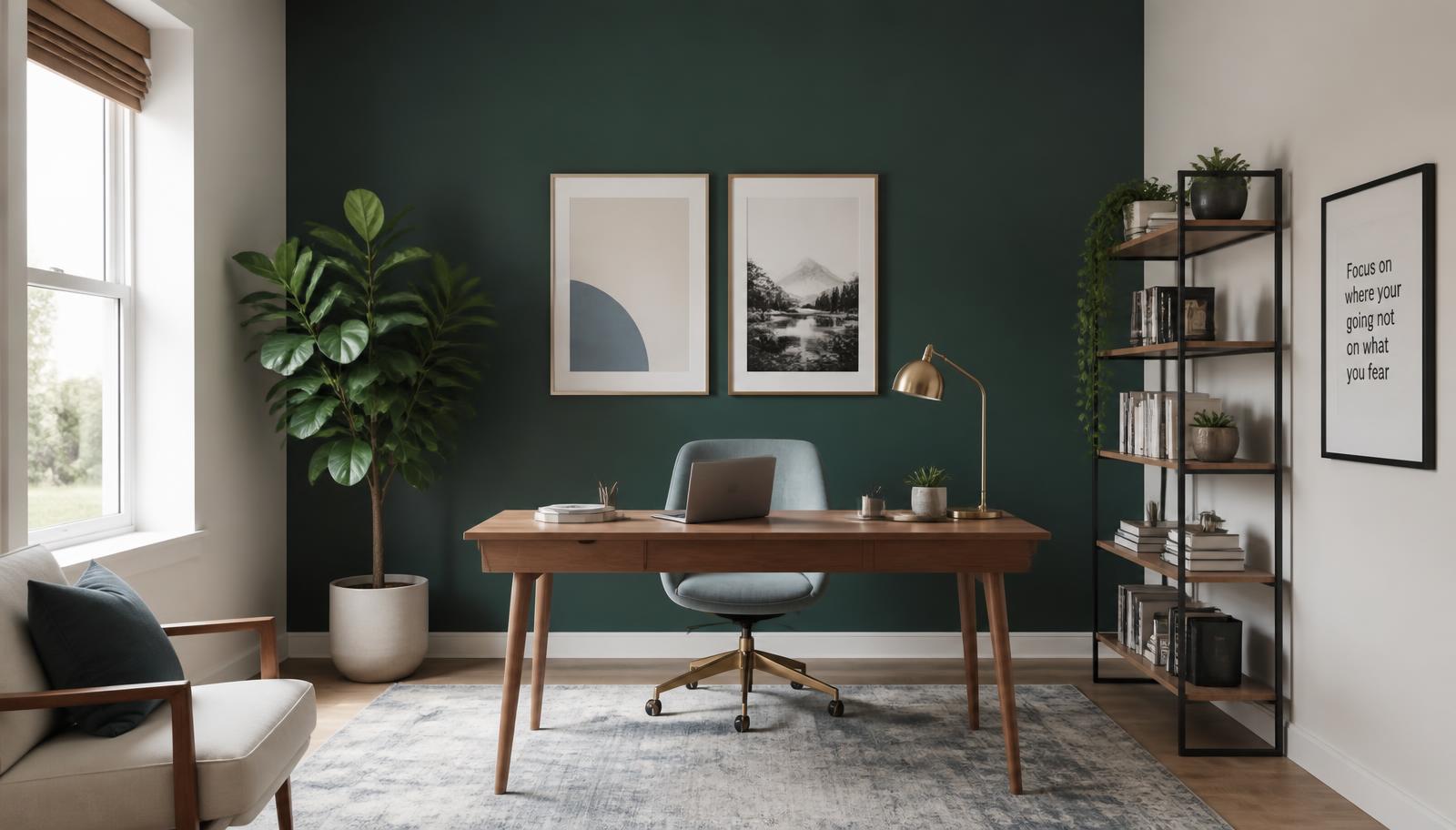
The Short Answer
The most reliable color combinations for a home office to improve focus pair a deep, nature-derived anchor with a light, low-distraction field and a single grounding warm accent. In practice: Deep Green (#2F4F4F) or Charcoal Gray (#51565C) behind you, Off-White (#F9F6EE) or Soft Blue-Gray (#B4C0C9) in front of you, and Terracotta (#B46A55) in small doses at roughly 10% of visible surface.
That structure works because attention is a limited resource. Every high-saturation surface in your peripheral vision spends a little of it. The palettes below are built to spend as little as possible while still giving the room enough character that you actually want to sit in it.
Why Color Changes How Long You Can Concentrate
Focus is not one thing. It is sustained attention (staying on task), selective attention (ignoring the rest of the room), and executive control (switching deliberately rather than reactively). Color influences all three through two mechanisms.
Arousal. Saturated warm hues raise physiological arousal — heart rate, skin conductance, perceived urgency. Short bursts help detail work; hours of it produces fatigue. Muted cool hues lower arousal, which extends the comfortable working window.
Restoration. Attention Restoration Theory holds that natural scenes replenish directed attention because they hold interest without demanding effort. Greens and earthy neutrals are the paint equivalent of a window onto trees. This is the same principle behind a full biophilic design color palette for a home office, and it is why nearly every focus-oriented scheme below leans green.
The practical translation: keep saturation low, keep value contrast deliberate, and put the darkest surface where it supports you rather than where it stares at you.
The Seven Core Colors, With Exact HEX Values
Deep Green — #2F4F4F (Benjamin Moore "Salamander" 2050-10)
A near-black green with a blue undertone. It reads as forest shadow rather than as a color decision, which is exactly what you want on a wall you look past all day. Deep Green is the strongest single-color intervention available for a home office: it is dark enough to create refuge behind your chair, restorative enough to avoid the oppressiveness of true black, and neutral enough to sit under any wood tone.
Use it on one wall — ideally the wall behind your desk chair, not the one you face.
Soft Blue-Gray — #B4C0C9 (Sherwin-Williams "Upward" SW 6239)
Calm, slightly cool, and almost entirely without personality — which is a compliment here. Soft Blue-Gray reduces visual clutter because it refuses to compete with anything on your desk. It is the best choice for the wall you face during long analytical stretches, where you want the field of view to be quiet. The blue bias also correlates with subjective spaciousness; small offices gain a few perceptual feet from it. For the mechanism behind that, see our deep dive on the psychology of blue in design.
Off-White — #F9F6EE (Farrow & Ball "Wimborne White" No. 239)
A warm off-white with a faint yellow bias. Unlike a cool pure white, it stays alive after sunset under 2700K bulbs instead of turning grey and clinical. Off-White is the light-reflecting workhorse of every palette here: it bounces daylight deeper into the room, raises alertness in dim spaces, and gives the eye somewhere to rest between tasks.
Terracotta — #B46A55 (Sherwin-Williams "Cavern Clay" SW 7701)
Earthy, warm, and grounding. Terracotta supplies the human warmth that a purely cool scheme lacks, without the cortisol spike of a true red. It works best as textiles, ceramics, a chair, or a single piece of art — around 10% of what you can see. Above roughly 20%, it starts to feel like a restaurant.
Sage Green — #BACCAD (Behr "Laurel Tree" S390-5)
A muted, dusty green that sits close to the eye's peak sensitivity, meaning the lens does almost no accommodation work to resolve it. Translation: minimal eye fatigue over long sessions. Sage is the safest full-room wall color on this list — it is soft enough to use on all four walls without the room closing in.
Charcoal Gray — #51565C (Benjamin Moore "Cheating Heart" 1617)
Serious, professional, and completely distraction-free. Charcoal is the alternative to Deep Green for people who find green too domestic. It flatters screens (less reflected glare in your peripheral vision), photographs well on video calls, and creates the strongest sense of enclosure of any color here. Pair it with plenty of Off-White or the room becomes a cave.
Muted Teal — #005A61 (Valspar "Deep Green Sea" 5011-6)
Blue's clarity plus green's restoration. Muted Teal is the most stimulating color on this list and the right pick when your work requires idea generation rather than pure execution. Use it on a feature wall, joinery, or the inside of a bookcase — not as an envelope.
Five Color Combinations for a Home Office to Improve Focus
1. Deep Focus — Deep Green + Off-White + Terracotta
| Role | Colour Name | Hex | Coverage |
|---|---|---|---|
| Rear feature wall | Deep Green | #2F4F4F | 25% |
| Main walls & ceiling | Off-White | #F9F6EE | 65% |
| Textiles & accessories | Terracotta | #B46A55 | 10% |
The default recommendation. The dark wall behind you creates refuge; the light walls in front recede and keep the room bright. Terracotta appears in a cushion, a mug, and a book spine — nothing structural. Best for writing, coding, research, and any work measured in hours rather than minutes.
2. Analytical Calm — Soft Blue-Gray + Off-White + Charcoal
| Role | Colour Name | Hex | Coverage |
|---|---|---|---|
| Facing wall | Soft Blue-Gray | #B4C0C9 | 40% |
| Side walls | Off-White | #F9F6EE | 45% |
| Desk, shelving, frames | Charcoal Gray | #51565C | 15% |
The most neutral scheme here, and the strongest for numbers, spreadsheets, and code review. Charcoal appears only in furniture and hardware, which gives the room structure without adding another painted surface. Add one plant; the scheme needs a living green somewhere or it drifts toward corporate.
3. Restorative Sage — Sage Green + Off-White + Warm Oak
| Role | Colour Name | Hex | Coverage |
|---|---|---|---|
| All walls | Sage Green | #BACCAD | 60% |
| Trim & ceiling | Off-White | #F9F6EE | 30% |
| Desk & shelving | Warm Oak | #C8A87C | 10% |
For anyone who works long days and finds accent walls distracting. Sage on every wall produces a uniform, low-arousal envelope that measurably reduces eye fatigue during screen work. Unfinished or lightly oiled oak carries the warmth so no painted accent is needed.
4. Executive Contrast — Charcoal + Off-White + Muted Teal
| Role | Colour Name | Hex | Coverage |
|---|---|---|---|
| Rear & side walls | Charcoal Gray | #51565C | 45% |
| Facing wall & ceiling | Off-White | #F9F6EE | 45% |
| Bookcase interior, art | Muted Teal | #005A61 | 10% |
The sharpest, most professional scheme, and the best for video-heavy work: charcoal behind you reads as intentional on camera and stops your webcam from blowing out your face. Requires good task lighting — CRI 90+, 2700–3000K — or the charcoal goes flat.
5. Creative Studio — Muted Teal + Off-White + Terracotta
| Role | Colour Name | Hex | Coverage |
|---|---|---|---|
| Feature wall | Muted Teal | #005A61 | 25% |
| Main walls | Off-White | #F9F6EE | 60% |
| Accents & textiles | Terracotta | #B46A55 | 15% |
Teal and terracotta are near-complementary, which is why this scheme has energy the others deliberately avoid. Choose it when your work is generative — design, strategy, writing first drafts — and accept that it is a slightly less restful room.
Data Table: Focus Color Reference
| Item | Color | Hex | Color Name | Psychological Meaning |
|---|---|---|---|---|
| Rear feature wall | Deep green | #2F4F4F | Salamander | Refuge, restoration, sustained concentration |
| Facing wall | Soft blue-gray | #B4C0C9 | Upward | Serenity, reduced mental clutter, clear thinking |
| Main walls / ceiling | Warm off-white | #F9F6EE | Wimborne White | Minimal distraction, light reflection, alertness |
| Textiles & accessories | Warm clay | #B46A55 | Cavern Clay | Grounding, comfort, stability without overstimulation |
| Full-room walls | Muted sage | #BACCAD | Laurel Tree | Balance, low eye fatigue, tranquility over long sessions |
| Joinery & furniture | Deep neutral | #51565C | Cheating Heart | Professionalism, enclosure, distraction-free seriousness |
| Creative feature wall | Deep blue-green | #005A61 | Deep Green Sea | Clarity, renewal, creative thinking |
| Desk surface | Warm oak | #C8A87C | Natural Oak | Tactile warmth, material honesty, permanence |
| Plant zone | Living foliage | #4C7A46 | Fern | Attention restoration, biophilic cue |
| Trim | Soft chalk | #EDE8DE | Chalk Linen | Definition without contrast fatigue |
Practical Takeaways
Put the dark color behind you, not in front of you. This is the single highest-leverage rule in workspace color. A deep wall in your field of view compresses the room and raises perceived enclosure all day; the same wall behind your chair produces refuge and disappears from awareness.
Hold the 60-30-10 split. Sixty percent quiet field, thirty percent secondary, ten percent accent. Most focus palettes fail because the accent grew. Terracotta at 10% is grounding; at 30% it is a distraction with a good backstory.
Match your palette to your dominant task. Analytical work wants blue-gray and charcoal. Generative work tolerates teal. Long-duration work of any kind wants sage. If you do all three, build the room around the one you spend the most hours on — that is the classic finding behind colors for productivity in office design.
Test against your actual light. North-facing rooms grey down warm colors and deepen cool ones; south-facing rooms do the reverse. Paint A3 sample boards, move them around the room, and check at 9am, 2pm, and 9pm.
Specify matte or eggshell. Sheen creates screen glare in your peripheral vision, which is a low-grade attention tax you will never consciously notice and will absolutely feel by 4pm.
Use 2700–3000K bulbs with CRI 90+. Low-CRI light collapses sage, terracotta, and charcoal into the same muddy grey. Lighting quality decides whether your palette works more than the paint choice does.
Avoid the two classic mistakes: an all-white office (colorless environments correlate with lower mood and perceived vitality), and a saturated "energizing" accent wall facing your desk. Neither survives a full working week.
Conclusion
The best color combinations for a home office to improve focus are not the most interesting ones. They are structured: a restorative dark anchor behind you, a quiet light field in front of you, and one warm earthy accent to keep the room human. Deep Green with Off-White and Terracotta will serve most people. Soft Blue-Gray with Charcoal will serve the analysts. Sage will serve anyone who simply needs to sit there for eight hours without their eyes complaining.
Pick the scheme that matches the work you actually do, test it under your own light, and let the accent stay small.
Ready to build your own? Use the Coloracci AI palette generator to generate a custom focus-oriented office scheme from a photo of your room — complete with exact HEX codes, harmony variants, and accessibility checks.