Bringing Nature In: A Guide to Biophilic Design Color Palettes for Your Home Office
· Coloracci Team
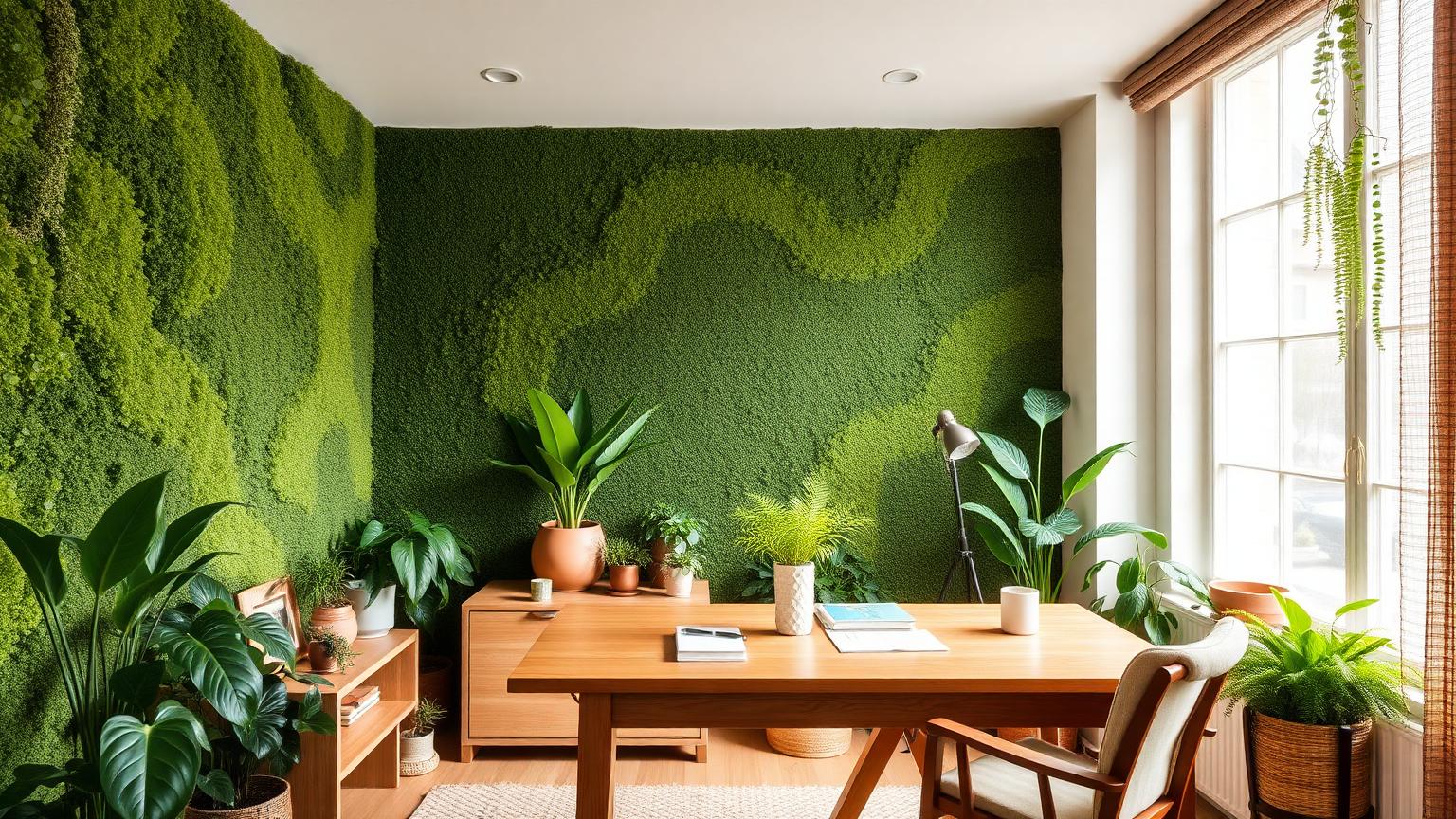
The Short Answer
A biophilic design color palette for a home office is built on three layers: a grounded neutral base drawn from soil, stone, and unbleached fibre; a dominant restorative green pulled from foliage; and a small accent borrowed from a living detail — clay, bark, lichen, or sky. In practice that means roughly 60% warm neutral (something like Linen Haze #EFE9DE), 30% muted green (Fern Shadow #6E7F62), and 10% earthy accent (Terracotta Ember #B4653F).
That formula works because it mirrors how colour actually appears in nature: never uniform, rarely saturated, always warm-lit and layered. The rest of this guide breaks down why it works, and how to adapt it to your specific room.
What Biophilic Design Actually Means for Colour
Biophilic design is the practice of building environments that satisfy our inherited preference for natural systems. Most people know it as "add plants." Colour is the quieter, more powerful half of the discipline — and unlike a fiddle-leaf fig, paint never dies.
Four principles translate directly into palette decisions.
1. Natural Analogues Over Literal Imitation
Nature almost never uses pure hues. Leaf green is desaturated by wax and dust; sky blue is greyed by atmosphere; soil is a chromatic mud of red, yellow, and black. A biophilic palette therefore lives at low-to-mid saturation (roughly 10–35% in HSL terms) and mid lightness. A #00FF00 accent wall is not biophilic; it is a traffic signal.
2. Complexity and Order
Natural scenes carry what researchers call fractal complexity — repeating variation at multiple scales. In a room, you reproduce this with tonal families rather than flat blocks: three greens within ten degrees of hue, three neutrals within one value step. The eye reads richness without being asked to resolve conflict, which is precisely the low-arousal state productive work requires.
3. Prospect and Refuge
Humans prefer spaces that offer both an open view (prospect) and an enclosed back (refuge). Colour delivers this cheaply: keep the wall you face toward the window light and cool-neutral so it recedes, and take the wall behind your chair one to two shades deeper and warmer so it holds you. This single move changes how a small office feels more than any furniture purchase.
4. Material Connection
Biophilic colour is inseparable from texture. The same green reads synthetic on gloss and organic on limewash, wool, or matte clay paint. Specify sheen levels of matte to eggshell for walls, and let unfinished oak, jute, rattan, and stoneware carry their own colour rather than painting over them.
Biophilic Design Color Palette for a Home Office: Five Complete Schemes
Each palette below is a full working scheme — base, secondary, accent, and trim — with exact hex values.
Palette 1: Forest Floor
The default recommendation for most home offices. Deep, grounded, quietly serious.
| Role | Colour Name | Hex |
|---|---|---|
| Base wall | Linen Haze | #EFE9DE |
| Feature wall | Forest Floor | #3F4A3A |
| Secondary | Fern Shadow | #6E7F62 |
| Accent | Terracotta Ember | #B4653F |
| Trim / joinery | Oat Bark | #C8B79C |
Use Forest Floor on the wall behind your desk chair, Linen Haze everywhere else. The terracotta lives in a chair cushion, a ceramic mug, a book spine — nothing structural.
Palette 2: Coastal Mist
For rooms with cool northern light, or anyone who finds green offices claustrophobic.
| Role | Colour Name | Hex |
|---|---|---|
| Base wall | Sea Foam Pale | #E4EAE7 |
| Secondary | Coastal Mist | #9BB1B4 |
| Depth | Driftwood Grey | #7E7A72 |
| Accent | Sandbar | #D9C7A7 |
| Contrast | Deep Tide | #2F4550 |
Coastal Mist sits exactly between blue and green, which is why it reads as "atmosphere" rather than as a decision. Deep Tide should appear only in small doses — a lamp base, a shelf back.
Palette 3: Desert Study
Warm, high-energy without being loud. Excellent for creative and client-facing work.
| Role | Colour Name | Hex |
|---|---|---|
| Base wall | Bone Clay | #F2E8DC |
| Secondary | Sunbaked Adobe | #C58A62 |
| Accent | Ochre Bloom | #D9A441 |
| Depth | Canyon Shade | #7A4B36 |
| Cool relief | Desert Sage | #A3AE93 |
Desert Sage is doing the real work here: without a cool green somewhere in the scheme, a warm palette tips into fatigue after about three hours of screen time.
Palette 4: Moss and Stone
The quietest scheme on this list. Ideal for deep-focus work — writing, coding, analysis.
| Role | Colour Name | Hex |
|---|---|---|
| Base wall | River Stone | #D8D5CD |
| Feature | Moss Velvet | #5A6B4F |
| Secondary | Lichen | #8E9A7C |
| Accent | Slate Pebble | #6B6F70 |
| Warmth | Raw Hemp | #BFAE94 |
Every hue here sits below 25% saturation. That is deliberate: this is a palette designed to disappear so the work can be the loudest thing in the room.
Palette 5: Canopy Light
For small or dark offices where you need brightness without sterility.
| Role | Colour Name | Hex |
|---|---|---|
| Base wall | Morning Vellum | #F6F2E9 |
| Secondary | New Leaf | #8FA97B |
| Accent | Amber Sap | #C98F3C |
| Depth | Bark Umber | #55483C |
| Cool note | Rain Glass | #BFCBD1 |
Morning Vellum is a warm off-white with a yellow-green bias, so it stays alive under artificial light rather than going grey after sunset — a common failure of "safe" white home offices, a problem covered further in our guide to home interior color psychology.
The Color Psychology of Nature-Inspired Hues
Green: The Restorative Default
Green sits at the centre of the visible spectrum, requiring the least accommodation from the eye's lens. This is not folklore — it is why green is the lowest-fatigue hue for long viewing. Attention Restoration Theory adds the behavioural layer: exposure to natural greens replenishes directed attention, the finite resource you spend on focused work. Practically, a desaturated green in the peripheral field (side walls, a plant cluster, a shelf back) restores between tasks without competing during them.
Brown and Ochre: Safety and Duration
Earth tones read as stable, permanent, and non-threatening. They lower perceived arousal, which extends comfortable time-in-room — the single most useful metric for a home office. This is why our earth tone color palette guide keeps surfacing in workspace contexts: browns make people stay.
Blue-Green and Grey-Blue: Cognitive Clarity
Cool, low-saturation blues correlate with improved analytical performance and a subjective sense of spaciousness. They also read as "distance," which is why Coastal Mist makes a 9-square-metre room feel deeper. The risk is coldness; always pair with a warm neutral or wood.
Terracotta and Clay Red: Controlled Stimulation
Muted reds raise alertness and attention to detail, but sustained exposure raises perceived stress. Keep them under roughly 10% of visible surface — an accent, never an envelope. The same logic drives commercial workspace design, which we explore in depth in our office and coworking color psychology guide.
White and Grey: The Absence That Costs You
A fully neutral office is not neutral in effect. Colourless environments correlate with lower mood and reduced perceived vitality — the biophilic deficit. If you keep white walls, the colour has to come from somewhere: plants, wood, textiles, art.
Data Table: Biophilic Colour Reference
| Item | Colour | Hex | Colour Name | Psychological Meaning |
|---|---|---|---|---|
| Feature wall | Deep green | #3F4A3A | Forest Floor | Grounding, refuge, sustained focus |
| Main walls | Warm off-white | #EFE9DE | Linen Haze | Openness, light amplification, calm |
| Side wall | Mid green | #6E7F62 | Fern Shadow | Attention restoration, low eye fatigue |
| Textiles | Burnt orange | #B4653F | Terracotta Ember | Warmth, alertness, human presence |
| Joinery | Tan neutral | #C8B79C | Oat Bark | Stability, tactility, material honesty |
| Accent wall (cool) | Grey-teal | #9BB1B4 | Coastal Mist | Spaciousness, clarity, mental distance |
| Shelving back | Deep blue-grey | #2F4550 | Deep Tide | Depth, seriousness, contrast anchor |
| Accessories | Golden yellow | #D9A441 | Ochre Bloom | Optimism, creative stimulation |
| Rug / floor | Soft grey-beige | #D8D5CD | River Stone | Neutral ground, visual rest |
| Plant zone | Sage green | #A3AE93 | Desert Sage | Balance, recovery, biophilic cue |
| Desk surface | Warm mid-brown | #7A4B36 | Canyon Shade | Permanence, focus, tactile warmth |
| Ceiling | Warm white | #F6F2E9 | Morning Vellum | Lift, daylight continuity |
Practical Takeaways
Test paint against your actual light. North-facing rooms grey down warm colours and amplify cool ones; south-facing rooms do the opposite. Paint A3 sample boards, move them around the room, and check at 9am, 2pm, and 9pm under your lamps.
Apply the 60-30-10 split literally. 60% base neutral, 30% green or secondary, 10% accent. Most failed biophilic rooms are failed because green crossed 50%, at which point the space stops reading as natural and starts reading as institutional.
Put the deepest value behind you. Refuge behind, prospect ahead. If your desk faces a wall, that wall should be your lightest surface, with the depth carried on the side and rear walls.
Match sheen to biology. Matte and eggshell scatter light the way leaves and stone do. Semi-gloss reads plastic and undermines the entire scheme.
Let the plants be the saturation. Living foliage is more saturated than any paint you should be using. Keep painted greens muted so the plants read as the brightest natural element in the room.
Choose warm-white bulbs at 2700–3000K with CRI 90+. Low-CRI lighting flattens earth tones into mud. This single specification decides whether your palette looks like a forest or a basement.
Bring in three materials minimum. Wood, stone or ceramic, and a natural fibre. Colour without material variation is a picture of nature, not an experience of it.
Avoid the two common mistakes: saturated "leaf" green on all four walls, and cool grey paired with cool wood tones. Both are technically nature-referencing and both feel wrong.
Conclusion
A biophilic home office is not a room with plants in it. It is a room whose colour logic — low saturation, warm light, layered tonal families, a deep refuge wall and a bright prospect wall — matches the environments our visual system evolved to read as safe and interesting. Get that right and the plants become confirmation rather than compensation.
Start with one of the five palettes above, adjust for your light, and build outward from a single deep green and a single warm neutral.
Ready to build your own? Use the Coloracci AI palette generator to generate a custom biophilic scheme from a photo of your room, your window light, or a favourite landscape — complete with exact HEX codes, harmony variants, and accessibility checks.