Boost Your Workout: The Best Energetic Color Palettes for a Home Gym
· Coloracci Team
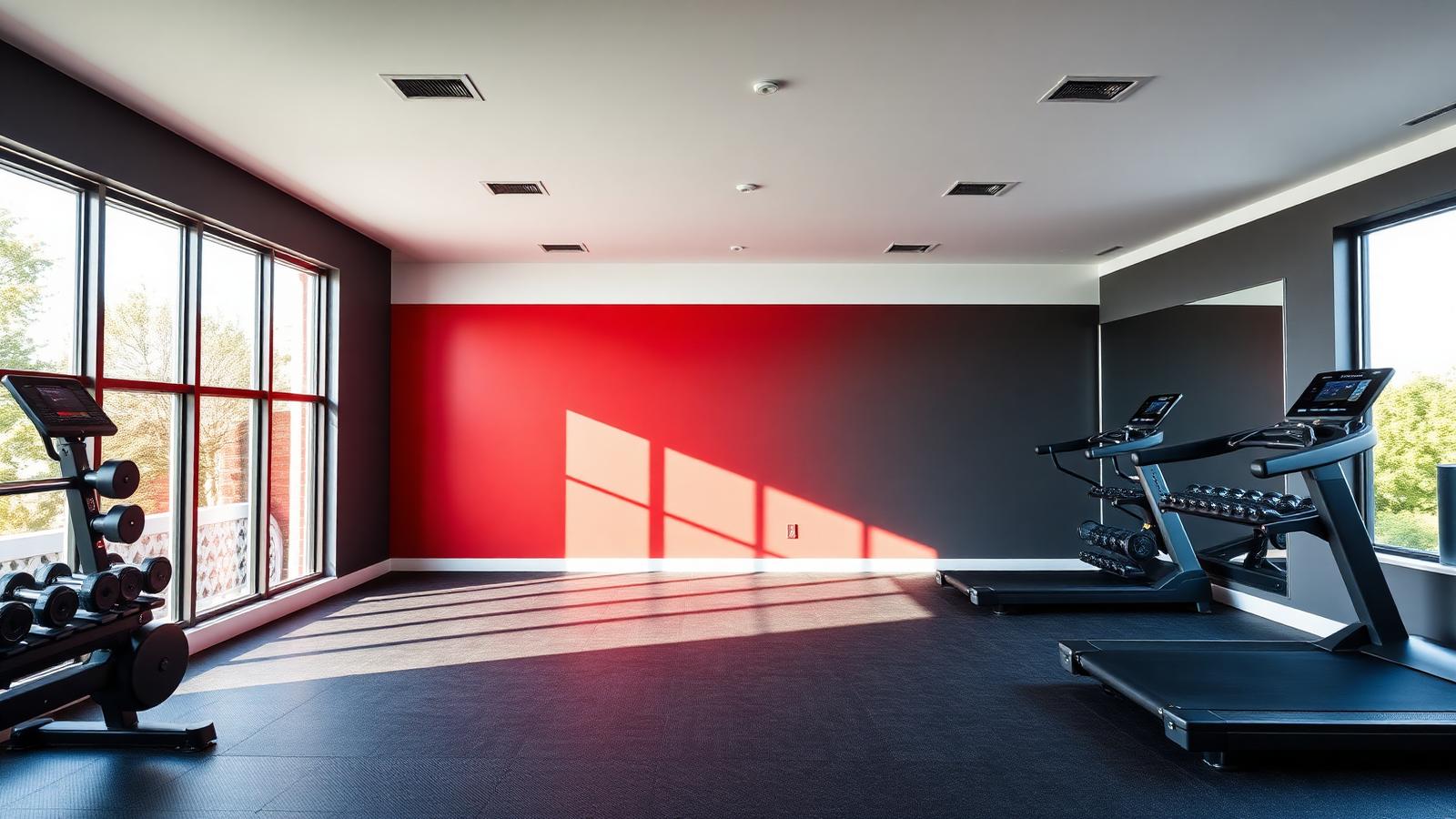
The most effective energetic color palettes for a home gym pair a grounding neutral shell — charcoal, greige, or crisp white — with one high-arousal accent: Fiery Red #FF1744, Electric Orange #FF6D00, or Aggressive Red #E74C3C. That single wall of saturated warmth is what raises perceived intensity, while the neutral 70% keeps the room from feeling like a fast-food interior after week two. If your space also hosts cardio, stretching, or yoga, you layer in Cool Blue #A2D2FF and Sage Green #B2AC88 by zone rather than repainting the whole room.
This guide breaks down the exact HEX codes, the psychology behind each hue, three ready-to-paint palettes for HIIT, cardio, and mind-body zones, and the practical rules that keep a small converted garage or spare bedroom feeling motivating instead of chaotic.
Why Color Changes How Hard You Train
Color is not decoration in a training space — it is an input to your nervous system. Long-wavelength colors (red, orange) sit at the high-arousal end of the arousal-valence model: they measurably increase heart rate, respiration, and perceived exertion readiness in short bursts. Short-wavelength colors (blue, green) do the opposite, lowering arousal and supporting sustained, steady-state focus.
That is the core insight behind every workout room color decision: match the hue's arousal level to the effort profile of the activity. Explosive, short, maximal effort wants red. Long, rhythmic, endurance effort wants blue. Recovery and mobility want green and earth tones.
Our deeper dive on gym and fitness color psychology covers the commercial-facility research behind this; here we translate it into home gym paint ideas you can execute in a weekend.
The Complete Color Breakdown with HEX Codes
Reds and Oranges — The Intensity Drivers
Fiery Red — #FF1744. The purest expression of urgency in this palette. Highly saturated, slightly blue-shifted red that reads as electric under LED lighting. Use on a single accent wall behind a squat rack or the wall you face during intervals. Never use on all four walls; sustained exposure to this saturation produces irritability, not output.
Electric Orange — #FF6D00. Orange carries red's arousal with a friendlier emotional read. It is the best choice if red feels aggressive or if the gym doubles as a family space. Pairs exceptionally well with charcoal and raw plywood.
Aggressive Red — #E74C3C. A softer, slightly desaturated red with a warm coral undertone. This is the forgiving option for smaller rooms where #FF1744 would overwhelm — it delivers roughly 70% of the energy at half the visual weight.
Institutional Red — #C0392B. Deeper, brick-leaning, and more masculine. Excellent for a full accent wall in a garage gym with concrete floors, where lighter reds can look plastic.
Blues — The Focus and Endurance Family
Cool Blue — #A2D2FF. A light, airy, sky-adjacent blue with high LRV. Cardio zones benefit from it because it reduces perceived effort during long sessions and visually expands a tight room. Pair with crisp white trim #FFFFFF for a clean, athletic-club feel.
Blue's practical advantage in a home gym is thermal perception: it reads cooler, which matters in a converted garage or attic where you generate a lot of heat.
Greens and Earth Tones — The Recovery Family
Sage Green — #B2AC88. Muted, grayed olive-green that sits at the exact midpoint between neutral and color. Restorative, low-arousal, and forgiving of imperfect drywall. Ideal for yoga mats, foam rolling, and stretching corners.
Warm Beige — #F5F5DC. A creamy, low-contrast partner for sage that keeps a mind-body zone soft without going stark white.
Deep Neutrals — The Strength Anchors
Charcoal (roughly #36393F) and blackened blue (#22303C) are the grounding colors of strength training. Dark walls make equipment read as sculptural, hide rubber-flooring scuffs and chalk, and create a focused, cave-like environment that many lifters prefer. They also make a single red or orange accent hit far harder than it would against white.
Three Energetic Color Palettes for a Home Gym
Palette 1 — High-Energy HIIT Zone
| Role | Color | HEX |
|---|---|---|
| Base walls (70%) | Neutral Gray | #9E9E9E |
| Accent wall (20%) | Fiery Red | #FF1744 |
| Trim and equipment (10%) | Charcoal | #36393F |
Swap Fiery Red for Electric Orange #FF6D00 if the room gets strong north light, which cools and dulls reds. This is the palette for interval training, boxing, and plyometrics: the accent wall should be the wall you face during work sets, not the one behind you.
Palette 2 — Focused Cardio Space
| Role | Color | HEX |
|---|---|---|
| Walls (70%) | Cool Blue | #A2D2FF |
| Trim and ceiling (20%) | Pure White | #FFFFFF |
| Accents (10%) | Electric Orange | #FF6D00 |
The small orange accent — a stripe, a piece of art, a set of kettlebells — prevents the blue from tipping into sleepy. Treadmill and bike zones perform best here because the palette supports 40-plus-minute sessions without visual fatigue.
Palette 3 — Mind-Body Zone
| Role | Color | HEX |
|---|---|---|
| Walls (70%) | Sage Green | #B2AC88 |
| Secondary (20%) | Warm Beige | #F5F5DC |
| Accents (10%) | Terracotta | #C1633F |
Yoga, mobility, and cooldown space. Keep sheen low — a matte or eggshell finish here, versus the scrubbable satin you want in the sweat zones.
Palette 4 — The Single-Room Hybrid
Most home gyms are one room doing three jobs. The hybrid solution: paint three walls in a deep neutral like charcoal #36393F, paint the fourth in Aggressive Red #E74C3C, and place your mat and recovery gear in the corner farthest from the accent wall, adding sage through textiles rather than paint. Color-zoning by furniture and rugs is far cheaper than partition walls and reads just as clearly.
Color Psychology Applied to Each Training Zone
Strength training. Dark, grounding, high-contrast. Deep neutrals reduce visual noise so attention narrows to the bar. A red accent in the sightline adds arousal at the moment of effort.
HIIT and conditioning. Maximum warmth, maximum saturation, minimum surface area. The 20% rule matters more here than anywhere: red beyond a quarter of the visible surface stops being motivating and starts being stressful.
Cardio. Cool, bright, and expansive. Light blues lower perceived exertion and make small rooms breathe. Add a single warm accent so the space still says "train," not "nap."
Recovery and mobility. Muted greens and earth tones. Low saturation, low contrast, matte finish. This is where you deliberately reduce arousal.
For the broader athletic branding angle — how teams and sportswear labels weaponize these same hues — see our analysis of sports and fitness color psychology.
Practical Takeaways for Designers and Homeowners
- Apply the 70-20-10 rule strictly. 70% neutral base, 20% energizing accent, 10% grounding or contrasting detail. Nearly every failed home gym repaint is a saturation-percentage error, not a hue error.
- Test under your actual lighting. Most home gyms run on cool 4000-5000K LEDs, which push reds toward pink and blues toward gray. Paint two-foot swatches and check them with the gym lights on, at the time of day you train.
- Mind the flooring. Black rubber tile absorbs a lot of light. In a room with dark flooring, move your base wall lighter — a mid gray rather than charcoal — or the space will feel like a basement regardless of the accent.
- Match sheen to sweat. Satin or semi-gloss in high-contact zones (wipeable, humidity-tolerant), matte only in recovery corners.
- Mirrors double the color. A full mirror wall reflects your accent back at you, effectively doubling its surface area. If you have mirrors, reduce the accent wall to a partial band or a narrower wall.
- Ceilings are the forgotten fifth wall. A white or very light ceiling keeps a low-clearance garage gym from feeling compressive, especially under dark walls.
- Use color to mark zones, not just to decorate. A painted floor stripe or a two-tone band at 48 inches is a cheap, legible way to separate lifting from mobility space.
Data Table: Home Gym Color Reference
| Item | Color | Hex | Color Name | Psychological Meaning |
|---|---|---|---|---|
| HIIT accent wall | ■ | #FF1744 | Fiery Red | Urgency, arousal, explosive effort |
| Alternative accent | ■ | #FF6D00 | Electric Orange | Enthusiasm, warmth, sociable energy |
| Small-room accent | ■ | #E74C3C | Aggressive Red | Intensity with softer visual weight |
| Garage feature wall | ■ | #C0392B | Institutional Red | Grit, endurance, industrial strength |
| Cardio walls | ■ | #A2D2FF | Cool Blue | Focus, calm, sustained endurance |
| Trim | ■ | #FFFFFF | Pure White | Clarity, hygiene, spatial expansion |
| Yoga zone walls | ■ | #B2AC88 | Sage Green | Restoration, balance, recovery |
| Yoga secondary | ■ | #F5F5DC | Warm Beige | Comfort, softness, grounding |
| Strength walls | ■ | #36393F | Charcoal | Seriousness, focus, discipline |
| Dark alternative | ■ | #22303C | Blackened Blue | Depth, control, quiet strength |
| Neutral base | ■ | #9E9E9E | Neutral Gray | Balance, professionalism, neutrality |
Common Mistakes in Workout Room Colors
Painting the entire room red. The most frequent error. Full-surface high-saturation red produces measurable irritability over long exposure. Cap it at one wall.
Choosing a color for photos, not for training. A neon gradient wall looks great on Instagram and terrible on set fourteen. Design for the 300 workouts, not the one photo.
Ignoring the transition. If your gym is visible from a hallway or living room, the accent should relate to your home's palette. A charcoal base with a red accent transitions gracefully; a lime-green room does not.
Skipping the neutral entirely. Two saturated colors fighting each other (red walls, blue equipment, orange flooring) create visual noise that reads as clutter and makes small rooms feel smaller.
Choosing Between the Three Energetic Palettes
If you primarily lift or do intervals, start with the HIIT palette and its neutral gray base — it is the most versatile and the easiest to repaint later. If your training is mostly cycling, running, or rowing, the cardio blue palette will serve you better across long sessions. If your room is genuinely multipurpose, take the hybrid approach: dark neutral shell, one warm accent wall, and recovery color introduced through a rug, mat, and textiles you can swap at any time.
Whichever direction you choose, lock the base neutral first. The accent is the fun decision, but the neutral is the one that determines whether the space still feels good in six months.
Conclusion
Energetic color palettes for a home gym work because they map arousal to activity: saturated reds and oranges for explosive effort, cool blues for endurance, muted greens for recovery, and deep neutrals to hold it all together. Keep the accent to roughly 20% of visible surface, test under your real lighting, and let zone function — not trend — pick the hue.
Ready to build yours? Use the Coloracci palette generator to enter your accent HEX — #FF1744, #FF6D00, or #E74C3C — and generate a complete, harmonized home gym palette with base neutrals, trim, and recovery accents, then export the codes straight to your painter.