Color Palettes to Modernize a Tuscan Kitchen
· Coloracci Team
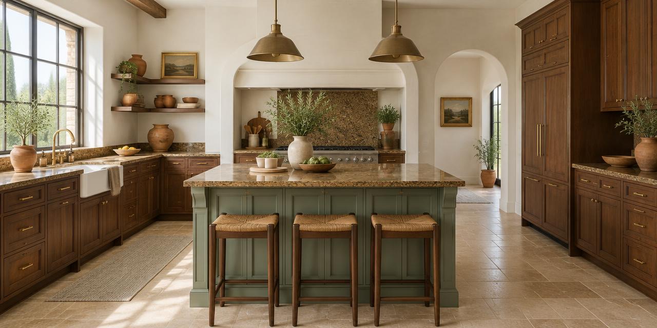
The best color palettes to update a Tuscan kitchen do not erase its warm stone, handcrafted wood, or Mediterranean character. They reduce the visual weight around those fixed finishes. A lighter wall color, a quieter cabinet accent, and one cool or muted counterpoint can make brown granite, travertine, terracotta tile, and cherry cabinetry look intentional again—without the expense and waste of a full remodel.
Tuscan kitchens became popular in the early 2000s because they felt warm, substantial, and connected to Old World hospitality. Their signature colors—terracotta, ochre, golden yellow, olive green, espresso brown, and red-toned wood—were often layered together. What once felt enveloping can now feel dark because every surface carries similar warmth and visual density. The modern answer is not bright white everywhere. It is controlled contrast: keep one or two authentic warm materials, then introduce light neutrals, softened greens, or blue-grays that give the eye somewhere to rest.
This guide presents three complete palettes with exact HEX codes, explains how they affect mood and perceived light, and shows how to work with the expensive surfaces already in place. The goal is a kitchen that feels current but still belongs to the house.
Why Tuscan Kitchens Can Feel Dated
A traditional Tuscan scheme usually contains several warm undertones at once. Cherry or mahogany cabinetry contributes red. Travertine adds cream, peach, and gold. Brown granite may contain rust, amber, black, or burgundy. Terracotta introduces orange-red. Glazed walls, bronze fixtures, and amber pendants intensify the same family.
No single element is necessarily the problem. The dated feeling comes from repetition without relief. When walls, cabinets, counters, floors, backsplashes, and lighting all sit in the warm mid-to-dark range, edges disappear and the room loses hierarchy. A modern kitchen gives dominant materials more breathing room. It uses fewer colors, cleaner value contrast, and a more deliberate relationship between warm and cool.
Before choosing paint, identify the fixed finish with the strongest pattern. In most kitchens that is granite, travertine, or tile. That surface becomes the palette's anchor. Pull one quiet undertone from it for continuity, then introduce a lighter neutral and one restrained counter-color. This approach is more reliable than selecting an attractive swatch in isolation.
Color Palettes to Update a Tuscan Kitchen: Greige and Creamy White
Palette 1: Neutral and Airy
- Benjamin Moore Revere Pewter — #CBCAC3
- Sherwin-Williams Alabaster — #EDEAE0
- Muted Sage Green — #B2AC88
- Existing dark wood, bronze, or brown granite as the grounding element
This is the safest and most versatile of the three color palettes to update a Tuscan kitchen. Revere Pewter is a balanced greige that softens orange and red wood without creating a cold gray-versus-warm-cabinet clash. Alabaster brings reflected light but retains enough cream to connect with travertine and golden granite. Muted sage adds natural color while remaining quiet enough to behave like a neutral.
Use Alabaster on walls when the room is especially dark, then reserve Revere Pewter for an island, pantry cabinetry, or adjacent dining area. In a brighter kitchen, reverse the roles: Revere Pewter walls with Alabaster trim and ceiling create gentle definition. Sage works well on a small island, back door, Roman shade, or ceramics.
Psychologically, this palette communicates composure, openness, and understated refinement. Greige reduces the sensory intensity of multiple brown surfaces. Creamy white feels hospitable rather than clinical. Sage reconnects the kitchen to landscape and food, making it especially effective in homes where rustic materials are worth preserving.
How to Update Tuscan Brown Granite
If you are researching how to update Tuscan brown granite, resist the urge to surround it with stark white. A highly patterned brown slab can look harsher when isolated against blue-white paint. Instead, find its lightest cream or gray-beige fleck and repeat that value on the walls. Alabaster #EDEAE0 is forgiving because its softness supports both yellow-beige and brown.
Then simplify everything around the granite. Remove a busy mosaic backsplash if practical, or paint adjacent walls in one uninterrupted color. Replace reddish hardware with aged brass, soft black, or brushed nickel depending on the stone's darkest flecks. Keep accessories limited. The granite becomes one rich material rather than one pattern among many.
Cool Blue and Crisp White for Coastal Contrast
Palette 2: Fresh and Clear
- Sherwin-Williams Krypton — #CAD3D9
- Behr Ultra Pure White — #F4F4F4
- Charcoal Blue — #36454F
- Existing oak, cherry, terracotta, or warm stone as contrast
Blue-gray is the most direct way to counter orange and yellow undertones. Krypton #CAD3D9 provides enough blue to refresh oak and terracotta, but its gray content keeps the result architectural rather than beach-themed. Ultra Pure White #F4F4F4 creates sharper definition on trim or upper cabinetry. Charcoal Blue #36454F adds depth for an island, door, range hood, or narrow bank of cabinets.
The success of this palette depends on repetition. One isolated blue-gray wall can look accidental against a strongly Tuscan room. Repeat Krypton in textiles, glazed pottery, or artwork, and repeat the charcoal in hardware or lighting. This creates a visual bridge across the room.
Psychologically, blue is associated with calm, clarity, and order. Those qualities are useful in a kitchen filled with active stone pattern and warm wood grain. White communicates cleanliness; charcoal adds authority. Together they make heavy existing materials feel sharper and more edited.
Be careful in north-facing kitchens, where Krypton may become noticeably cooler. Test a large sample beside the granite and flooring from morning through evening. If the room lacks natural light, use Krypton on a smaller surface and let warm-white walls carry most of the space.
Modern Paint Colors for Kitchens with Travertine Floors
The best modern paint colors for kitchens with travertine floors acknowledge the floor's undertone. Pink-beige travertine generally prefers muted greige or green-gray. Golden travertine can accept creamy white or softened blue-gray, provided the blue is not too icy. Gray-beige travertine works beautifully with Krypton.
Do not judge the paint against a single tile. Natural stone varies, so place the sample where several tiles meet. If a cool blue-gray exaggerates pink or orange in the floor, return to Revere Pewter or a warm off-white. Modernization should quiet the undertone, not spotlight it.
Color Palettes to Update a Tuscan Kitchen with Organic Green
Palette 3: Warm White and Earthy Green
- Benjamin Moore Swiss Coffee — #EFEBE0
- Sherwin-Williams Evergreen Fog — #93968F
- Terracotta — #E2725B, retained as an existing accent
- Natural oak, walnut, linen, and warm brass
This palette works with the Tuscan kitchen's earthy roots rather than opposing them. Swiss Coffee #EFEBE0 opens the room while preserving a warm connection to limestone, travertine, and cream veining. Evergreen Fog #93968F is a subdued green-gray that gives old wood and clay a contemporary botanical context. Terracotta #E2725B remains visible, but it becomes a controlled accent instead of the entire visual story.
Paint walls Swiss Coffee, then use Evergreen Fog on an island, lower cabinets, pantry door, or breakfast-nook built-ins. If terracotta flooring is permanent, repeat its color only once or twice through a vessel, textile stripe, or artwork. Repetition creates intention; over-repetition recreates the old scheme.
The psychology is grounded and restorative. Warm white feels welcoming, green suggests growth and balance, and terracotta adds human warmth. This is an ideal organic-modern direction for homeowners who still love rustic texture but want less visual heaviness.
For a deeper exploration of natural palettes, see our guide to the earth-tone color palette. Its proportion principles are particularly useful when several stone and wood colors must coexist.
Paint Colors That Go with Terracotta Tile
Terracotta is vivid because it contains both red and orange. The best paint colors that go with terracotta tile either soften those warm notes or create a deliberate complementary contrast. Creamy white #EFEBE0 is the least risky choice. Muted sage #B2AC88 feels natural and balanced. Evergreen Fog #93968F adds enough gray to prevent a literal red-and-green effect. Soft blue-gray #CAD3D9 can be striking, but it needs repeated blue accents to feel connected.
Avoid matching terracotta with peach, golden beige, or saturated yellow unless you deliberately want a traditional look. Similar warm hues cause the tile to spread visually across the whole room. A lighter neutral above it and a green-gray on selected cabinetry establish separation.
Finish matters too. Use matte or eggshell wall paint to diffuse the shine of glazed tile and polished granite. Satin cabinetry provides durability without creating another reflective plane. If the room already has glossy stone, quieter paint finishes will feel instantly more modern.
Room Elements and Color Psychology
| Item | Color | Hex | Color Name | Psychological Meaning |
|---|---|---|---|---|
| Main wall neutral | Greige | #CBCAC3 | Revere Pewter | Calm, balanced, sophisticated |
| Trim or cabinetry | Creamy white | #EDEAE0 | Alabaster | Airy, welcoming, clean |
| Cool wall option | Soft blue-gray | #CAD3D9 | Krypton | Refreshing, clear, composed |
| Organic cabinet accent | Muted green-gray | #93968F | Evergreen Fog | Grounded, restorative, serene |
| Natural supporting accent | Muted sage | #B2AC88 | Sage Green | Balanced, quiet, connected to nature |
| Existing tile accent | Terracotta | #E2725B | Terracotta | Warm, social, artisanal |
| Deep contrast | Charcoal blue | #36454F | Charcoal Blue | Stable, tailored, authoritative |
Color psychology should guide atmosphere, not replace material testing. A calming green can still look wrong if its undertone conflicts with the granite. Use emotional intention to shortlist colors, then verify the relationship in the actual light.
Tuscan Kitchen Refresh Ideas Without a Full Remodel
1. Change the Largest Flat Surface First
Walls usually offer the highest visual return for the lowest cost. Replacing ochre, gold, or faux-finished walls with one continuous warm white or greige immediately separates wood from stone. Paint the ceiling the same light color or a slightly lighter version to reduce visual breaks.
2. Edit the Backsplash
Many Tuscan kitchens combine patterned granite with patterned mosaic tile. If budget allows one construction change, simplify the backsplash. A handmade cream tile, quiet stone-look slab, or plain off-white zellige keeps texture while reducing color noise. If replacement is not possible, choose wall and accessory colors that repeat its lightest neutral.
3. Modernize Metal Finishes
Oil-rubbed bronze can reinforce the early-2000s look when every fixture uses it. You do not need to eliminate warm metal; refine it. Unlacquered or aged brass feels lighter and more intentional. Soft black works when granite contains black flecks. Brushed nickel complements the cool-blue palette.
4. Lighten Selected Cabinetry
Painting every cabinet is not always necessary. Keep quality wood perimeter cabinets and paint only the island. Evergreen Fog, muted sage, or charcoal blue creates a focal point and interrupts the uninterrupted brown mass. Conversely, paint uppers a creamy white while preserving wood lowers for a lighter sightline.
5. Correct the Lighting Temperature
Amber bulbs intensify yellow walls, orange wood, and brown stone. Choose warm-neutral LEDs around 3000K rather than very yellow 2200K bulbs or stark blue 5000K light. High color-rendering bulbs reveal the actual undertones in food, paint, and stone.
6. Reduce Decorative Repetition
Modern rooms allow materials to speak. Remove clusters of faux vines, ornate iron scrollwork, and numerous red-orange accessories. Keep a few authentic pieces—one terracotta vessel, a wood board, a woven runner—and give them open space.
Lightening Up a Dark Tuscan Kitchen
When lightening up a dark Tuscan kitchen, evaluate color by light reflectance and surface area. A pale wall cannot fully compensate for dark cabinets, dark floors, dark granite, and weak lighting. Use several coordinated interventions: light walls, brighter ceiling paint, cleaner window treatments, reflective but not glaring backsplash tile, and layered task lighting.
Put the lightest color where it receives and returns the most light. That is often the wall opposite a window, the ceiling, or upper cabinets. Use the medium color on lower or vertical focal surfaces. Reserve the darkest accent for less than ten percent of the visible scheme.
A practical distribution is 60 percent creamy white or light greige, 30 percent existing wood and stone, and 10 percent muted green, blue-gray, or dark hardware. The exact percentages vary, but the hierarchy prevents every finish from competing equally.
Practical Designer Takeaways
Photograph the fixed finishes in daylight. A phone image can reveal whether the room is dominated by orange, red, yellow, or pink more clearly than staring at it for hours.
Sample beside every permanent surface. Move a large painted board between the granite, floor, backsplash, and cabinets. Review it in morning daylight, afternoon sun, and electric light.
Choose one modernization strategy. Greige and cream blend gently. Blue-gray and white create contrast. Warm white and green reinterpret the earthy story. Mixing all three approaches can produce another busy palette.
Keep warmth, but control it. Tuscan materials are not inherently outdated. The problem is usually concentration. One beautiful wood species or one expressive stone can become the room's character when the surrounding colors become quieter.
Use contrast intentionally. Crisp white works best when the room has enough clean white repetition. Otherwise, choose creamy white. Deep charcoal belongs where there is adequate light and another repeated dark note.
Treat color as a system. The same principles used in visual communication apply to interiors: hierarchy, contrast, repetition, and proportion determine whether a palette feels clear. Our color psychology guide for brands explains how repeated color cues shape perception, while the restaurant color psychology guide explores how color and appetite interact in food-centered spaces.
Conclusion: A Lighter Tuscan Kitchen Without Losing Its Soul
The strongest color palettes to update a Tuscan kitchen preserve what is costly, authentic, and well made, then remove the excess warmth around it. Revere Pewter, Alabaster, and muted sage create an airy neutral direction. Krypton, crisp white, and charcoal blue provide cool contrast. Swiss Coffee, Evergreen Fog, and restrained terracotta deliver an organic-modern interpretation.
Start with the fixed material you cannot change. Identify its quietest undertone, select one light field color, and add one counterbalancing accent. Test everything in the room's real light before committing. This disciplined approach can make a dark, layered kitchen feel calm and contemporary while retaining the tactile stone and wood that gave it character in the first place.
Ready to visualize the update? Enter your granite, tile, or cabinet color into the Coloracci palette generator to build a coordinated modern scheme with exact HEX values, balanced accents, and shareable color combinations.