Color Combinations for Small Rooms: Making Your Space Feel Bigger
· Coloracci Team
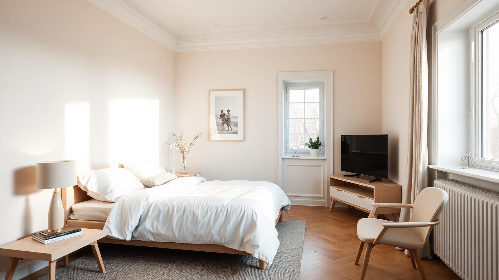
The Direct Answer: The Best Color Combinations for Small Rooms
The most reliable color combinations for small rooms pair a light, high-reflectance base with one or two closely related neighbours rather than a strong contrast. In practice that means warm off-whites such as Swiss Coffee (#F1EBDD), soft light blues such as Benjamin Moore Smoke 2122-40 (#BAC8C9), muted yellows such as Cream Silk OC-115 (#F3EAD3), and pale greens or peaches used as accents. Combine them monochromatically — one hue in three values — or analogously — three hues sitting side by side on the wheel — and the walls visually recede instead of closing in.
That is the whole principle in one sentence: small rooms grow when the eye stops finding edges. Every hard boundary between wall, trim, ceiling, and door tells the brain "this is where the room ends." Light, cool, closely related colors blur those boundaries. High-contrast schemes announce them.
This guide gives you the exact HEX values, four tested palettes, the psychology behind why they work, and the proportional rules that keep a compact room from reading flat. If you want the broader theory first, our companion piece on what color palette makes a room look bigger covers light reflectance value in depth.
Why Light and Cool Colors Make Walls Recede
Two separate mechanisms are at work, and confusing them is the most common mistake homeowners make.
The first is light reflectance value (LRV). Every paint color reflects a measurable percentage of the light that hits it, from 0 (absolute black) to 100 (pure white). A wall at LRV 82 bounces light back into the room, illuminating the opposite wall and the ceiling; a wall at LRV 12 absorbs that light and the room's usable brightness collapses. In a small space with one window, LRV is not an aesthetic preference — it is the difference between a room that feels open at 4 p.m. and one that needs a lamp.
The second is advancing and receding color. Warm hues — reds, oranges, saturated yellows — are perceived by the visual system as closer than they physically are. Cool hues — blues, blue-greens, cool greys — are perceived as further away. This is partly chromatic aberration in the eye's lens: long wavelengths focus slightly behind the retina, short wavelengths slightly in front, and the brain interprets the difference as depth. Paint a small room's far wall in cool Smoke #BAC8C9 and it reads roughly a hand's width further back than the same wall in a warm terracotta.
The third factor is cohesion. Every time the eye crosses a color boundary it registers a stop. Six stops between the door and the window and the room feels chopped into fragments; two stops and it reads as one continuous volume. This is why monochromatic and analogous schemes outperform complementary ones in tight spaces, regardless of how beautiful the complementary pairing is in isolation.
The Complete HEX Reference for Small-Room Palettes
These are the working colors used across the palettes below. Names follow standard manufacturer naming where a direct equivalent exists.
| Item | Color | Hex | Color Name | Psychological Meaning |
|---|---|---|---|---|
| Primary wall (warm neutral) | Warm off-white | #F1EBDD |
Swiss Coffee OC-45 | Calm, welcoming, unpretentious openness |
| Primary wall (cool neutral) | Soft blue-grey | #BAC8C9 |
Smoke 2122-40 | Distance, quiet, mental spaciousness |
| Primary wall (warm light) | Muted buttery yellow | #F3EAD3 |
Cream Silk OC-115 | Optimism, gentle warmth, daylight substitute |
| Secondary wall | Light gray | #D3D3D3 |
Light Gray | Neutrality, restraint, visual quiet |
| Trim | Mid gray | #A9A9A9 |
Dark Gray (trim value) | Structure without weight |
| Accent | Charcoal blue-grey | #36454F |
Charcoal | Depth, anchoring, sophistication |
| Secondary wall | Soft blue | #ADD8E6 |
Light Blue | Serenity, air, coolness |
| Tertiary | Pale blue-green | #B0E0E6 |
Powder Blue | Freshness, fluidity, calm |
| Accent | Pale green | #98FB98 |
Pale Green | Renewal, nature, lightness |
| Accent | Soft peach | #F6D8C6 |
Pale Peach | Warmth, intimacy, skin-flattering glow |
| Ceiling | Near-white | #F8F6F1 |
Chantilly Lace (soft) | Height, release, uninterrupted overhead space |
Four Small-Room Color Combinations That Work
1. The Tonal Grey Scheme (Monochromatic)
Walls in Light Gray #D3D3D3, trim one step darker at #A9A9A9, and a single Charcoal #36454F accent on a door, a bookcase interior, or a piece of furniture.
This is the most forgiving of all color combinations for small rooms because it removes the trim contrast that normally frames and shrinks a wall. Painting the trim slightly darker than the wall rather than brilliant white is counterintuitive to most homeowners, yet it produces a more continuous surface — the eye reads wall and trim as one plane, and the room's corners soften. The charcoal accent gives the scheme a focal depth so it does not read as fog. Keep charcoal to under 10% of visible surface.
Best for: hallways, home offices, north-facing rooms with cool light. See our monochromatic color schemes guide for the value-spacing rules that keep single-hue rooms from going flat.
2. The Coastal Analogous Scheme
Soft Blue #ADD8E6 on the walls, Powder Blue #B0E0E6 on the ceiling or an alcove, Pale Green #98FB98 as a small accent in textiles or ceramics.
Three neighbouring hues, all high-value, all cool. Because blue, blue-green, and green sit adjacent on the wheel, the transitions between surfaces are almost imperceptible — the room reads as a single atmospheric volume rather than a box with painted sides. The pale green accent is what stops the scheme drifting into infirmary blandness; it is the one note the eye registers as intentional.
A caution: this palette needs some warmth in materials. Natural oak, rattan, unbleached linen, and brass hardware supply it without adding a fourth paint color. Our breakdown of analogous color examples explains why adjacent hues create harmony the eye reads as effortless.
3. The Warm Off-White Envelope
Swiss Coffee #F1EBDD on walls, ceiling, and trim in a single continuous wrap, with Pale Peach #F6D8C6 in soft furnishings and a Charcoal #36454F accent at floor level.
The "envelope" technique — one color on every architectural surface — is the single most effective move available for a small room. With no ceiling line and no trim line, the eye finds no edge and the room's true dimensions become genuinely harder to judge. Swiss Coffee works better than a pure white here because pure white in a small space with limited daylight goes grey and sterile; the warm off-white holds its color even in weak light.
Best for: small bedrooms, guest rooms, spaces with low ceilings.
4. The Muted Yellow Daylight Substitute
Cream Silk #F3EAD3 on walls, near-white #F8F6F1 on the ceiling, Light Gray #D3D3D3 on trim, and Pale Green #98FB98 or a soft sage in plants and art.
Small rooms that face north or sit at the back of a building receive cool, weak, blue-shifted light. A cool blue-grey in that condition compounds the problem and the room reads grim by mid-afternoon. A muted yellow at high LRV does the opposite: it mimics the warm end of daylight and makes the space feel lit even when it is not. The trick is muted — a saturated yellow advances aggressively and will shrink the room. Cream Silk reads as a warm neutral first and a yellow second.
The Psychology Behind Small-Room Color Choices
Spatial perception research consistently shows that occupants estimate light, cool-toned rooms as larger than identically dimensioned rooms in dark or warm tones — with reported differences of 10-15% in perceived floor area. Three psychological effects drive this:
Perceived distance. Cool, desaturated colors are read by the visual system as atmospheric — the same way distant mountains appear blue-grey through kilometres of air. Applying that same blue-grey to a wall two metres away triggers a distance cue the brain does not fully override.
Cognitive load. Every additional color in a room is another element the visual system must parse. In a large space that complexity registers as richness; in a small one it registers as clutter. Restricting a compact room to three related values reduces the processing burden and the space feels calmer, which people reliably report as "bigger."
Boundary ambiguity. When wall, ceiling, and trim share a value, the brain cannot precisely locate the room's corners. Ambiguity about where a surface ends is experienced as openness. This is the mechanism behind the envelope technique, and it is far more powerful than any individual paint color.
Practical Takeaways for Designers and Homeowners
Aim for LRV 70+ on the primary wall. Below roughly 60 you lose the light-bouncing benefit that makes a small room work. Manufacturer data sheets list LRV; use it rather than judging from a chip.
Reduce trim contrast, don't increase it. Brilliant white trim against a colored wall draws a hard line around every window, door, and skirting board, and each of those lines is a size cue. Either match trim to wall or shift it by one value step.
Paint the ceiling the wall color at 75-80% strength. A ceiling in a slightly diluted version of the wall color reads as height rather than as a lid.
Cap the accent at 10%. Charcoal #36454F in a small room is an asset in a lamp base, a door, or a picture frame; on a full wall it is a subtraction of square metres.
Test on two walls, at three times of day. Paint an A2 sample on the wall nearest the window and the wall furthest from it, and look at 9 a.m., 2 p.m., and after dark under your actual bulbs. Small rooms exaggerate the difference between daylight and artificial light because there is less surface area to average it out.
Use sheen strategically. An eggshell or satin finish reflects marginally more light than a matte and helps a dim room — but it also reveals wall imperfections, which in a small space are viewed from close range. Matte on walls, satin on trim is the usual compromise.
Keep the floor light too. A dark floor in a small room truncates the space at the bottom. Pale oak, light stone, or a large light-toned rug extends the visual floor plane.
Conclusion: Cohesion Beats Contrast
The best color combinations for small rooms are not clever — they are quiet. A warm off-white envelope, a tonal grey monochrome, a coastal analogous trio, or a muted yellow daylight substitute all work for the same reason: they give the eye fewer edges to find and lighter surfaces to bounce off. Save the high-contrast, high-drama palette for the room that can absorb it.
Start from one of the HEX codes above — Swiss Coffee #F1EBDD, Smoke #BAC8C9, Cream Silk #F3EAD3, or Light Gray #D3D3D3 — and build outward in small value steps rather than large hue jumps.
Generate your own small-room palette with the Coloracci palette generator — drop in any base color above and get mathematically harmonious tints, shades, and analogous companions, ready to export for your paint chart or mood board.