Calm and Serene: Your Guide to Grey and Blue Bedroom Color Schemes
· Coloracci Team
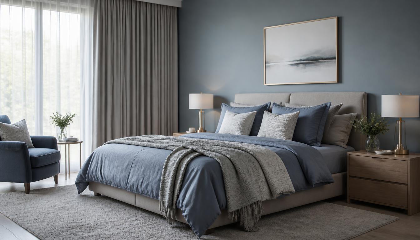
Calm and Serene: Your Guide to Grey and Blue Bedroom Color Schemes
If you are looking for calm grey and blue bedroom color schemes, the answer is straightforward: this is one of the most reliable pairings for a restful, sophisticated bedroom. Grey provides a quiet, adaptable foundation, while blue layers in a cool, calming presence that research consistently links to slower heart rate, reduced anxiety, and better sleep quality. The secret is not simply using grey and blue together, but balancing their temperature, saturation, and proportion so the room feels serene rather than sterile. In this guide, we break down three complete palettes with exact HEX codes, explain the psychology behind the combination, and share practical ways to adapt the scheme to your space.
The appeal of grey and blue bedrooms has remained strong in interior design because the palette works across styles. It can feel coastal, minimalist, traditional, or dramatically modern depending on the shades you choose. Understanding how each shade behaves under natural and artificial light is what separates a flat scheme from one that feels intentionally designed.
Why Calm Grey and Blue Bedroom Color Schemes Work
Grey and blue sit near each other on the cool side of the color spectrum, which gives them an inherent visual harmony. Blue carries associations with sky, water, and open space, while grey functions as a visual pause—a neutral that recedes and lets blue take the emotional lead. Together they create a low-stimulation environment that helps the brain shift out of active mode, exactly what a bedroom needs.
The psychology of blue in design explains why blue is the world's favorite color and why it dominates spaces intended for rest. Studies in environmental psychology have shown that people fall asleep faster in rooms dominated by cool, muted tones than in rooms with warm, high-contrast palettes. Blue also lowers blood pressure and reduces mental alertness, making it ideal for the final room you see before sleep.
Grey, meanwhile, is more complex than it appears. What makes gray such a misunderstood color is its undertone. A grey can lean green, blue, purple, or brown, and that undertone determines whether the room feels fresh or muddy next to blue. For a calm grey and blue bedroom, the safest choices are greys with blue or green undertones because they extend the cool story rather than fighting it. Greige—grey with a warm beige undertone—can also work beautifully when you want to prevent the room from feeling cold.
Soft and Airy Grey and Blue Bedroom Palette
This is the most forgiving option for small bedrooms, north-facing rooms, or spaces with limited natural light. The goal is to keep everything light, bright, and gently varied so the room feels open rather than crowded.
| Color | HEX Code | Role in the Room | Why It Works |
|---|---|---|---|
| Dove Gray | #B0A8B9 | Walls or large upholstered headboard | A soft, warm grey that reads almost lavender in certain light; it holds color without dominating |
| Powder Blue | #B0E0E6 | Bedding, accent pillows, curtains | A pale, desaturated blue that adds freshness without visual weight |
| Cloud White | #F0F8FF | Trim, ceiling, sheer curtains | A cool white that keeps edges crisp and reflects light |
Start with Dove Gray on the walls if your room receives decent natural light. In a darker room, reverse the proportions: paint the walls Cloud White and bring Dove Gray in through the headboard, rug, or throw. Powder Blue works best in soft fabrics because matte textiles mute the color further. Avoid glossy finishes for the blue elements; silk or linen look more serene than satin. This palette suits Scandinavian, transitional, and cottage-style bedrooms.
The psychology here is one of expansion. Light values reflect more light, and the cool temperature of Powder Blue and Cloud White creates the sensation of more space. This is an excellent choice for anyone who wants calm grey and blue bedroom color schemes that feel breezy and uncluttered.
Moody and Sophisticated Grey and Blue Bedroom Palette
For a primary bedroom or a space where you want to feel enveloped, deeper tones create drama without the harshness of black. This palette is about depth, contrast, and controlled metallic accents.
| Color | HEX Code | Role in the Room | Why It Works |
|---|---|---|---|
| Charcoal Grey | #36454F | Feature wall or headboard wall | Deep enough to anchor the room, but softer than black; excellent for hiding imperfections |
| Navy Blue | #000080 | Bedding, velvet pillows, curtains | A timeless blue that reads rich and cocooning, especially in matte or velvet finishes |
| Silver | #C0C0C0 | Lamps, picture frames, hardware, decorative accents | Adds a cool, reflective accent that lifts the darkness without introducing warm metals |
Use Charcoal Grey on a single accent wall behind the bed, and keep the remaining walls a lighter warm grey or off-white. Navy Blue works best as the dominant textile color—think a navy duvet or a pair of navy blackout curtains. Silver accents prevent the room from feeling heavy; brushed silver or satin nickel finishes are less flashy than chrome and better suited to sleep spaces.
The psychology of this palette is protective. Darker surrounds signal to the brain that the environment is enclosed and secure, which can actually support deep sleep when paired with blackout textiles. The key is contrast control: too much silver will read cold, while too little will leave the room feeling flat.
Coastal and Casual Grey and Blue Bedroom Palette
This interpretation of calm grey and blue bedroom color schemes draws from beach-house aesthetics: relaxed, sun-washed, and slightly warmer than the minimalist versions. It is ideal if you find pure grey too cool but still want a restful palette.
| Color | HEX Code | Role in the Room | Why It Works |
|---|---|---|---|
| Greige | #B9B4A9 | Walls or large area rug | A warm grey-beige that prevents the room from feeling chilly |
| Slate Blue | #5A7D9A | Accent chairs, throw blankets, artwork | A muted, medium blue with grey undertones that feels worn-in and easy |
| Linen White | #FDF5E6 | Bedding, curtains, lampshades | A warm off-white that adds softness and casual comfort |
Greige on the walls is a strong choice for south-facing rooms that receive warm afternoon light, because it balances the yellow cast of the sun. Slate Blue introduces the blue element without looking nautical or childish. Linen White keeps the bedding from looking stark and adds tactile warmth. Natural materials—wicker, jute, light oak—pair beautifully here. This palette is the best introduction to grey and blue for anyone worried the combination might feel too cold.
The coastal palette works because it borrows from natural environments people already associate with rest: driftwood, sea glass, sand, and fog. Those mental associations make the room feel familiar and calming before any psychology research is considered.
How Light Direction Changes the Palette
A calm grey and blue bedroom can look dramatically different depending on the room's orientation. Understanding this prevents the most common disappointment: a blue that looked perfect on a paint chip turning muddy or cold on the wall.
| Room Orientation | Light Quality | Recommended Greys | Recommended Blues |
|---|---|---|---|
| North-facing | Cool, consistent, lower intensity | Warm greige, greys with taupe undertones | Soft powder blues, muted slate blues |
| South-facing | Warm, bright, strong afternoon sun | Cool blue-greys, true greys | Navy, deeper slate blues, crisp powder blue |
| East-facing | Warm morning, cooler afternoon | Balanced greige, light dove grey | Soft sky blues, pale aqua accents |
| West-facing | Cool morning, warm evening | Mid-tone greys, blue-grey | Muted blues that can handle golden light |
North-facing rooms are the trickiest for grey and blue because the light is already cool. Without a warm undertone in the grey, the room can feel like a hospital corridor. South-facing rooms can handle cooler greys and richer blues because the sunlight adds warmth all day. East- and west-facing rooms need transitional shades that look good under both warm and cool light.
If you are uncertain about undertones, test large swatches on every wall and observe them at three times of day: morning, midday, and evening with artificial lighting. The color that looks best across all three is your winner.
The 60-30-10 Rule for Grey and Blue Bedrooms
Applying a color proportion rule keeps a two-color palette from feeling accidental. The 60-30-10 rule is simple but powerful: 60 percent dominant color, 30 percent secondary color, 10 percent accent.
| Proportion | Typical Application | Example in Soft Palette | Example in Moody Palette |
|---|---|---|---|
| 60% | Walls, large furniture, flooring | Dove Gray walls + light wood floor | Charcoal feature wall + charcoal bed frame |
| 30% | Bedding, curtains, rugs | Powder Blue duvet and curtains | Navy Blue bedding and curtains |
| 10% | Art, lamps, hardware, decorative objects | Cloud White trim + silver lamp bases | Silver hardware + a single white ceramic vase |
The 10 percent accent layer is where you introduce contrast and personality. In a calm scheme, keep accents within the same color family—cool whites, silvers, and pale blues—rather than introducing a bold third color like orange or yellow. Those warmer accents create energy, which is the opposite of what you want in a sleep-focused room. If you crave visual interest, use texture instead: ribbed ceramics, nubby wool, slubby linen, and matte metal.
Common Mistakes in Grey and Blue Bedrooms
Even a calm palette can go wrong. Here are the pitfalls to avoid:
- Choosing grey without checking undertones. A grey with a strong purple undertone can clash with a blue-grey bedding set. Always compare swatches in the actual room.
- Using too many cool tones in a dark room. If the bedroom has little natural light, pair cool blues with warm greige or linen white to keep it welcoming.
- Forgetting the ceiling. A stark white ceiling against blue walls can feel jarring. Cloud White or Linen White is usually a better ceiling companion than pure brilliant white.
- Overmatching metals. Mixing warm brass with cool silver in the same sightline creates visual tension. Stick with one metal family for a calm result.
- Ignoring the floor. A warm wood floor softens grey and blue beautifully, while a cold grey carpet can make the room feel bottom-heavy. If you have grey carpet, add a warm-toned rug.
Calm Grey and Blue Bedroom Color Schemes for Different Styles
The same palette can be adapted to suit your aesthetic:
- Modern Minimalist: Use a blue-grey like #8FA3B5 on all walls, a charcoal bed frame, and white bedding with one navy throw. Keep surfaces clear and hardware minimal.
- Traditional Elegance: Pair slate blue walls with dove grey silk curtains, a silver-framed mirror, and a cream upholstered headboard. Add a soft floral or paisley in muted blue-grey tones.
- Scandinavian Hygge: Paint walls Linen White, use a dove grey duvet, and add powder blue accent pillows. Layer natural wood and wool.
- Coastal Cottage: Greige walls, navy blue striped bedding, whitewashed furniture, and rope or driftwood accents.
For a bohemian interpretation, you can also explore how a modern bohemian bedroom color palette layers terracotta and teal accents. While that style uses warmer notes, the same layering principles apply: one dominant neutral, one supporting color, and small accents through textiles.
Reference Table: Complete Color Breakdown
| Item | Color | HEX Code | Color Name | Psychological Meaning |
|---|---|---|---|---|
| 1 | Soft Grey | #B0A8B9 | Dove Gray | Stability, quiet elegance, adaptability |
| 2 | Pale Blue | #B0E0E6 | Powder Blue | Calm, openness, restful clarity |
| 3 | Cool White | #F0F8FF | Cloud White | Cleanliness, lightness, spatial expansion |
| 4 | Deep Grey | #36454F | Charcoal Grey | Depth, sophistication, enclosure |
| 5 | Rich Blue | #000080 | Navy Blue | Trust, serenity, classic authority |
| 6 | Metallic Accent | #C0C0C0 | Silver | Refinement, cool reflection, subtle luxury |
| 7 | Warm Grey | #B9B4A9 | Greige | Comfort, warmth, natural balance |
| 8 | Muted Blue | #5A7D9A | Slate Blue | Reliability, coastal ease, quiet confidence |
| 9 | Warm White | #FDF5E6 | Linen White | Softness, casual comfort, tactile warmth |
This table gives you a ready reference when shopping for paint, textiles, or decor. The psychological meanings reinforce why calm grey and blue bedroom color schemes are so effective for sleep spaces: every hue contributes to a sense of safety, stillness, and softness.
Practical Takeaways for Designers and Homeowners
- Start with the light in the room, not the trend. North-facing rooms need warm greys; south-facing rooms can handle cool greys and deeper blues.
- Test paint on every wall at large scale. Color shifts from wall to wall because light hits each surface differently.
- Anchor the bed first. The headboard, duvet, and largest rug should establish the dominant and secondary colors; walls can then support or contrast.
- Use blue in textiles if you want flexibility. It is easier to swap pillows and throws than repainting walls when you want a refresh.
- Add living elements. A small plant, fresh flowers, or natural wood introduces organic warmth without breaking the cool palette.
Calm grey and blue bedroom color schemes succeed because they respect what a bedroom is meant to do: slow the body down and prepare the mind for rest. Whether you prefer the airy softness of Dove Gray and Powder Blue, the enveloping depth of Charcoal and Navy, or the relaxed warmth of Greige and Slate Blue, the formula remains the same—cool colors, balanced undertones, and thoughtful texture. Use the palettes and HEX codes here as a starting point, then adjust to your room, your light, and your sense of calm.
If you want to explore how these colors interact before committing to paint, try the Coloracci palette generator to build your own grey and blue scheme, complete with proportion guidance and HEX outputs tailored to your room's lighting.