The Designer's Guide: Best Paint Colors for Rooms with Cherry Wood Floors and Trim
· Coloracci Team
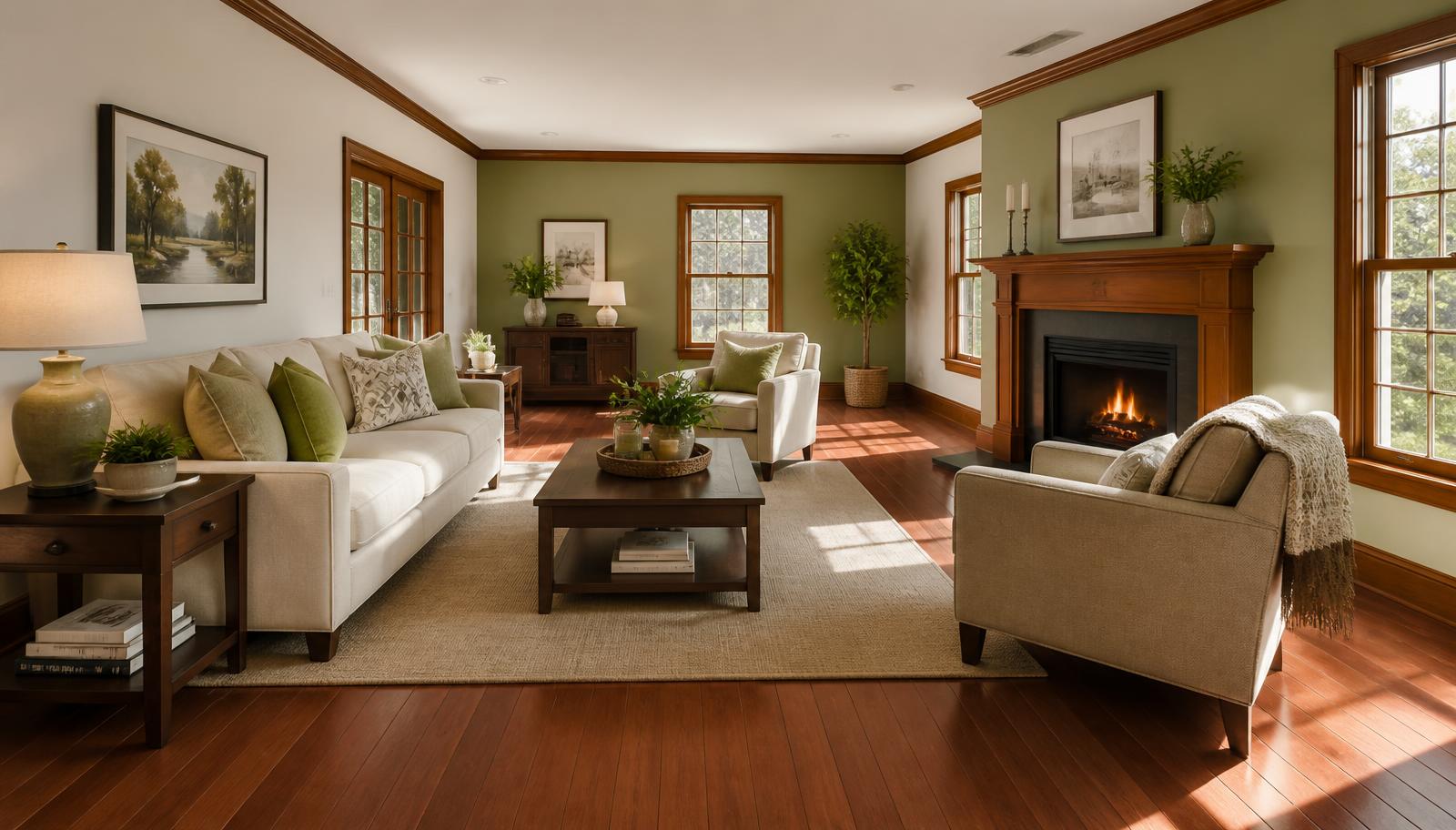
Best Paint Colors for a Room with Cherry Wood Floors and Trim
If you want the short answer: the best paint colors for a room with cherry wood floors and trim are creamy off-whites (#FFFDD0), soft beiges (#F5F5DC), warm taupes (#483C32 in its full strength, lightened for walls), muted sage greens (#B2AC88), and disciplined cool grays (#DCDCDC). Those five families work because cherry is not simply "brown wood" — it is a red-orange hue with high chroma that deepens and reddens as it ages. Your wall color is not decorating around wood; it is entering a color relationship with a large, saturated red-orange field that never turns off.
That single fact explains most cherry-wood paint failures. Homeowners pick a fashionable cool greige, roll it on, and the room turns pink or the trim suddenly looks orange and dated. Nothing is wrong with the paint. The undertone was simply fighting the floor. Below is the full designer breakdown — exact HEX codes, tested palettes, the psychology behind each choice, and the practical rules that keep cherry looking like an asset rather than a problem to hide.
Understanding Cherry Wood as a Color, Not a Material
Freshly finished cherry sits roughly around #8B3A1E to #A0522D. Give it five to ten years of light exposure and it patinates toward #7B2E12 — deeper, redder, and more saturated. Cherry trim compounds this: baseboards, casings, crown molding and doors distribute that red-orange around the entire perimeter of the room, effectively framing every wall in warm color.
Three consequences follow:
- Red amplifies red. Any wall color carrying a pink or mauve base will read stronger next to cherry than it does on the chip. This can be intentional and beautiful, or it can look like a blush accident.
- Green is the natural counterweight. Green sits opposite red on the color wheel, so muted greens neutralize excess warmth without draining the room of life.
- Contrast is already high. Cherry is dark and rich. You rarely need a dramatic wall color to create interest — the wood is doing it. Restraint usually reads more expensive.
If your floors are darker and browner rather than red, the rules shift; our guide to the best paint colors for rooms with dark wood floors covers that scenario in depth, and our wall paint colors for dark wood trim guide handles espresso, walnut and mahogany millwork.
The Five Best Paint Color Families for Cherry Wood
1. Creamy Off-Whites — The Safest Sophisticated Choice
Key HEX codes: Cream #FFFDD0, Antique White #F7F0E2, Beige-White #F5F0E1
Pure builder white (#FFFFFF) next to cherry is a mistake. Cold, blue-based white makes cherry look artificially orange, like stage furniture. A creamy off-white with a yellow-to-warm-neutral base does the opposite: it echoes cherry's warmth just enough to feel like the same family, while providing the light, expansive backdrop the wood cannot supply on its own.
Sherwin-Williams users should look at the creams and the off-whites carrying a faint pink undertone — that whisper of rose bridges beautifully to cherry's red without turning the room into a nursery. Reserve true cool whites for ceilings only.
Best for: Living rooms, dining rooms, hallways with heavy cherry trim, any room where you want the woodwork to be the star.
2. Soft Beiges — Warm, Forgiving, Timeless
Key HEX codes: Beige #F5F5DC, Camel Tan #C3A17A, Wheat #E8DCC0
Beige has spent a decade being unfairly maligned, but it remains the most reliable partner for red-toned wood. Glidden's Camel Tan is a genuinely excellent cherry companion — enough pigment to read as a color rather than a default, warm enough to sit in harmony with the floor, and light enough to bounce daylight.
The trick with beige is chroma discipline. Choose a beige that is slightly less saturated than you think you want. Cherry will supply the intensity; the walls should supply the calm.
Best for: Bedrooms, family rooms, north-facing spaces where a cooler tone would go flat.
3. Warm Taupes — Earthy and Grounding
Key HEX codes: Taupe #483C32 (accent depth), Mid Taupe #9C8C7B, Pale Taupe #C6B9A8
Taupe is the sophisticated middle path: a gray-brown that carries just enough warmth to relate to cherry, and just enough gray to keep the room from feeling like a log cabin. In its darkest form (#483C32) it is an outstanding accent wall or fireplace surround, framing cherry trim with the same weight and letting the wood glow against it.
Greige — the beige-gray hybrid that Sherwin-Williams has built an empire on — belongs here too, with one critical caveat covered below in the gray section.
Best for: Studies, libraries, dining rooms, and open-plan spaces that need one grounded anchor color.
4. Muted Sage Greens — The Designer's Secret Weapon
Key HEX codes: Sage #B2AC88, Soft Moss #A8B49A, Deep Pine #35533F
If you ask a working colorist for the single best wall color for cherry, many will say sage. Because green is red's complement, a muted sage neutralizes the excess warmth that cherry pushes into a room, which makes the wood look richer rather than louder. It is the same principle as green-tinted color corrector on red skin tones.
Keep the green dusty and desaturated. Bright kelly or lime greens fight cherry; a grayed sage (#B2AC88) supports it. For dramatic rooms, deep pine green (#35533F) with cherry trim is a heritage combination that reads as an old-money library.
Best for: Bedrooms, offices, sunrooms, dining rooms — anywhere calm is the goal.
5. Cool Grays — Modern Contrast, Used Carefully
Key HEX codes: Gainsboro #DCDCDC, Classic Grey-style warm gray #E4DFD6, Charcoal #4A4E52
Cool gray next to cherry is the highest-risk, highest-reward option. Done well, it is genuinely striking: the neutral coolness makes the wood's warmth pop with an editorial, modern edge. Done badly, the gray turns violet and the cherry turns fluorescent orange.
The rule: choose a gray with a warm or greenish undertone rather than a blue or violet one. Benjamin Moore Classic Grey is the reference point most designers cite — technically a warm off-white gray that stays neutral against red wood. Anything with obvious blue in the base coat will clash.
Charcoal (#4A4E52) works surprisingly well as a single accent wall behind cherry built-ins, delivering contrast without the pink-shift risk of mid-tone grays.
Cherry Wood Paint Data Table
| Item | Color | Hex | Color Name | Psychological Meaning |
|---|---|---|---|---|
| Main wall (light) | Cream | #FFFDD0 | Cream | Warmth, comfort, timelessness |
| Main wall (neutral) | Beige | #F5F5DC | Beige | Stability, calm, welcome |
| Main wall (mid) | Camel Tan | #C3A17A | Camel Tan | Earthiness, hospitality |
| Main wall (grounded) | Mid Taupe | #9C8C7B | Taupe | Sophistication, restraint |
| Accent wall | Deep Taupe | #483C32 | Dark Taupe | Depth, security, gravitas |
| Main wall (calming) | Sage | #B2AC88 | Sage Green | Balance, renewal, quiet |
| Accent wall | Deep Pine | #35533F | Pine Green | Heritage, permanence |
| Main wall (modern) | Gainsboro | #DCDCDC | Cool Gray | Clarity, modernity |
| Accent wall | Charcoal | #4A4E52 | Charcoal Gray | Authority, contrast |
| Accent detail | Soft Pink | #E8CFC6 | Blush | Softness, intimacy |
| Accent detail | Teal Blue | #2F6B72 | Teal | Refreshment, contrast |
| Accent detail | Plum | #5C3A52 | Plum | Luxury, drama |
| Metal / hardware | Bronze | #7B5B3A | Bronze | Craft, age, warmth |
| Bold accent | Red Gumball | #B02B2C | Red Gumball | Energy, confidence |
| Reference | Aged Cherry | #7B2E12 | Cherry Wood | Richness, tradition |
Five Tested Palettes for Cherry Wood Rooms
Palette 1 — Classic Cream Envelope Walls #FFFDD0 · Ceiling #FBF8F0 · Trim (cherry) #7B2E12 · Textiles #C3A17A · Metal #7B5B3A Quiet, traditional, resale-safe. The room reads bright and the woodwork reads intentional.
Palette 2 — Sage Sanctuary Walls #B2AC88 · Trim (cherry) #7B2E12 · Ceiling #F5F0E1 · Textiles #E8DCC0 · Accent #2F6B72 The complement play. Best bedroom palette on this list.
Palette 3 — Grounded Taupe Study Walls #9C8C7B · Accent wall #483C32 · Trim (cherry) #7B2E12 · Textiles #DCDCDC · Metal #7B5B3A Masculine, library-like, excellent for rooms with limited natural light.
Palette 4 — Modern Cool Contrast Walls #DCDCDC · Ceiling #FFFFFF · Trim (cherry) #7B2E12 · Accent #4A4E52 · Textiles #E8CFC6 Contemporary. Requires disciplined gray selection — sample obsessively.
Palette 5 — Heritage Drama Walls #35533F · Trim (cherry) #7B2E12 · Ceiling #F7F0E2 · Accent #5C3A52 · Metal #7B5B3A Dining rooms and studies. Rich, saturated and unapologetically traditional.
You can build any of these into a working scheme — with tints, shades and accessibility contrast data — using the Coloracci palette generator, then export the HEX values straight into your paint list.
The Color Psychology of Cherry Wood Interiors
Cherry is psychologically loaded. Red-orange is the hue family associated with warmth, appetite, energy and social connection — which is precisely why cherry has historically dominated dining rooms, libraries and executive offices. It signals permanence and status.
The wall color determines which side of that signal dominates:
- Cream and beige soften cherry's intensity into hospitality. The room feels generous rather than formal.
- Sage green converts cherry's energy into calm. Complementary pairs create visual rest because neither hue starves the eye.
- Taupe reads as controlled sophistication — cherry's status without its heat.
- Cool gray intellectualizes the wood, repositioning a traditional material as a deliberate design choice.
- Charcoal and pine deepen the drama, pushing the room toward retreat and concentration.
Warm environments measurably increase perceived social closeness, which is why cherry-heavy dining rooms feel convivial. If you want the opposite — a focused, cool workspace — you must actively counterbalance with green or gray rather than doubling down on warm neutrals.
Practical Designer Takeaways
1. Sample vertically, not on a table. Paint two coats on poster board and tape it directly against the cherry trim at baseboard height and at eye level. Color relationships change with proximity.
2. Judge at three times of day. Cherry throws warm reflected light. A gray that looks perfect at noon can read lavender at 7 p.m. under 2700K bulbs.
3. Respect the 60-30-10 split. Cherry floors and trim typically consume 25-35% of a room's visual field already. Treat the wood as your 30%, keep walls as the 60% quiet field, and reserve 10% for a true accent — teal, plum or bronze all work.
4. Do not fight red with pink by accident. Check every candidate for mauve or violet undertones. If the chip looks slightly purple against white paper, it will look distinctly purple against cherry.
5. Whiten the ceiling, warm the walls. A slightly cooler ceiling lifts the room while warm walls preserve harmony with the floor.
6. Use bold color in small doses. A Red Gumball (#B02B2C) door or a plum (#5C3A52) powder room next to cherry can be spectacular. On four walls it becomes overwhelming.
7. Coordinate metals. Bronze and antique brass (#7B5B3A) harmonize with cherry; polished chrome tends to fight it unless the palette is deliberately cool and modern.
For a broader framework on layering accent color into a neutral, wood-heavy home, see our guide on how to add color to your home.
Conclusion: Let the Cherry Lead
The best paint colors for a room with cherry wood floors and trim all follow one principle: choose a wall color that acknowledges the wood's red-orange hue instead of ignoring it. Creamy off-whites and beiges harmonize, sage green neutralizes, taupe grounds, and carefully chosen warm-based grays modernize. Every failure mode — the pink wall, the orange trim, the muddy greige — comes from an undertone that was never tested against the floor.
Pick your direction, sample it against the trim, and let cherry do what it has always done best: make a room feel warm, established and worth staying in.
Ready to build your palette? Drop your favorite HEX code from the table above into the Coloracci palette generator to generate complementary tints, shades and accent colors — then check contrast and export the full scheme for your painter.