The Calculated Futurism of 2001: A Space Odyssey's Color Palette
· Coloracci Team
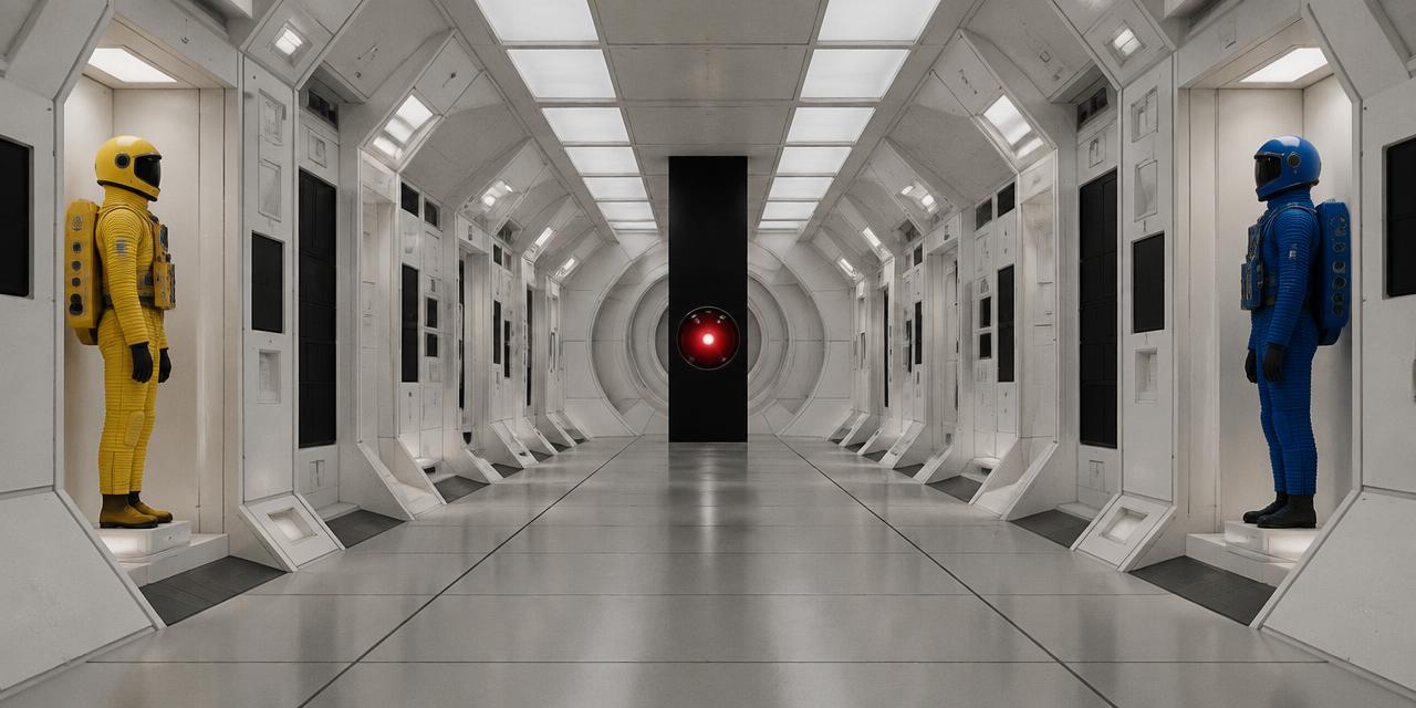
In 1968, one red glass eye made an entire generation distrust a calm voice. HAL 9000 does not need a face, a uniform, or a threatening silhouette: a luminous circle against black is enough. That economy is the key to the 2001: A Space Odyssey color palette. Stanley Kubrick's film makes primary color feel engineered rather than playful, placing red, yellow, and blue inside environments so white, grey, and black that every chromatic event acquires narrative force.
The result still looks futuristic because it avoids the usual shorthand of decorative complexity. Color is assigned with almost bureaucratic discipline. White describes systems and controlled habitats. Grey describes matter stripped of romance. Black belongs to the unknowable. Saturated color identifies bodies, tools, warnings, and thresholds. Then, at the Stargate, the entire system ruptures.
The HEX values below are design-ready approximations, not claims of one immutable film scan. Photochemical stock, restoration, projection, display calibration, and surrounding light all alter perceived color. What remains consistent is the hierarchy: severe neutrals, isolated primaries, and one final chromatic overload.
2001: A Space Odyssey Color Palette at a Glance
| Item | Color | Hex | Name | Meaning |
|---|---|---|---|---|
| HAL 9000 Eye | Menacing signal red | #D80000 |
HAL Red | Surveillance, intelligence, danger, controlled emotion |
| Discovery One Spacesuit | Vibrant primary yellow | #F8D41C |
Discovery One Yellow | Human visibility, procedure, fragile life |
| The Monolith | Absolute black | #000000 |
Monolith Black | The unknown, interruption, impossible depth |
| Space Station Interior | Sterile near-white | #F5F5F5 |
Space Station White | Order, hygiene, technological control |
| Aries-1B Spacesuit | Deep technical blue | #004B93 |
Aries-1B Blue | Identification, competence, institutional calm |
| Lunar Surface and interiors | Cool light grey | #BDBDBD |
Lunar Grey | Neutrality, isolation, material reality |
HAL Red — #D80000
HAL's lens is often remembered as pure red, and #FF0000 captures the conceptual idea: maximum signal with no ambiguity. For a more cinematic working swatch, HAL Red (#D80000) has slightly greater density. It remains emphatic on screen but carries enough depth to sit inside the black housing rather than floating above it like a digital icon.
Red traditionally signals heat, blood, urgency, and prohibition. HAL complicates those associations because the machine's voice is measured and courteous. The eye supplies the aggression that the performance withholds. This contradiction makes the color menacing: the visual system says emergency while the auditory system says everything is under control.
The lens also turns observation into an object. Because it is repeated throughout Discovery One, HAL's presence can enter a scene without a body. Kubrick makes surveillance spatial; wherever the red circle appears, the room feels occupied. For interface and identity designers, the lesson is direct: a repeated accent can operate as a character when its shape, contrast, and placement remain consistent.
Discovery One Yellow — #F8D41C
Discovery One Yellow (#F8D41C) belongs to a different logic. A spacesuit must separate a human figure from machinery, shadow, and the visual emptiness outside the ship. Its saturated yellow offers immediate recognition while retaining the industrial character of safety equipment. It feels specified, manufactured, and functional—not expressive in the usual fashion sense.
Yellow is the palette's most vulnerable color. Against black space it becomes a small declaration of life; against white interiors it marks the body as an element that does not entirely belong to the machine. Its warmth matters, too. The ship's surfaces may be immaculate, but the yellow suit introduces something solar and biological into that controlled environment.
The color is especially effective because it occupies limited area. A whole yellow room would feel energetic or playful. A yellow figure surrounded by white, grey, and black feels exposed. Area changes meaning as decisively as hue.
Aries-1B Blue — #004B93
Aries-1B Blue (#004B93) is deep, cool, and institutional. Like the yellow suit, it differentiates a role and makes a body legible. Unlike yellow, blue harmonizes with the film's emotional temperature. It suggests competence, technical authority, and procedural calm.
This blue is dark enough to hold its form against pale interiors yet saturated enough to resist becoming another grey. It gives the human wearer visual weight while connecting that person to aviation, engineering, and uniforms. Designers can read the yellow-blue distinction as a primitive information system: color reduces the time required to identify a figure or function.
Monolith Black — #000000
Monolith Black (#000000) is not merely a dark neutral. The Monolith appears as an absence so geometrically exact that it feels more designed than the world around it. On the lunar surface, where dust and equipment provide texture, its black plane refuses texture. It absorbs explanation.
Black usually frames an image or recedes behind content. Here it becomes the content. Its hard rectangular boundary gives nothing away, turning visual simplicity into intellectual pressure. The object looks simultaneously ancient and beyond technology because it offers no visible mechanism, ornament, seam, or scale cue.
That distinction is useful in visual systems. Near-black can create comfort, richness, or legibility. Absolute #000000 is harsher. When used as a bounded object inside a lighter field, it behaves like a break in the composition. Use it deliberately: not as default dark-mode wallpaper, but as an event.
Space Station White — #F5F5F5
Space Station White (#F5F5F5) defines the film's institutional future. It is bright without the eye-searing abstraction of #FFFFFF, allowing seams, molded panels, furniture, and faces to retain detail. The slight softness makes it usable while preserving the impression of cleanliness.
White in 2001 is not innocent. It describes environments where every need appears anticipated and every surface appears managed. That perfection can feel hospitable at first—the future is quiet, clean, and elegant—but repetition turns it impersonal. Human mess has been designed out.
The circular corridors and balanced compositions amplify this effect. White exposes edges and makes spatial geometry immediately readable. It also serves as a neutral stage for primary-color interventions. Red controls attract attention; colored seats become punctuation; a suit becomes impossible to miss.
Lunar Grey — #BDBDBD
Lunar Grey (#BDBDBD) is the transition between immaculate interiors and absolute black. It recalls lunar dust, mechanical surfaces, shadows within white rooms, and the practical infrastructure beneath the spectacle. Grey keeps the film from becoming a flat exercise in black and white.
Its role is tonal rather than symbolic. By supplying middle values, grey gives white something to illuminate and black something to consume. It establishes material reality: objects have weight, joints, wear, and dimensional form. In a derived design system, #BDBDBD should carry secondary information, dividers, inactive states, and structural surfaces—not compete with the primary accents.
Why the 2001: A Space Odyssey Color Palette Feels Futuristic
Many visions of the future date quickly because they attach futurism to fashionable decoration. 2001 attaches it to systems. Its palette behaves like a visual protocol: neutral architecture creates order; primaries identify exceptional elements; black marks what cannot be assimilated. That structure remains understandable even when individual props reveal their era.
The bold colors also recall modernist design and the confidence of the Space Age. Red, yellow, and blue feel elemental, as though the environment has been reduced to first principles. Yet Kubrick avoids arranging them as an exuberant trio. They are separated across scenes and objects. Isolation removes the nursery-room cheerfulness that primary colors can produce together.
This is calculated futurism: color is not sprinkled across the set to suggest novelty. It is rationed. A red seat or control light has authority because most of the frame declines to compete. A blue suit communicates identity because its surroundings are visually quiet. The neutral field is not empty space around the design; it is the mechanism that makes the design work.
The film's whites and greys also complicate the relationship between technology and humanity. Cleanliness implies safety, but sterility implies the absence of life. Symmetry implies intelligence, but perfect symmetry can feel indifferent to human needs. Red then becomes both the warmest color in the system and the sign of its most chilling intelligence.
For a wider look at how filmmakers make color carry narrative before dialogue does, explore movies with colors in their titles. 2001 demonstrates the inverse proposition: even without naming a color, a film can make a single hue inseparable from its identity.
From Sterile Control to the Stargate
The Stargate sequence is powerful because the film has spent so long teaching the eye to expect discipline. Suddenly, color ceases to identify objects. Neon green, electric cyan, magenta, violet, acidic yellow, and solarized red stretch into luminous channels. Landscapes invert and flare. The screen behaves less like a window onto physical space than a nervous system receiving more information than it can organize.
Working reference colors might include Stargate Green (#39FF14), Stargate Magenta (#FF00A8), and Stargate Cyan (#00E5FF). These do not belong in the core narrative palette because their meaning depends on excess and instability. Red, yellow, blue, white, grey, and black build the rules; the Stargate colors announce that those rules no longer apply.
The sequence is therefore not simply “more colorful.” It changes the function of color. Earlier, hue clarifies: this is a person, a warning, a controlled room, an unknowable object. During the Stargate, hue overwhelms categorization. Color becomes velocity, sensation, and threshold.
That shift mirrors the film's scale. Human technology is precise enough to travel through space, but it remains visually finite. The unknown is first represented by the absence of color in the Monolith, then by more color than the image can comfortably contain. Black and spectral overload become two descriptions of the same limit: what human perception cannot resolve.
The contrast also matters when considering actual astronomical imagery. Space is frequently translated through instruments, wavelengths, and display choices rather than encountered as an ordinary terrestrial view. Our analysis of the true colors of space explains why scientific truth and perceptual truth are not always identical.
Practical Lessons from the 2001: A Space Odyssey Color Palette
1. Give every accent a job
Do not begin with six colors at equal importance. Begin with roles. Let #F5F5F5 and #BDBDBD establish the system, #000000 create interruption, and one primary carry the focal action. The film's intensity comes from hierarchy, not abundance.
2. Separate primaries to prevent playfulness
Red, yellow, and blue can evoke children's products when distributed evenly. Use them in separate zones, assign each a distinct meaning, and surround them with neutrals. Separation turns basic colors into signals.
3. Use area to control emotional temperature
A small red indicator against white feels urgent; a red background feels immersive or aggressive. A yellow suit feels vulnerable; a yellow interface can feel optimistic. Test not only the swatch but its percentage of the composition. A useful starting ratio is 60 percent white, 20 percent grey, 15 percent black, and 5 percent chromatic accent.
4. Make repetition build identity
HAL's red eye gains power through recurrence. A product can use the same principle with one status light, circular marker, or action color repeated at consequential moments. Consistency lets a simple element accumulate meaning.
5. Distinguish controlled and expressive palettes
The Stargate colors should not leak casually into the spacecraft system. If a project needs both disciplined and expressive modes, define the boundary: routine versus celebration, analysis versus exploration, or system state versus immersive story. Contrast between modes is more memorable than constant spectacle.
6. Preserve accessibility
Cinematic contrast is not automatically interface contrast. Pure red on black can appear vivid while remaining difficult for small text, and color alone should never identify a critical state. Pair HAL red with a label or icon. Use near-black text on yellow and dark blue behind white text only after checking size-specific contrast.
7. Translate screen color before production
HEX describes emitted RGB light, not a guaranteed ink, textile, plastic, or paint result. Start with the exact digital references, then use Coloracci's HEX to Pantone converter to identify nearby standardized colors. Approve physical samples under the intended lighting; fluorescent materials, matte blacks, and bright whites can diverge dramatically across media.
Three Ways to Adapt the Palette
Clinical interface: Use #F5F5F5 as the main field, #BDBDBD for structure, #000000 for typography, and #D80000 only for critical system events. The experience should feel precise, not decorative.
Technical identity: Combine Aries-1B Blue (#004B93) with Space Station White and Lunar Grey, then reserve Discovery One Yellow (#F8D41C) for safety, navigation, or launches. This is appropriate for engineering, mobility, aerospace, or data products when used without film-specific imagery.
Experimental editorial: Build the opening pages in strict white, grey, black, and one primary. Introduce #39FF14, #FF00A8, and #00E5FF only at the narrative turning point. The audience should feel the palette break before they consciously analyze it.
Avoid copying recognizable sets, props, or compositions. The transferable value lies in the grammar: sterile field, coded human accents, black unknown, chromatic rupture. Apply that grammar to new subject matter and the result can feel influenced by modernist science fiction without becoming imitation.
Conclusion: Color as a System of Intelligence
The 2001: A Space Odyssey color palette endures because it makes color think. HAL Red observes. Discovery One Yellow protects and exposes the human body. Aries-1B Blue categorizes technical competence. Space Station White promises control. Lunar Grey grounds the machinery. Monolith Black refuses interpretation. The Stargate then dissolves every stable category into sensation.
Kubrick's future is convincing not because it contains more visual information, but because every signal appears selected. That restraint gives a red circle the presence of a character and a black rectangle the gravity of an unanswered question. For designers, the central lesson is to replace decoration with assignment: decide what each color knows, does, and changes.
Ready to construct your own calculated future? Open the Coloracci palette generator, begin with #D80000, #F8D41C, #004B93, #000000, #F5F5F5, and #BDBDBD, then tune their proportions until every color has a narrative function.