YouTube Brand Colors: The Red Play Button That Commands Attention
· Coloracci Team
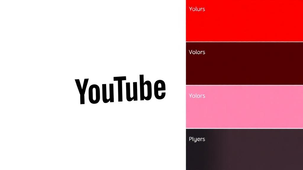
The Most Clicked Color on the Internet
Every day, billions of people click on a red play button. YouTube's choice of pure red (#FF0000) isn't just a brand decision — it's a behavioral trigger that has trained an entire generation to associate red with "press play." No other brand has so successfully turned a color into a universal action signal.
YouTube's color story is one of radical simplification: from a cluttered early logo to one of the cleanest, most recognizable icons in digital history.
The Exact YouTube Brand Color Palette
| Color Name | Hex Code | RGB | Primary Usage |
|---|---|---|---|
| YouTube Red | #FF0000 | 255, 0, 0 | Play button, logo, primary brand |
| Almost Black | #282828 | 40, 40, 40 | Dark mode background, text |
| White | #FFFFFF | 255, 255, 255 | Light mode background, play icon |
| Light Gray | #F9F9F9 | 249, 249, 249 | Page backgrounds, cards |
The Logo Evolution: From Wordmark to Icon
Phase 1: The Broadcast TV Era (2005–2011)
YouTube's original logo featured "You" in black and "Tube" in white text inside a red rounded rectangle — a visual reference to old television sets (the "tube" in cathode ray tube). The red TV shape was:
- A nostalgic nod to broadcast television
- A container that separated "Tube" as the distinctive element
- Already establishing red as the primary brand color
Phase 2: The Simplification (2011–2017)
The logo was refined with cleaner typography and a slightly darker red, but maintained the same fundamental structure. The red rectangle became more of a play button shape, subtly shifting from "television" to "streaming."
Phase 3: The Icon Era (2017–Present)
The transformative 2017 rebrand reduced YouTube to two elements:
- A red rounded rectangle with a white play triangle — the universal "play" symbol
- The wordmark "YouTube" in a clean sans-serif, colored black
This was brilliant for the mobile era: the play button icon works at any size, from a 16px favicon to a billboard. The red play button is now more recognizable than the full wordmark.
The Psychology of Pure Red (#FF0000)
YouTube uses the purest possible red — #FF0000, maximum red channel with zero green and blue. This is significant because pure red:
Neurological Impact
- Fastest processing — The human visual system processes red faster than any other color, making the play button impossible to miss
- Urgency creation — Red triggers urgency responses, driving the impulse to click and watch
- Emotional arousal — Red increases heart rate and emotional engagement, priming viewers for content consumption
- Attention capture — In a sea of blue-dominant social media interfaces, red stands out immediately
Why Pure Red Works for Video
Unlike brands that use modified reds (Coca-Cola's darker #F40009, Netflix's deeper #E50914), YouTube chose the most aggressive red possible. This works because:
- YouTube is about action — The platform's core interaction is clicking play, and pure red is the most action-oriented color
- Thumbnail competition — Creator thumbnails compete for attention; the persistent red UI elements maintain brand presence without competing with content
- Cross-platform recognition — Pure red maintains consistency across every screen type, OS, and color profile
YouTube Premium and Music: Color Sub-Brands
YouTube has developed distinct color identities for its premium services:
| Sub-Brand | Color Approach | Strategy |
|---|---|---|
| YouTube | Red (#FF0000) + White | Free, universal, action-oriented |
| YouTube Premium | Red + Dark background | Premium positioning through darkness |
| YouTube Music | Red gradient + Dark | Music-focused, immersive listening |
| YouTube TV | Red + Blue accents | Broadcast TV associations |
| YouTube Kids | Multicolor + Red | Playful, safe, colorful |
| YouTube Studio | Gray + Red accents | Professional, creator-focused |
The red thread connecting all sub-brands maintains family recognition while the secondary colors signal different use contexts.
Creator Studio and Content Design
YouTube's influence on color extends to how creators design content:
Thumbnail Color Psychology
Research shows that YouTube thumbnails with certain color characteristics get more clicks:
- High contrast between subject and background
- Warm colors (reds, yellows, oranges) tend to outperform cool colors
- Face + bright background combinations drive the highest CTR
- Red elements in thumbnails benefit from association with the platform's own red branding
The YouTube Red Halo Effect
Because YouTube's interface is red, thumbnails with red elements can benefit from a "halo effect" — viewers unconsciously associate the thumbnail's red with YouTube's trusted brand. This is why many successful creators incorporate red into their thumbnails, borders, and channel branding.
YouTube vs. Video Platform Competitor Colors
| Platform | Colors | Hex Codes | Strategy |
|---|---|---|---|
| YouTube | Red + White/Black | #FF0000 | Action, urgency, universality |
| Twitch | Purple + White | #9146FF | Gaming culture, creativity |
| Vimeo | Blue + White | #1AB7EA | Professional, artistic |
| Dailymotion | Blue gradient | #0066DC | Trust, European identity |
| TikTok | Cyan + Pink + Black | #25F4EE, #FE2C55 | Youth, energy, neon |
YouTube's red is the most aggressive in the video category, matching its position as the dominant player. Social media color psychology shows that market leaders often choose the boldest colors.
How Red Drives Engagement Metrics
YouTube's internal design teams have optimized red throughout the interface for maximum engagement:
Red in the UI
- Subscribe button — The bright red "Subscribe" button is the platform's most important conversion element
- Notification bell — Red notification dots create urgency to return
- Live indicator — "LIVE" badges use red to signal real-time content
- Progress bar — The red playback bar shows viewing progress, creating completion motivation
The Subscribe Button Psychology
The red subscribe button is a masterclass in conversion design:
- It's the boldest colored element on any video page
- It changes from red to gray once subscribed, creating a satisfying state change
- The red color creates urgency ("subscribe NOW")
- It stands out against the neutral gray/white interface
What Designers Can Learn from YouTube
Lesson 1: Pure Colors Create Pure Associations
YouTube chose #FF0000 — the purest red — and now owns the association between red and "play." Don't dilute your brand color with unnecessary modifications.
Lesson 2: Icons Scale Better Than Wordmarks
The red play button works from 16px to 16 feet. If your brand will appear at many sizes, invest in an icon that carries your color identity.
Lesson 3: One Color Can Unify Many Products
YouTube's sub-brands all share red as a common thread. Use a single strong color to connect diverse product lines.
Lesson 4: Color Can Become a Verb
"Click the red button" — YouTube has made red synonymous with action. The strongest brand colors don't just identify; they instruct.
Practical Tips
- If your product's core action is a button, make it your boldest brand color
- Use Coloracci's AI palette generator to find complementary colors that support a dominant red
- Test pure vs. modified colors — sometimes #FF0000 is more effective than a "sophisticated" darker red
- Design your color system for the smallest size — if it works as a favicon, it works everywhere
- Let your brand color become an action signal — consistency between branding and UI creates behavioral associations
YouTube's red proves that the right color, applied consistently, can become the most clicked element on the entire internet.