The Ultimate Guide to Sherwin Williams Accessible Beige (SW 7036): Palettes & Color Theory
· Coloracci Team
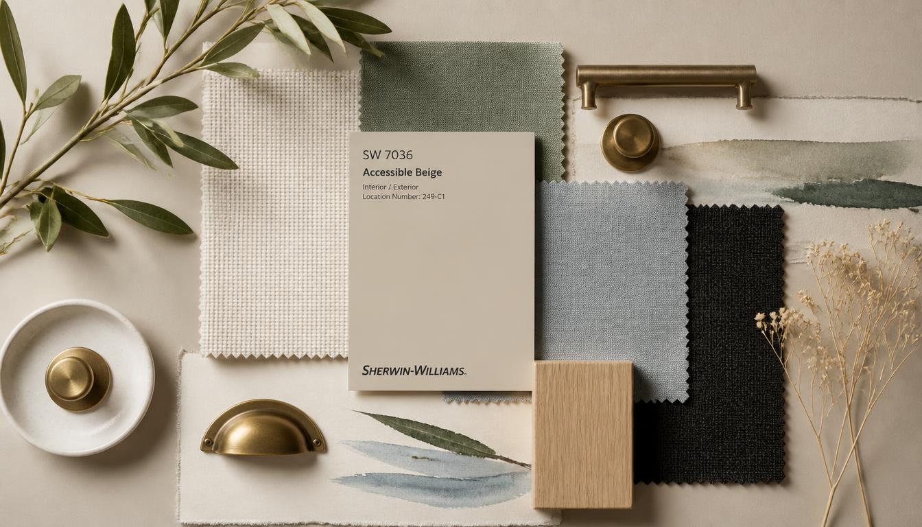
The Direct Answer: What Colors Go With Sherwin Williams Accessible Beige
If you are asking what colors go with Sherwin Williams Accessible Beige (SW 7036, #D1C7B8), the short answer is: warm, clean whites such as Alabaster (#EDEAE0) for trim; soft, green-tinged neutrals like Sea Salt (#CAD8C9) for spa-like rooms; moody blue-grays like Stardew (#B5C4D0) for accent walls; graphic blacks like Tricorn Black (#303030) for hardware and window frames; and stepped greiges such as Agreeable Gray (#D4CEC3) for open-plan flow. These are the five partner families that make Accessible Beige look intentional rather than merely beige.
This guide gives you the exact HEX codes, explains why each color flatters SW 7036, and shows you how to deploy them in real rooms — from north-facing bedrooms to south-facing kitchens — without the color drifting green-gray or flat.
Meet the Color: Sherwin Williams Accessible Beige SW 7036
Before you can coordinate, you have to understand what you are coordinating with. Accessible Beige is a warm greige: a color that lives in the narrow corridor between gray and beige, with a slight lean toward green-gray rather than violet-gray.
- HEX: #D1C7B8
- RGB: 209, 199, 184
- LRV (Light Reflectance Value): 58 — a true mid-tone that reflects light without behaving like a white.
- Undertone: warm beige with a subtle green-gray undertone, especially visible under cool LED light.
- Temperature: neutral-to-warm, more overtly beige than Agreeable Gray.
- Personality: the reliable host — inviting, flexible, and more forgiving than either stark white or muddy taupe.
The reason what colors go with Sherwin Williams Accessible Beige is one of the most searched interior-paint questions is that SW 7036 behaves like a chameleon. In warm afternoon sun, it reads as a creamy tan. In cool north light, it can pull surprisingly green-gray. That adaptability is its superpower — and the reason your partner colors need to be chosen with the same undertone awareness.
Color Psychology: What Accessible Beige Communicates
Color psychology operates through association and context. Accessible Beige triggers a specific set of impressions:
- Comfort and calmness — the low saturation and warm base quiet the eye, which is why it dominates living rooms, bedrooms, and entryways.
- Stability and timelessness — beige is rarely trendy, so it reads as a long-term choice rather than a passing statement.
- Flexibility and neutrality — it recedes visually, allowing furniture, art, and textiles to carry the design narrative.
- Welcoming warmth — unlike cooler greiges, Accessible Beige retains a hospitable, sun-bleached quality that flatters skin tones and natural materials.
The practical takeaway: Accessible Beige is a supporting actor. Choose partners that either amplify its warmth or provide a controlled, deliberate contrast.
Coordinating Color 1 — Crisp White: Alabaster SW 7008 #EDEAE0
Alabaster is the most popular trim partner for Accessible Beige, and for good reason. It is a warm white with a faint yellow undertone that shares the same temperature family as SW 7036.
How to use it:
- Trim, ceilings, and doors: Alabaster #EDEAE0
- Wall color: Accessible Beige #D1C7B8
- Floor: warm white oak or natural maple
- Accent metal: brushed brass, champagne bronze, unlacquered brass
Why it works. Alabaster is warm enough that it does not look icy next to Accessible Beige, but it is still light enough to create a clean, architectural edge. The contrast between LRV 58 and LRV 82 is enough to define moulding without the jarring effect of a stark blue-white.
Best for: Whole-house schemes, traditional and transitional homes, real-estate staging, and anyone who wants a soft, neutral envelope that feels finished.
For rooms with dark wood trim, the same principle applies, but the value contrast changes. See our guide on the best wall paint colors for dark wood trim for how to adjust the trim-to-wall ratio when working with espresso or walnut millwork.
Coordinating Color 2 — Soft Gray-Green: Sea Salt SW 6204 #CAD8C9
Sea Salt is a desaturated blue-green that feels like coastal air. Paired with Accessible Beige, it produces a calm, spa-like palette that never competes for attention.
How to use it:
- Primary wall: Accessible Beige #D1C7B8
- Feature wall or bathroom vanity: Sea Salt #CAD8C9
- Trim: Alabaster #EDEAE0
- Deep anchor: Stardew #B5C4D0 or a soft navy at #2E4057
- Textiles: white linen, seagrass, pale blue ceramics
Why it works. Sea Salt and Accessible Beige sit at a similar lightness level, so the transition between them feels seamless rather than abrupt. Both carry a whisper of green, which prevents the blue-green from reading as too cool or minty. The combination is ideal for bathrooms, bedrooms, and laundry rooms where the goal is rest.
Best for: Coastal homes, spa bathrooms, bedrooms, and any open floor plan where you want adjacent rooms to shift gently without clashing.
Coordinating Color 3 — Moody Blue-Gray: Stardew SW 9138 #B5C4D0
Stardew is a sophisticated blue-gray with enough depth to serve as a feature wall, built-in accent, or front-door color. It gives Accessible Beige the contrast it needs to feel layered rather than flat.
How to use it:
- Main walls: Accessible Beige #D1C7B8
- Feature wall or kitchen island: Stardew #B5C4D0
- Trim: Alabaster #EDEAE0
- Hardware: matte black or oil-rubbed bronze
- Flooring: weathered oak or gray-washed wood
Why it works. Stardew introduces a cool temperature that counterbalances the warmth of Accessible Beige. Because it is a muted blue-gray rather than a saturated navy, the contrast is calm, not theatrical. The result is a room that reads tailored and contemporary without losing its warmth.
Best for: Living rooms, dining rooms, offices, front doors, and kitchen islands in transitional or modern homes.
Coordinating Color 4 — Bold Black: Tricorn Black SW 6258 #303030
Tricorn Black is the grounding element that makes an Accessible Beige room feel designed rather than default. Use it in small doses for maximum effect.
How to use it:
- Wall: Accessible Beige #D1C7B8
- Window frames, hardware, light fixtures: Tricorn Black #303030
- Furniture: blackened steel, charcoal leather, matte black cabinetry
- Accent white: Alabaster #EDEAE0 on ceilings and trim
- Warm relief: natural wood, cognac leather, brass
Why it works. Accessible Beige's LRV 58 gives black enough light to read as crisp and graphic. Because Tricorn Black is a neutral black without strong undertones, it does not pull the wall color toward green or purple. It simply adds contrast and definition.
Best for: Modern farmhouses, industrial-transitional spaces, black window frames, and any room that needs a visual anchor.
For another warm-neutral wall that pairs beautifully with black accents, our guide to paint colors that go with honey oak trim shows how to balance black hardware with wood tones that share a similar warmth.
Coordinating Color 5 — Popular Greige: Agreeable Gray SW 7029 #D4CEC3
Agreeable Gray is Accessible Beige's slightly cooler, slightly lighter cousin. Pairing the two is a favorite trick for open floor plans where you want subtle differentiation without a hard color break.
How to use it:
- Living room: Accessible Beige #D1C7B8
- Adjacent dining room or hallway: Agreeable Gray #D4CEC3
- Trim throughout: Alabaster #EDEAE0
- Shared accent: Sea Salt #CAD8C9 or Stardew #B5C4D0
- Flooring: consistent throughout the open plan
Why it works. Accessible Beige is warmer and more beige; Agreeable Gray is slightly cooler and more gray. Used side by side, they create a gentle tonal shift that makes each room feel distinct while preserving the visual continuity open plans require. Both share the same greige family, so there is no temperature clash.
Best for: Open-concept homes, hallways connecting multiple rooms, and anyone who wants a layered neutral scheme.
For a full breakdown of this partner color, see our complete guide on what colors go with Sherwin Williams Agreeable Gray.
Five Complete Palettes Using Accessible Beige
Palette 1 — The Classic Neutral
- Walls: Accessible Beige #D1C7B8
- Trim: Alabaster #EDEAE0
- Accent: Tricorn Black #303030
- Textiles: cream, oatmeal, camel
This is the most universally flattering answer to what colors go with Sherwin Williams Accessible Beige. It is clean, warm, and timeless.
Palette 2 — The Coastal Spa
- Walls: Accessible Beige #D1C7B8
- Accent wall: Sea Salt #CAD8C9
- Trim: Alabaster #EDEAE0
- Deep accent: Stardew #B5C4D0
- Materials: white oak, rattan, brushed nickel
Use this in bathrooms, bedrooms, and anywhere you want a calm, breathy feel.
Palette 3 — The Moody Modern
- Walls: Accessible Beige #D1C7B8
- Feature wall: Stardew #B5C4D0
- Hardware: Tricorn Black #303030
- Trim: Alabaster #EDEAE0
- Materials: concrete, blackened steel, walnut
This palette gives Accessible Beige a contemporary edge without turning cold.
Palette 4 — The Open-Flow Greige
- Living room: Accessible Beige #D1C7B8
- Hallway/dining room: Agreeable Gray #D4CEC3
- Trim: Alabaster #EDEAE0
- Soft accent: Sea Salt #CAD8C9
Best for open-concept homes where you want rooms to feel connected but not identical.
Palette 5 — The Warm Graphic
- Walls: Accessible Beige #D1C7B8
- Window frames and hardware: Tricorn Black #303030
- Accent: warm charcoal at #4A4A4A
- Trim: Alabaster #EDEAE0
- Materials: black metal, warm wood, ivory linen
This is the modern-farmhouse palette: high contrast, warm materials, and crisp edges.
Practical Designer & Homeowner Takeaways
Test in the actual room. Accessible Beige shifts noticeably between warm south light and cool north light. Buy a sample pot and paint a 2-foot square on two walls.
Match the white to the undertone. Avoid stark blue-white with SW 7036; it will make the wall look muddy by contrast. Choose warm whites like Alabaster or Swiss Coffee.
Use black for architecture, not just decoration. Window frames, door hardware, and light fixtures are more powerful than black pillows or vases because they define the structure of the room.
Keep wood tones consistent. Accessible Beige pairs beautifully with white oak, maple, and warm walnut. Avoid very red or very orange woods unless you want an overtly traditional look.
Layer texture before adding more color. Linen, jute, woven leather, and unglazed ceramics add visual interest without competing with the neutral palette.
Follow the 60-30-10 rule. Let Accessible Beige be the 60% dominant color, Alabaster or a partner greige the 30% secondary, and Sea Salt, Stardew, or Tricorn Black the 10% accent.
Color Reference Table
| Item | Color | Hex | Color Name | Psychological Meaning |
|---|---|---|---|---|
| Core Wall | #D1C7B8 | SW 7036 | Accessible Beige | Warmth, calm, flexibility, timeless comfort |
| Trim | #EDEAE0 | SW 7008 | Alabaster | Clean, soft, welcoming, subtle warmth |
| Spa Accent | #CAD8C9 | SW 6204 | Sea Salt | Serenity, coastal ease, restorative calm |
| Moody Accent | #B5C4D0 | SW 9138 | Stardew | Sophistication, depth, quiet confidence |
| Graphic Anchor | #303030 | SW 6258 | Tricorn Black | Definition, drama, modern structure |
| Greige Partner | #D4CEC3 | SW 7029 | Agreeable Gray | Continuity, neutral balance, subtle coolness |
Conclusion: Make Accessible Beige Work for You
Sherwin Williams Accessible Beige is not a statement color — it is a foundation color. The question is never whether it works; it is whether you have given it the right supporting cast. What colors go with Sherwin Williams Accessible Beige? The answer is warm whites, soft blue-greens, moody blue-grays, graphic blacks, and stepped greiges. Together they create rooms that feel intentional, layered, and quietly expensive.
If you are ready to build your own palette around SW 7036, try the Coloracci palette generator. It lets you start from any base color, test coordinating combinations, and export the exact HEX codes for your paint schedule or design system.
Your next move: sample Accessible Beige on the wall, hold up a swatch of Alabaster for trim, and decide whether your room wants the spa softness of Sea Salt or the structured contrast of Tricorn Black. Either way, you are working with one of the most forgiving neutrals in the design world.