A Designer's Guide: What Colors Go With Benjamin Moore Hale Navy?
· Coloracci Team
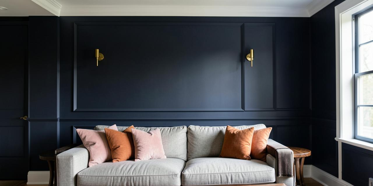
What Colors Go With Benjamin Moore Hale Navy?
If you're asking what colors go with Benjamin Moore Hale Navy, the short answer is: almost everything in the designer's toolkit. Hale Navy (HC-154) is a deep, timeless navy blue with a slight gray undertone—HEX #263445, RGB (38, 52, 69), and a Light Reflectance Value of just 8—which makes it behave less like a color and more like a sophisticated neutral. The crisp whites Chantilly Lace (OC-65, #F0F2EB) and Simply White (OC-117, #F6F5EA) are its classic partners, while warm greiges like Revere Pewter (HC-172, #CBCCC6) soften it, and accents of brass, blush pink, deep green, and terracotta bring it to life. Below is the complete breakdown of the Benjamin Moore HC-154 palette I recommend to clients, with exact HEX codes you can use immediately.
Understanding Hale Navy: The Neutral Navy
Before choosing Hale Navy coordinating colors, you need to understand what makes this paint so adaptable. Most navies lean heavily blue—sometimes almost purple under artificial light. Hale Navy's gray undertone mutes that saturation, producing a navy that reads as grounded and architectural rather than loud.
Three properties define how it behaves in a room:
| Property | Value | Design Implication |
|---|---|---|
| HEX | #263445 | Deep blue-gray anchor color |
| RGB | 38, 52, 69 | More red than pure navy—adds subtle warmth |
| LRV | 8 | Absorbs 92% of light; demands contrast |
| Undertone | Gray | Pairs with both warm and cool palettes |
That LRV of 8 is the critical number. Hale Navy swallows light, so every successful palette built around it includes deliberate contrast—either through light-reflecting whites, warm metallics, or strategically placed saturated accents. If you're exploring how deep blues shape a room's mood, my analysis of the psychology of blue in design explains why this color family dominates trust-driven spaces.
The Psychology of Hale Navy
Hale Navy carries the psychological weight of the entire blue family, concentrated into its most serious expression:
- Sophistication: Dark, desaturated blues signal refinement and intentionality—the reason Hale Navy appears in law offices, libraries, and luxury retail.
- Stability: Navy is the color of uniforms and institutions. On walls and cabinetry, it creates a sense of permanence and security.
- Calm through depth: Rather than the airy calm of pale blue, Hale Navy offers a cocooning, enveloping calm—ideal for bedrooms, dens, and media rooms.
- Versatility of mood: The same color reads nautical beside crisp white, moody beside charcoal, and classic beside warm wood.
This flexibility is why designers treat Hale Navy as a long-term commitment color: it won't feel dated the way trend-driven hues do.
What Colors Go With Benjamin Moore Hale Navy? The Complete Breakdown
Here is every pairing I use professionally, organized by role in the palette.
Crisp Whites: Trim, Ceilings, and Contrast
The best trim color for Hale Navy is a clean, high-LRV white that creates a sharp architectural outline:
| Paint Color | HEX | Character |
|---|---|---|
| Benjamin Moore Chantilly Lace (OC-65) | #F0F2EB | Crisp, cool-neutral white; the sharpest contrast |
| Benjamin Moore Simply White (OC-117) | #F6F5EA | Slightly warmer white; softer, friendlier transition |
Rule of thumb: Choose Chantilly Lace when you want gallery-like crispness (modern, coastal, high-contrast looks). Choose Simply White when the room has warm wood floors or brass hardware and you want the trim to echo that warmth.
Warm Grays and Greiges: The Softening Layer
For adjacent walls, upholstery, and rugs, warm greiges prevent the navy from feeling cold:
| Paint Color | HEX | Character |
|---|---|---|
| Benjamin Moore Revere Pewter (HC-172) | #CBCCC6 | Warm greige; adds earthiness and warmth |
| Benjamin Moore Classic Gray (OC-23) | #DDDBD9 | Pale warm gray; keeps rooms airy beside the navy |
Revere Pewter is particularly reliable—its greige warmth balances Hale Navy's cool depth without competing. If you love that warm-neutral register, see how the same logic applies in my guide to what colors go with Sherwin Williams Agreeable Gray, the Sherwin-Williams counterpart to this pairing strategy.
Contrasting Accent Colors: Where Hale Navy Comes Alive
| Accent | Example | HEX | Effect |
|---|---|---|---|
| Warm metallics | Brass, gold, copper hardware | — | Instant luxury; warms the cool navy |
| Soft pink/blush | Benjamin Moore First Light (2102-70) | #F2E0DE | Elegant, surprising, romantic contrast |
| Deep green | Benjamin Moore Narragansett Green (HC-157) | #4C5955 | Rich, analogous, library-like depth |
| Coral/terracotta | Benjamin Moore Coral Gables (2010-40) | #E48B79 | Vibrant complementary pop; energizing |
Blush pink against Hale Navy is the pairing clients resist until they see it—the cool depth of #263445 makes #F2E0DE read as sophisticated rather than sweet. Coral Gables works on the opposite principle: maximum complementary energy for spaces that need life, like powder rooms and entryways.
The Complete Data Table: Hale Navy Coordinating Colors
| Item | Color | Hex | Color Name | Psychological Meaning |
|---|---|---|---|---|
| Core | Navy Blue | #263445 | Hale Navy HC-154 | Sophistication, stability, calm |
| Trim | White | #F0F2EB | Chantilly Lace OC-65 | Clarity, crispness, order |
| Trim | Warm White | #F6F5EA | Simply White OC-117 | Warmth, welcome, softness |
| Softening | Greige | #CBCCC6 | Revere Pewter HC-172 | Balance, comfort, earthiness |
| Softening | Pale Gray | #DDDBD9 | Classic Gray OC-23 | Airiness, subtlety, calm |
| Accent | Blush Pink | #F2E0DE | First Light 2102-70 | Elegance, romance, surprise |
| Accent | Deep Green | #4C5955 | Narragansett Green HC-157 | Richness, nature, gravitas |
| Accent | Coral | #E48B79 | Coral Gables 2010-40 | Energy, warmth, optimism |
Four Designer Palettes Built on Hale Navy
Palette 1: Classic Coastal Hale Navy #263445 + Chantilly Lace #F0F2EB + Classic Gray #DDDBD9 + natural linen + brushed nickel. The timeless nautical register—crisp, breezy, never kitschy.
Palette 2: Warm Transitional Hale Navy #263445 + Simply White #F6F5EA + Revere Pewter #CBCCC6 + brass hardware + walnut wood tones. The most livable scheme; works in kitchens, living rooms, and whole homes.
Palette 3: Romantic Modern Hale Navy #263445 + First Light #F2E0DE + Chantilly Lace #F0F2EB + gold accents + velvet textures. Bedrooms and dining rooms where elegance is the goal.
Palette 4: Dark Academia Hale Navy #263445 + Narragansett Green #4C5955 + leather browns + aged brass + low warm lighting. Studies, libraries, and home offices with serious character.
Where to Use Hale Navy: Real-World Applications
Kitchen Cabinets: Hale Navy lower cabinets with white uppers (or open shelving) is one of the most enduring kitchen moves of the past decade. Pair with brass pulls and Simply White walls.
Accent Walls: A single Hale Navy wall behind a bed or sofa anchors a room without darkening it entirely. Keep the remaining walls in Classic Gray or Simply White to protect light levels.
Home Offices: Navy's association with focus and stability makes Hale Navy a top home-office choice. Add a warm desk lamp (2700K) to keep the LRV-8 walls from feeling cave-like on video calls.
Exteriors: On siding or front doors, Hale Navy reads as stately rather than stark. White trim (Chantilly Lace) and natural wood accents complete the curb appeal.
Dark Wood Pairings: Hale Navy is one of the few paint colors that genuinely flatters espresso and walnut millwork—the gray undertone bridges the warm wood and the cool wall. For the full strategy, see my guide to the best wall paint colors for dark wood trim.
Practical Designer Takeaways
- Respect the LRV: At LRV 8, Hale Navy needs either abundant natural light or layered artificial lighting (ambient + task + accent). Never rely on a single ceiling fixture.
- Test at night: The gray undertone emerges under warm evening bulbs. Sample the color and view it at 8 PM before committing.
- Mind the finish: Use matte or eggshell on walls for a velvety depth; satin or semi-gloss on cabinets and trim for durability and subtle light bounce.
- Two-coat minimum: Deep navies show lap marks; budget for two full coats plus cutting in.
- Anchor with metals: If the room feels cold, brass or copper hardware is the fastest fix—warm metal against #263445 is a guaranteed elevation.
Conclusion: Build Your Hale Navy Palette
What colors go with Benjamin Moore Hale Navy? Crisp whites like Chantilly Lace #F0F2EB for contrast, warm greiges like Revere Pewter #CBCCC6 for softness, and accents from blush #F2E0DE to coral #E48B79 for personality. The gray undertone in #263445 is what makes all of these relationships work—it's the rare dark paint that functions as a neutral.
Ready to combine these colors into a shareable palette? Try the free Coloracci palette generator —drop in #263445 and generate harmonious combinations, check contrast ratios, and export your scheme in seconds.