Tennis Court Colors & Player Performance: The Visibility, Psychology, and Design Science
· Coloracci
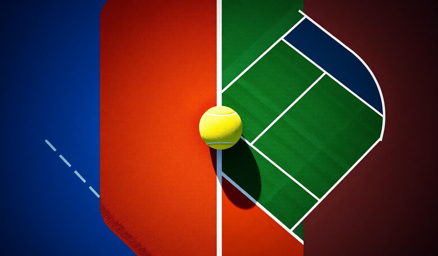
Few design decisions look as innocent as picking a color for the ground — and almost none have a bigger impact on elite athletic performance. Tennis court colors are not aesthetic choices. They are visibility systems, psychological cues, and broadcast tools engineered around a single fast-moving object: an optic-yellow ball traveling up to 160 mph. From the cerulean blues of the US Open and Australian Open to the burnt clay of Roland-Garros and the living grass of Wimbledon, every Grand Slam court is a case study in how color shapes reaction time, focus, and emotion.
This is a designer's companion guide to those decisions. For the full hex breakdown of each tournament's identity, see our pillar post on tennis Grand Slam court colors. Here, we go deeper into the why — the perceptual science, color psychology, and translatable lessons you can steal for your next UI, brand, or environment.
Why Tennis Court Colors Are a Masterclass in Functional Color Design
Most "color choices" in branding are aspirational. Tennis court colors are different: they must satisfy four hard constraints simultaneously — broadcast legibility (4K and HDR cameras), in-stadium visibility, athlete eye comfort over 5-hour matches, and the brand identity of a 100+ year-old tournament. When a discipline forces color to do this much work, it stops being decoration and becomes infrastructure.
The fundamental problem every tennis court color solves is contrast against the ball. Optic yellow tennis balls (around #CCFF00) sit in a narrow band of the visible spectrum that the human eye resolves faster than almost any other hue. Pick a court color that fights that yellow — pure white, lemon, lime — and you blur reaction time. Pick a color that pushes the yellow forward — deep blue, terracotta, dark green — and the ball pops with almost stereoscopic depth.
The Four Grand Slam Court Color Systems — Exact Hex Codes
Each Grand Slam has converged on a different solution to the same visibility problem. The result is one of the most distinctive color systems in global sport.
US Open: Highland Green + DecoTurf Blue
The US Open's iconic two-tone hard court pairs a saturated court blue (approximately #1E8FD5) inside the lines with a deeper Highland Green (around #4A6E3F) in the run-off. The blue dramatically increases ball contrast under stadium lighting, while the green run-off reduces glare and gives umpires a clear visual boundary. Adopted in 2005 after decades of green-on-green, the switch was made specifically for television clarity — the blue reads more vividly on HD broadcasts.
Australian Open: Plexicushion Blue
The Australian Open uses a brighter, more saturated Plexicushion blue (around #0B6FB8) with lighter blue run-off zones. The choice is deliberately cool — the tournament plays in Melbourne's January heat, where warm court colors would amplify perceived temperature. Blue is psychologically cooling, and in interviews players consistently describe the surface as feeling less oppressive than red or green courts in extreme heat.
Roland-Garros (French Open): Crushed-Brick Clay
Roland-Garros is the only Grand Slam played on natural crushed-brick clay. The signature color — somewhere between burnt sienna and terracotta (approximately #B06500) — is not painted; it's the natural pigment of crushed red brick layered over limestone. The orange-on-yellow contrast is technically complementary on the color wheel, which means the ball appears to shimmer against the court in a way no painted surface can replicate. It's also why clay matches feel more visually warm and emotionally intense on broadcast.
Wimbledon: Living Grass + Royal Purple
Wimbledon's emerald grass (around #228B22 when freshly cut) is paired with the famous All England Club purple (#552D60) and green livery — one of the most disciplined two-color brand systems in sport. Grass provides moderate ball contrast (worse than blue, better than clay-on-yellow), but the trade-off is heritage. Wimbledon's color identity sells the tournament as tradition rather than spectacle.
The Color Psychology of Each Surface
Court color does more than aid visibility — it shapes the emotional register of the match itself. Color psychology research consistently links specific hues to distinct cognitive and emotional responses, and tennis is one of the cleanest natural experiments we have.
Blue: Calm Under Pressure
Blue is the most studied "calming" color in environmental psychology. It lowers perceived arousal, slows heart rate response, and is consistently associated with focus and mental clarity. The US Open and Australian Open's blue courts create matches that look composed even when they're not — a visual ceiling on perceived chaos. For designers, this is the lesson: when your environment needs to support high-cognitive-load work (dashboards, productivity tools, financial apps), blue is doing work no other color can.
Red and Orange: Energy and Aggression
Roland-Garros's clay reads as red-orange, and red is one of the most stimulating colors in the perceptual spectrum — it raises heart rate, increases urgency, and is linked in research to competitive aggression. The five-set marathons of the French Open feel different in part because the surface itself is psychologically warmer. The takeaway for designers: if you need urgency, conversion pressure, or emotional intensity, the clay-court palette is your template (see our deep-dive on military uniform colors for another high-stakes use of warm reds).
Green: Concentration and the Natural World
Grass and green hard courts are linked to focus, restoration, and what environmental psychologists call soft fascination — the kind of low-effort attention that reduces mental fatigue. Wimbledon's grass is the most "restorative" surface in the Slams. But green also has a problem: under direct sun, mid-green wavelengths cause more eye strain than deeper colors, which is part of why hard-court tournaments moved away from green-on-green in the 2000s.
Gray and Modern Neutrals
Many modern recreational and ATP-500 courts are shifting toward graphite gray (around #4B5560) for the same reason: it reduces glare in sunny climates, provides excellent ball contrast, and reads as contemporary rather than traditional. Gray courts are the "Scandinavian minimalism" of tennis design — a deliberate retreat from emotional signaling toward pure functional clarity.
The Hidden Variable: Ball Contrast as a Performance Metric
The deepest insight tennis court colors offer designers is this: contrast is a performance metric, not a stylistic one. Research on athlete visual tracking shows reaction time is directly proportional to figure-ground contrast. The same principle drives WCAG accessibility guidelines, financial-app readability rules, and motion-graphics legibility.
If you want to feel this in your own work, run any UI through our color contrast checker and treat the result as a reaction time score, not a compliance checkbox. The Grand Slam designers do exactly that — every season's surface is tested against current broadcast cameras and ball color, and the hex codes are tuned within a 5–10 unit range. Color decisions, formalized as data.
Patterns: What the Color Choices Reveal
Looking across all four Slams reveals three structural patterns:
- Two-tone systems beat single tones. Every modern Slam pairs an in-court color with a contrasting run-off — this creates a built-in visual boundary that helps both players and viewers parse the action faster.
- Cool colors dominate hard courts. Blue won the broadcast era because it pushes optic-yellow forward and reduces perceived stadium heat. The same color logic that powers fintech UIs (see our blue and trust analysis) powers Grand Slam court design.
- Heritage surfaces (grass, clay) trade visibility for identity. Wimbledon and Roland-Garros sacrifice some ball contrast for cultural distinctiveness — proof that brand value can override pure functional optimization.
Designer Takeaways: Stealing the Grand Slam Palette
The Grand Slam color system is one of the world's best, freely accessible case studies in functional palette design. Five things you can apply directly:
- Pick a "ball" first, then a "court." Identify the single most important element in your interface — the call-to-action, the focal headline, the data point that must be tracked — and choose its color first. Then design the surrounding environment to maximize contrast against it.
- Use complementary pairs for tracking tasks. If users need to follow something fast (live data, animation, motion graphics), pair the moving element with its color-wheel complement — exactly what crushed-brick clay does for an optic-yellow ball.
- Treat run-off zones as part of the system. The US Open uses Highland Green specifically to frame the blue court without competing with it. Your secondary surfaces — sidebars, footers, modal scrims — should do the same. They are not decoration; they are the visual run-off that makes the main content legible.
- Match color temperature to user state. Blue calms, red activates, green restores. If your product is used in high-stress moments (medical, financial, productivity), bias cool. If you need urgency (e-commerce, gaming, fitness), bias warm. The Slams have run this experiment for you.
- Test contrast as a performance metric. Don't ship a palette until you've measured it the way Grand Slam organizers measure their courts — under the actual conditions of use, against the actual element users need to track.
Data Table: Grand Slam Court Color System
| Tournament | Primary Court Color | Hex Code | Color Name | Psychological Meaning |
|---|---|---|---|---|
| US Open (Hard) | Court Blue | #1E8FD5 |
DecoTurf Blue | Calm focus, broadcast clarity, mental composure |
| US Open (Run-off) | Highland Green | #4A6E3F |
Highland Green | Grounded boundary, reduced peripheral glare |
| Australian Open | Plexicushion Blue | #0B6FB8 |
Curious Blue / Deep Aqua | Cooling under heat, mental clarity, stress reduction |
| Roland-Garros | Crushed-Brick Clay | #B06500 |
Traditional Coral / Dark Coral | Energy, intensity, urgency, competitive aggression |
| Wimbledon (Grass) | Living Grass | #228B22 |
Traditional Green | Concentration, restoration, natural calm, tradition |
| Wimbledon (Trim) | All England Purple | #552D60 |
Royal Purple | Heritage, authority, prestige |
| Modern / Neutral | Graphite Gray | #4B5560 |
Graphite | Harmony, balance, low-glare functionality |
| The Ball (Reference) | Optic Yellow | #CCFF00 |
Optic Yellow | The unspoken third color every court is designed around |
Related Reading
The Grand Slam court palette is part of a broader pattern in high-performance color design. For more on how elite sport and high-stakes environments use color as functional infrastructure, see:
- F1 team colors: hex codes and livery psychology — another sport where color is engineered for broadcast and speed.
- Military uniform colors — when color decisions are literally a matter of survival.
- Tennis Grand Slam court colors: full hex breakdown — our pillar post with the complete color identity of each tournament.
Conclusion: Color as Performance Infrastructure
The Grand Slams have spent a century quietly proving that color is not decoration — it's infrastructure. Every blue court, every clay surface, every grass tradition is a deliberate decision about how human attention, emotion, and reaction time should be shaped. When you next pick a primary color for a product, treat it the way a Grand Slam organizer treats a court: choose the single most important element first, design contrast around it, and measure the result as a performance number, not a vibe.
Ready to build your own performance-grade palette? Try the Coloracci AI palette generator to extract, analyze, and refine color systems engineered around the element that matters most in your design — your version of optic yellow.