Tennis Grand Slam Court Colors: Hex Codes, Design & Color Psychology
· Coloracci
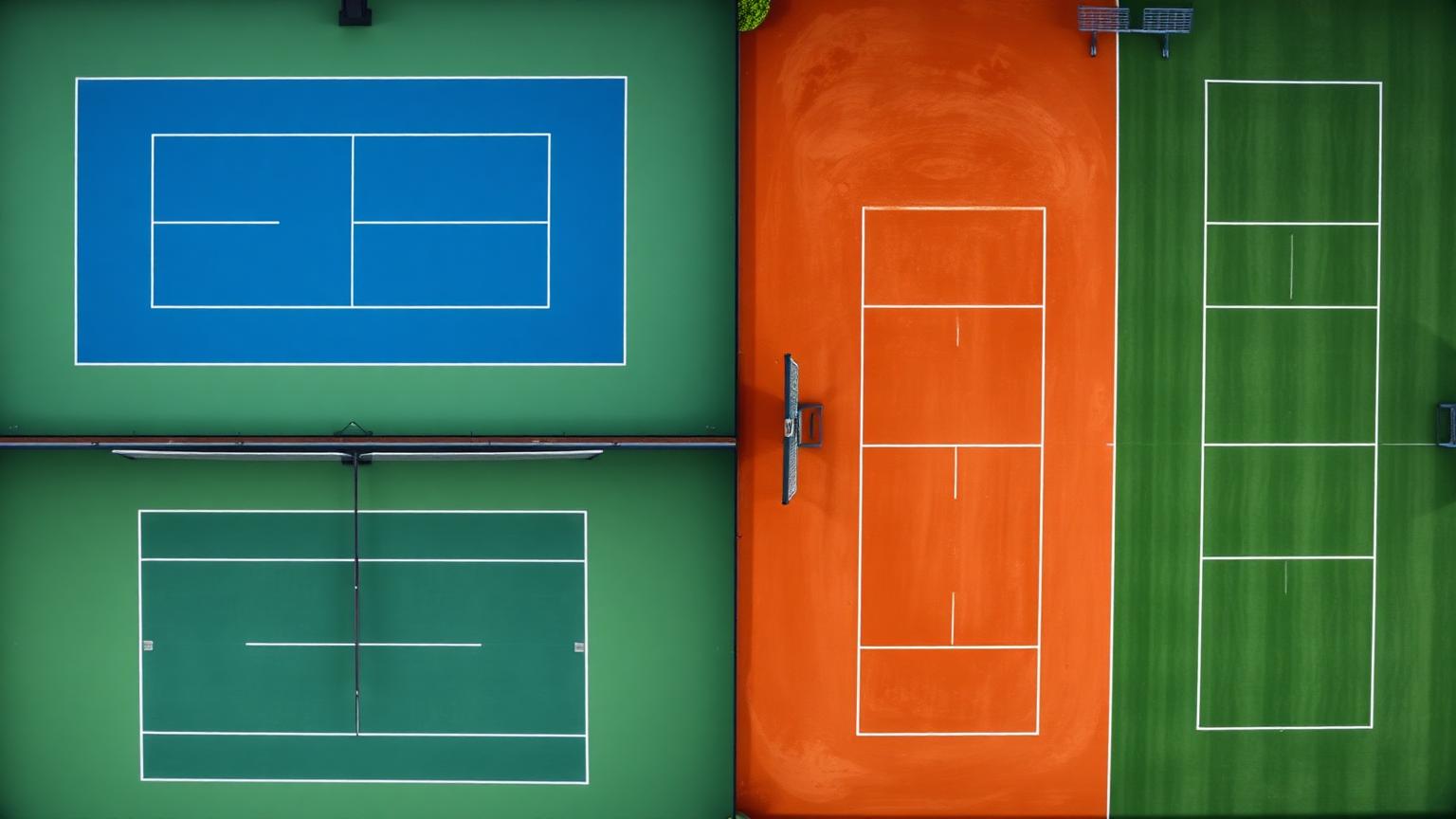
Why Tennis Grand Slam Court Colors Matter to Designers
Few color systems are watched more closely — by literally hundreds of millions of eyes per match — than the surfaces of tennis's four Grand Slam tournaments. The Tennis Grand Slam Court Colors are not aesthetic accidents. They are the result of decades of optical engineering, broadcast science, surface chemistry, and brand strategy. Each Slam uses color to telegraph an entire identity: tradition, modernity, heritage, or precision.
Want to reproduce these court surfaces in print or merchandise? Run any of the hex codes below through our Pantone color finder.
For designers, color analysts, and brand strategists, these four palettes form one of the most disciplined color case studies in global sport. The blue of the US Open, the cobalt of Melbourne, the burnt clay of Roland-Garros, and the verdant green of Wimbledon are instantly recognizable — even at a thumbnail's glance. That is the holy grail of color branding: instant recognition without a logo in sight.
In this in-depth analysis, we'll dissect every Grand Slam surface with exact hex codes, decode the psychology behind each palette, and translate the lessons into actionable design principles you can apply to web design, branding, packaging, and product UX.
The Complete Grand Slam Court Palette
Each of the four Grand Slams uses a tightly controlled, two-color (or three-color) court system: a primary playing surface and a contrasting surround. Below is the full palette breakdown with exact hex codes.
US Open — Blue Hard Court (Flushing Meadows)
In 2005, the US Open made one of the most consequential color decisions in sports broadcasting history: it abandoned its traditional all-green hard court and adopted a vivid blue playing surface, surrounded by a green run-off. The change was driven by visibility — both for players tracking the optic-yellow ball and for television audiences watching in HD.
- US Open Blue (#1E8FD5) — Sometimes called Tennis Court Blue. RGB (30, 143, 213). A bright, slightly desaturated cerulean that sits squarely in the high-visibility band of human vision. It produces maximum contrast with the standard yellow tennis ball (#CCFF00 family), making the ball appear to "pop" off the surface in both daylight and stadium lighting.
- Highland Green (#6C935C) — RGB (108, 147, 92). A muted, slightly olive green used for the run-off area surrounding the court. The desaturation is intentional: it frames the action without competing with the blue playing surface.
The combination is a classic complementary-adjacent pairing — blue and green sit next to each other on the wheel, but the high contrast in lightness and the cool-vs-warm balance creates dynamic tension that reads beautifully on camera.
Australian Open — Plexicushion Blue (Melbourne Park)
The Australian Open is the most aesthetically modern of the four Slams. Played on a Plexicushion acrylic surface, its court palette deliberately mirrors the US Open blue family — but with a slightly cooler, more saturated edge, and a stronger contrast between the inside court and the surround.
- AO Cobalt Blue (#1E8FD5) — Visually near-identical to US Open Blue. Engineered for high-definition broadcast, this blue maximizes ball-tracking accuracy for line judges, Hawk-Eye review systems, and home viewers alike.
- Melbourne Green (#0F4D2A) — A deep, forest-leaning green for the surround. The deeper, more saturated green creates a stronger visual frame than the US Open's softer Highland Green.
The Australian Open's color strategy is unapologetically modern: high contrast, high saturation, optimized for screens. It is the closest a tennis court has come to feeling like a deliberate piece of digital design.
French Open — Roland-Garros Red Clay
The French Open is the only Grand Slam played on natural clay — specifically, crushed brick layered over limestone. The result is one of the most romantic and instantly recognizable surfaces in sport: a warm, earthy red-orange that has barely changed in over a century.
- Roland-Garros Clay (#B06500) — RGB (176, 101, 0). A burnt terracotta orange. Real Roland-Garros clay shifts subtly through the day as players slide and the surface dries — but the brand approximation lives in this warm, slightly desaturated burnt-orange band.
- Parisian Green (#1A4D2E) — A deep, classic forest green used on signage, tarpaulins, ball boy/girl uniforms, and the surrounding trim. The green-on-clay pairing is one of the most iconic complementary palettes in all of sport.
This is a textbook complementary palette — orange and green sit directly opposite on the color wheel — but executed with restrained saturation so it reads as elegant heritage rather than carnival.
Wimbledon — Pure Grass (All England Club)
Wimbledon is the oldest and most traditional Grand Slam. Played on natural rye grass cut to exactly 8mm, the court is a living surface that changes hue across the fortnight — beginning lush emerald and ending the championship as a sun-baked, worn olive.
- Wimbledon Grass (#228B22) — Classic forest green. RGB (34, 139, 34). The richest, most saturated natural green of any Slam.
- Royal Wimbledon Purple (#552D60) — Paired with green throughout the All England Club's identity, from scoreboards to umpire jackets to merchandise.
Wimbledon's identity is rooted in green and purple — a complementary pair that signals royalty, tradition, and exclusivity. Few sporting brands have committed so strictly to a two-color identity for so long.
Patterns & Analysis: What the Color Choices Reveal
Look at all four Slams side by side and three patterns emerge.
1. Two Slams chose visibility. Two chose heritage.
The US Open and Australian Open — both played on engineered hard courts — were free to choose any color. They both chose blue, and they both chose nearly the same blue (#1E8FD5). That is not coincidence. It is broadcast science. Blue maximizes contrast against the yellow ball, reduces eye fatigue for viewers across multi-hour matches, and reads cleanly on every screen size from phone to stadium jumbotron.
The French Open and Wimbledon chose tradition. Their colors are dictated by the natural materials of their surfaces — clay and grass. They could have switched. They chose not to, because the color is the brand.
2. Every Slam uses a complementary or near-complementary pair.
- US Open: Blue + green-yellow surround
- Australian Open: Blue + deep green surround
- French Open: Burnt orange + forest green
- Wimbledon: Forest green + royal purple
Three out of four use a green/blue–vs–warm pairing. This isn't aesthetic accident — complementary palettes maximize visual energy and recall. They're also some of the easiest palettes for the human eye to parse at speed, which matters when a ball is traveling at 130 mph.
3. The ball is the third color.
Every Grand Slam court is designed around an unspoken third color: optic yellow (Wilson/Penn ball ≈ #CCFF00). The court palettes are essentially backdrops engineered to make that single yellow dot maximally legible. It's a masterclass in designing for a focal element — the entire system bends around the smallest object on the field.
Color Psychology: What Each Palette Communicates
Each Grand Slam palette is a deliberate emotional statement. Here is how they decode psychologically.
Blue (US Open & Australian Open)
Blue is the world's most universally preferred color. It signals trust, calm, focus, professionalism, and modernity. In a sporting context, a blue court reads as:
- Engineered, not natural — these are precision events, not garden parties
- Modern and forward-looking — both Slams reinvented their identity in the modern broadcast era
- Calm under pressure — blue lowers heart rate and is associated with composure
- High-tech and global — blue is the dominant color in tech branding (Facebook, IBM, Intel, PayPal) for the same reason
Read more on this in our deep dive on the Psychology of Blue in Design.
Burnt Orange / Clay (French Open)
The Roland-Garros clay communicates heritage, earthiness, romance, and slow craft. Burnt orange is rare in sports branding precisely because it's hard to use without looking dated — but on a Parisian summer afternoon, it reads as warm, sophisticated, and unmistakably European.
- Earthy and natural — connects the sport to its agrarian, European roots
- Slow and tactical — clay slows the ball down; the color reinforces the feeling of long, attritional rallies
- Romantic and artisan — the only Slam where the surface is literally swept by hand between sets
Grass Green & Royal Purple (Wimbledon)
Green and purple together is one of the oldest "royal" pairings in heraldry. Wimbledon weaponizes this:
- Green signals tradition, growth, and harmony with nature
- Purple signals royalty, exclusivity, and ceremony
- Together they say: this is the championship that takes itself most seriously
No accident that Wimbledon enforces an all-white player dress code on top of this palette. The chromatic restraint is part of the brand.
Designer Takeaways: Stealing From the Grand Slams
Here is how to translate Grand Slam court color logic into your own design work.
Takeaway 1: Design around your focal element
The single most powerful lesson from tennis courts is design the background to serve the foreground. The court palette exists to make a 6.7 cm yellow ball maximally visible. In your work:
- Picking a CTA button color? Design your hero section's background to make it pop.
- Designing a product card grid? Pick a neutral that maximizes contrast with the product photography.
- Building a dashboard? Choose a base UI color that lets data visualizations stand out.
This is the same principle as our Color Theory Basics guide — the focal element rules the palette, not the other way around.
Takeaway 2: Use complementary pairs, but desaturate them
Pure complementary palettes (#FF0000 vs #00FF00) vibrate uncomfortably. Every Grand Slam softens its complementary pair through desaturation. The US Open uses a softened green next to a softened blue. The French Open uses burnt orange — not pure orange — next to deep green.
Rule of thumb: when using complementary colors, drop the saturation of at least one (ideally both) by 20–40%. The result is energetic but elegant.
Takeaway 3: Own a two-color identity
Wimbledon has owned green-and-purple for over 100 years. UPS owns brown. Tiffany owns blue. Coca-Cola owns red. Two-color brand identities outperform three-color identities for recall because the human brain encodes color pairs more efficiently than triplets.
If you are building a brand, resist the temptation to have a "primary, secondary, accent, neutral, dark mode, light mode" 12-color system at launch. Pick two. Commit. Expand later.
Takeaway 4: Let the surface communicate the experience
A clay court tells you the rallies will be long. A grass court tells you the points will be short. A blue hard court tells you the experience will be modern and fast. Your color palette should communicate your product's experience before a single word is read.
- A meditation app should not be neon
- A fintech challenger bank should not be beige
- A children's brand should not be navy and gray
Takeaway 5: Consider the broadcast context (i.e., the screen)
The US Open switched to blue in 2005 specifically because of HD television. Today, your "broadcast context" is mobile screens, retina displays, OLED phones, and dark mode. Test your palette across screens before you ship. Colors that look beautiful on a calibrated 5K monitor often look muddy or oversaturated on a phone.
Data Table: Tennis Grand Slam Court Colors at a Glance
| Tournament | Surface | Primary Color | Hex Code | Color Name | Psychological Meaning |
|---|---|---|---|---|---|
| US Open | Hard (DecoTurf) | Blue | #1E8FD5 | US Open Blue | Modernity, trust, broadcast precision |
| US Open | Run-off | Green | #6C935C | Highland Green | Calm, framing, natural balance |
| Australian Open | Hard (Plexicushion) | Blue | #1E8FD5 | AO Cobalt Blue | High-tech identity, focus, clarity |
| Australian Open | Surround | Deep Green | #0F4D2A | Melbourne Green | Stability, contrast, bold framing |
| French Open | Clay | Burnt Orange | #B06500 | Roland-Garros Clay | Heritage, earthiness, slow craft |
| French Open | Trim | Forest Green | #1A4D2E | Parisian Green | Tradition, sophistication, balance |
| Wimbledon | Grass | Forest Green | #228B22 | Wimbledon Grass | Tradition, growth, harmony |
| Wimbledon | Brand | Royal Purple | #552D60 | Royal Wimbledon Purple | Royalty, exclusivity, ceremony |
Conclusion: Four Palettes, One Lesson
The Tennis Grand Slam Court Colors prove that great color design is never decoration. It is broadcast strategy, brand strategy, psychological strategy, and material strategy fused into a single decision. Whether your canvas is a 23-meter rectangle in Queens or a 1440-pixel landing page, the principles are identical: design around your focal element, commit to a tight palette, balance complementary tension with desaturation, and let your color communicate the experience before a word is read.
The next time you watch Roland-Garros sweep its clay between sets, or the Australian Open glow cobalt under stadium lights, look past the players. Look at the palette. There is a masterclass running underneath every match.
Build Your Own Grand Slam Palette
Inspired? Generate your own broadcast-ready, complementary, or heritage-style palette in seconds with Coloracci's AI-powered tools.
- 🎾 Create a custom palette — generate a Grand Slam-inspired palette with one click
- 🎨 Explore Coloracci's full toolkit — palette generators, contrast checkers, and AI color analysis
- 🧠 Read the Color Psychology Guide — the complete reference for emotional color design
- 📚 Master Color Theory Basics — fundamentals every designer should know
Pick your blue. Pick your clay. Pick your grass. Then build the most recognizable two-color brand in your category.