Slack Brand Colors: Hex Codes — Aubergine #4A154B & Full Palette
· Coloracci Team
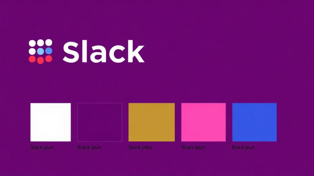
Slack's official colors are Aubergine #4A154B plus the four logo hues: blue #36C5F0, green #2EB67D, yellow #ECB22E and red #E01E5A. The purple was a deliberate rejection of corporate blue — friendly where enterprise software is formal. Full palette values and usage guidelines below.
The Anti-Corporate Workplace Brand
In a world where workplace tools were defined by Microsoft's blues and Google's primary colors, Slack arrived with an audacious color choice: aubergine (#4A154B) — a deep purple that no enterprise software had dared use before. Combined with four vibrant accent colors, Slack's palette declared that work tools didn't have to feel like work.
This deliberate rejection of corporate blue became Slack's strongest brand signal, communicating that this was a different kind of workplace platform — and a clear case study in why selecting the right color palette is one of the most important brand decisions.
The Exact Slack Brand Color Palette
| Color Name | Hex Code | RGB | Primary Usage |
|---|---|---|---|
| Aubergine | #4A154B | 74, 21, 75 | Sidebar, primary brand |
| Blue | #36C5F0 | 54, 197, 240 | Logo accent, links |
| Green | #2EB67D | 46, 182, 125 | Logo accent, online status |
| Yellow | #ECB22E | 236, 178, 46 | Logo accent, notifications |
| Red | #E01E5A | 224, 30, 90 | Logo accent, mentions, alerts |
| White | #FFFFFF | 255, 255, 255 | Content areas, text backgrounds |
Aubergine: The Color Nobody Expected
Slack's most revolutionary color choice is its primary sidebar color — a deep, rich purple called "aubergine." In the context of enterprise software, this was radical:
Why Aubergine Works
- Instant differentiation — No competitor uses anything close to this color, making Slack immediately recognizable
- Purple's psychology — Purple communicates creativity, imagination, and premium quality
- Warm darkness — Unlike cold grays or blues, aubergine creates a warm, inviting workspace
- Content focus — The dark sidebar pushes attention toward the lighter content area
- Personality — Aubergine feels more human and less institutional than corporate grays
The Enterprise Purple Problem
Before Slack, purple was essentially absent from enterprise software. The unspoken rule was: serious business tools use blue (trust), gray (professionalism), or green (productivity). Slack broke this rule and proved that workers actually prefer tools with personality.
The 2019 Logo Simplification
Slack's original logo was an 11-color hashtag that, while beloved, created significant practical problems:
The Old Logo Issues
- 11 colors were nearly impossible to reproduce consistently
- The overlapping transparent shapes created different colors depending on the background
- It didn't work well at small sizes (favicons, app icons)
- Print reproduction was unreliable
The New Logo Solution
The 2019 redesign reduced the hashtag to four solid colors (blue, green, yellow, red) plus white, arranged in a pinwheel pattern:
- Fewer colors — 4 instead of 11, dramatically improving consistency
- Solid shapes — No transparency effects, works on any background
- Scalable — Clean geometry that reads at any size
- Maintained personality — Still colorful, still playful, still distinctly Slack
The redesign was initially controversial but proved that simplification doesn't have to mean losing character.
Four Colors = Diversity and Collaboration
Slack's four accent colors aren't arbitrary — they represent core values:
Blue (#36C5F0): Communication
- Connected to channels, messaging, and information flow
- A cooler, more approachable blue than corporate blue (#0000FF)
- Signals openness and transparency
Green (#2EB67D): Productivity
- Used for online status indicators and success states
- Communicates growth, progress, and accomplishment
- A warmer green than typical "success" greens
Yellow (#ECB22E): Creativity
- Highlights, starred messages, and important items
- Signals warmth, ideas, and creative energy
- Functions as a beacon for attention
Red (#E01E5A): Urgency
- Mentions, notifications, and alerts
- Creates appropriate urgency without anxiety
- More pink-toned than aggressive reds, keeping the friendly tone
The Collaborative Message
Together, the four colors represent diversity in collaboration — different colors working together harmoniously, just like team members in a channel. This wasn't just graphic design; it was brand storytelling through color.
Slack Connect and Color Extensions
As Slack expanded beyond internal teams to inter-company collaboration through Slack Connect, the color system evolved:
- External channels use subtle visual differentiation to signal cross-company communication
- Slack Huddles introduced audio-specific color indicators
- Slack Canvas uses the color system for document collaboration
- Workflows use color to indicate automation status
Each new feature maintains the established color language while adding contextual meaning.
Why Slack Avoids Corporate Blue
The most notable absence in Slack's palette is corporate blue — the dominant color in enterprise tech. This was intentional:
The Anti-Blue Strategy
- Blue is boring — Every competitor (Microsoft Teams, Zoom, Salesforce) uses blue
- Blue means hierarchy — Slack's flat, channel-based structure needed a non-hierarchical color
- Blue doesn't spark joy — Slack wanted users to enjoy opening the app, not just tolerate it
- Differentiation is survival — When Microsoft Teams launched as a competitor, Slack's distinctive purple sidebar was its strongest visual differentiator
Slack does use a light cyan-blue (#36C5F0) as an accent, but it's warmer and more playful than the institutional blues of competitors.
Slack vs. Workplace Tool Competitor Colors
| Tool | Primary Color | Hex | Feeling |
|---|---|---|---|
| Slack | Aubergine | #4A154B | Creative, warm, distinctive |
| Microsoft Teams | Blue | #6264A7 | Corporate, familiar, safe |
| Zoom | Blue | #2D8CFF | Bright, approachable, tech |
| Google Workspace | Multicolor | Various | Playful, Google-branded |
| Discord | Blurple | #5865F2 | Gaming, casual, community |
| Notion | Black/White | #000000 | Minimal, flexible, modern |
Color Customization as a Feature
Uniquely among enterprise tools, Slack allows users and organizations to customize their sidebar colors. This feature:
- Empowers brand integration — Companies can match Slack to their brand colors
- Creates ownership — Personalized colors increase emotional attachment
- Reduces monotony — Different workspaces can have different colors, aiding mental context-switching
- Community building — Slack themes became shareable community content
What Designers Can Learn from Slack
Lesson 1: Don't Follow Category Color Conventions
Every enterprise tool was blue before Slack. By choosing aubergine, Slack proved that category conventions are opportunities for differentiation, not rules to follow.
Lesson 2: Multiple Colors Can Tell a Story
Slack's four colors represent collaboration and diversity. Your color palette can communicate values beyond aesthetics.
Lesson 3: Simplification Strengthens
Going from 11 colors to 4 made Slack's brand stronger, not weaker. Audit your palette for colors that can be eliminated.
Lesson 4: Let Users Customize
Offering color customization can increase user engagement and emotional investment in your product.
Practical Tips
- Explore unconventional primary colors for workplace products using Coloracci's AI palette generator
- Use a dark-colored sidebar to create focus and content hierarchy
- Assign meaning to each accent color in your system — don't use colors randomly
- Consider user-customizable color themes to increase engagement
- Test your enterprise palette against competitors — if you look the same, you'll be treated the same
Slack's color strategy proves that in enterprise software, the brand that dares to be different is the brand people remember.