Screen Calibration for Designers: How to Ensure Accurate Colors on Every Display
· Coloracci Team
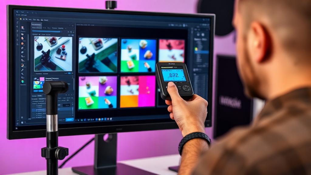
Why Your Monitor Lies to You
Right now, the colors on your screen are probably wrong. Not dramatically—you can still tell red from blue—but subtly wrong in ways that affect every design decision you make.
Out of the box, most monitors prioritize looking "impressive" over looking "accurate." Whites are pushed bluer (cooler) to appear brighter in showroom lighting. Saturation is boosted to make product photos pop. Contrast is cranked up for punchy video.
For design work, this is a problem. If your monitor shows blues as slightly greener than reality, every blue you pick is compensating for that error.
Why Monitors Display Colors Differently
Panel Technology
IPS (In-Plane Switching): Best color accuracy, wide viewing angles, consistent color across the screen. Preferred for design work. Common in Apple displays, EIZO, BenQ designer monitors.
VA (Vertical Alignment): Good contrast ratios but weaker color accuracy at angles. Colors shift when viewed from the side.
TN (Twisted Nematic): Worst color accuracy, significant color shift at angles. Not suitable for color-critical work.
OLED: Excellent color and contrast, but can have slight blue-shift as pixels age differently. Growing in design use with OLED monitors from ASUS and LG.
Manufacturing Variance
Even two identical monitors from the same production batch will display slightly different colors. Each panel has unique characteristics that only calibration can correct.
Backlight Aging
LED backlights change over time. A monitor's color temperature and brightness shift gradually, making annual recalibration essential.
Ambient Light
A monitor in a bright, warm-lit room appears different from the same monitor in a dim, daylight-balanced room. Professional color work requires controlled lighting—ideally D50 (5000K) ambient illumination.
Hardware Calibration Tools
Hardware calibration uses a physical colorimeter placed on your screen to measure actual output and create a correction profile.
Datacolor SpyderX Series
SpyderX Pro (~$170):
- Calibrates one display
- Room light monitoring
- Good for most designers
- Accuracy: ΔE < 1 achievable
SpyderX Elite (~$270):
- Multi-monitor matching
- More target options (video, photography, prepress)
- Ambient light profiling
- Recommended for professionals
X-Rite i1 Series
i1Display Studio (~$250):
- Excellent accuracy
- Works with projectors too
- Adaptive technology for different panel types
- Film and video presets
i1Display Pro Plus (~$350):
- Top-tier accuracy
- Measures ambient light and flare
- Professional-grade for photographers and prepress
- Supports high-brightness HDR displays
Calibrite (formerly X-Rite consumer)
ColorChecker Display (~$190):
- Good all-around calibrator
- Simple workflow
- Works with most software
Calibration Process Step-by-Step
Before Calibrating
- Warm up your monitor for at least 30 minutes
- Clean the screen—dust affects the colorimeter's readings
- Control ambient light—close blinds, dim room lights
- Reset monitor to factory settings (remove any manual adjustments)
Hardware Calibration Workflow
- Launch calibration software (comes with your device)
- Set targets:
- White point: D65 (6500K) for web/general design, D50 (5000K) for print
- Luminance: 120 cd/m² for general use, 80-100 cd/m² for print proofing
- Gamma: 2.2 (standard for sRGB content)
- Attach colorimeter to the screen center
- Run measurement — software displays color patches, colorimeter reads them
- Review results — software shows before/after, delta-E accuracy values
- Save ICC profile — automatically loaded on system startup
Target Settings for Design Work
| Purpose | White Point | Luminance | Gamma |
|---|---|---|---|
| Web design | D65 (6500K) | 120 cd/m² | 2.2 |
| Print proofing | D50 (5000K) | 80-100 cd/m² | 2.2 |
| Photography | D65 | 120 cd/m² | 2.2 |
| Video editing | D65 | 100 cd/m² | 2.4 (BT.1886) |
| General purpose | D65 | 120 cd/m² | 2.2 |
Software Calibration on Mac/Windows
If you can't invest in hardware calibration yet, software calibration is better than nothing.
macOS Built-in Calibration
- System Settings → Displays → Color tab (or search "Calibrate")
- Click Calibrate to launch the Display Calibrator Assistant
- Follow the on-screen steps to adjust white point and gamma
- Save the profile
Limitations: Relies on your eyes, which adapt to what they see. Results are approximate.
Windows Built-in Calibration
- Search for "Calibrate display color" in Windows Settings
- Follow the wizard: gamma, brightness, contrast, color balance
- Save the calibration
Third-Party Software
- DisplayCAL (free, open-source): Works with most colorimeters, extremely detailed options
- CalMAN (professional): Studio-grade calibration software, supports hardware control of professional monitors
Multi-Monitor Color Matching
Design workflows often span multiple displays. Matching them is critical.
Hardware Matching
Most colorimeter software supports multi-monitor calibration:
- Calibrate your primary monitor first (the one you make color decisions on)
- Calibrate secondary monitors to the same targets
- Use the "Match" feature if available—sets both to identical targets
Practical Tips
- Same model monitors: Easiest to match. Buy two of the same if possible.
- Different models: Calibration gets you close, but panel technology differences mean they'll never be perfect
- Brightness matching: This matters more than you think. If one monitor is brighter, colors appear different even if calibrated identically
- Position reference work: Keep color-critical tasks on your best monitor; use the secondary for palettes, code, or reference
When to Recalibrate
Recommended Schedule
- Monthly: For color-critical professional work (photography, print design, brand work)
- Quarterly: For general design work
- After moving: Different ambient lighting may warrant recalibration
- After OS updates: System updates occasionally reset display profiles
Signs You Need Recalibration
- Prints consistently look different from screen
- White backgrounds have a noticeable tint (yellow, blue, or pink)
- Colors look different from what clients or team members see
- Your monitor is over a year old and has never been calibrated
Budget vs Pro Monitors for Color Accuracy
Budget Monitors ($200-$500)
- Can be calibrated to reasonable accuracy
- Usually cover 95-99% sRGB
- Fine for web design
- Limited P3 or Adobe RGB coverage
Mid-Range ($500-$1,000)
- BenQ PD2725U, ASUS ProArt PA278QV
- 95-99% sRGB, some with P3 coverage
- Hardware calibration support
- Good for most professional design
Professional ($1,000-$3,000+)
- EIZO ColorEdge, BenQ SW series, NEC MultiSync PA
- 99%+ Adobe RGB and P3
- Built-in hardware calibration (self-calibrating)
- 10-bit color support
- Factory-calibrated with individual ΔE reports
The Best Investment Priority
- A colorimeter ($170-$350) — transforms any decent monitor
- A good IPS monitor ($500-$1,000) — provides a reliable base
- A professional monitor ($1,000+) — for those whose livelihood depends on color
A calibrated $500 monitor outperforms an uncalibrated $2,000 monitor for color accuracy.
Testing Your Calibration
After calibrating, verify the results:
Visual Tests
- Open a photo with known colors (use a standard reference image)
- Check that neutral grays appear truly neutral—no color cast
- Verify that gradient displays smoothly from dark to light without banding
- Compare a print proof held next to your screen under consistent lighting
Software Tests
- Run your calibration software's verification mode
- Target ΔE (Delta E) under 2.0 for general design, under 1.0 for professional color work
- Check white point accuracy (should be within 100K of target)
Matching Colors Accurately
Accurate screen calibration is the foundation for all color work—whether you're matching colors professionally or ensuring accessibility compliance. Without a calibrated display, every color decision is based on flawed information.
Start with calibration, then use Coloracci's AI tools to explore and define your color palettes with confidence, knowing what you see on screen is what everyone else will see too.