Rust and Chocolate Brown: The Ultimate Color Palette for Warm, Earthy Interiors
· Coloracci Team
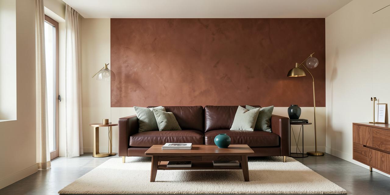
A rust and chocolate brown color palette for interior design creates a room that feels grounded, warm, and sophisticated rather than merely dark. The most successful version pairs a true red-orange rust such as #B7410E with a deep chocolate brown such as #7B3F00, then introduces cream (#FFFDD0) or beige (#F5F5DC) for light, muted sage green (#8F9779) for organic softness, and deep teal (#008080) for controlled contrast. Rust supplies energy; chocolate brown gives that energy a stable architectural foundation.
Both colors originate in the earth: oxidized iron, clay, bark, cacao, leather, and dark timber. Rust advances and attracts attention, while chocolate brown anchors the eye. With disciplined proportions and enough light relief, they create an adaptable warm color palette for every room.
Why a Rust and Chocolate Brown Color Palette for Interior Design Works
Rust is a reddish brown with enough orange to feel animated. Chocolate brown is deeper, quieter, and more structurally stable. Their shared red and yellow ancestry makes them naturally harmonious, but their difference in value—the relative lightness or darkness of a color—creates useful hierarchy.
Think of chocolate brown as the bass line and rust as the melody. Brown can occupy large, weight-bearing elements: a sofa, cabinetry, timber flooring, built-ins, or a headboard. Rust performs best where the eye should travel: an accent wall, upholstery, curtains, art, ceramics, or a tiled backsplash. Cream and beige provide negative space so both saturated colors remain legible.
The result suits several styles. In an industrial interior, rust recalls weathered steel and chocolate echoes leather. In an organic-modern room, both colors connect clean silhouettes to natural materials. In a traditional scheme, chocolate-stained wood and rust textiles feel established and elegant. For a broader foundation in nature-derived schemes, see our earth tone color palette guide.
The Core Colors: Exact HEX Codes and Undertones
Not every rust or brown behaves the same way. The right variation depends on light, material, and the mood you want to create.
Classic Rust — #B7410E
Classic Rust is a strong red-orange brown modeled on iron oxide. It feels energetic, artisanal, and grounded. Because it has considerable chromatic intensity, it is ideal for a feature wall, velvet chair, large artwork, or repeated textile accent. Against chocolate brown, it creates clear separation without leaving the warm family.
Use #B7410E when you want the room to feel confident and autumnal. In cool northern light it may appear slightly browner; in warm western light its orange undertone becomes more visible.
Burnt Orange Rust — #C04000
This variation is brighter and more orange than classic rust. It adds movement and makes a dark room feel more energized, but it should usually occupy less area. Try it on dining chairs, a bench cushion, lamp bases, or a patterned rug rather than every wall.
Because #C04000 is assertive, balance it with plenty of cream and a restrained chocolate base. It is especially effective in mid-century and eclectic interiors where saturated accent colors already belong.
Muted Rose Rust — #9B4444
At #9B4444, rust becomes softer, redder, and slightly dustier. This is the most elegant choice for bedrooms and formal sitting rooms. It pairs beautifully with dark walnut, chocolate velvet, aged brass, and muted sage.
Choose this version when bright orange feels too rustic or energetic. Its softened saturation gives a layered palette more nuance and helps warm schemes feel sophisticated rather than themed.
Deep Chocolate Brown — #7B3F00
The core chocolate brown is rich, warm, and unmistakably earthy. It communicates stability, quality, and comfort. On leather, wood, or painted joinery, #7B3F00 has enough warmth to connect directly with rust while still reading as the darker anchor.
Use it for the 30% secondary layer in a light room or as a smaller architectural accent in spaces with limited daylight. Large areas of chocolate absorb light, so always judge the actual material under the room's daytime and evening illumination.
Cinnamon Chocolate — #D2691E
Commonly recognized as the web color Chocolate, #D2691E is lighter and more orange than a typical dark chocolate. In an interior it reads closer to caramel, cinnamon, or warm saddle leather. It bridges classic rust and deep brown, making transitions feel seamless.
This is an excellent midtone for wood furniture, leather dining chairs, woven baskets, and terracotta. Avoid placing it beside too many other orange-browns of equal intensity; vary value and texture so each surface remains distinct.
Dark Cocoa — #5C2F00
Dark Cocoa is the deepest anchor in the set. It can appear almost espresso in low light and gives a room a tailored, enveloping quality. Use it on cabinetry, bookcases, a kitchen island, or one wall in a well-lit room.
When #5C2F00 occupies a major surface, cream becomes essential. Pale ceilings, light rugs, linen curtains, and reflective warm metals prevent the scheme from becoming visually compressed.
Supporting Colors That Complete the Palette
Cream — #FFFDD0
Cream is more sympathetic than optic white because its yellow undertone belongs to the same warm family. It reflects light, creates breathing room, and makes both rust and chocolate look richer. Use it on walls, ceilings, rugs, or large curtains.
Beige — #F5F5DC
Beige creates a quieter transition between cream and brown. It is useful for upholstery, stone counters, woven shades, and broad textile surfaces. Its restraint allows tactile materials—linen, wool, leather, timber—to carry the visual interest.
Muted Sage Green — #8F9779
Muted sage offers organic balance. Green sits opposite the red family, so it cools rust gently while reinforcing the nature-based character of chocolate brown. At this desaturated value, #8F9779 feels calm rather than botanical or playful.
Deep Teal — #008080
Deep teal creates the strongest contrast. Blue-green is complementary to red-orange rust, making both colors appear more vivid. Use teal sparingly in ceramics, art, a side chair, or small areas of tile. Ten percent—or less—is generally enough.
Rust and Chocolate Brown Color Palette for Interior Design: Four Complete Schemes
1. The Balanced Earthy Living Room
Palette: Cream #FFFDD0 + Deep Chocolate #7B3F00 + Classic Rust #B7410E + Aged Brass
Apply the classic 60-30-10 structure: 60% creamy white walls and rug, 30% chocolate brown leather sofa and wood furniture, and 10% rust pillows, throws, and artwork. This is the safest route to sophisticated living room colors because no single dark shade overwhelms the room.
The sofa becomes the visual anchor, while rust moves around it in at least three small repetitions. Brass or copper adds light without introducing a new color family. If the sofa is already in place, our guide to paint colors that complement a dark brown leather sofa offers additional wall-color options.
2. The Organic Modern Retreat
Palette: Beige #F5F5DC + Muted Rose Rust #9B4444 + Dark Cocoa #5C2F00 + Sage #8F9779
Begin with beige walls, then layer a dark cocoa bed frame or console, muted rust upholstery, and sage linen. Keep forms simple and materials tactile: limewash, oak, wool, boucle, stone, and hand-thrown ceramics. The muted versions of rust and green reduce visual noise, making this palette suitable for bedrooms and quiet reading spaces.
Black can feel unnecessarily sharp here. Choose aged bronze, dark wood, or patinated brass for hardware so transitions remain soft.
3. The Dramatic Teal Contrast
Palette: Cream #FFFDD0 + Chocolate #7B3F00 + Burnt Orange Rust #C04000 + Deep Teal #008080
This is the boldest of the brown and orange color schemes. Keep cream dominant, use chocolate on furniture, and divide the accent allowance between rust and teal. A rust chair opposite a teal ceramic lamp creates complementary tension without turning the room into a two-color theme.
Repeat both accents carefully. A teal vessel can echo a small blue-green detail in artwork; rust upholstery can repeat in a stripe or book spine. The eye then reads a designed rhythm rather than isolated color spots.
4. The Refined Tonal Dining Room
Palette: Cream #FFFDD0 + Dark Cocoa #5C2F00 + Cinnamon Chocolate #D2691E + Muted Rust #9B4444
This tonal palette relies on differences in lightness and material rather than complementary contrast. Use cream above a chair rail, dark cocoa on lower walls or cabinetry, cinnamon leather on dining chairs, and muted rust in curtains or art.
Because the hues are closely related, texture is critical. Matte paint, polished timber, woven linen, glazed ceramic, and brushed metal catch light differently and stop the palette from looking flat.
Real-World Room Applications
Living Room: Leather, Plaster, and Soft Contrast
Start with a chocolate brown leather sofa and place it against a rust-colored plaster or limewash accent wall. A cream wool rug separates the dark furniture from the floor, while beige curtains diffuse daylight. Finish with brass or copper lighting and one muted sage textile to calm the warm intensity.
If the room is small or north-facing, reverse the emphasis: choose cream walls throughout, keep chocolate on the sofa, and restrict rust to portable accents. Dark walls are not forbidden, but they require intentional illumination and reflective relief.
Kitchen: Rich Cabinetry With a Rust Backsplash
Dark chocolate brown cabinets create a substantial, furniture-like base. A rust-colored tile backsplash adds warmth and variation, especially when the glaze shifts naturally between #B7410E and softer clay tones. Beige countertops bridge the dark and saturated surfaces without the harshness of pure white.
Use rust tile in a simple format when the palette is already rich. Zellige, handmade subway tile, or a restrained geometric pattern adds depth through surface movement rather than excessive color. Copper hardware can work, but avoid matching every metallic element exactly; a little variation feels more collected.
Bedroom: A Softer Interpretation
Choose #9B4444 for an upholstered headboard or painted wall, dark cocoa for bedside tables, cream for bedding, and sage for a coverlet. This lower-contrast interpretation preserves the warmth and security of the palette while reducing its energy for rest.
Home Office or Library: Cocooning and Focused
Dark cocoa built-ins, a cinnamon leather chair, a cream ceiling, and rust artwork create a focused, club-like atmosphere. Place task lighting strategically because brown absorbs light. Warm bulbs around 2700K enhance the palette after dark; higher-quality LEDs with strong color rendering keep rust from looking dull.
Color Psychology: Warmth, Security, and Creative Energy
Color psychology is contextual, but this pairing has consistent associations rooted in nature and material culture.
Rust suggests fired clay, autumn foliage, oxidized metal, and spice. It carries orange's sociability and energy, tempered by brown's maturity. In interiors, rust can encourage warmth, conversation, and creative expression. Its earthiness makes that energy feel cultivated rather than loud.
Chocolate brown evokes soil, timber, cacao, and leather. It communicates stability, shelter, reliability, and physical comfort. Dark brown also carries associations of heritage and luxury, particularly when expressed through well-crafted natural materials.
Together, the colors create psychological security with movement. Chocolate holds the space steady; rust prevents it from becoming solemn. Cream brings openness, sage encourages restoration, and teal introduces clarity and contrast. This is why the palette works equally well for a sociable living room and a focused study: its emotional balance can be adjusted through proportion.
How to Apply the 60-30-10 Rule
For most rooms, use 60% cream or beige, 30% chocolate brown, and 10% rust. The percentages describe visual impression, not precise square footage. Walls and broad floors dominate the 60% layer; major furniture and cabinetry form the 30%; accessories and focal details supply the final 10%.
In a dramatic room, you can let chocolate take 60%, cream take 30%, and rust take 10%—but only with sufficient natural and artificial light. Do not divide all six colors equally. Equal proportions eliminate hierarchy and make a refined palette feel busy. For a deeper explanation, read our guide to the color proportions 60-30-10 rule.
Practical Designer Takeaways
- Sample color on the actual plane. A rust wall sample, chocolate cabinet sample, and fabric swatch reflect light differently. Test each where it will live.
- Observe morning and evening light. Rust becomes more orange in warm sunlight and browner under cool light. Chocolate can lose detail in dim corners.
- Vary value before adding more hues. Cream, midtone cinnamon, classic rust, and dark cocoa already provide a complete light-to-dark range.
- Use texture to separate similar colors. Pair matte rust plaster with smooth leather, open-grain wood, and nubby cream wool.
- Keep ceilings light in darker schemes. A cream ceiling lifts visual weight and reflects useful ambient light.
- Choose warm or patinated metals. Brass, bronze, and copper naturally connect to rust and chocolate. Use polished chrome only for deliberate cool contrast.
- Add teal with restraint. #008080 is powerful beside rust. One or two deliberate repetitions are more elegant than distributing it everywhere.
- Use sage for softness. #8F9779 is the easier accent for restful rooms because it lowers contrast while preserving a natural character.
- Respect fixed finishes. Flooring, stone, brick, and large wood pieces are already colors. Include them when calculating the palette's proportions.
- Avoid generic bright white. Cream #FFFDD0 or a similarly warm off-white creates a more coherent transition into earthy hues.
Quick Reference: Rust and Chocolate Brown Interior Colors
| Item | Color | Hex | Color Name | Psychological Meaning |
|---|---|---|---|---|
| Core | Red-Orange Brown | #B7410E | Classic Rust | Energy, earthiness, creativity |
| Core | Burnt Orange | #C04000 | Burnt Orange Rust | Warmth, sociability, confidence |
| Core | Muted Red-Brown | #9B4444 | Muted Rose Rust | Comfort, maturity, refinement |
| Anchor | Deep Brown | #7B3F00 | Chocolate Brown | Stability, luxury, security |
| Midtone | Cinnamon Brown | #D2691E | Cinnamon Chocolate | Warmth, familiarity, hospitality |
| Anchor | Dark Brown | #5C2F00 | Dark Cocoa | Strength, intimacy, sophistication |
| Neutral | Warm Pale Yellow | #FFFDD0 | Cream | Openness, softness, calm |
| Neutral | Warm Neutral | #F5F5DC | Beige | Balance, simplicity, ease |
| Accent | Gray-Green | #8F9779 | Muted Sage Green | Nature, restoration, harmony |
| Accent | Blue-Green | #008080 | Deep Teal | Clarity, depth, creative contrast |
Conclusion: Build a Warm Interior With Purpose
A rust and chocolate brown color palette for interior design succeeds when the colors have distinct jobs. Let chocolate brown establish security and visual weight. Use rust to create energy and guide attention. Add cream or beige for light, then choose muted sage for calm or deep teal for drama.
The most dependable formula is 60% cream, 30% chocolate, and 10% rust, but the palette can become lighter, moodier, more organic, or more eclectic through proportion and material. Test every color in your room, repeat accents intentionally, and let texture do as much work as hue.
Ready to design your own variation? Open the Coloracci AI Color Palette Generator, enter #B7410E or #7B3F00 as your starting color, and generate a coordinated palette with exact codes you can share with your painter, designer, or furniture supplier.