The Colors of the Pride Flag: Meaning, Hex Codes & History of the Rainbow
· Coloracci Team
The Colors of the Pride Flag: Meaning, Hex Codes & History of the Rainbow
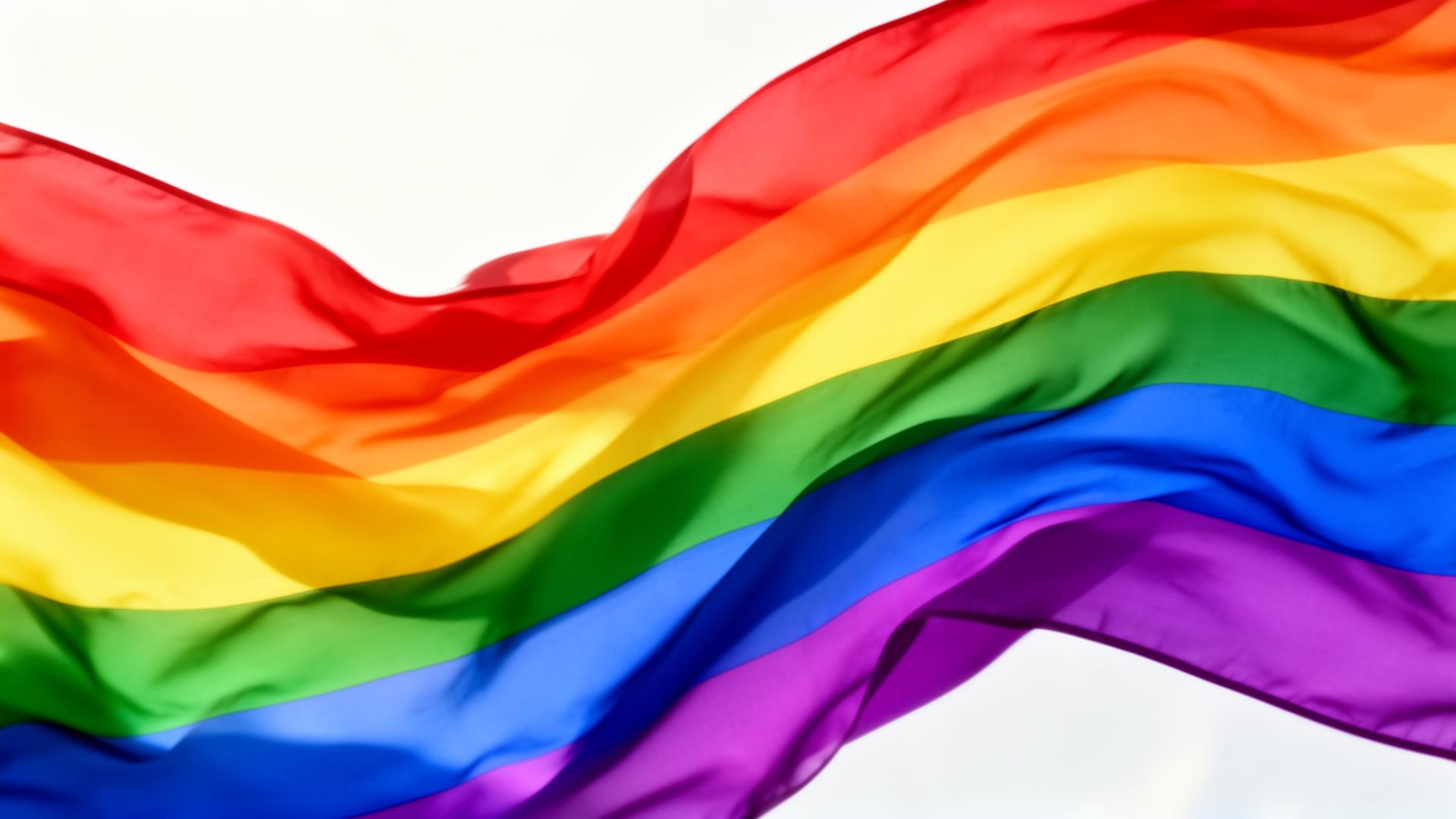
Few color systems on Earth carry as much emotional weight as the pride flag colors. In just six saturated stripes, the rainbow Pride flag communicates joy, defiance, grief, hope, community, and belonging — and it does so across languages, borders, and generations. From a hand-dyed banner stitched in a San Francisco attic in 1978 to a global symbol projected onto the White House, the Eiffel Tower, and millions of social profiles every June, this palette is arguably the most recognized color symbol of the modern era.
This guide unpacks every stripe: the exact hex codes, the meaning Gilbert Baker assigned to each color, the lost stripes of the original eight-color design, the evolution into the Progress Pride Flag, and a designer's toolkit for using these colors with respect rather than rainbow-washing.
Watch: The Colors of Pride
A Brief History: Gilbert Baker and the 1978 Original
The rainbow Pride flag was born in San Francisco in 1978, designed by artist and activist Gilbert Baker at the urging of Harvey Milk. Baker wanted a positive symbol — something to replace the pink triangle, which Nazi Germany had used to mark gay prisoners. He chose the rainbow because it was natural, universal, and inherently inclusive: "a rainbow is a part of nature, and you have to be in the right place to see it."
Baker's original flag, hand-dyed and stitched with volunteers, had eight stripes, each with a specific meaning:
| Stripe | Color | Hex | Meaning |
|---|---|---|---|
| 1 | Hot Pink | #FF69B4 | Sex |
| 2 | Red | #E40303 | Life |
| 3 | Orange | #FF8C00 | Healing |
| 4 | Yellow | #FFED00 | Sunlight |
| 5 | Green | #008026 | Nature |
| 6 | Turquoise | #00C0C0 | Magic & Art |
| 7 | Blue (Indigo) | #004DFF | Serenity / Harmony |
| 8 | Violet | #750787 | Spirit |
After Harvey Milk's assassination in November 1978, demand for the flag exploded. Two practical problems forced the design to evolve:
- Hot pink #FF69B4 fabric was not commercially available at scale, so the pink stripe was dropped.
- To display the flag vertically on Market Street with an even number of stripes on each side of the lamppost, turquoise #00C0C0 and indigo were merged into a single blue, reducing the flag to its now-iconic six stripes.
By 1979 the six-stripe rainbow had become the standard — not for symbolic reasons, but for the most ordinary of design constraints: supply chain and sightlines.
The 6 Core Rainbow Stripes (with Exact Hex Codes)
These are the official pride flag colors used in the modern six-stripe rainbow flag. The hex values below are the widely standardized digital equivalents.
Red — #E40303 — Life
The top stripe. A bold, oxygenated red just shy of pure primary, #E40303 carries 89% saturation and 89% luminance — visually loud without sliding into orange. Baker chose it to represent life itself: the blood we share, the body we inhabit, the vitality of a community that refused to disappear.
Orange — #FF8C00 — Healing
Sitting at roughly 33° on the hue wheel, #FF8C00 is "Dark Orange" in CSS but it reads as warm, optimistic, and analgesic. Baker associated orange with healing — the restorative warmth a community needs after trauma, illness, or loss. During the AIDS crisis of the 1980s, this stripe took on a meaning Baker could not have anticipated.
Yellow — #FFED00 — Sunlight
#FFED00 is a pure, high-energy yellow — closer to spectral yellow than to gold. It represents sunlight: clarity, visibility, the right to be seen in daylight rather than forced into shadow. Yellow is also the most attention-grabbing hue at long distances, which is part of why the rainbow flag remains legible from far across a parade route.
Green — #008026 — Nature
A deep, forest-leaning green, #008026 grounds the upper warm stripes with cool, organic stability. Baker tied green to nature — a reminder that queer identity is itself natural, not aberrant. In color theory, green sits at the perceptual midpoint of the visible spectrum, which is why it functions as the flag's visual fulcrum.
Blue — #004DFF — Serenity / Harmony
This is a saturated, slightly indigo-leaning blue. In the six-stripe flag, #004DFF carries the meaning Baker originally assigned to the indigo stripe: serenity and harmony. Cool blues are the most universally calming hue across cultures, and on the flag this stripe is the emotional exhale between the energetic warm tones and the spiritual violet.
Violet — #750787 — Spirit
The deepest, most pigment-rich stripe, #750787 anchors the flag at the bottom. Baker chose violet to represent spirit — the inner life, courage, and resilience of the community. Historically, violet has carried associations with royalty and the sacred precisely because the dye was rare and expensive; on the Pride flag, that connotation of preciousness is reclaimed for ordinary queer lives.
The Lost Stripes: Hot Pink and Turquoise
For decades, the original eight-stripe design was considered a historical curiosity. In recent years it has experienced a revival as communities seek to honor Baker's full vision.
Hot Pink — #FF69B4 — Sex
The original top stripe. Baker deliberately led with sex — refusing to sanitize queer identity for mainstream comfort. #FF69B4 is a saturated magenta-pink, warm enough to vibrate against the red below it. Its loss from the flag in 1978 was logistical, not editorial, and many designers today reintroduce it when recreating the eight-stripe original.
Turquoise — #00C0C0 — Magic & Art
Sitting between green and blue, #00C0C0 represented magic and art — the creative spirit, the otherworldly, the queer contribution to culture. Visually, turquoise bridges the warm and cool halves of the flag, and its absence is part of why the six-stripe version feels slightly more polarized between energy and calm.
The Progress Pride Flag (Daniel Quasar, 2018)
In 2018, nonbinary designer Daniel Quasar redesigned the flag to address what they saw as the rainbow's biggest blind spot: it celebrated the community as a whole without acknowledging that some members — trans people and queer people of color — were still being left behind, even inside the movement.
Quasar added a chevron on the hoist side pointing rightward, signaling "progress still to be made." The chevron contains five additional stripes:
Black & Brown — Marginalized Communities of Color
- Black #000000 and Brown #785017 honor LGBTQ+ people of color, whose central role in the Stonewall uprising and ongoing liberation work has historically been erased from mainstream narratives.
- Black additionally memorializes those lost to HIV/AIDS and stigma — a meaning carried forward from the Philadelphia "More Color, More Pride" flag of 2017.
The Trans Pride Stripes (Monica Helms, 1999)
The three remaining chevron stripes come from the Transgender Pride flag designed by Monica Helms:
- Light Blue #5BCEFA — the traditional color for baby boys, representing trans men and transmasculine people.
- Pink #F5A9B8 — the traditional color for baby girls, representing trans women and transfeminine people.
- White #FFFFFF — representing nonbinary, agender, and intersex people, and those still exploring their gender.
Helms designed the flag to be symmetrical so that "no matter which way you fly it, it is always correct, signifying us finding correctness in our lives."
The Progress Pride Flag is now the dominant variant in most major Pride events and corporate communications — though Gilbert Baker's six-stripe original remains the most-printed flag in the world.
Pride is one of many color systems with deep cultural meaning. For broader context, see our guides to national flag colors and their meanings and how color cultures around the world shape flag symbolism.
The Color Psychology of the Pride Rainbow
What makes the Pride palette feel so unmistakably joyful? It is not just the rainbow itself — many brands use rainbows and read as childish. The Pride flag works because of three specific perceptual choices:
1. Uniformly High Saturation
Every stripe sits at 85–100% saturation. There are no muted tones, no pastels, no desaturated "tasteful" choices. This consistency is what makes the flag read as a single confident statement rather than a decorative gradient. High saturation across an entire palette communicates conviction.
2. Equal Stripe Weight
Each stripe occupies exactly the same vertical space. No color is dominant; no color is subordinate. This is a visual encoding of the flag's core message: every identity carried under this banner has equal weight. Designers borrowing Pride colors who weight one stripe heavier than another inadvertently break this contract.
3. Full Spectral Coverage
The six stripes span the entire visible spectrum from ~620nm (red) to ~430nm (violet). This completeness is the perceptual root of inclusion. The eye reads "everything is here," and the brain translates that to "everyone is welcome." It is one of the rare cases where color science and political symbolism reinforce each other perfectly.
Designer Takeaways: Using Pride Colors Tastefully
Pride colors are a privilege to design with, not a free aesthetic. Five rules separate respectful use from rainbow-washing:
1. Use the Official Hex Codes
Do not eyeball the rainbow. The values above — #E40303, #FF8C00, #FFED00, #008026, #004DFF, #750787 — are standardized for a reason. Off-spec rainbows (pale, muted, or "branded" pride palettes) erode the symbol's recognizability. If you want to honor the flag, use the real colors. You can generate harmonious extensions of these hues with the coloracci.ai palette generator for supporting UI without distorting the core stripes.
2. Mind Contrast and Accessibility
The Pride palette has serious WCAG challenges. Yellow #FFED00 on white gives a contrast ratio of only 1.07:1 — well below the 4.5:1 AA threshold for body text. Never set yellow text on white backgrounds. When using rainbow gradients behind text, place a solid dark layer underneath the type (≥ #1a1a1a). Light blue #5BCEFA and pink #F5A9B8 from the Trans flag fail contrast on white even more dramatically.
3. Gradients Should Preserve Stripe Order
When you blend the rainbow into a gradient, keep the spectral order: red → orange → yellow → green → blue → violet. Rearranging the stops for "aesthetic balance" breaks the flag's symbolism. The order is not decorative; it is the flag.
4. Avoid Rainbow-Washing
Rainbow-washing is the practice of slapping Pride colors on a logo or product in June without backing it up with year-round substance — non-discrimination policies, donations to queer organizations, hiring and retention practices. If a brand cannot point to material support for LGBTQ+ communities, the rainbow becomes extractive. Design teams should push back when asked to apply Pride colors without that foundation.
5. Default to the Progress Pride Flag When in Doubt
If your project is meant to signal inclusion broadly — not specifically reference Baker's original — use the Progress Pride Flag. It is the current consensus symbol for the full community, and choosing it signals attention to ongoing conversations about race and trans inclusion rather than nostalgia.
Complete Pride Flag Color Reference
| Color | Hex | Stripe / Flag | Meaning |
|---|---|---|---|
| Hot Pink | #FF69B4 | Baker 8-stripe (1978) | Sex |
| Red | #E40303 | Core 6-stripe | Life |
| Orange | #FF8C00 | Core 6-stripe | Healing |
| Yellow | #FFED00 | Core 6-stripe | Sunlight |
| Green | #008026 | Core 6-stripe | Nature |
| Turquoise | #00C0C0 | Baker 8-stripe (1978) | Magic & Art |
| Blue | #004DFF | Core 6-stripe | Serenity / Harmony |
| Violet | #750787 | Core 6-stripe | Spirit |
| Black | #000000 | Progress chevron | POC communities & lives lost to AIDS |
| Brown | #785017 | Progress chevron | LGBTQ+ people of color |
| Light Blue | #5BCEFA | Trans Pride / Progress | Trans men & transmasculine people |
| Pink | #F5A9B8 | Trans Pride / Progress | Trans women & transfeminine people |
| White | #FFFFFF | Trans Pride / Progress | Nonbinary, agender, intersex |
Conclusion: A Palette That Made History
The pride flag colors are proof that a small, disciplined palette — six stripes, high saturation, equal weight, spectral order — can carry more meaning than any logo ever designed. Gilbert Baker's rainbow has survived a supply-chain edit, a global pandemic, a culture war, and the relentless flattening pressure of corporate branding, and it still reads instantly as joy, defiance, and belonging.
Whether you are designing a Pride campaign, building an inclusive product, or simply curious about why this rainbow feels different from every other rainbow, the lesson is the same: color is never just decoration. It is a contract with the people who recognize it.
Ready to build palettes that carry meaning of their own? Open the coloracci.ai palette generator and start with a single hex — we will help you extend it into a system that says exactly what you want it to say.