Olympic Sports Uniform Colors: The Psychology, Hex Codes & Design Strategy Behind the Games
· Coloracci Team
Watch: The Colors of Olympic Sports Uniforms Song
Olympic Sports Uniform Colors: The Psychology, Hex Codes & Design Strategy Behind the Games
Few color systems on Earth carry as much symbolic weight as the Olympic sports uniform colors. Born from a 1913 sketch by Pierre de Coubertin, the five Olympic rings — blue, yellow, black, green, and red — were designed so that at least one color of every national flag could be found within them. More than a century later, those same hues dominate Olympic uniforms, podium graphics, broadcast packages, and merchandise. For designers and color enthusiasts, the Games are a masterclass in how a tightly engineered palette can communicate unity, energy, and identity at planetary scale.
This guide unpacks the Olympic sports uniform colors in full: every hex code, the psychology each shade triggers in athletes and fans, the patterns that emerge across delegations, and the takeaways you can apply the next time you build a brand palette in coloracci.ai.
Why Olympic Uniform Colors Matter to Designers
The Olympics is the rare global event where color is functional, not decorative. Uniform color affects:
- Athlete performance — red has been linked in peer-reviewed studies to higher win rates in combat sports, while blue is associated with focus and lower heart-rate variability.
- Referee bias — research from Durham University showed officials award more points to athletes in red in evenly matched bouts.
- Broadcast legibility — colors are chosen to remain distinguishable on SDR, HDR, and mobile screens across 200+ markets.
- Fan engagement — a saturated, high-contrast jersey drives merchandise sales and creates the emotional "team color" loyalty that lasts a lifetime.
If you design for sports, products, or brands, the Olympic palette is the closest thing we have to a universal color language. Let's break it down.
The Complete Olympic Ring Palette (with Hex Codes)
The official Olympic ring colors form the foundation of every Games' visual identity. Each hue maps to one of the five inhabited continents and carries its own psychological signature.
1. Congo Blue — #0085C7
A clear, mid-saturation cyan-blue, Congo Blue anchors the Olympic palette. It evokes the open sky and the Atlantic and Pacific oceans that connect competing nations. Psychologically, this blue communicates calmness, focus, reliability, and stability — exactly the mental state coaches want their athletes to enter before a final. It is also the most globally "safe" color, carrying positive associations in nearly every culture.
2. Dashing Yellow — #F4C300
A warm, slightly amber yellow, Dashing Yellow is the palette's energy source. It triggers optimism, enthusiasm, confidence, and morale — perfect for opening ceremonies, medal podiums, and the celebratory graphics that punctuate every broadcast. Yellow also has the highest luminance of any saturated hue, which makes it the most readable color on a stadium scoreboard.
3. Olympic Black — #000000
True black does the heavy lifting in the Olympic system. It communicates authority, sophistication, strength, and dominance, which is why it dominates equipment, type, and silhouettes. Black is also the great unifier: it lets the four chromatic ring colors pop without competing with them.
4. Super Green — #009F3D
A pure, jewel-toned green, Super Green signals balance, harmony, growth, peace, and teamwork. It is the color most associated with the Olympic ideal itself — friendly competition and renewal — and it nods to the natural environments (forests, fields, oceans) where so many Olympic sports are contested.
5. Spanish Red — #DF0024
A pure, slightly cool red, Spanish Red is the palette's adrenaline shot. It communicates energy, aggression, passion, dominance, and excitement — and it is statistically the most worn jersey color among gold medalists in combat and contact sports. Red is also the color most likely to raise a viewer's heart rate, which is why broadcasters reach for it during medal moments.
Extended Olympic-Adjacent Colors
While the five rings define the official system, national delegations introduce three additional hues that have become unofficial members of the Olympic palette.
Orange — The Dutch Effect
Worn most famously by the Netherlands, orange has become synonymous with Olympic crowd takeovers. It communicates enthusiasm, creativity, and boosted energy, and it is the color most likely to inspire action — perfect for a delegation that wants to feel visible in every venue.
Indigo — The Strategist's Hue
A deep blue-violet, indigo shows up in technical sportswear and esports-adjacent Olympic events. It carries connotations of intuition, wisdom, spirituality, clarity, and strategic thinking — ideal for sports where mental discipline outweighs raw power (archery, shooting, sailing).
Violet — Luxury and Ambition
Reserved for premium kits, opening-ceremony robes, and select federations, violet projects creativity, ambition, uniqueness, luxury, prestige, and mental stimulation. It is the rarest hue on Olympic uniforms — which is exactly what makes it powerful when used.
Patterns & Analysis: What the Olympic Color Choices Reveal
Look at every Olympic uniform from the last twenty Games and three patterns emerge.
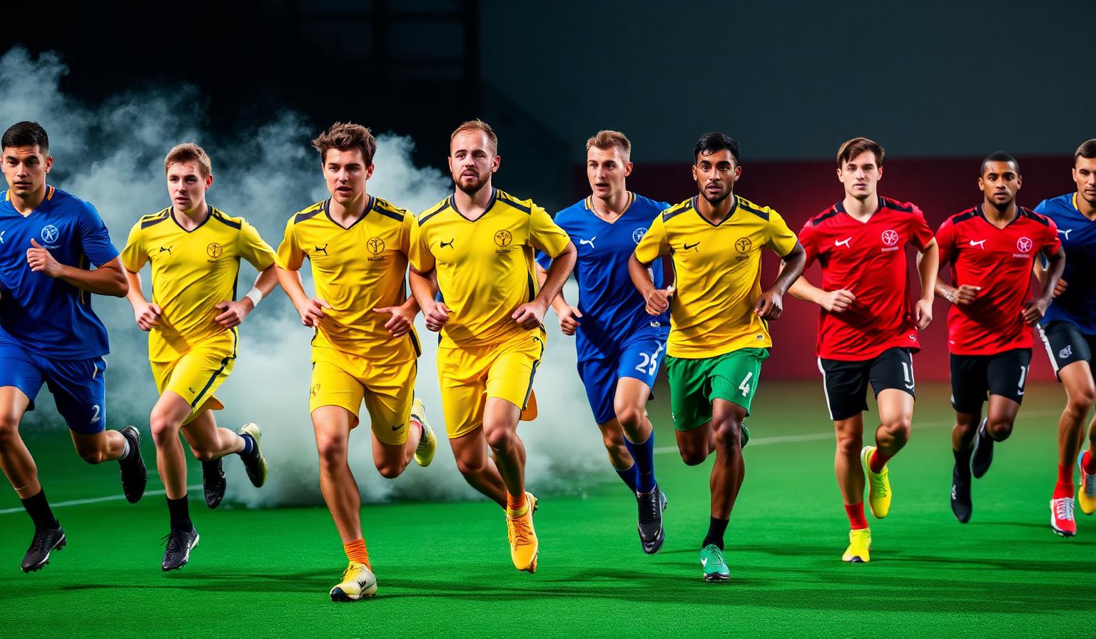
Pattern 1: Primary colors dominate. Blue, yellow, and red appear on more than 70% of all Olympic kits. Designers default to primaries because they are unambiguous on a 30-second broadcast cutaway and they translate to merchandise without losing saturation.
Pattern 2: Black is the universal frame. Trim, type, and silhouettes lean black because it lets the national hue lead without color clashes when two delegations share a frame.
Pattern 3: Green is the "identity color." Brazil, Mexico, South Africa, Ireland, Australia, and Saudi Arabia all use green to communicate national identity tied to land and growth — proving the psychological coding holds across continents.
The takeaway: the Olympic system works because it uses a small set of saturated primaries plus black as a unifier. That same structure powers some of the strongest brand palettes in the world — see our breakdown of the 60-30-10 color proportion rule for how to translate this into product design.
Color Psychology: The Emotional Engine of Olympic Uniforms
The Olympic palette is not arbitrary — it is a carefully tuned emotional instrument. Here is what each color is doing to the brain of a viewer (and an athlete) at any given moment.
- Blue lowers cortisol and slows breathing. Athletes in blue are perceived as more disciplined; viewers feel reassured.
- Yellow raises serotonin and triggers the reward circuit. Yellow podiums and medal graphics literally make winning feel better on camera.
- Black is processed as "premium" by the visual cortex. It is why high-tech kits (swimming, cycling, track) lean black — it signals engineered performance.
- Green is the only color the human eye can process without any focal adjustment. It is restful, which is why marathon and endurance kits often lean green in trim.
- Red activates the amygdala. It is the body's "go" signal — and the reason coaches in combat sports actively request red corners.
- Orange is the most "social" warm color. It is highly visible in crowds without the aggression of red.
- Indigo and violet project intelligence and prestige — colors for sports that want to be taken seriously beyond athletic dominance.
For a deeper look at how these emotional triggers translate to digital products, see our guide to CTA button colors and conversions — the same psychology that makes a red kit intimidating makes a red "Buy Now" button click-worthy.
Designer Takeaways: How to Use the Olympic Palette in Real Projects
You do not need to be designing a national team kit to steal these moves. Here are five ways to deploy the Olympic system in client work.
1. Pick one ring color as your hero, then use black as your structural color. This single move gives you instant "premium sports" energy. Try #DF0024 on #000000 for fitness brands, or #0085C7 on #000000 for fintech and SaaS.
2. Use yellow only as an accent — never as a hero. Dashing Yellow is so high in luminance that it overwhelms any layout when used at 50%+ coverage. Cap it at 10-15% of any surface.
3. Pair Super Green with white space for wellness brands. The Olympic green at #009F3D reads as healthy, balanced, and active — perfect for wellness, nutrition, and outdoor categories.
4. Reserve violet for premium tiers. If you have a pricing page with Free / Pro / Elite tiers, give Elite a violet treatment. The psychological association with prestige does the selling for you.
5. Test every Olympic pairing for accessibility. Spanish Red on Congo Blue looks vibrant — but it fails WCAG AA contrast at small body sizes. Run any palette through a contrast checker before shipping.
The fastest way to experiment with all eight Olympic hues is to drop them into the coloracci.ai palette generator and let the AI suggest complementary tints, shades, and tonal variations.
Data Table: Olympic Sports Uniform Colors at a Glance
| Item | Primary Color | Hex Code | Color Name | Psychological Meaning |
|---|---|---|---|---|
| Olympic Ring 1 | Blue | #0085C7 | Congo Blue | Calmness, focus, reliability, stability |
| Olympic Ring 2 | Yellow | #F4C300 | Dashing Yellow | Optimism, enthusiasm, confidence, morale |
| Olympic Ring 3 | Black | #000000 | Olympic Black | Authority, sophistication, strength, dominance |
| Olympic Ring 4 | Green | #009F3D | Super Green | Balance, harmony, growth, peace, teamwork |
| Olympic Ring 5 | Red | #DF0024 | Spanish Red | Energy, aggression, passion, dominance, excitement |
| Delegation Accent | Orange | #FF7900 | Dutch Orange | Enthusiasm, creativity, energy, action |
| Strategic Sports | Indigo | #4B0082 | Olympic Indigo | Intuition, wisdom, clarity, strategy |
| Premium Kits | Violet | #8F00FF | Ceremony Violet | Creativity, ambition, luxury, prestige |
This eight-color system is one of the most studied palettes in the world — and one of the most copy-resistant. The reason: every hue is doing a job, and removing any one of them collapses the emotional range of the system.
Conclusion: The Olympic Palette Is a Designer's Cheat Sheet
The Olympic sports uniform colors are not just symbols — they are a working color system refined over more than a century of broadcast, performance, and merchandise pressure-testing. Blue calms, yellow celebrates, black unifies, green balances, red ignites, orange engages, indigo strategizes, and violet elevates. Together they form a palette that scales from a single pin badge to a 100,000-seat stadium.
If you want to bring that same emotional precision into your own work, start by sampling the exact hex codes above into the coloracci.ai AI palette generator. Generate complementary tints, lock in your hero color, and let the platform recommend accessible pairings.
For more on how proportion and psychology turn a palette into a high-performing brand system, read our guides on CTA button colors and conversions and the 60-30-10 color proportions rule.
The Olympic rings have told the same story for over a hundred years using just five colors. The right palette can do the same for your brand — starting today.