The Origin Stories Behind La Liga Kit Colors: How History, Geography, and Rivalry Shaped Spain's Football Palette
· Coloracci Team
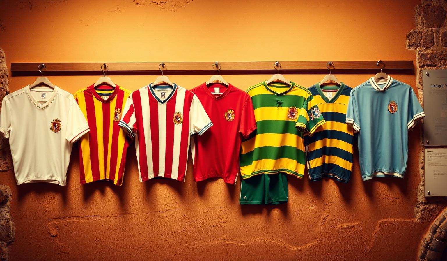
Every La Liga Kit Is a Frozen Historical Decision
Most analyses of La Liga kit colors treat them as design choices — palettes selected for psychological impact, broadcast visibility, or brand differentiation. That framing is mostly wrong. Almost none of the iconic Spanish football kits worn today were chosen in the modern marketing sense. They were inherited, accidental, geographically determined, or politically loaded — and then frozen in place by a century of fan loyalty that makes any change commercially impossible.
This is the most underrated fact about Spanish football branding: the colors came first, and the meaning was retrofitted. Athletic Bilbao didn't pick red-and-white because red signals passion. Real Madrid didn't pick white because white signals supremacy. Barcelona didn't pick blaugrana because the combination optimizes for Catalan identity. Each of these palettes arrived through a specific historical accident — often involving a shipment of cheap English jerseys, a Swiss founder's homesickness, or a regional flag dispute — and then the cultural meaning grew up around them.
For designers, brand strategists, and color enthusiasts, this is a more useful story than another hex-code breakdown. (For the psychology-and-hex angle, see our companion piece on La Liga team colors, and for the league's own rainbow identity, the La Liga logo rainbow palette deep-dive.) What follows is the historical why — the inherited origins behind every La Liga kit color you recognize.
The English Imports: How a Shipment of Jerseys Created Two Spanish Giants
The most consequential color decision in Spanish football history wasn't made in Spain. It was made in Sunderland and Southampton, in the late 1890s and early 1900s, by English shirt manufacturers fulfilling export orders.
Athletic Bilbao — Red and White by Accident
Athletic Club Bilbao was founded in 1898 by Basque students returning from England, where they had fallen in love with football at universities in Leeds, Manchester, and London. Their first kits were blue and white — a tribute to Blackburn Rovers, the team many of them had watched. For over a decade, Athletic wore Blackburn's halved blue-and-white shirt.
In 1909, Athletic placed an order for new shirts from Southampton. The story — repeated in club histories, sometimes embellished, but supported by the basic timeline — is that the order was bundled together with a separate order from Atlético Madrid (then a Bilbao subsidiary). To save shipping costs and simplify the order, Southampton's red-and-white striped jerseys were sent to both clubs.
Athletic adopted the kit because they had no choice — the Blackburn shirts were unavailable and the season was starting. They never went back. Today the red-and-white vertical stripes are the most powerful symbol of Basque footballing identity in the world, an unbreakable badge of regional pride.
The origin is almost comically mundane: a logistics shortcut. The meaning is everything.
Atlético Madrid — Inheriting the Same Shipment
Atlético Madrid was founded in 1903 as a Madrid-based affiliate of Athletic Bilbao, populated by Basque students studying in the capital. They wore the same Blackburn-inspired blue-and-white halves until 1911, when — for the same shipment-related reasons — they switched to the Southampton red-and-white stripes their parent club had adopted.
What's striking is that the colors survived the relationship. Atlético became fully independent from Athletic in 1921, but kept the rojiblanco identity. By then, two generations of Madrid fans had grown up with the stripes. The colors had outlived their origin story and become the club. This is the central pattern in football color heritage: a palette only needs to survive one generation of fan adoption to become permanent.
Real Madrid: The Corinthian White
Real Madrid's choice of all-white is often attributed to royalty, divine purity, or aristocratic prestige. The reality is more interesting: they copied an English amateur club.
The club was founded in 1902 as Madrid Football Club. Their founders — including the Spanish-Cuban brothers Juan and Carlos Padrós — were inspired by Corinthian FC, the legendary English amateur side that wore plain white shirts and embodied a Victorian ideal of sporting purity. Corinthian were the most admired football club in the world at the turn of the century. Adopting their kit was, for an aspirational young Madrid club, the equivalent of a 21st-century startup wearing Apple's design language.
The "Real" prefix — and the crown atop the crest — came two decades later, in 1920, when King Alfonso XIII granted royal patronage. The white had been chosen first; the royal symbolism layered on afterward. By the 1950s, when Real Madrid began winning European Cups in their pristine white kits under the floodlights of the Bernabéu, the original Corinthian inspiration was largely forgotten. The white had become Madridista white — a global symbol of footballing aristocracy that the original founders never engineered.
This is the second pattern of inherited color: a borrowed identity becomes original through sustained excellence. White is now Real Madrid's color in a way that transcends the historical accident of its adoption.
FC Barcelona: The Swiss Connection Behind Blaugrana
Barcelona's blue-and-claret stripes — blaugrana in Catalan — are arguably the most recognized two-color combination in world sport. The origin is contested, but the most credible story points away from Catalonia entirely and toward Switzerland.
Barcelona was founded in 1899 by Joan Gamper (born Hans-Max Gamper Haessig in Winterthur, Switzerland). Gamper had previously played for FC Basel, whose colors were — and remain — red and blue. The simplest and most likely explanation for blaugrana is that Gamper, a 22-year-old Swiss expatriate organizing a new club in a foreign city, reached for the colors of his home club.
A competing theory credits the colors to the Merchant Taylor's School in Crosby, England, where one of the founding members had studied. Another points to the kit of the accountancy firm where Gamper worked. The historical record doesn't definitively settle the question, but all three candidate origins share a common feature: none of them are Catalan.
The colors were adopted in 1899. They became inseparable from Catalan identity over the next century, particularly during the Franco era when Més que un club (more than a club) crystallized as Barcelona's defining slogan and the blaugrana became a coded symbol of suppressed Catalan culture. By the time blaugrana reached its modern symbolic weight, the question of whether it originated in Basel or Crosby or a Barcelona accountancy office had become irrelevant. Cultural meaning had completely overwritten origin.
This is the third pattern: palettes acquire political and regional meaning long after the fact, often in opposition to political pressure that tried to suppress them.
The Regional Pride Palette: Colors as Geography
Some La Liga kits weren't borrowed from English clubs or Swiss founders — they were chosen as direct expressions of regional identity. These tend to be the most chromatically distinctive palettes in the league, precisely because regional flags rarely look like other regional flags.
Real Betis — Andalusian Green and White
Real Betis Balompié, founded in 1907 in Seville, originally wore blue and white. The switch to green and white in 1914 was a deliberate alignment with the flag of Andalusia — the white and green banner that would later (in 1918) be formally adopted as the Andalusian regional flag.
Betis was making a political statement before there was even a formal flag to align with. The choice signaled allegiance to a regional identity distinct from both Madrid and Catalonia, and it explicitly contrasted with cross-city rival Sevilla FC's red-and-white (whose origins also trace to early English football influence in the Andalusian capital).
Green is rare in elite football because it competes visually with the pitch. Betis accepted the visibility tradeoff in exchange for a chromatic position no other major Spanish club could occupy. They own green in La Liga because no rational marketing analysis would have chosen it.
Real Sociedad — The Basque Coastal Choice
Real Sociedad, founded in 1909 in San Sebastián, adopted blue-and-white vertical stripes that consciously echo the maritime identity of the Basque coast. The blue references the Bay of Biscay; the white references the city's beach light and the foam of Atlantic waves.
This is one of the few La Liga origin stories where the palette was selected with explicit symbolic intent from day one. It also positions Real Sociedad as chromatically distinct from regional rival Athletic Bilbao — a deliberate Basque-internal differentiation that matters enormously inside the regional rivalry, even if it looks subtle from outside.
Celta de Vigo — Galician Sky
Celta de Vigo's sky blue kit, adopted at the club's founding in 1923, is an explicit reference to Galicia's Atlantic-facing geography and the region's Celtic heritage (hence "Celta"). The lighter blue distinguishes them sharply from the deeper blues of Real Sociedad and the navies used in Madrid and Catalan regional symbolism.
Sky blue is one of the most culturally specific color choices in La Liga. It cannot be confused with any of the league's other blue-using clubs, which is the entire point. Geographic specificity drives chromatic specificity.
The Outliers: Yellow and Orange
Two La Liga clubs occupy chromatic positions that almost no other elite European club has dared to claim.
Villarreal CF — The 1947 Strategic Yellow
Villarreal CF, a small club from a town of 50,000 in the province of Castellón, was founded in 1923 and originally wore black and white. In 1947, the club switched to all yellow — and the switch was, unusually for football, a deliberate strategic choice rather than an inherited accident.
The reasoning was almost startlingly modern: yellow was the color of the local agricultural economy (Castellón is Spain's primary citrus-growing region), it was visually distinct from every nearby competitor, and it could anchor a unique town-and-club identity that no larger neighbor could copy. The nickname El Submarino Amarillo (The Yellow Submarine) didn't arrive until 1967, popularized after the Beatles song, but it cemented the chromatic position permanently.
Villarreal is a rare case of a football club making a Coca-Cola-style color ownership decision decades before the discipline of brand strategy formally existed.
Valencia CF — Mediterranean Orange
Valencia CF, founded in 1919, adopted white shirts with orange trim to reflect the Mediterranean character of Spain's eastern coast. Orange is associated with Valencian agriculture (oranges, of course), the region's intense coastal sun, and the culturally distinct Comunitat Valenciana. The bat in the crest references local heraldry dating to the medieval reconquest.
Like Villarreal's yellow, Valencia's orange is a chromatic position no other major Spanish club has successfully challenged. Once a club owns a unique hue in a competitive ecosystem, that ownership becomes a moat.
How Rivalry Locked These Colors in Place
The reason none of these clubs has ever rebranded — even when modern design logic might suggest it — is derby dynamics. Once two rival clubs hold opposing chromatic positions, neither can move without surrendering identity to the other.
- Real Madrid (white) vs Atlético Madrid (red-and-white) — any move by Atlético toward white would feel like submission; any move by Madrid toward red would feel absurd. The colors are locked.
- Sevilla (red-and-white) vs Real Betis (green-and-white) — the Andalusian derby has reinforced the chromatic split for over a century. Neither club can ever change without losing the rivalry's visual structure.
- Barcelona (blaugrana) vs Espanyol (blue-and-white) — Espanyol's choice of blue-and-white in 1900 was itself a political signal, distinguishing themselves as the "Spanish" club in Catalonia versus Barcelona's increasingly Catalan identity.
- Athletic Bilbao (red-and-white) vs Real Sociedad (blue-and-white) — the Basque derby permanently splits the regional identity into two chromatic halves.
This is the fourth and most important pattern of color heritage: rivalry is the most powerful preservation force in branding. Once a competitor occupies the opposite chromatic position, your own colors become not just identity but opposition — and opposition is the most defensible brand asset that exists.
The same dynamic governs corporate branding. Coke's red exists in opposition to Pepsi's blue. Nike's bold orange-and-black exists in opposition to Adidas's three-stripe black-and-white. Rival brands stabilize each other's color choices through mutual chromatic gravity.
What Designers Can Learn From La Liga's Inherited Palettes
The La Liga origin stories offer four practical lessons for anyone designing a brand identity, product palette, or visual system today.
1. Origin Doesn't Determine Meaning — Adoption Does
Almost every iconic La Liga palette started as an accident, an import, or an arbitrary choice. The meaning came from a century of use, not from clever original strategy. The lesson: stop worrying about whether your color choice has perfect symbolic justification at launch. What matters is whether you can stay consistent long enough for meaning to accumulate around it.
If you're designing a startup brand, pick a defensible palette and commit. The cultural weight will arrive — but only if the palette stays still. Use our AI palette generator to explore options, and our color contrast checker to make sure the palette you commit to is accessible across every surface.
2. Geographic and Cultural Specificity Beats Trend-Following
Real Betis's green and Celta's sky blue are powerful precisely because they refer to specific places. When your palette anchors to a geographic, cultural, or community reference your audience already cares about, the colors stop being arbitrary and start being inherited.
For applied palette work that draws on cultural anchors, our Fibonacci color generator can help you build mathematically harmonious palettes around a culturally significant base hue.
3. Owning a Unique Hue Is a Permanent Moat
Villarreal's yellow and Valencia's orange demonstrate the most underused branding move in modern design: claim the color no one else in your competitive set is willing to claim. The short-term risk of looking unconventional is wildly outweighed by the long-term benefit of being the only player your audience associates with that hue.
This is the same principle behind Tiffany's blue, T-Mobile's magenta, and John Deere's green. Identify the color your competitors avoid. Claim it.
4. Rivalries Stabilize Identity — Design For Them
If you can position your brand in chromatic opposition to a known competitor, you double your identity strength. The competitor preserves your colors by being unable to move toward them; you preserve theirs by the same logic. This applies far beyond football. Pick a chromatic enemy, and let them stabilize your palette for free.
For deeper exploration of how identity-driven palettes work in storytelling and entertainment, see our analysis of superhero color psychology — the same opposition principles govern how heroes and villains are visually encoded.
Quick-Reference: La Liga Kit Color Origins
| Club | Primary Color | Year Adopted | Origin Story | Modern Hex |
|---|---|---|---|---|
| Athletic Bilbao | Red & White stripes | 1909 | Southampton kit shipment shared with Atlético Madrid | #EE2523 / #FFFFFF |
| Atlético Madrid | Red & White stripes | 1911 | Inherited from Bilbao parent club via same English shipment | #CB3524 / #FFFFFF |
| Real Madrid | White | 1902 | Direct copy of Corinthian FC amateur ideal | #FFFFFF |
| FC Barcelona | Blue & Claret | 1899 | Likely Joan Gamper's Swiss FC Basel heritage | #004D98 / #A50044 |
| Real Betis | Green & White | 1914 | Explicit Andalusian regional flag alignment | #00954C / #FFFFFF |
| Real Sociedad | Blue & White | 1909 | Basque maritime / Bay of Biscay symbolism | #0067B1 / #FFFFFF |
| Celta de Vigo | Sky Blue | 1923 | Galician Atlantic & Celtic heritage reference | #8AC3EE |
| Villarreal CF | Yellow | 1947 | Strategic adoption referencing Castellón citrus economy | #FFE667 |
| Valencia CF | White & Orange | 1919 | Mediterranean coastal & Valencian agricultural identity | #FFFFFF / #EE7A0E |
| Sevilla FC | White & Red | 1905 | Early English football influence in Andalusian port city | #FFFFFF / #D6001C |
Conclusion: Heritage Is the Most Underrated Color Strategy
The deepest lesson from La Liga's color origins isn't about Spanish football. It's about how identity actually works. The brands with the most powerful color positions in any industry are almost never the brands that designed those positions deliberately. They are the brands that inherited a palette from a shipment of jerseys, a homesick founder, or a regional flag dispute — and then had the discipline to never change.
In a world where most modern brands rebrand every five years and chase chromatic trends through Pantone's annual color forecasts, La Liga's clubs offer a quieter and more durable model: pick a palette you can defend for a hundred years, then defend it.
Ready to start building a palette worth inheriting? Try the Coloracci AI palette generator, explore mathematically balanced systems with our Fibonacci color generator, and verify accessibility with our color contrast checker. The next iconic football kit is just a series of disciplined decisions away from existing.