Is Brown a Real Color? Why Brown Is Secretly Orange
· Coloracci Team
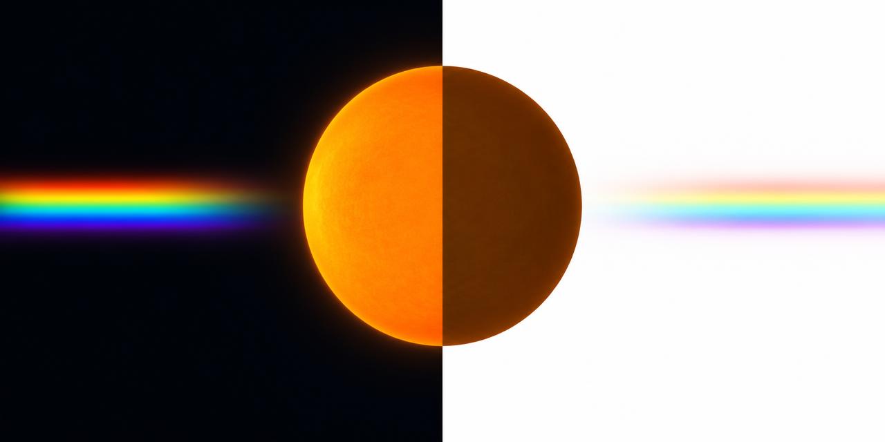
Is brown a real color? Here is a fact that designers love to drop into conversation: there is no brown in the rainbow. Hold a prism up to sunlight and you will see red, orange, yellow, green, blue and violet — but never brown. And here is the stranger part: the color-wheel brown #964B00 is, in HSV terms, literally orange at 30 degrees of hue, 100 percent saturation and 59 percent brightness. Brown is not a separate color at all. It is orange — viewed in the dark.
The honest answer is both no and yes. No, in the sense that no wavelength of light is "brown" and no pixel on your screen emits brown light. Yes, in the sense that brown is one of the most stable, universal and ancient color categories humans have — a genuine perceptual experience that your brain manufactures out of context. Understanding that paradox makes you a better designer, because brown behaves differently from every other color in your palette.
Is Brown a Real Color? The Short Answer
Every spectral color corresponds to a band of wavelengths: red lives around 620–700 nanometers, green around 495–570, blue around 450–495. Brown corresponds to nothing. If you isolate the light that looks brown — say, the light reflecting off a wooden table — and view it through a narrow tube so you cannot see anything around it, it stops looking brown. It looks orange, or dark yellow, or a muted red. Brown only exists when the same light is surrounded by something brighter.
This makes brown what color scientists call a "related color" — a color that can only be perceived in relation to its surroundings. The same physical stimulus that reads as chocolate brown on a bright white page reads as glowing orange on a black background. You can test this yourself in thirty seconds: fill a rectangle with #964B00 on a white canvas, then place the identical rectangle on a black canvas. On white, it is unmistakably brown. On black, it glows like a ember. Same HEX code, same photons, two different colors.
This is why the question "is brown a real color" has a more interesting answer than a simple yes or no. Brown is real the way a shadow is real — not as a thing in the light itself, but as a relationship between the light and everything around it.
Why Brown Is Secretly Orange: The Science
The mechanism behind brown is simultaneous contrast. Your visual system does not measure the absolute brightness of a surface; it measures brightness relative to the surround. When an orange-ish surface is dimmer than its environment, your brain flags it as a dark surface reflecting warm light — and that flag is the sensation of brown. Raise the ambient brightness or lower the surface brightness, and orange crosses an invisible threshold into brown.
This is why the same cup of coffee looks orange-brown in a sunlit kitchen and nearly black in a dim hallway, and why the embers of a fire — physically the same temperature and color as the "brown" wood they came from — glow vivid orange against the night. Dim the room and browns ignite into oranges; brighten it and oranges settle into browns. Interior designers exploit this constantly, often without knowing the science: a "warm brown" leather sofa is just orange that the room's brightness has tamed.
On the color wheel, brown occupies the hue range between roughly 20 and 40 degrees — squarely inside orange territory — at reduced lightness. That is why every brown in your design software is secretly an orange, a yellow-orange or a red-orange with the brightness turned down. There is no other hue that does this. Dark blue is still called blue. Dark green is still green. Only the orange-yellow-red family gets a whole new name when it darkens — which tells you how perceptually important this category is to human beings.
Brown on Screens and in Print
Because brown has no wavelength, every medium has to fake it — and each fakes it differently.
On a screen, brown is an RGB construction: strong red, a moderate amount of green, and little or no blue. The classic #964B00 is red 150, green 75, blue 0 — pure orange light at reduced intensity. Your monitor never shows you brown; it shows you dim orange, and the bright white interface around it does the rest. This has a practical consequence: a brown swatch that looks perfect in your dark-mode design tool may look outright orange when exported onto a white slide deck, because you changed the surround, not the swatch.
In print, brown is a CMYK recipe: yellow, a smaller amount of magenta, and a decisive dose of black. The black channel is what pulls orange down into brown on paper. This is also why browns are notoriously unstable in cheap printing — a few points of variation in the black plate shifts a packaging brown from rich chocolate to muddy maroon. When a brand's brown must survive both screen and print, professionals specify it in both systems and verify the match with a tool like our HEX to Pantone converter, which finds the closest spot-color equivalent for any digital brown.
A Word Older Than English: The Language of Brown
Languages reveal how deeply brown is woven into human life. The English word comes from Old English brun, with the first recorded uses around the year 1000 — originally describing dark, dusky, burnished surfaces. But many languages name brown not after darkness, but after the brown things that mattered most to daily life. In Turkish, brown is kahverengi — literally "coffee-colored." In Japanese, it is chairo — "tea color." The world over, brown is the color of the roasted, the brewed, the earthen and the wooden: the color of things that sustain us.
That linguistic pattern matters for branding. Brown never reads as exotic or technological; it reads as edible, drinkable, craftable and grounded. It is the color of coffee, chocolate, leather, bread, soil and timber — which is why it anchors the identities of everything from artisan roasters to logistics giants, as we explored in our deep dive on UPS's Pullman Brown.
From Cave Walls to Canvas: A Brief History of Brown Pigments
Brown is arguably the oldest color in human art. Umber — a natural clay pigmented by iron and manganese oxides — was among the first pigments ever used. The horses of the Lascaux cave paintings, rendered in browns and ochres some 17,300 years ago, still look alive today. Brown was there at the very beginning of image-making.
In ancient Rome, brown carried class meaning: the common plebeians were called the pullati — "the ones dressed in brown" — because undyed and earth-dyed wool was the clothing of the poor. Centuries later, Franciscan monks adopted brown robes as a deliberate vow of humility, earning the nickname "the greyfriars' brown brothers." An English statute of 1363 went further, legally requiring the poor to wear russet, a coarse brown-red cloth. Brown was the color of modesty — sometimes chosen, sometimes imposed.
The Renaissance turned brown into high craft. Painters worked with four great earth browns: raw umber from Umbria, raw sienna from Siena, and their roasted, darker siblings burnt umber and burnt sienna. Rembrandt built his luminous portraits on dark brown grounds, using Cassel earth — a brown so associated with the Old Masters that it became known as Van Dyck brown, approximated today by #664228. Sepia ink, harvested from cuttlefish and used by Leonardo da Vinci for drawings and sketches, gave us the warm brown tone (#704214) that still means "vintage" in every photo filter.
Then brown got strange. From the 18th into the 19th century, a pigment called Mummy brown — made, literally, from ground Egyptian mummies — was prized for its rich, transparent flesh tones. When artists discovered what they were actually painting with, the pigment's popularity collapsed; it is now a cautionary footnote in pigment history. And by the late 19th century, the Impressionists had turned against brown entirely, banishing it from their palettes in favor of prismatic color and colored shadows. Brown, the oldest pigment in art, was suddenly the enemy of modern painting.
The Brown Reference Palette
Here are the essential browns for a designer's toolkit, with the comparison orange that exposes the family secret:
| Item | Color | Hex | Name | Meaning |
|---|---|---|---|---|
| Color-wheel brown | 🟫 | #964B00 |
Brown | Literally orange at 59% brightness — the proof that brown is dark orange |
| CSS named brown | 🟫 | #A52A2A |
Brown (CSS) | Actually a red-brown; the web's official "brown" leans red |
| Saddle brown | 🟫 | #8B4513 |
SaddleBrown | Leather and craft; warm, equestrian, traditional |
| Sienna | 🟫 | #A0522D |
Sienna | The Renaissance earth pigment of Siena; warm and painterly |
| Chocolate | 🟫 | #D2691E |
Chocolate | A lighter, edible brown; appetite and comfort |
| Burnt umber | 🟫 | #8A3324 |
Burnt Umber | Roasted umber; deep, warm, Old Master shadow tones |
| Raw umber | 🟫 | #826644 |
Raw Umber | The cooler, greener earth brown of Umbrian clay |
| Burnt sienna | 🟫 | #E97451 |
Burnt Sienna | The brightest of the earth browns; almost terracotta |
| Sepia | 🟫 | #704214 |
Sepia | Cuttlefish ink; nostalgia, archives, vintage photography |
| Van Dyck brown | 🟫 | #664228 |
Van Dyck Brown | Cassel earth; the Old Masters' deep, smoky ground |
| UPS Pullman Brown | 🟫 | #644117 |
Pullman Brown | A trademarked brand brown; reliability and heritage |
| Comparison orange | 🟧 | #FF8000 |
Orange | The same hue family at full brightness — brown's true identity |
Practical Takeaways for Designers
Build browns in HSL, not by guessing HEX. Start with orange — hue 25 to 35 degrees, saturation 60 to 100 percent — then pull lightness down to 20–45 percent. Every good brown is a controlled descent of orange.
#964B00,#8B4513and#644117all live on that same slide.Test brown swatches on both light and dark backgrounds. Because brown is a contrast effect, your brown UI elements will shift identity with the surround. A button that reads "rich brown" on white can read "burnt orange" on near-black. If your app ships both light and dark themes, audit every brown twice.
Remember that CSS "brown" is not brown. The named color
brownin CSS is#A52A2A— a red-brown that surprises everyone who types it expecting#964B00. Always specify browns by HEX, never by name.Match brand browns to print deliberately. Screen browns are dimmed orange light; print browns are yellow, magenta and black ink. The translation is not automatic. Run your brand's brown through the HEX to Pantone tool to find the closest spot color, and expect to fine-tune from there — deep browns like
#3E2723sit near the edge of what coated paper can reproduce.Use brown's humility strategically. Brown signals the edible, the crafted and the dependable. It is the strongest choice for coffee, chocolate, leather, logistics, sustainability and heritage brands — and the wrong choice when you need energy, luxury-tech or urgency.
Pair brown the way nature does. Brown's natural partners are the bright versions of itself — orange, amber, gold (
#FFB500) — plus cream and deep green. These pairings work because they echo the light-surround relationship that creates brown in the first place.
Conclusion: So Is Brown a Real Color?
Is brown a real color? Physically, no — it has no wavelength, no place in the spectrum, no independent existence in light. Perceptually, it is one of the realest colors we have: a category so important that humans named it after coffee and tea, painted cave horses with it 17,300 years ago, regulated it by law, and built global brands on it. Brown is the proof that color is not a property of the world but a construction of the mind — the same lesson at the heart of why magenta isn't a real color and our exploration of whether color itself is real.
For designers, that is not a curiosity — it is a tool. Once you understand that brown is orange in context, you control it: you know how to build it, why it shifts, and how to keep it consistent from screen to print. Ready to anchor your own brown in the physical world? Try our HEX to Pantone converter and find the closest Pantone match for any brown in your palette — from Pullman Brown to burnt sienna.