Fast Food Branding Colors Decoded: The Psychology Behind Every Hue on the Menu
· Coloracci Team
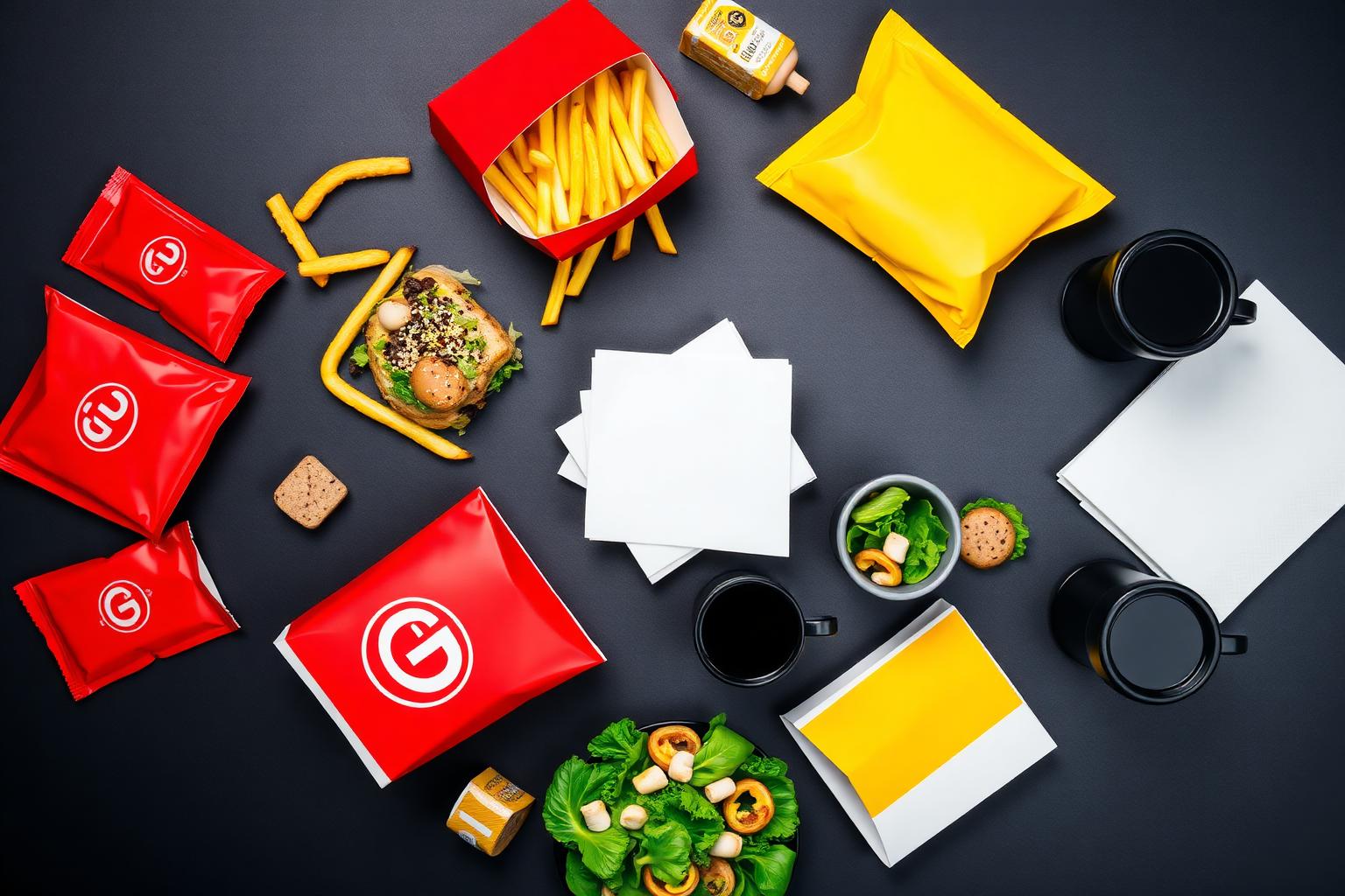
The Billion-Dollar Color Equation
Walk down any commercial strip in the world and you will spot them before you read a single word: the glowing red of a KFC bucket, the golden arches piercing the skyline, the orange flame of a Burger King wrapper. Fast food branding colors are not aesthetic choices — they are calculated neurological triggers deployed at global scale.
The fast food industry spends approximately $20 billion annually on advertising, and color is the silent headline of every campaign. Before a customer tastes the food, smells the fryer, or hears the jingle, their brain has already processed the brand's color signal and made an emotional decision. That decision happens in roughly 90 milliseconds — faster than conscious thought.
Understanding why the industry converges on red, yellow, and orange while strategically excluding blue and purple reveals one of the most disciplined applications of color psychology in modern commerce. This article breaks down the exact fast food branding colors, their hex codes, the neuroscience driving their selection, and what designers can extract from a category that has tested color at planetary scale.
The Exact Fast Food Branding Color Palette
| Brand | Primary Color | Hex Code | Color Name | Psychological Function |
|---|---|---|---|---|
| McDonald's | #DA291C | McDonald's Red | Appetite stimulation, urgency | |
| McDonald's | #FFC72C | Golden Yellow | Happiness, visibility, serotonin | |
| KFC | #F40027 | Colonel Red | Boldness, hunger, impulse | |
| KFC | #FFFFFF | White | Cleanliness, simplicity, trust | |
| Burger King | #D62300 | Flame Red | Heat, grilling, energy | |
| Burger King | #F5891F | Flame Orange | Comfort, value, appetite | |
| Burger King | #502314 | Deep Brown | Flame-grilled authenticity | |
| Wendy's | #E2203A | Wendy's Red | Freshness, quality signal | |
| Wendy's | #199FDA | Wendy's Blue | Differentiation, trust, coolness | |
| Subway | #008C15 | Subway Green | Health, freshness, nature | |
| Subway | #FFC600 | Subway Yellow | Energy, optimism, visibility | |
| Taco Bell | #702082 | Bell Purple | Boldness, youth, uniqueness | |
| Taco Bell | #E5007D | Magenta Pink | Playfulness, energy, memorability | |
| Dairy Queen | #EF4423 | DQ Orange | Fun, nostalgia, comfort | |
| Starbucks (QSR) | #00704A | Siren Green | Premium, natural, relaxation | |
| Dunkin' | #E11383 | Dunkin' Pink | Fun, approachable, morning energy | |
| Dunkin' | #F58220 | Dunkin' Orange | Warmth, speed, caffeine rush | |
| Domino's | #E31837 | Domino's Red | Hunger, delivery urgency | |
| Domino's | #0065A9 | Domino's Blue | Trust, reliability, order tracking |
Why Red Dominates Fast Food Branding Colors
Red is the most statistically dominant color in fast food branding colors, appearing in the primary palette of McDonald's, KFC, Wendy's, Burger King, and Domino's. The reason is not tradition — it is biology.
The Neuroscience of Red in Food Contexts
Red light wavelengths (approximately 620–750 nm) increase heart rate by 12–15 beats per minute within 30 seconds of exposure. In a restaurant context, this translates to faster eating, quicker table turnover, and higher revenue per square foot. The fast food business model depends on volume, and red is the physiological accelerator.
Beyond cardiovascular arousal, red triggers the release of norepinephrine, a neurotransmitter associated with alertness and urgency. This creates the "I need food NOW" impulse that drives unplanned drive-through visits. When a driver spots a red KFC bucket logo at highway speed, the brain processes it as a survival signal — hunger as emergency.
Red is also evolutionarily coded to signal ripe fruit and fresh meat. Before grocery stores and refrigeration, humans used color to assess food safety and nutritional value. Red meant calorically dense, immediately available energy. Fast food brands hijack this ancestral wiring.
Visibility at Velocity
At 65 mph on a highway, a driver has 3–5 seconds to process a brand sign, decide, and decelerate. Red's wavelength makes it the first color the human eye detects against blue sky, green foliage, and gray asphalt. Yellow follows as the second-most visible, which is why the red-yellow combination is the industry standard.
Yellow: The Happiness Hook
If red creates urgency, yellow creates willingness. Yellow (#FFC72C, #FAD06D) is the second pillar of fast food branding colors, appearing in McDonald's, Burger King, Subway, and Lay's packaging.
Yellow stimulates serotonin production, the neurotransmitter linked to mood regulation and satisfaction. In food branding, this translates to emotional pre-conditioning: before the customer even orders, they feel the promise of satisfaction. The golden arches do not just say "McDonald's" — they say "you will feel good here."
Visibility science reinforces the choice. Yellow reflects the most light of any hue on the visible spectrum, making it detectable at greater distances and in lower light than any other color. A yellow sign is readable at dawn, dusk, and in rain — conditions where red alone would fade into the background.
When combined, red and yellow create what psychologists term an approach response: the unconscious behavioral trigger that makes people want to enter a space, act quickly, and leave satisfied. This is not accidental. It is the product of decades of applied color research funded by billions in sales data.
Orange: The Friendlier Appetite Stimulant
Orange sits between red and yellow on the spectrum, inheriting properties from both. In fast food branding colors, orange signals energy without aggression, comfort without sedation.
Burger King deploys orange (#F5891F) to communicate flame-grilling — the color of fire without the danger red implies. Dairy Queen uses orange (#EF4423) to evoke nostalgia and warmth, aligning with its ice-cream-and-burgers comfort positioning. Dunkin's orange (#F58220) pairs with pink to create a morning-rush energy that feels playful rather than frantic.
Orange also carries a value perception. Studies in retail color psychology show that orange pricing labels and promotional materials increase purchase intent by 8–12% compared to red labels, which can trigger skepticism about quality. In fast food, orange says "affordable" without saying "cheap."
Green: The Health Exception
Subway (#008C15) and Starbucks (#00704A) represent the most significant deviation from warm fast food branding colors. Green is an appetite modulator, not an appetite stimulant. It slows eating pace, encourages lingering, and signals freshness over speed.
Subway's green was a strategic differentiator in a sea of red and yellow. When the chain launched its "Eat Fresh" campaign, the color became a promise: green meant vegetables, transparency, and health consciousness. In testing, green-background stores were perceived as 23% more "nutritious" than equivalent red-background stores, even when menu items were nutritionally identical.
McDonald's European green rebrand (#264F36) applied the same principle regionally. In markets where health consciousness and environmental concern were higher, green backgrounds replaced red without changing the core yellow identifier. The Golden Arches carried brand recognition; the green background carried the emotional message.
For designers, the lesson is critical: green works in fast food only when the strategy is differentiation, not volume. If the goal is quick turnover and impulse purchasing, green suppresses the very behavior the business model requires.
Brown, Black, and White: Supporting Players
Brown (#502314, #6F4E37) appears in Burger King's flame-grilled identity and McCafé's premium coffee positioning. Brown suppresses general appetite but stimulates specific cravings — coffee, chocolate, roasted meat. It is the color of authenticity and earthiness, deployed when a brand wants to signal "real food" rather than "fast food."
Black and white serve structural roles in fast food branding colors. Black conveys sophistication and authority — used in premium menu boards, packaging accents, and digital interfaces. White creates space, cleanliness, and legibility. On cluttered menu boards, white negative space is what makes the red and yellow items pop.
Blue and Purple: The Appetite Suppressants (With Exceptions)
Blue is statistically the least common color in fast food branding colors, and for good reason: it suppresses appetite. There are almost no naturally blue foods in the human ancestral diet, so blue signals "not edible" at a pre-conscious level.
Wendy's blue (#199FDA) is the most prominent exception, used strategically to differentiate from the red-dominant competition. Domino's blue (#0065A9) serves a functional role in digital ordering — blue inspires trust and reliability, reducing cart abandonment in online ordering flows.
Taco Bell's purple (#702082) and magenta (#E5007D) are the most radical departure in the category. Purple is historically associated with rarity and luxury (Tyrian purple was once worth more than gold). In fast food, it signals boldness, youth, and deliberate rule-breaking. Taco Bell's color choice says "we are not like the others" — a positioning that has built one of the most loyal followings in the industry.
Patterns in the Data: What the Industry Reveals
Analyzing the full spectrum of fast food branding colors exposes several deliberate patterns:
Pattern 1: The 80/20 Warm Rule
Approximately 80% of major fast food brands use warm colors (red, yellow, orange) as their primary identifier. The remaining 20% use green or purple for strategic differentiation. Warm colors stimulate; cool colors differentiate.
Pattern 2: The Two-Color Minimum
Every major fast food brand uses at least two dominant colors. Single-color brands fail at distance recognition and emotional complexity. Red alone is urgent but stressful. Yellow alone is cheerful but lacks urgency. The combination creates behavioral completion.
Pattern 3: The Digital Adaptation Gap
Brands with strong digital ordering platforms (Domino's, Starbucks) use more blue in their app interfaces than in their physical signage. The physical environment demands appetite stimulation; the digital environment demands trust and reduced friction.
Pattern 4: Regional Color Flexibility
McDonald's green European rebrand, KFC's localized color adjustments in Asia, and Subway's regional menu color coding all demonstrate that fast food branding colors are not rigid. The core identifier remains constant; the emotional modifier adapts.
Color Psychology: The Emotional Menu
| Color | Hex Range | Emotion | Fast Food Application |
|---|---|---|---|
| Red | #D62300–#F40027 | Urgency, hunger, excitement | Drive-through conversion, impulse ordering |
| Yellow | #FAD06D–#FFC72C | Happiness, visibility, optimism | Brand recognition, serotonin priming |
| Orange | #F5891F–#EF4423 | Energy, comfort, value | Flame-grilling, nostalgia, affordability |
| Green | #00704A–#008C15 | Health, freshness, relaxation | Differentiation, health positioning, linger time |
| Brown | #502314–#6F4E37 | Authenticity, earthiness, warmth | Premium coffee, "real food" signaling |
| Black | #000000–#282828 | Sophistication, authority, premium | Menu boards, digital interfaces, luxury sub-brands |
| White | #FFFFFF | Cleanliness, space, simplicity | Text legibility, packaging, interior design |
| Blue | #0065A9–#199FDA | Trust, reliability, calm | Digital ordering, differentiation from red competitors |
| Purple | #702082–#E5007D | Boldness, youth, uniqueness | Rule-breaking positioning, Gen Z targeting |
What Designers Can Learn from Fast Food Branding Colors
Lesson 1: Color Is a Behavioral Tool, Not Decoration
Fast food brands treat color as a conversion mechanism. Every hue is tested for its impact on dwell time, order size, and repeat visits. Designers should apply the same rigor: what behavior should this color drive?
Lesson 2: Contrast Creates Conversion
The red-yellow combination works because it creates maximum contrast against natural environments. Designers working in competitive visual spaces should prioritize contrast over subtlety.
Lesson 3: Differentiation Requires Color Courage
Taco Bell's purple and Subway's green succeeded because they were willing to break category conventions. In saturated markets, the brand that dares to use the color nobody else uses can own that space permanently.
Lesson 4: Digital and Physical Need Different Palettes
Domino's physical signage is red; its app interface is blue-heavy. The environment determines the emotional need. Design systems should include environment-specific color variants, not one-size-fits-all palettes.
Lesson 5: Test at Distance and Speed
Fast food colors are optimized for highway recognition at 65 mph. Designers should test brand colors under degraded conditions: small sizes, quick exposures, and competing visual noise.
The Complete Fast Food Branding Colors Reference
| Brand | Primary Color | Hex Code | Color Name | Psychological Meaning |
|---|---|---|---|---|
| McDonald's | #DA291C | Red | Appetite, urgency, speed | |
| McDonald's | #FFC72C | Yellow | Happiness, visibility, satisfaction | |
| KFC | #F40027 | Red | Boldness, hunger, impulse | |
| KFC | #FFFFFF | White | Cleanliness, simplicity | |
| Burger King | #D62300 | Red | Heat, grilling, energy | |
| Burger King | #F5891F | Orange | Comfort, value, warmth | |
| Burger King | #502314 | Brown | Authenticity, flame-grilled | |
| Wendy's | #E2203A | Red | Freshness, quality | |
| Wendy's | #199FDA | Blue | Trust, differentiation | |
| Subway | #008C15 | Green | Health, freshness, nature | |
| Subway | #FFC600 | Yellow | Energy, optimism | |
| Taco Bell | #702082 | Purple | Boldness, youth, uniqueness | |
| Taco Bell | #E5007D | Magenta | Playfulness, energy | |
| Dairy Queen | #EF4423 | Orange | Fun, nostalgia, comfort | |
| Starbucks | #00704A | Green | Premium, natural, relaxation | |
| Dunkin' | #E11383 | Pink | Fun, approachable, morning | |
| Dunkin' | #F58220 | Orange | Warmth, speed, caffeine | |
| Domino's | #E31837 | Red | Hunger, delivery urgency | |
| Domino's | #0065A9 | Blue | Trust, reliability, digital |
Conclusion: The Color of Speed and Satisfaction
Fast food branding colors represent one of the most ruthlessly optimized applications of color psychology in modern commerce. Red creates urgency. Yellow creates happiness. Orange creates comfort. Green creates differentiation. Purple creates memorability. Every hue is chosen not for beauty but for behavior.
The industry's convergence on warm palettes is not a lack of creativity — it is the result of billions of dollars in empirical testing. When every brand in a category converges on a color strategy, the strategy works.
For designers, the takeaway is precision. The fast food industry does not guess with color. It measures, tests, and optimizes. Whether you are building a restaurant brand, a SaaS interface, or an e-commerce experience, the discipline of treating color as a behavioral tool — not an aesthetic preference — separates effective design from decoration.
Ready to build your own appetite-stimulating palette? Use Coloracci's AI palette generator to explore warm combinations, or apply the Fibonacci color proportion system to create mathematically harmonious palettes. For a deeper dive into how bold colors drive emotional response, explore our analysis of superhero color psychology — where red, blue, and yellow create entirely different narrative effects.