F1 Livery Design: The Psychology Behind Every Team's Colors
· Coloracci Team
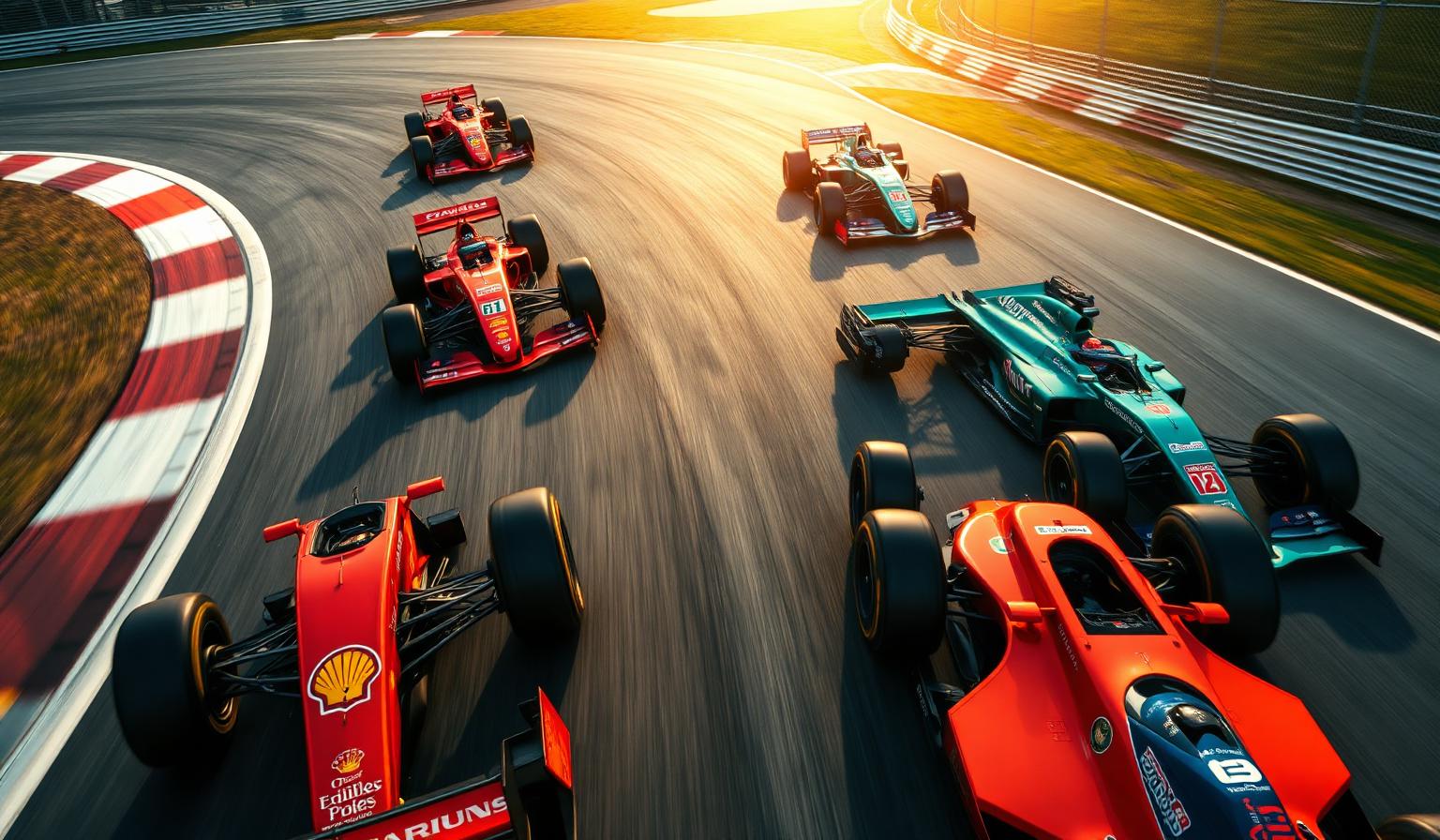
F1 liveries are 200-mph brand statements: every color balances sponsor contracts, national racing heritage and TV legibility at speed. Ferrari's red is non-negotiable identity; McLaren's papaya is deliberate differentiation. This deep-dive decodes the design logic behind each livery — beyond the hex codes.
Watch: The F1 Team Colors Decoded: Psychology, Design Logic & Iconic Livery Palettes Song
F1 Livery Design: The Psychology Behind Every Team's Colors
There is no harder visual brief in the world than designing a Formula 1 livery. The result has to survive a 340 km/h flyby, a broadcast cut that lasts 24 frames, a die-cast model on a child's shelf, and a Times Square billboard — all while sharing real estate with eight sponsor logos and the FIA's regulatory markings. The F1 team colors you see on the 2026 grid are not aesthetic choices. They are the most ruthlessly tested brand systems in sport.
This guide is written from a color analyst's chair. We'll walk through every major team's livery palette, the psychology those colors trigger, the design patterns that emerge when you line them up, and what brand designers and product teams can steal from the discipline. If you want a pure 2026 hex breakdown, our F1 2026 livery color analysis post is the sister piece — this one is about why the design logic works.
Why F1 Team Colors Matter More Than Almost Any Other Sports Palette
Most sports brand palettes operate inside a stadium, on a static jersey, or across a 90-minute broadcast where the camera lingers. F1 has none of those affordances. A livery has to:
- Register identity in under one second as the car flashes through a TV cut
- Stay readable across carbon fibre, helmet shell, pit-wall LED, hospitality suite, and retail merch
- Survive being surrounded by hostile color — Shell yellow, Oracle red, Petronas teal, all fighting for attention
- Distinguish teammates clearly enough for stewards and broadcasters
- Carry 75 years of heritage gravity without looking dated on a 4K stream
That set of constraints forces every team into the cleanest possible expression of color strategy. There is nowhere to hide a tasteful but invisible palette. Every hex on the grid is the answer to one question: what is the single color that says everything about us, instantly, from any angle, in any light?
For broader context on how color carries identity in sport, see our companion piece on racing car aesthetics across motorsport history.
The Complete F1 Team Colors Breakdown
Below is a team-by-team palette breakdown, ordered by how dominant the primary color is in the team's identity system. Hex codes reflect the working values used across modern F1 brand systems; some are official, some are best-fit digital equivalents of the physical paint specs.
Ferrari — Rosso Corsa Red #DC0000
The most culturally loaded color in motorsport. Rosso Corsa was assigned to Italy under the early 1900s FIA national racing color allocation, and Ferrari has spent the last 75+ years compounding that assignment into pure brand equity. Modern broadcast variants push slightly cooler and more saturated than the historical paint, optimizing for OLED screens, but the cultural meaning is unchanged: passion, speed, Italian heritage, dominance.
No other team can credibly use red as a primary. Ferrari has owned the color category for so long that any challenger reads as derivative.
Mercedes — Silver #C0C0C0 & Stealth Black #15151E
Mercedes' palette tells two stories at once. The silver lineage traces to the 1930s "Silver Arrows," when team mechanics famously stripped white paint from a W25 to make weight — turning bare aluminium into a brand asset. The near-black #15151E introduced in the modern era signals aggression, sophistication, and aerodynamic stealth. Together they read as elegance + engineering precision.
The Petronas teal accent (more on this in our 2026 livery breakdown) has gradually become a third identifying signal — a textbook case of a sponsor color becoming a team color over a decade of disciplined repetition.
Red Bull Racing — Navy Blue #0A1B40 with Yellow #FFD700 & Red Accents
Red Bull's palette is the most commercially literal on the grid: it's the can. The deep navy projects strength, stability, and intensity; the golden yellow delivers the energy-drink-coded jolt of dynamism and youth; the red bull marks add aggression. It is a three-color system where every shade is doing a specific psychological job.
The lesson for brand designers: when your product packaging is already a beloved color system, don't reinvent it for adjacent surfaces — extend it.
McLaren — Papaya Orange #FF8700
The single most aggressive single-color claim on the grid. McLaren's papaya is so saturated, so warm, and so unique that no other team can credibly use orange. McLaren has effectively claimed the entire orange wedge of the F1 color wheel — a textbook example of category ownership.
Psychology: vibrancy, uniqueness, heritage (Bruce McLaren's original 1960s orange), and creative speed. Read more on McLaren's color story in our racing car aesthetics post.
Aston Martin — British Racing Green #005F41
British Racing Green is the second-oldest national racing color still in active use — the UK's allocation under the original FIA color scheme. Aston Martin's modern interpretation sits in the deep emerald range, leaning slightly cooler and richer than vintage 1950s BRG. The shift is intentional: it reads as heritage, luxury, and contemporary British elegance rather than nostalgia.
This is one of the cleanest examples in sport of a heritage color being modernized without being abandoned.
Alpine — French Blue #005BA9 with Pink #FF80BD
Alpine is the modern inheritor of France's 1900s national racing color (Bleu de France). The #005BA9 blue projects performance and engineering tradition; the BWT-driven pink #FF80BD is the team's distinctiveness lever — a deliberately unexpected secondary that makes the car instantly readable in any crowd of blues.
Pink-and-blue is a textbook complementary pairing the grid otherwise avoids. It's a case study in how a single bold secondary can rescue an otherwise crowded primary color category.
Williams — Williams Blue #1868DB
The most "old-school F1" blue on the modern grid. Williams' royal-leaning blue is slightly brighter than a true admiralty navy — a deliberate broadcast-visibility concession — but it still reads as the most traditional blue in the paddock. It does the heavy lifting of resilience, tradition, and engineering determination without needing a loud secondary.
Haas — Industrial Grey #9C9FA2 with Red & Black
Haas's choice of a true industrial grey is the closest the modern grid gets to the original Silver Arrows aesthetic. The neutral metallic body color lets the red and black secondary palette carry the emotional work, while the grey itself projects American manufacturing seriousness — CNC, tooling, machine-shop honesty.
Kick Sauber — High-Saturation Green #01C00E
The most attention-seeking color on the grid. Kick Sauber's near-pure RGB green is a value rarely chosen in serious brand work because it screams. That's the point. Maximum saturation signals a new sponsorship era and stakes out unmistakable territory against a grid dominated by blues, reds, and silvers.
Racing Bulls (VCARB) — Light Blue #6C98FF
A deliberately lighter, pastel-shifted blue that signals "development team / younger sibling" inside the Red Bull family. The lighter shade is a visual hierarchy cue: same family, junior member. It also avoids head-on conflict with Williams navy and Alpine French blue.
Patterns & Analysis: What F1 Team Colors Reveal About Brand Strategy
When you stack the full grid side by side, three patterns dominate.
1. Blue is the most contested category in F1 — and differentiation happens entirely through shade. Five teams (Mercedes' teal accent, Red Bull, Alpine, Williams, Racing Bulls) live somewhere on the blue spectrum. Blue reads as trustworthy, technical, and premium — exactly what sponsors want. The differentiation challenge is solved not by leaving the category but by claiming a precise shade: navy vs. royal vs. French vs. pastel vs. teal. This is the live demonstration of why shade-level discipline beats category-level ambition. If you're picking colors for a crowded SaaS or fintech vertical, this is the playbook.
2. The bold-color teams own their hues outright. Ferrari = red. McLaren = orange. Aston Martin = green. Kick Sauber = bright green. None of these teams has serious in-grid competition for their primary color. The lesson: when you can claim a color category entirely, do it. The brand recall benefit compounds for decades, and the cost of switching later becomes prohibitive.
3. Heritage colors are modernized, not abandoned. Ferrari's red, Aston's green, Alpine's blue, and Mercedes' silver are all examples of teams keeping the category of their historical color but updating the exact shade for digital-first viewing. This is the single most important pattern any legacy brand should study: equity lives in the color category, not the specific paint mix.
Color Psychology Across the F1 Grid
If you cluster the grid by the emotion each livery is engineered to provoke, you get four groups:
- Aggression & dominance — Ferrari (#DC0000), McLaren (#FF8700), Kick Sauber (#01C00E). High saturation, warm or screaming hues that demand attention.
- Authority & precision — Mercedes (#C0C0C0 / #15151E), Red Bull (#0A1B40), Williams (#1868DB). Confident silvers and deep blues that signal engineering credibility.
- Heritage & elegance — Aston Martin (#005F41), Alpine (#005BA9). Colors that lean on national or historical association to project earned prestige.
- Pragmatism & utility — Haas (#9C9FA2), Racing Bulls (#6C98FF). Neutral or pastel-shifted shades that read as supporting characters in a larger ecosystem.
Notice what's missing: no team on the grid uses a muted, low-saturation primary. F1 cannot afford tasteful invisibility. Every livery operates at the high end of the saturation curve because broadcast and merchandising both reward visibility over subtlety. The same is true for any brand that needs to survive being a thumbnail.
Designer Takeaways: Applying F1 Color Logic to Your Brand
You're probably not painting an 798 kg carbon fibre missile. The discipline still transfers.
1. Own a hex, not a "color family." Ferrari doesn't own "red" — it owns #DC0000. The specificity is what makes recognition automatic across hostile surroundings. Pick a single primary value and refuse to drift from it across surfaces. Document it in your design system like a paint code.
2. Use shade as differentiation, not category. If your competitive space is crowded with blues — fintech, SaaS, healthtech, infrastructure — don't escape to a different color. Pick a specific blue that no competitor uses. The F1 grid co-exists with five blues purely through shade discipline. Browse coloracci.ai/popular-gradients to find shade-level differentiation cues drawn from real-world systems.
3. Modernize heritage colors with digital values in mind. Aston Martin did not abandon British Racing Green — it shifted from near-black historical green to a richer, slightly cooler emerald that reads on OLED. If your brand has heritage equity, update the hex without abandoning the category.
4. Pair one saturated primary with one disciplined neutral. Almost every successful livery follows a 60-30-10 split: primary color, deep neutral (black or carbon), single accent. Resist the temptation to introduce a third or fourth saturated color into a brand palette — F1 teams that try multi-color systems consistently lose recognition share to single-color rivals.
5. Engineer for the worst viewing condition. F1 teams design liveries that must survive being a 40-pixel sliver on a phone screen. Test your brand palette at the smallest, lowest-contrast, worst-lit place it will appear — that's the real spec, not the hero shot on your homepage.
6. Match your hex to a physical reference where possible. Brand teams that want true cross-substrate consistency should anchor their digital hex to a physical color system. The coloracci.ai/pantone-finder tool maps any hex to its closest Pantone equivalent — the same discipline F1 teams use to keep paint, vinyl, fabric, and screen all reading as the same color.
Quick-Reference Data Table
| Team | Primary Color | Hex Code | Color Name | Psychological Meaning |
|---|---|---|---|---|
| Ferrari | Red | #DC0000 | Rosso Corsa | Passion, speed, Italian heritage, dominance |
| Mercedes | Silver | #C0C0C0 | Silver Arrow | Elegance, technology, precision |
| Mercedes | Black | #15151E | Stealth Black | Aggression, sophistication, stealth |
| Red Bull Racing | Navy Blue | #0A1B40 | Bull Navy | Strength, stability, intensity |
| Red Bull Racing | Yellow | #FFD700 | Bull Gold | Energy, dynamism, youth |
| McLaren | Orange | #FF8700 | Papaya | Vibrancy, uniqueness, heritage, speed |
| Aston Martin | Green | #005F41 | British Racing Green | Heritage, luxury, British elegance |
| Alpine | Blue | #005BA9 | French Blue | Performance, engineering tradition |
| Alpine | Pink | #FF80BD | BWT Pink | Distinctiveness, modern flair |
| Williams | Blue | #1868DB | Williams Blue | Resilience, tradition, determination |
| Haas | Grey | #9C9FA2 | Industrial Silver | American pragmatism, neutrality |
| Kick Sauber | Green | #01C00E | Kick Green | Freshness, new era, raw energy |
| Racing Bulls | Light Blue | #6C98FF | VCARB Sky | Youth, energy, approachability |
Conclusion: F1 as the Cleanest Brand Color Lab in the World
Every two weeks during the season, ten brand identities are stress-tested in front of 70+ million viewers under harsher visual conditions than almost any commercial brand will ever face. F1 team colors are not decoration — they are the most disciplined, most measurable, most ruthlessly optimized brand systems anywhere in sport. Exact hex codes, owned color categories, heritage updated for digital, and zero tolerance for tasteful muting.
If you're building a brand palette and want a reference set with proof that the choices work, you cannot do better than the modern F1 grid. Pick your hex with the same conviction Ferrari picks Rosso Corsa, and your brand will read at any speed.
Ready to build your own dominance-level palette? Head to the Coloracci AI palette generator to extract, refine, and lock in the exact hex codes that will define your brand the way #DC0000 defines Ferrari. Then explore popular gradients for shade-level inspiration and use the Pantone finder to bridge your digital hex to a real-world print and product spec.
Further reading: F1 2026 livery color analysis, F1 team colors hex codes & livery psychology, NBA team uniform colors.