Eigengrau: What Color Do We See in Total Darkness?
· Coloracci Team
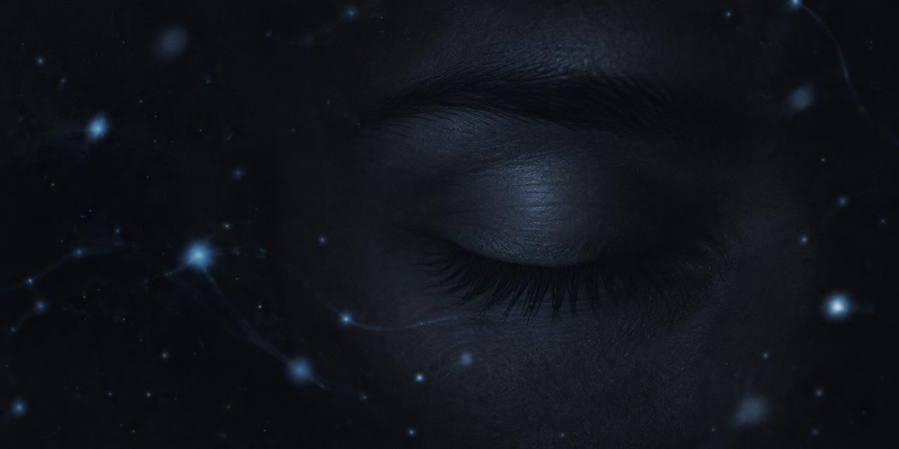
Close your eyes in a sealed, windowless room at midnight and look carefully at what you see. It is not black. It is a faint, grainy, slightly bluish charcoal — a soft fog that seems to shimmer at the edges of attention. That color has a name: Eigengrau, German for "intrinsic gray." In the nineteenth century the German physicist and founder of psychophysics, Gustav Theodor Fechner, gave this "self-light" of the eye serious scientific attention, and the term Eigengrau has stuck ever since. Designers who discover it usually react the same way: the darkest thing a human can see is not #000000. It is something like #16161D — a color your monitor can show, but never quite the way your retina does.
This guide explains what Eigengrau is, why your visual system produces it, how it relates to phosphenes and other "lights in the dark," and — most usefully — what it teaches anyone who designs dark interfaces, night scenes, cinema grades, or print blacks.
What Is Eigengrau? The Color of Complete Darkness
Eigengrau (also called Eigenlicht, "dark light," or "brain gray") is the uniform dark gray perceived in the total absence of light. It is the baseline your visual system reports when there is literally nothing to report.
The surprising part is the word gray. Intuition says darkness should look like perfect black — the absence of any signal. But perceptual black is not an absence. It is a judgment. Your brain sees "black" most convincingly when a dark region sits next to something bright: a black letter on white paper, a shadow beside a sunlit wall, the space between stars. Black is a contrast effect. Remove every light source, and the contrast disappears — so does the deep black. What remains is a dim, featureless gray.
This is why the deepest black you have ever seen probably wasn't in a dark room at all. It was a matte black object under strong light, surrounded by brighter surfaces. In complete darkness, there is nothing to compare against, and the visual system falls back to its resting state: Eigengrau.
If this sounds familiar, it should. As we explored in Is Color Real? How We See a World That Isn't There, color is something the brain constructs from signals, not a property it reads directly off the world. Eigengrau is the purest demonstration of that idea: a color with no stimulus at all.
Why We See Eigengrau Instead of Black
Thermal noise in the retina
The retina is not a passive camera sensor that sits at zero when the shutter is closed. Its photoreceptors — rods for low-light vision, cones for color — contain light-sensitive pigments. In rods, that pigment is rhodopsin. A photon normally triggers a shape change in the rhodopsin molecule, starting a chain reaction that ends in a nerve signal.
But rhodopsin is a molecule at body temperature, about 37°C. Every so often, random thermal energy alone is enough to flip a pigment molecule into its activated state, with no photon involved. Vision scientists call these thermal isomerizations, or "dark events." Each one is indistinguishable from the capture of a single real photon. Physiologists measuring isolated rods in the late twentieth century found these spontaneous events happen at a low but steady rate in every rod — and the human retina contains roughly 90–120 million rods.
Add in spontaneous activity further along the pathway — in bipolar cells, ganglion cells, and the visual cortex itself — and the brain receives a constant, faint, random trickle of "light" signals even in perfect darkness. It interprets that trickle exactly as it was built to: as dim light. The result is a low, noisy gray rather than a clean black.
The brain sets a floor, not a zero
Engineers will recognize the concept immediately: Eigengrau is the visual system's noise floor. Every sensor — a camera chip, a microphone, a radio telescope — has one. A camera shooting in pitch darkness at high ISO doesn't produce pure #000000 either; it produces grainy, colored noise. Your eye is doing the same thing, with the brain smoothing the noise into a soft fog.
This also explains a curious design consequence of evolution. A system tuned to detect single photons on a moonless night must be extremely sensitive — and extreme sensitivity always comes with noise. Eigengrau is the price we pay for being able to see a candle flame kilometers away in the dark.
Why it reads slightly blue
Most people describe Eigengrau as a cool gray rather than a neutral one. In very dim conditions, vision is dominated by rods (scotopic vision). Rods are most sensitive around 498 nm — the blue-green part of the spectrum — and the well-known Purkinje shift makes blues and greens appear relatively brighter as light fades. That bias is one reason the common digital stand-in, #16161D, carries a faint blue-violet tilt instead of being a mathematically neutral gray like #161616.
Eigengrau and #16161D: Can You Display It?
The HEX value most often cited for Eigengrau is #16161D (RGB 22, 22, 29). It is a popular approximation, not a measured standard. No instrument can capture Eigengrau, because it exists only as a perception generated inside a single observer's visual system. You cannot photograph it, and no spectrophotometer can read it.
So why does #16161D feel right? Because it captures three qualities people consistently report:
- Not black: a lightness well above zero, so it reads as a "surface" rather than a void.
- Very dark: close enough to black that it still feels like darkness.
- Slightly cool: a small extra push in the blue channel, echoing rod-dominated night vision.
But displaying #16161D is not the same as reproducing Eigengrau. A screen showing #16161D emits real light, sits inside a room with other light, and is surrounded by bezels, walls, and UI elements that set up contrast. Your brain interprets it as a dark-gray object, not as the absence of everything. In that sense Eigengrau belongs to the same family as magenta — a color that is real as an experience yet awkward as physics. We unpacked that kind of paradox in The Color That Doesn't Exist: Why Magenta Isn't a Real Color.
The Eigengrau Reference Palette
Below are reference values for the darkness spectrum, from true digital black to the perceptual approximations designers actually use. Treat the Eigengrau rows as illustrative stand-ins for an experience, not measurements.
| Item | Color | Hex | Name | Meaning |
|---|---|---|---|---|
| Digital zero | Pure black | #000000 | Absolute Black | No emitted light; achievable on OLED pixels that switch off, never seen in total darkness |
| Perceptual darkness | Blue-tinted charcoal | #16161D | Eigengrau | Popular approximation of the intrinsic gray seen with no light at all |
| Neutral comparison | Neutral charcoal | #161616 | Neutral Floor | Same lightness as Eigengrau without the cool rod-vision tint |
| Dark UI surface | Soft dark gray | #121212 | Material Dark Surface | Widely recommended dark-mode background that avoids pure black |
| Night-sky tone | Deep navy | #0F172A | Midnight Slate | Cool, dark brand surface that reads as "night" rather than "void" |
| Phosphene flash | Pale violet-white | #C9C3FF | Phosphene Glow | Illustrative tint for pressure phosphenes and spontaneous specks of light |
| Rod peak | Blue-green | #00C8A0 | Scotopic Peak | Approximate rendering of ~498 nm, where rods are most sensitive |
Notice how close #16161D, #161616, and #121212 are numerically — yet in a UI they feel distinctly different. The blue channel in Eigengrau adds a "night" quality that neutral grays lack.
Phosphenes: The Lights Inside the Dark
Eigengrau rarely stays perfectly uniform. Sit in darkness long enough and you will see faint drifting specks, swirls, or flickers. These are phosphenes — perceptions of light produced without light entering the eye.
Phosphenes come from several sources:
- Pressure phosphenes. Rub your closed eyes and you'll see glowing rings, checkerboards, or colored blooms. Mechanical pressure deforms the retina and stimulates its cells directly, and the brain reads the activity as light.
- Spontaneous phosphenes. The same random retinal and cortical noise that produces Eigengrau occasionally clusters into visible sparks — the "prisoner's cinema" reported by people kept in long darkness.
- Electrical and magnetic phosphenes. Researchers have induced flashes by stimulating the visual cortex, and astronauts have reported flashes caused by cosmic rays passing through the eye.
- Sudden movement. A quick eye movement in darkness can produce a brief flash as the retina is tugged.
For designers, phosphenes are a reminder that the visual system "fills in" texture when information is missing. A perfectly flat dark field invites the eye to invent detail. That is one reason subtle grain and gradient are so effective in dark-themed design: they give the eye something to resolve instead of letting it hallucinate noise.
What Eigengrau Teaches Designers About Dark Color
1. Pure black is rarely the darkest-feeling choice
Because black is a contrast judgment, the perceived depth of a dark area depends on what surrounds it. A #000000 background behind blinding white text can feel harsh and cause "halation," where light text appears to bleed into the dark. A slightly lifted background like #121212 or #16161D reduces that glare while still reading as dark. Major dark-mode systems recommend off-black surfaces for exactly this reason.
2. Tint your darks with intent
Neutral grays at very low lightness can look dead or muddy. A small cool tint — the Eigengrau move — signals night, depth, and calm; a warm tint signals intimacy and evening. Decide which mood your product needs, then push one channel by a few units. The difference between #161616 and #16161D is just seven points of blue, but the emotional shift is real.
3. Build an elevation scale above your "floor"
Treat your darkest surface as a noise floor and build layers upward: base background, raised card, modal, popover. Each step should be lighter by a perceptible amount. Dark interfaces fail when everything collapses into a single murky band — the visual equivalent of staring into Eigengrau with nothing to focus on.
4. Remember the Purkinje shift in night-use products
Apps used in bedrooms, cars, observatories, or cinemas operate near scotopic conditions. In dim environments, reds lose brightness faster than blues and greens. That is why astronomers use red lights to preserve night vision — and why a red warning on a dark dashboard can feel weaker than expected. Test critical colors at the brightness users will actually see them.
5. Respect accessibility on dark backgrounds
Very dark grays narrow your contrast budget less than you might think, but low-contrast secondary text on #16161D can easily fall below WCAG thresholds. Check every text color against the actual background, not against pure black. Avoid ultra-thin type on dark surfaces; thin strokes break apart visually in the same way faint signals dissolve into Eigengrau.
6. Plan for print separately
A designer might want an "Eigengrau" brand black on packaging. On paper, black depends on ink density, substrate, and finish — a rich black built from CMYK behaves very differently from a single black ink, and a cool tint requires deliberate ink choices. Start from your digital reference and find the closest print match using the HEX to Pantone converter, then proof it physically under the lighting where it will be seen.
7. Use grain to fight the void
Large flat dark areas on screens can show banding and feel synthetic. A very subtle noise texture — echoing the retina's own noise — makes dark gradients smoother and more natural. Keep it below the threshold of conscious notice; the goal is texture, not grit.
Eigengrau in Culture, Art, and Branding
Eigengrau has become a quiet cult reference among designers, photographers, and science communicators. It appears as a named dark-mode theme, a paint and nail-polish name, and a shorthand in film-grading circles for "a black that still feels alive." Cinematographers have long avoided crushing shadows to pure zero for the same reason the eye does: a scene with no detail in the dark looks flat and electronic, while lifted, slightly tinted shadows read as atmosphere.
The idea also resonates with artists because it inverts a basic assumption. Darkness is not empty. Even with nothing to see, the visual system keeps working, generating its own quiet signal. Painters who mix "black" from deep blues and umbers instead of using tube black are, in a way, painting Eigengrau — a dark with structure and temperature.
Practical Takeaways
- Eigengrau is real as perception, not as a measurable stimulus. #16161D is a convenient approximation, not a standard.
- Black is a contrast effect. Make darks feel deeper by controlling surrounding brightness, not by forcing #000000.
- Off-black backgrounds reduce glare and halation for light text; #121212 to #16161D is a reliable range.
- A small cool tint adds "night" to dark surfaces; a warm tint adds intimacy.
- Design an elevation ladder above your darkest surface so layers stay legible.
- Test in real dim lighting to account for the Purkinje shift and screen glare.
- Translate darks for print deliberately, proofing physical samples under final lighting.
Conclusion: The Gray at the Bottom of Vision
Eigengrau is one of the most elegant facts in color science. The darkest experience available to a human being is not nothing — it is the faint hum of a visual system that never truly switches off. Thermal noise in rods and cones, random firing along the neural pathway, and a brain that interprets every signal as light combine into a soft, cool gray that no screen can truly capture.
For designers, that hum is a lesson. Darkness works best when it has structure: a considered lightness, a deliberate tint, surfaces that step upward, and contrast that respects how eyes actually behave. Fechner's "intrinsic gray" reminds us that every color decision is, ultimately, a decision about perception.
Ready to turn your darkest digital tones into reliable print colors? Enter any dark value — try #16161D — in our HEX to Pantone converter to find the closest match, then dive deeper into perception with Is Color Real? and Why Magenta Isn't a Real Color.