Inside Discord's Dark Theme: How Blurple and Functional Color Power Community UX
· Coloracci Team
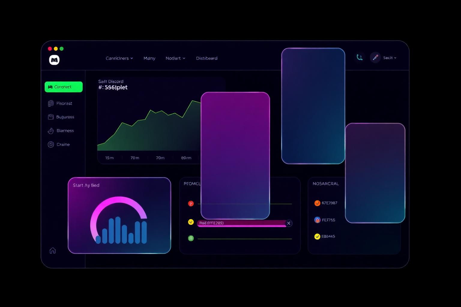
Why Discord's Colors Are Iconic
Most communication apps look like office software. Discord doesn't. Open the desktop client and you're dropped into a near-black workspace lit up by a single, unmistakable hue — Blurple #5865F2. It's a color so specific to the brand that Discord built an entire visual identity around it, even renaming their internal design system after it. The result is one of the most recognizable color systems in modern SaaS: a dark canvas, one hero hue, and a tightly disciplined set of functional accents that quietly run the entire product.
This article isn't a generic brand-color rundown. It's a focused look at how Discord's palette functions in production — how Blurple anchors hierarchy on a black-dominant surface, why the accent quartet (green, yellow, fuchsia, red) earns its keep on every screen, and what designers building community products in 2026 should steal from the Discord brand colors playbook.
The Exact Colors
Discord publishes its core brand palette publicly through its design guidelines. The platform separates brand colors (used in marketing, logo, and identity) from functional colors (used inside the product to convey state and meaning). Below is the working palette this article unpacks.
| Color Name | Hex | Usage |
|---|---|---|
| Blurple | #5865F2 |
Primary brand color, logo, primary CTAs, mentions, links |
| Light Blurple | #E0E3FF |
Soft backgrounds, hover tints, badges, illustration highlights |
| Black | #000000 |
Marketing surfaces, deep contrast wells, OLED-friendly chrome |
| Green | #57F287 |
Online status, positive confirmations, success toasts |
| Yellow | #FEE75C |
Idle status, warnings, attention without alarm |
| Fuchsia | #EB459E |
Nitro accents, premium moments, celebratory highlights |
| Red | #ED4245 |
Errors, destructive actions, Do Not Disturb status |
A few things stand out immediately. The brand layer is tiny — only three colors do the heavy identity work. The functional layer is also small, with just four accents covering every status and feedback case. That restraint is the entire point: a small palette, applied with discipline, scales across thousands of servers, millions of channels, and a product that ships changes weekly.
Color Psychology: What Each Color Communicates
Blurple #5865F2 — The Invented Hue
Blurple is the linchpin. It sits exactly between blue and purple on the color wheel, which is more strategically loaded than it sounds. Blue carries the trust, calm, and reliability that communication tools desperately need — nobody wants a chat app that feels unstable. Purple brings creativity, playfulness, and a slight outsider energy that aligns Discord with gaming, makers, and creator communities rather than corporate IT.
By living in between, Blurple lets Discord be both things at once: trustworthy enough for a Fortune 500 community team to deploy, expressive enough for a 15-year-old's anime server. That dual signal is almost impossible to achieve with an off-the-shelf primary. Discord's decision to invent a color rather than pick one was a brand-defining move.
Light Blurple #E0E3FF — Whisper, Not Shout
Light Blurple is the supporting actor that prevents Blurple fatigue. At ~92% lightness, it provides Blurple's identity signal without the visual weight. You'll see it in tinted hover states, soft badge backgrounds, illustration highlights on the marketing site, and pre-pressed states for primary buttons. It also gives Discord a way to use brand color on white backgrounds without screaming.
Black #000000 — The Stage, Not the Star
Discord uses pure black far more aggressively than most consumer SaaS. On marketing pages it functions as a deep contrast well, making Blurple feel almost luminescent against it. In the product, near-black surfaces (the dark theme has shifted slightly from #36393F toward deeper grays in recent redesigns) create a calm reading environment for hours-long sessions.
Psychologically, black communicates focus, modernity, and elegance. Practically, it does three things very few palettes manage simultaneously: it reduces eye strain in low-light environments, it makes one hero color (Blurple) carry maximum semantic weight, and it looks premium on OLED hardware — the screens Discord's audience actually uses.
The Functional Accents
The four-color accent set is a model of restraint:
- Green
#57F287— Positive, alive, "go." Used for online status dots and success states. The slightly minty saturation reads as fresh rather than industrial. - Yellow
#FEE75C— Attention without panic. Reserved for idle status and soft warnings, where red would be overkill. - Fuchsia
#EB459E— Celebration and premium. Anchors the Nitro subscription and any moment Discord wants to feel like a treat. - Red
#ED4245— Stop, error, destructive. Used sparingly so it actually means something when it appears.
Each accent owns exactly one semantic job. That's why a red badge in Discord feels urgent in a way that red badges in over-saturated dashboards do not.
Website and App Analysis: How the Palette Actually Works
Hierarchy Through Scarcity
Walk through any Discord screen and count the Blurple. You won't find much — usually one or two elements per viewport. The primary CTA. The active server icon's pill indicator. An @mention. A link. By keeping Blurple scarce, Discord makes every appearance of it mean something. The eye is drawn to it instantly because nothing else competes.
This is the opposite of how most consumer apps treat their brand color, which is typically applied to headers, icons, accents, badges, and decorative shapes simultaneously. Discord's restraint is the reason Blurple feels powerful rather than decorative.
Contrast and Accessibility
On the dark theme, Blurple #5865F2 sits on near-black surfaces and produces strong luminance contrast — comfortably above WCAG AA thresholds for non-text UI elements like buttons. Body text is delivered in high-contrast off-white (#DBDEE1 family) rather than pure white, which softens harsh edges in long reading sessions without sacrificing legibility.
The functional accents are also tuned for the dark canvas. Note how Green and Yellow lean light and slightly desaturated rather than pure neon — that's deliberate. On a black background, fully saturated greens and yellows vibrate uncomfortably. Discord's tones sit just below that vibration threshold.
Whitespace in the Dark
Whitespace doesn't disappear in dark UIs — it just becomes blackspace. Discord uses generous negative space between channel groups, message clusters, and sidebar sections, letting the dense information density of an active server breathe. The result is a UI that handles 20 channels and 50 unread messages without feeling like a control panel.
Dark Theme as Default Identity
For most products, dark mode is an option. For Discord, it's the identity. New users land in dark theme by default, and the entire marketing site reinforces that aesthetic. This commitment lets Discord optimize every visual decision — accent saturation, contrast ratios, illustration style — for one canvas instead of two. It's a strategic choice with real product velocity benefits.
Composition and Visual Order
Discord's interface is dense — a left rail of server icons, a channel sidebar, a member list, a chat column, and often a thread or call panel — yet it rarely feels chaotic. The reason is structural: the layout follows a strict left-to-right hierarchy that mirrors how attention should flow (orientation → navigation → content → context).
Color reinforces that flow. The leftmost server rail is the darkest, almost black. Channel sidebars step up slightly. The active chat column is the lightest dark surface. Modal overlays shift darker again to push the underlying UI back. This stepped luminance creates an implicit z-axis — depth without shadows — that helps users understand which surface is "in front" without conscious thought.
It's not literally a golden-ratio layout, but it follows the same compositional instinct: a small number of clearly defined regions, each with a distinct visual weight, arranged so the eye knows exactly where to land first. Color is doing structural work that geometry alone couldn't.
What Designers Can Learn
1. Invent Your Primary if You Need To
Blurple exists because no off-the-shelf blue or purple could do the job Discord needed. If your brand has to communicate two seemingly contradictory ideas (trust + play, power + warmth, premium + accessible), don't compromise with a safe pick. Mix until you find a hue nobody else owns. That investment pays back every time someone sees your color and thinks of you first.
2. Make Your Hero Color Scarce
A primary color earns its power from how rarely it appears, not how often. Audit your interface and count the percentage of pixels using your brand color. If it's above ~5%, you're probably diluting the signal. Discord's discipline — one primary CTA per screen, mentions and active states sparingly — is why Blurple still feels electric after a decade.
3. Give Each Accent Exactly One Job
Discord's green is for "online" and "success." It is not for "approve," "go," "active," "live," or "premium." That semantic rigor is what lets users glance at the UI and read state instantly. Before adding a fifth color to your palette, ask whether one of your existing four can stretch — and before reusing an accent, ask whether the second meaning will erode the first.
4. Tune Saturation for Your Canvas
Colors that look great on white often look broken on black, and vice versa. If you're shipping a dark-default product, design every accent on the dark canvas — not against a white wireframe. Discord's slightly muted Green and Yellow are tuned for black. Pick saturations that sit just below the "vibration" point on your actual surface.
5. Treat Dark Theme as a Brand Decision, Not a Setting
If dark mode is core to who your users are (gamers, developers, creators, anyone working long hours on a screen), make it the default and design for it first. You'll move faster, your accent system will be tighter, and your identity will feel more cohesive than a brand straddling two visual languages.
Bringing Discord-Grade Discipline to Your Own Palette
You don't need a billion-dollar brand team to apply these principles. The same discipline — one inventive primary, a small set of single-job accents, a luminance-stepped surface system — works for indie SaaS, creator tools, internal dashboards, and community products of any size.
If you want to see how a palette like this comes together, Coloracci's color tools let you generate, audit, and refine palettes that follow the same principles Discord codifies in their guidelines: a hero color you own, accents that mean exactly one thing, and luminance choices tuned for your actual canvas. For more on how brand palettes shape perception, our deep dive on superhero color psychology explores how single-color identities like Blurple build the same kind of instant recognition comic-book characters have spent decades earning.
Discord's palette works because every color earns its place. Build yours the same way and you'll get a product that, like Discord, doesn't need its logo to be recognized — the color does the talking.
Ready to design your own Blurple? Generate a custom brand palette on Coloracci.ai and start building an identity that's instantly, unmistakably yours.