Color Picker vs Color Extractor: Which Tool Do You Need?
· Lion Dada
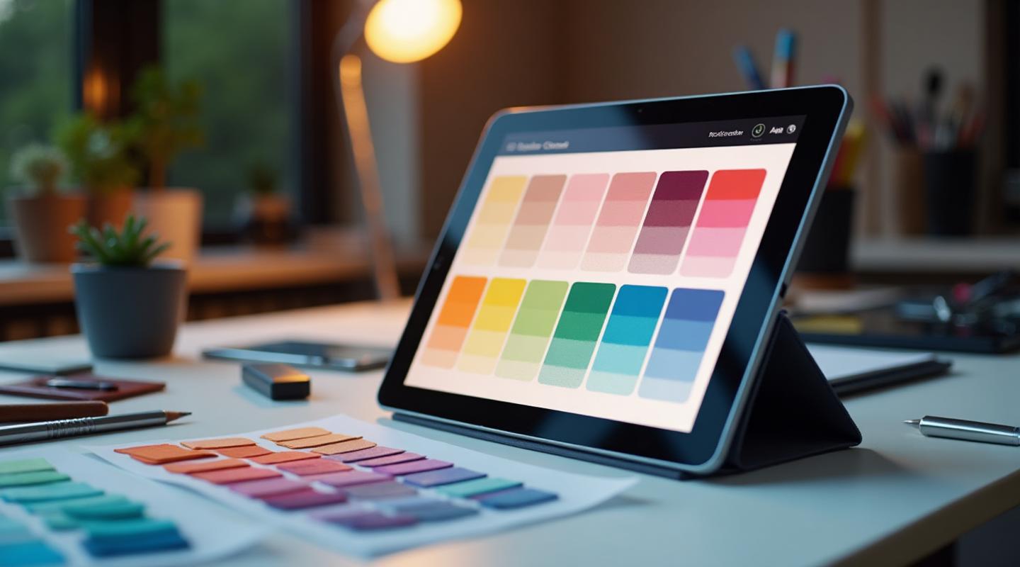
I remember sitting in my first design job, staring at my screen completely confused. My creative director had asked me to "pull the colors from this image" and then "pick a complementary shade for the CTAs."
I had no idea which tool to use. The color picker? The eyedropper? Some kind of extractor thing?
After making every possible mistake (including accidentally sending a client a palette that was just five slightly different grays), I finally figured out the difference between these two essential color tools—and more importantly, when to use each one.
Let me save you the embarrassment I went through.

The Core Difference: Creation vs. Discovery
Here's the simplest way to understand it:
Color Picker = You're creating colors from scratch or fine-tuning existing ones
Color Extractor = You're discovering colors that already exist in images or designs
Think of it like cooking. A color picker is like being a chef with a full spice rack—you can create any flavor combination you want. A color extractor is like being a food scientist analyzing a dish to figure out exactly what spices were used.
Both are essential. Neither replaces the other.
What Exactly Is a Color Picker?
A color picker tool gives you complete control over color creation. It's the Swiss Army knife of digital color work.

Core Features of Color Pickers:
- Color Wheel Selection: Click anywhere to select a hue
- HSL/HSB Sliders: Fine-tune hue, saturation, and lightness with precision
- RGB/HEX Input: Enter exact values when you know what you need
- Color Harmony Generation: Create complementary, analogous, triadic, and other color harmonies
- Format Conversion: Switch between HEX, RGB, HSL, CMYK instantly
- Eyedropper Tool: Sample colors from your screen (this is where some confusion starts)
When to Use a Color Picker:
- Building a brand from scratch: You have a concept but no visual reference
- Creating color variations: Need 5 shades of your brand blue
- Converting between formats: Client gives you Pantone, you need HEX
- Fine-tuning specific values: That blue is almost right but needs to be 10% more saturated
- Generating harmonies: Starting with one color and building a complete palette
The key insight? Color pickers are about precision and control. You're the artist mixing paints on a palette.
What Exactly Is a Color Extractor?
A color extractor tool analyzes existing images and pulls out the dominant colors automatically.

Core Features of Color Extractors:
- Image Upload: Drag and drop any photo, screenshot, or design file
- URL Analysis: Paste a website URL to extract its color scheme
- Dominant Color Detection: AI identifies the most prominent colors
- Palette Generation: Get a ready-to-use palette from any source
- Color Distribution: See how much of each color appears in the image
- Export Options: Save extracted colors in various formats
When to Use a Color Extractor:
- Gathering inspiration: You love how a photo feels and want those exact colors
- Reverse-engineering designs: What colors is that competitor using?
- Matching existing materials: Client sent their packaging—now you need the digital equivalent
- Mood board creation: Building a mood board from collected images
- Quick palette generation: Need a cohesive palette in 30 seconds
The key insight? Color extractors are about discovery and speed. You're a detective finding clues in existing visuals.
The Confusion: Why People Mix These Up
Here's where designers get tripped up: many color pickers include a basic eyedropper, and many extractors let you tweak colors afterward. The lines blur.
But there's a crucial difference:
- An eyedropper samples a single pixel at a time
- An extractor analyzes entire images and finds patterns
Using an eyedropper to "extract" colors from a sunset photo means clicking dozens of times and hoping you caught the right ones. Using an extractor means uploading once and getting the 5-8 most important colors instantly.

Side-by-Side Comparison
| Aspect | Color Picker | Color Extractor |
|---|---|---|
| Input | Manual selection | Image/URL upload |
| Output | Single color + harmonies | Complete palette |
| Speed | Deliberate, precise | Fast, automatic |
| Best For | Creation & refinement | Research & inspiration |
| Skill Required | Color theory helps | Minimal |
| Starting Point | Blank canvas | Existing visuals |
| Control Level | Maximum | Moderate |
Real-World Scenarios: Which Tool When?
Let me walk you through actual design situations I face regularly:
Scenario 1: New Brand Identity
Situation: Client is a wellness startup. They want "calm, natural, premium" vibes but have no visual references.
Tool: Color Picker
Why: You're creating from concepts, not copying existing visuals. You'll use color psychology knowledge to select greens and neutrals that evoke wellness. The picker lets you build harmonies from scratch and adjust until everything feels right.
Scenario 2: Website Redesign
Situation: Client loves three competitor websites and wants "something like that but different."
Tool: Color Extractor → Color Picker
Why: Start by extracting palettes from those competitors to understand what colors work in this industry. Then switch to the picker to create your own unique variation that stands apart while hitting similar emotional notes.
Scenario 3: Marketing Campaign for Existing Brand
Situation: Brand guidelines exist. You need complementary colors for a seasonal campaign.
Tool: Color Picker
Why: You already have the brand colors. Now you're generating harmonies and variations that work with what exists. The picker's harmony generator is perfect for this.
Scenario 4: Social Media Content
Situation: Client sends you photos from their product shoot. Posts need to match the vibe.
Tool: Color Extractor
Why: Those product photos ARE the brand. Extract the actual colors from the images to ensure your graphics feel cohesive with the photography.
Scenario 5: Accessibility Audit
Situation: Existing website fails WCAG contrast requirements. You need to fix colors while maintaining brand recognition.
Tool: Color Picker + Contrast Checker
Why: You're fine-tuning existing colors, not discovering new ones. Small HSL adjustments (darker text, lighter backgrounds) require precision control.
The Pro Workflow: Using Both Tools Together
Here's what I wish someone had told me on day one: the most efficient designers use both tools in combination.

The Extract → Refine → Export Workflow
Step 1: Extract Upload your inspiration images to the color extractor. This gives you a starting point in seconds rather than hours of manual selection.
Step 2: Analyze Look at what the extractor found. Are these colors close to what you need? What's missing?
Step 3: Refine Take those extracted colors into the color picker. Adjust saturation, tweak lightness, generate complementary shades for accents.
Step 4: Check Run your refined palette through the contrast checker to ensure accessibility compliance.
Step 5: Export Save your final palette in whatever format your project needs—CSS variables, Tailwind config, JSON, or Figma styles.
This workflow combines the speed of extraction with the precision of picking.
Common Mistakes (And How to Avoid Them)
Mistake 1: Using Picker When Extractor Would Be Faster
The Problem: Spending 2 hours manually picking colors that match a client photo.
The Solution: Upload the photo to an extractor first. Get a 90% solution in 30 seconds, then fine-tune with the picker.
Mistake 2: Trusting Extracted Colors Without Refinement
The Problem: The extractor pulled colors that look great in the photo but muddy in a UI.
The Solution: Photos and UIs work differently. Always run extracted colors through the picker to adjust saturation and lightness for digital use. Check the 60-30-10 rule for proper distribution.
Mistake 3: Ignoring Color Formats for Print vs. Digital
The Problem: Sending a client HEX codes for a print project.
The Solution: Use the picker's format conversion. For print, you need CMYK or Pantone matches. For digital, HEX/RGB is fine.
Mistake 4: Eyedropping One Pixel From Complex Images
The Problem: The "gold" you eyedropped from a sunset is actually orange because you hit the wrong pixel.
The Solution: Use a proper extractor that analyzes the whole image and finds the actual dominant colors—not just whatever pixel your mouse happened to land on.

Which Tool Should You Start With?
If you're new to design or working on unfamiliar projects, here's my simple decision tree:
Start with Extractor if:
- You have visual references or inspiration
- The client sent existing materials
- You're analyzing competitors
- Speed is critical
Start with Picker if:
- You're creating from a concept (no visuals)
- You need specific color values
- You're generating variations of known colors
- Precision is critical
Use both if:
- It's a significant project (brand identity, website)
- You want professional-quality results
- You value both speed and precision
The Tools I Actually Use
For extraction, I use our Image Color Extractor. It handles photos, screenshots, and even website URLs. The AI is smart about finding actually-usable colors, not just mathematically-dominant ones.
For picking and refinement, our AI Color Palette Generator uses Fibonacci-based harmonies that create naturally pleasing combinations. The AI advisor helps when you're stuck.
For the full workflow? The Mood Board Generator combines extraction, curation, and palette generation in one tool.
And when I'm checking existing websites? Our Chrome extension extracts colors directly from any page without screenshots.
Quick Reference Guide
| Your Situation | Use This |
|---|---|
| "I need to match this photo" | Extractor |
| "I want colors that feel like..." | Picker |
| "What colors is this website using?" | Extractor or Extension |
| "I need a darker shade of this blue" | Picker |
| "Give me 5 colors that work together" | Both |
| "What's the HEX code for Pantone 300?" | Picker |
| "Make a palette from these 3 images" | Extractor |
| "Is this accessible for colorblind users?" | Simulator |
| "Check my contrast ratio" | Contrast Checker |
The Bottom Line
Color pickers and color extractors aren't competing tools—they're complementary ones. Pickers give you control when you're creating. Extractors give you speed when you're discovering.
The best designers don't choose between them. They master both and know exactly when to reach for each.
Now, the next time your creative director asks you to "pull colors from this image and pick a complementary accent," you'll know exactly what they mean—and exactly which tools to use.
Ready to Try Both?
Stop guessing which tool you need. Our color suite gives you everything in one place:
- AI Color Palette Generator - The most intuitive color picker with AI-powered suggestions
- Image Color Extractor - Extract palettes from any image in seconds
- Mood Board Generator - Combine extraction + curation + AI magic
- Chrome Extension - Extract colors from any website instantly
Whether you're picking, extracting, or doing both—you've got the right tool for the job.