What Colors Go With Terracotta Floor Tiles? A Complete Guide
· Coloracci Team
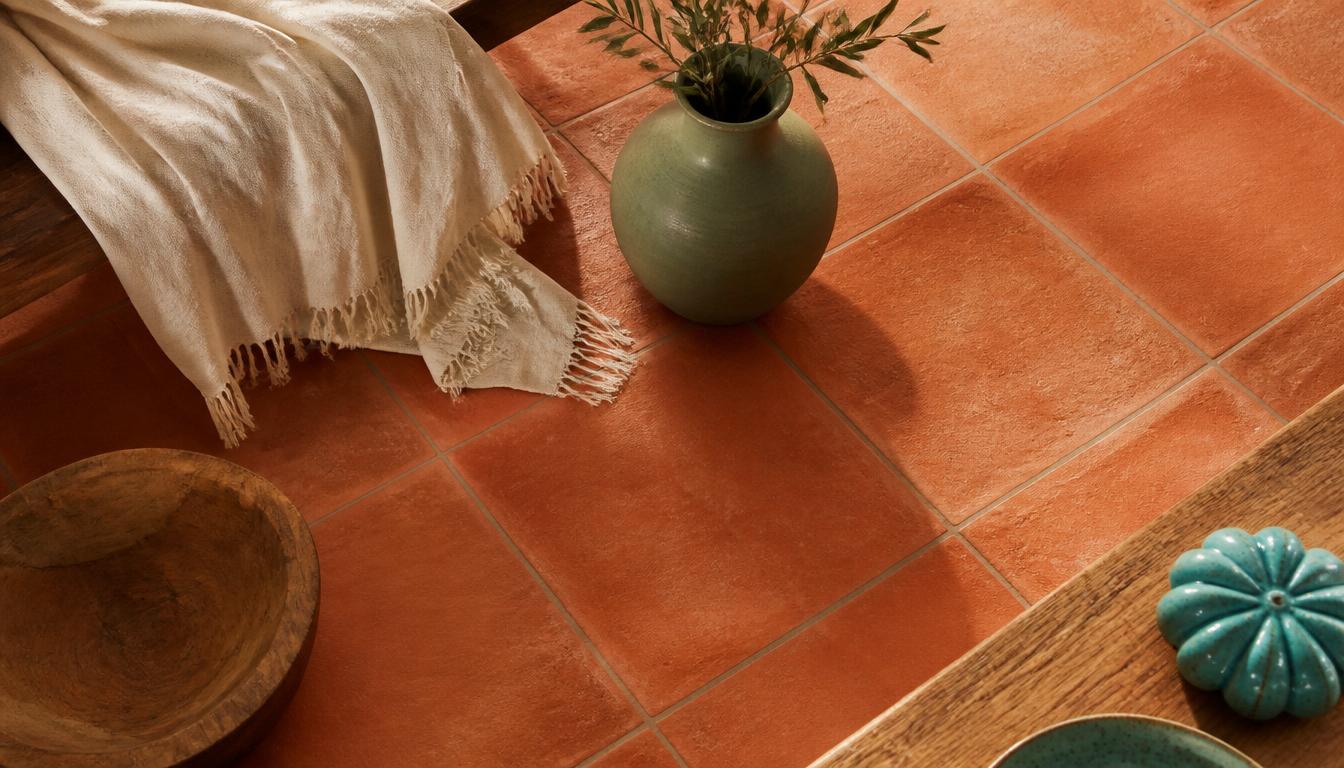
If you are standing in a room with terracotta floor tiles and wondering what colors go with terracotta floor tiles, the short answer is surprisingly simple: lean into neutrals, borrow from the Mediterranean, or lean into the clay with deeper earth tones. The color that works best depends on whether you want the floor to whisper, sing, or take center stage.
Terracotta is a warm, earthy orange-brown — its primary HEX code is #E35336 — that carries the visual weight of fired clay, sun-baked soil, and centuries of architecture. From the Terracotta Army in China to Spanish Colonial courtyards, this color has always been associated with permanence, warmth, and history. That means the colors you pair with it are not just decorating choices; they are emotional signals that set the entire mood of a space.
This guide breaks down every practical pairing, gives you the exact HEX codes, explains the psychology behind each combination, and shows you how to apply the palettes to a terracotta floor tiles living room, a kitchen, or a wall color scheme. By the end, you will have a clear color plan and a simple way to test it before you buy a single paint can.
What Colors Go With Terracotta Floor Tiles: The Neutral Foundation
The safest and most versatile answer to what colors go with terracotta floor tiles is a neutral palette. Neutrals do not compete with the floor; they frame it. They let the clay tones become the warm heartbeat of the room while the surrounding colors provide visual rest.
Cream — #FFFDD0
Cream is the classic partner for terracotta. It creates a light, airy, Spanish-mission feel that reads as relaxed and timeless. Unlike stark white, cream has a yellow undertone that echoes the warmth in the tile, so the transition between wall and floor feels seamless rather than jarring. Use cream on walls, linen upholstery, and sheer curtains to make a terracotta floor tiles living room feel open and sunlit.
White — #FFFFFF
Pure white provides a crisp, clean contrast that makes terracotta pop. This is the palette to choose when you want the floor to be the star. White walls, white kitchen cabinetry, and white ceiling beams against terracotta tiles create a bright, Mediterranean farmhouse look. The risk is that the contrast can feel too clinical if you do not introduce texture — add natural wood, woven baskets, or matte ceramics to keep the room from feeling sterile.
Beige — #F5F5DC
Beige enhances the natural, earthy character of terracotta tiles. It is the quietest choice in this group, ideal for spaces where you want calm above drama. Beige walls, a beige sofa, or a beige area rug will make the room feel larger and more cohesive, especially in a north-facing room where the terracotta can otherwise feel heavy. Beige is also a practical wall color with terracotta floors because it hides minor imperfections and ages gracefully.
Soft Gray — #D3D3D3
Soft gray offers a modern, neutral backdrop that complements the warmth of terracotta without fighting it. This pairing is especially effective in contemporary homes where the floor is traditional but the furniture is clean-lined. Gray kitchen cabinets with terracotta floors, for example, feel current rather than rustic. Just keep the gray warm-toned or greige; a cold blue-gray can make terracotta look muddy by comparison.
What Colors Go With Terracotta Floor Tiles: Contrasting & Bold Palettes
Once you understand the neutral foundation, you can add contrast. The question what colors go with terracotta floor tiles becomes more interesting when you look at complementary and accent colors that make the clay feel alive.
Turquoise — #40E0D0
Turquoise is the classic complementary color for terracotta and creates a vibrant Mediterranean look. On the color wheel, blue-green sits opposite orange-red, which means the two colors intensify each other when placed side by side. A turquoise backsplash in a kitchen with terracotta tiles, or turquoise throw pillows on a cream sofa in a terracotta living room, immediately feels coastal and cheerful. This is the boldest palette in this guide — use turquoise as a 10% accent to keep it from overwhelming the space.
Royal Blue — #305CDE
Royal blue is a brilliant shade that creates an elegant and classic contrast with terracotta. It reads as more formal than turquoise, making it a strong choice for dining rooms, entryways, or a terracotta floor tiles living room that needs a sense of occasion. Royal blue velvet chairs, a navy rug, or deep blue curtains against terracotta feel sophisticated and intentional. For kitchen colors with terracotta tiles, royal blue bar stools or pendant lights add instant personality without committing to a full wall color.
Sage Green — #9CAF88
Sage green is a muted, earthy green that enhances the rustic charm of terracotta. Unlike emerald or forest green, sage does not compete with the floor; it complements it. This pairing feels like a garden room or a Tuscan kitchen. Sage cabinetry, a sage velvet sofa, or sage green ceramics on terracotta floors create a calm, nature-first environment. It is one of the most forgiving accent colors because it works with both warm and cool neutrals.
What Colors Go With Terracotta Floor Tiles: Earthy & Warm Palettes
The most harmonious answer to what colors go with terracotta floor tiles is often to stay within the warm, earthy family. These palettes do not contrast with the floor; they extend it, creating a color-drenched, cocooned feeling.
Soft Pink — #FDDDE6
Soft pink is an on-trend choice that feels fresh and uplifting against terracotta. It pairs especially well with exposed plaster walls or limewash finishes, where the texture softens the color even further. In a bedroom or bathroom with terracotta floors, soft pink walls feel like a warm sunrise. The key is to keep the pink dusty or blush-toned; bubblegum or hot pink will clash with the earthy quality of the tile.
Wood Tones
Natural wood grains and textures enhance terracotta's warmth and authenticity. This is not a single HEX code because every wood species reads differently — oak, walnut, teak, and reclaimed pine all bring their own character. Wood furniture, ceiling beams, and floating shelves are the easiest way to ground a terracotta room. In a kitchen with terracotta tiles, wood countertops or open shelving add the organic warmth that makes the space feel lived-in rather than decorated.
Deeper Reds — #A52A2A
Deeper reds, such as brick red or brown-red, create a harmonious, color-drenched, and cozy atmosphere. This is the palette to use when you want the room to feel enveloped and intimate. A deeper red accent wall, rust-colored textiles, or burgundy leather furniture against terracotta floors can feel like a library or a wine cellar. It is a high-commitment look, but when executed with the right lighting — warm bulbs, candles, dimmers — it is one of the most emotionally satisfying palettes for terracotta.
The Color Psychology of Terracotta
Terracotta is a warm, earthy, orange-brown color. It evokes feelings of serenity, stability, and groundedness because of its direct connection to fired clay and natural soil. When you walk into a room with terracotta floors, your eye subconsciously reads the material as ancient, durable, and honest. It is the color of shelter.
Historically, terracotta carries weight. The Terracotta Army in China used the same fired clay to protect an empire. Spanish Colonial architecture relied on terracotta roofs and tiles to cool interiors under intense sun. Moroccan riads, Italian villas, and Mexican haciendas all used terracotta not because it was fashionable, but because it was available, practical, and beautiful. That history gives terracotta an emotional advantage: it makes a home feel rooted.
This psychology explains why the best pairings are rarely flashy. Colors like cream, sage, and soft pink work because they share the same quiet confidence. Colors like turquoise and royal blue work because they create a joyful tension without destabilizing the room. And colors like deeper red and wood tone work because they deepen the existing warmth rather than introducing a new emotional temperature.
For a broader look at how earth tones function as a design language, our earth tone color palette guide breaks down the exact codes and room-by-room strategies that make clay-based colors feel cohesive.
Room-by-Room Practical Takeaways
Terracotta Floor Tiles Living Room
Start with a 60-30-10 structure: 60% neutral walls in cream or beige, 30% soft furnishings in sage or soft pink, 10% bold accents in turquoise or royal blue. A cream linen sofa, sage green pillows, and a single turquoise ceramic vase on a terracotta floor will feel balanced and intentional. Add a jute or natural-fiber rug to soften the tile underfoot without hiding it.
Wall Color With Terracotta Floors
The safest wall colors are cream, beige, and soft gray. If you want more drama, a deeper red accent wall or a sage green feature wall works beautifully. Avoid walls that are too close to the tile color — an orange-peach wall will make the floor look dirty, and a bright red wall will make the room feel overheated. The goal is contrast or harmony, not competition.
Kitchen Colors With Terracotta Tiles
Kitchens with terracotta floors benefit from crisp, clean cabinetry. White, cream, sage green, and soft gray cabinets all perform well. For a Mediterranean look, pair white cabinetry with a turquoise tile backsplash. For a modern look, use soft gray cabinets with matte black hardware. For a rustic look, wood open shelving and cream walls are the simplest winning formula. The terracotta floor provides the warmth, so the kitchen palette can be cleaner than you think.
Bedroom & Bathroom
In smaller, more private rooms, lean into cocooning. Soft pink walls, terracotta floors, and cream textiles create a warm, restful bedroom. In a bathroom, cream walls, terracotta floors, sage green towels, and wood accents feel like a spa. The smaller the room, the more important it is to keep the palette tight — two or three colors are usually enough.
Color Palette Reference Table
| Palette Style | Color Name | Hex Code | Psychological Meaning |
|---|---|---|---|
| Neutral | Cream | #FFFDD0 | Light, airy, timeless; creates a Spanish-mission openness |
| Neutral | White | #FFFFFF | Crisp, clean contrast that makes terracotta pop |
| Neutral | Beige | #F5F5DC | Calm, earthy cohesion; expands and softens the room |
| Neutral | Soft Gray | #D3D3D3 | Modern, quiet backdrop that complements warmth without competing |
| Contrasting | Turquoise | #40E0D0 | Vibrant, Mediterranean, complementary energy that enlivens the clay |
| Contrasting | Royal Blue | #305CDE | Elegant, formal contrast; adds sophistication and depth |
| Contrasting | Sage Green | #9CAF88 | Muted, rustic, nature-first harmony that feels like a garden room |
| Earthy & Warm | Soft Pink | #FDDDE6 | Fresh, uplifting, and gently warm; pairs with plaster and limewash |
| Earthy & Warm | Wood Tones | Natural | Authentic, grounding, and organic; enhances the floor's material honesty |
| Earthy & Warm | Deeper Reds | #A52A2A | Cozy, enveloping, and color-drenched; creates intimacy and shelter |
This table is the fastest way to decide what colors go with terracotta floor tiles for any room. Match the psychological meaning to the mood you want, then use the HEX code to test the exact shade in paint or digital samples before you commit.
Design Mistakes to Avoid
The most common mistake with terracotta floors is trying to neutralize them. Homeowners often choose cool gray walls or stark black furniture in an attempt to "modernize" the tile, and the result is a room that feels disconnected. Terracotta is warm; it needs colors that acknowledge that warmth, even when they contrast with it.
Another mistake is introducing too many accent colors. Terracotta is already visually rich. If you add turquoise, royal blue, sage green, pink, and deeper red all in one room, the eye has nowhere to rest. Pick one accent family and repeat it in varying proportions.
Finally, avoid lighting that fights the palette. Cool LED bulbs can make terracotta look orange and flat, while warm bulbs bring out its depth. Test your wall colors and textiles under the actual lighting you will use in the room.
If you are planning a larger home refresh, our complete guide on how to add color to your home walks through the 60-30-10 rule, mood boards, and the practical decisions that make color feel confident rather than accidental.
Conclusion: Build Your Terracotta Palette With Confidence
Terracotta floor tiles are not a limitation — they are a starting point. Whether you choose neutral cream walls for a Spanish-mission living room, a turquoise backsplash for a Mediterranean kitchen, or deeper red accents for a cozy bedroom, the right colors will make the floor feel intentional and timeless.
The key is to match the palette to the mood you want: neutrals for calm, bold contrasts for energy, and earthy warm tones for intimacy. Use the exact HEX codes and the table above to test your ideas before you buy paint, fabric, or tile samples.
For a more coastal interpretation of the same warm palette, our Mediterranean coastal colors guide shows how terracotta, turquoise, and cream work together in sunlit spaces.
Ready to see your terracotta palette in action? Use the Coloracci Palette Generator to build, test, and export your perfect combination in seconds. Start with the terracotta HEX code #E35336 and discover the colors that make your floor feel like the foundation of a beautiful home.