What Color Jewelry to Wear With a Terracotta Dress: A Complete Style Guide
· Coloracci Team
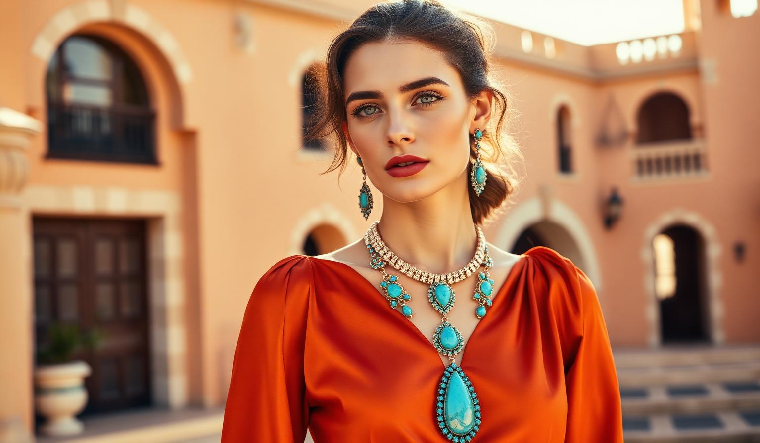
If you are asking yourself what color jewelry to wear with a terracotta dress, the direct answer lies in balancing earthy warmth with intentional visual contrast. Terracotta is a rich, sun-baked clay shade anchored by the exact hex code #E2725B. Rooted deeply in red-orange pigment with subtle brown undertones, it exudes an undeniable sense of nature, organic warmth, and emotional stability. Because terracotta commands a strong visual presence without being loud or neon, the best jewelry pairings either lean into its golden solar warmth or create a striking, high-frequency counterpoint across the color wheel. Expert color analysts recommend five definitive jewelry colors for a terracotta dress: Turquoise & Teal (#40E0D0 and #008080) for an earthy yet electric contrast; classic Gold (#FFD700) for luxurious, melting harmony; Cream & Off-White (#FFFDD0) for understated elegance; Cobalt Blue (#0047AB) for bold, modern sophistication; and Emerald Green (#50C878) for a natural, regal jewel-tone pairing.
Choosing accessories is never merely an afterthought—it is an exercise in applied color theory. When you wear terracotta (#E2725B), your dress acts as an architectural foundation. The jewelry you select introduces secondary and accent hues that dictate the formality, mood, and seasonal energy of your entire look. In this comprehensive style guide, we will explore the precise color science behind these pairings, examine exact hex codes, break down occasion-ready color palettes, explore the psychological signals your accessories broadcast, and translate these fashion principles into actionable takeaways for interior designers and homeowners.
Decoding What Color Jewelry to Wear With a Terracotta Dress: The Color Science
To master color pairing, one must first understand the structural anatomy of terracotta (#E2725B). On the traditional color wheel, terracotta resides in the warm quadrant between vibrant orange and muted crimson ochre. Unlike pure primary orange (#FFA500), which can feel aggressive or synthetic, terracotta is softened by earth pigments. This infusion of brown and red gives it an exceptionally grounding, tactile quality.
When determining what accessories will complement this complex base, color analysts look at three primary chromatic relationships:
- Analogous Warmth (The Golden Glow): Colors that sit immediately adjacent to terracotta on the spectrum—namely yellows, ambers, and warm golds. Pairing #E2725B with luminous metals creates a seamless, low-contrast gradient that feels radiant, cohesive, and sunlit.
- Complementary & Split-Complementary Contrast (The Oceanic Counterpoint): Directly opposite red-orange on the color wheel sit cool blues, cyans, and teals. Introducing cool-toned minerals like turquoise (#40E0D0) or cobalt (#0047AB) activates maximum dynamic tension. The warm background forces the cool jewelry to appear brighter, while the cool jewelry deepens the richness of the terracotta fabric.
- Triadic & Jewel-Tone Harmony (The Forest Canopy): Rich greens such as emerald (#50C878) form a natural organic bond with clay reds. This relationship mimics the natural world—tree bark and earth beneath vibrant foliage—resulting in a sophisticated appearance that feels inherently balanced.
For a broader foundational dive into how organic clay tones function across creative disciplines, explore our definitive guide to the earth tone color palette. Understanding the ancestral roots of natural pigments will sharpen your eye for modern textile and hardware combinations.
Complete Jewelry Color Breakdown: Exact Hex Codes and Pairings
Every gemstone, metal, and bead carries a distinct spectral signature. Below is the complete breakdown of the top jewelry pairings for a terracotta gown, complete with exact hex identifiers and style analysis.
Turquoise & Teal: Earthy High Contrast
Pairing turquoise (#40E0D0) or deep teal (#008080) with terracotta (#E2725B) produces a striking, high-contrast look that manages to feel simultaneously earthy and intensely vibrant. This combination represents one of nature’s most iconic pairings, frequently observed in desert Southwest landscapes, Mediterranean coastal architecture, and ancient Mesoamerican artistry.
- Turquoise (#40E0D0): Lighter, cyan-leaning turquoise stones (such as Sleeping Beauty or Kingman turquoise) introduce a punch of electric energy against warm clay fabric. Because #40E0D0 contains significant blue and green wavelengths, it cuts through the heat of #E2725B, drawing immediate focus to the neckline or face.
- Teal (#008080): For formal evening affairs where bright turquoise might feel too casual, deep teal minerals or enamels offer a darker, more mysterious alternative. Teal carries a heavier saturation that anchors the warm rust tones of the dress without sacrificing chromatic contrast.
Styling Pro-Tip: Opt for raw, matrix-veined turquoise set in hammered silver or antique bronze for daytime bohemian events, or polished teal sapphires and tourmalines for evening galas.
Gold: Warm and Luxurious Harmony
Gold (#FFD700) is the undisputed classic choice for terracotta. Because both hues share an underlying yellow-orange base, gold jewelry enhances the natural warmth of #E2725B rather than competing against it. The result is a luxurious, harmonious, and patrician aesthetic that flatters virtually all skin tones.
- Yellow Gold (#FFD700): High-karat yellow gold chains, chunky hoops, or stacked bangles create an opulent, sun-drenched finish. The reflective metallic surface catches ambient light, adding dimension to matte terracotta fabrics like linen, cotton, or crepe.
- Rose Gold & Bronze: Muted rose golds blend almost imperceptibly into terracotta, providing a whisper-soft romantic touch. Antique bronze hardware leans into historical rusticity, perfect for vintage-inspired ensembles.
When styling gold with terracotta, do not be afraid of scale. Bold geometric cuffs, oversized collar necklaces, and cascading chandelier earrings thrive against an earthy canvas.
Cream & Off-White: Soft Sophisticated Understatement
If your goal is quiet luxury and refined restraint, cream (#FFFDD0) and off-white pearls or ivory beads offer a soft, elegant, and understated pairing. Stark optic white (#FFFFFF) can occasionally appear harsh or clinical against warm brown-red clay, but cream contains just enough yellow-warm undertone to bridge the gap gracefully.
- Cream (#FFFDD0): Mother-of-pearl pendants, baroque freshwater pearls, and carved bone or horn accessories illuminate the upper chest and jawline. This combination breathes fresh air into autumn and winter terracotta garments, softening the overall silhouette.
This pairing works exceptionally well for bridal parties, garden receptions, and daytime executive luncheons where sophistication takes precedence over drama.
Cobalt Blue: Bold Modern Contrast
For those seeking an avant-garde, fashion-forward statement, cobalt blue (#0047AB) delivers an electrifying counterpoint. Cobalt is a cool, deeply saturated primary blue. When placed directly atop warm terracotta (#E2725B), the chromatic vibration is immediate and undeniable.
- Cobalt Blue (#0047AB): Lapis lazuli, blue glass enamel, or synthetic cobalt sapphires create a bold and modern contrast. This pairing commands authority and exudes confident sophistication. It bridges historical art movements—reminiscent of Majolica pottery and Fauvist ceramics—with contemporary runway aesthetics.
As highlighted in our analysis of fashion color trends 2025-2026, bold primary collisions are dominating high-end lookbooks. Cobalt and terracotta embody this fearless approach to color blocking.
Emerald Green: Rich Regal Jewel Tone
Emerald green (#50C878) is a rich jewel tone that establishes an exquisitely luxurious and organic relationship with terracotta. On the spectrum, green and red function as direct complements. However, because terracotta is muted by brown and emerald is deepened by blue-green undertones, the pairing avoids looking festive or holiday-themed, achieving instead an air of regal nobility.
- Emerald Green (#50C878): Colombian emeralds, malachite, chrome diopside, or deep jade earrings create a sumptuous focal point. The cool forest depths of #50C878 elevate the rustic simplicity of clay red into something suitable for red-carpet appearances and black-tie galas.
To dive deeper into why opposite hues create such captivating visual magic, review our curated breakdown of complementary colors examples.
5 Curated Palettes: Choosing What Color Jewelry to Wear With a Terracotta Dress by Occasion
To simplify your wardrobe planning, our design team has assembled five occasion-specific accessory palettes anchored by a terracotta gown (#E2725B).
1. The Bohemian Sunset Palette (Resort & Festival Wear)
- Primary Base: Terracotta Silk (#E2725B)
- Primary Jewelry: Matrix Turquoise (#40E0D0)
- Secondary Accent: Brushed Solar Gold (#FFD700)
- Vibe: Free-spirited, sun-warmed, artistic, and expressive. Perfect for outdoor concerts, beachside dinners, and vacation styling.
2. The Patrician Gala Palette (Formal & Black-Tie)
- Primary Base: Terracotta Velvet (#E2725B)
- Primary Jewelry: Rich Emerald Green (#50C878)
- Secondary Accent: Champagne Cream (#FFFDD0)
- Vibe: Aristocratic, deeply luxurious, polished, and commanding. Ideal for evening charity balls and winter weddings.
3. The Avant-Garde Minimalist Palette (Gallery & Cocktail)
- Primary Base: Structural Terracotta Crepe (#E2725B)
- Primary Jewelry: Electric Cobalt Blue (#0047AB)
- Secondary Accent: Polished Sterling or White Gold
- Vibe: Architectural, modern, high-contrast, and intellectually sharp. Tailored for art exhibition openings and urban rooftop soirées.
4. The Romantic Garden Palette (Bridal & Daytime Formal)
- Primary Base: Airy Terracotta Chiffon (#E2725B)
- Primary Jewelry: Luminous Luster Cream (#FFFDD0)
- Secondary Accent: Soft Rose Gold (#B76E79)
- Vibe: Ethereal, gentle, romantic, and timelessly graceful. Excellent for spring luncheons and vineyard ceremonies.
5. The Autumn Executive Palette (Professional & Corporate)
- Primary Base: Terracotta Wool Knit (#E2725B)
- Primary Jewelry: Deep Enamel Teal (#008080)
- Secondary Accent: Classic Yellow Gold Hoops (#FFD700)
- Vibe: Grounded, authoritative, approachable, and impeccably curated. Designed for keynote presentations and autumn conference dinners.
The Color Psychology Behind Terracotta and Jewelry Pairings
Color psychology demonstrates that every hue stimulates specific subconscious emotional responses. Terracotta (#E2725B) inherently communicates reassurance, endurance, comfort, and authenticity. It reminds the viewer of hearth, soil, and ancient pottery. When you introduce jewelry, you actively modulate this psychological baseline.
- Terracotta + Turquoise/Teal: Communicates creative vitality and open-mindedness. The grounding earth tone provides safety, while the bright teal signals refreshing communication and emotional clarity.
- Terracotta + Gold: Broadcasts warmth, success, and abundance. This pairing triggers feelings of generosity, traditionalism, and welcoming hospitality.
- Terracotta + Cobalt/Emerald: Signals high intellectual confidence and discerning taste. Jewel tones demand attention and reflect an analytical, uncompromising approach to personal branding.
- Terracotta + Cream: Radiates calm, honesty, and maternal sincerity. It disarms tension and fosters immediate interpersonal trust.
Practical Takeaways: What Color Jewelry to Wear With a Terracotta Dress for Designers and Homeowners
The rules governing fashion accessories are identical to the principles guiding architectural design, branding palettes, and interior decoration. At Coloracci, we view clothing ensembles as micro-interiors. Here is how interior designers, graphic artists, and homeowners can translate these jewelry guidelines into physical and digital spaces:
For Interior Designers & Homeowners
- Hardware as Jewelry: If you paint a dining room or accent wall in rich terracotta (#E2725B), treat your lighting fixtures, cabinet pulls, and door hardware as the room’s jewelry. Brushed gold (#FFD700) sconces provide melting warmth, while matte cobalt (#0047AB) ceramic lamps or emerald (#50C878) glass vases create striking focal points.
- Textile & Upholstery Layering: When styling a terracotta leather sofa, introduce throw pillows and cashmere blankets in cream (#FFFDD0) and deep teal (#008080). This mirrors the high-contrast balance of styling a gown with turquoise gemstones.
- Bathroom & Kitchen Tilework: In kitchens featuring terracotta floor tiles or clay backsplashes, install unlacquered brass faucets (analogous gold) or seafoam turquoise artisan shelving for an authentic Mediterranean villa atmosphere.
For Brand Strategists & UI/UX Designers
- Accent Button Hierarchy: When designing an interface or packaging system with a terracotta foundational palette, utilize electric turquoise (#40E0D0) or cobalt blue (#0047AB) exclusively for primary call-to-action (CTA) buttons. The extreme complementary contrast guarantees high user engagement.
- Typography & Backgrounds: Pair terracotta digital headers with soft off-white (#FFFDD0) background surfaces rather than pure clinical #FFFFFF to reduce eye strain and cultivate an approachable, organic brand identity.
Quick Reference Data Table
Below is a structured reference table summarizing the core jewelry styling elements for terracotta fabrics, detailing item categories, exact hex codes, standard color nomenclature, and psychological resonance.
| Item | Color | Hex | Color Name | Psychological Meaning |
|---|---|---|---|---|
| Gown / Foundation | Terracotta | #E2725B | Clay Terracotta | Nature, warmth, emotional stability, and organic grounding |
| Statement Necklace / Rings | Turquoise | #40E0D0 | Vibrant Turquoise | Striking contrast, creative vitality, and refreshing clarity |
| Evening Bangles / Pendants | Teal | #008080 | Deep Teal | Sophisticated depth, mysterious elegance, and tranquil balance |
| Chains / Hoops / Cuffs | Gold | #FFD700 | Classic Gold | Luxurious warmth, classic harmony, abundance, and prestige |
| Pearl Strands / Drop Earrings | Cream | #FFFDD0 | Soft Cream | Soft elegance, understated refinement, calm, and sincerity |
| Sculptural Modern Earrings | Cobalt Blue | #0047AB | Deep Cobalt | Bold modernism, confident authority, and artistic flair |
| Cocktail Rings / Chokers | Emerald Green | #50C878 | Regal Emerald | Sumptuous luxury, natural opulence, and patrician dignity |
Conclusion: Master Your Palette With Coloracci
Knowing what color jewelry to wear with a terracotta dress empowers you to transform a beautiful dress into an unforgettable, masterfully harmonized visual statement. Whether you gravitate toward the bohemian electricity of turquoise (#40E0D0), the patrician warmth of classic gold (#FFD700), the refined whisper of cream (#FFFDD0), the fearless pop of cobalt blue (#0047AB), or the regal allure of emerald green (#50C878), your accessories hold the key to unlocking the full potential of earthy terracotta (#E2725B).
Color harmony is not a guessing game—it is an exact science waiting to be explored. If you are inspired to build your own custom color schemes for fashion, interior styling, or digital branding, take your creative vision to the next level. Explore exact hex relationships, generate instant AI mood boards, and unlock endless chromatic possibilities with the Coloracci AI Color Palette Generator. Step into a world where every hue tells a story, and let Coloracci guide your next masterpiece.