Vintage & Antique Shop Color Psychology: Nostalgic Palettes That Sell Stories
· Coloracci Team
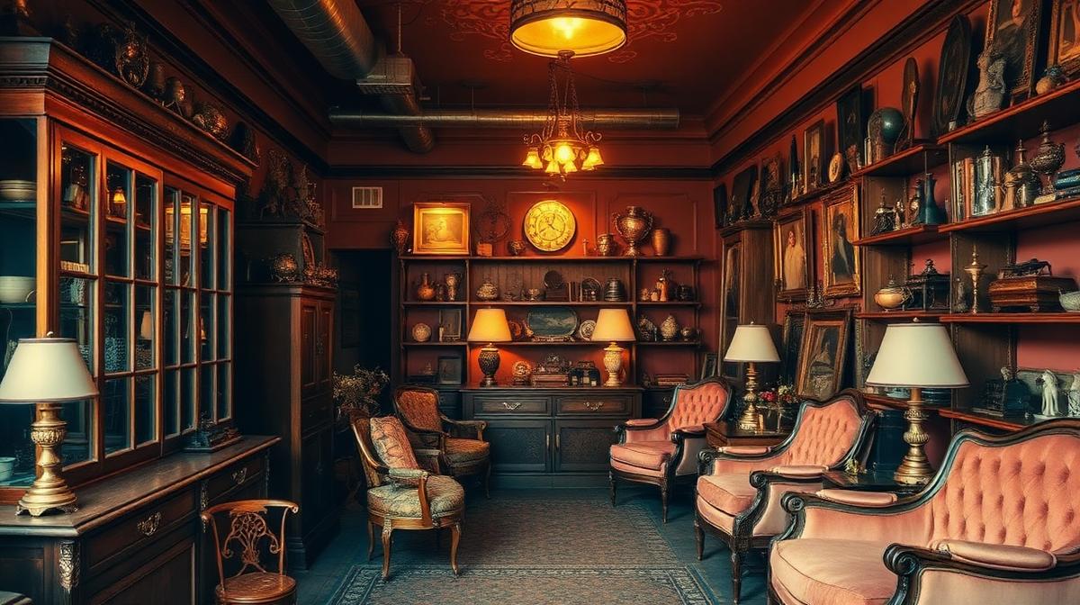
Vintage & Antique Shop Color Psychology: Nostalgic Palettes That Sell Stories
Vintage and antique shops sell something that new retail cannot: time, memory, and story. Every object carries history, and the shop's color palette must create an environment where customers feel they're discovering hidden treasures rather than merely shopping. The right colors transform a room of old things into a cabinet of wonders.
The Psychology of Nostalgia Colors
Why Aged Colors Feel Good
Research in nostalgia psychology reveals that muted, warm colors trigger positive emotional responses:
| Color Quality | Hex Example | Psychological Effect | Connection to Vintage |
|---|---|---|---|
| Faded red | #B85C5C | Warm memory, gentle passion | Sun-bleached fabrics |
| Aged gold | #B8A04A | Past glory, enduring value | Tarnished brass, gilding |
| Dusty rose | #C9918A | Gentle femininity, romance | Victorian textiles |
| Weathered blue | #6B8BA4 | Calm nostalgia, reliability | Old denim, sky memories |
| Sepia brown | #704214 | Authenticity, earthiness | Old photographs, leather |
| Patina green | #6B8C72 | Age with grace, nature's touch | Oxidized copper, aged wood |
| Ivory cream | #FFFFF0 | Timelessness, parchment | Old paper, lace, bone china |
The "Patina Effect"
Patina—the visible aging of materials—communicates value in the antique world. Colors that suggest patina include:
- Verdigris (#43B3AE): Oxidized copper and bronze
- Rust (#B7410E): Weathered iron and steel
- Foxing brown (#9E7B5D): Aged paper and prints
- Tarnished silver (#8E8E8E): Aged sterling and pewter
- Faded gilt (#C4A265): Worn gold leaf
The Five Vintage Shop Archetypes
1. The Victorian Curio Shop
Palette: Deep burgundy (#4A0E2B) + Aged gold (#B8A04A) + Dark green (#2D4A3E) + Cream (#FFF8DC)
Cabinet-of-curiosities aesthetic:
- Dark jewel-toned walls: Create intimate, treasure-filled atmosphere
- Gold frames and details: Suggest former grandeur
- Rich textiles: Velvet and brocade in deep colors
- Dim, warm lighting: Edison bulbs and candle-like warmth
2. The Mid-Century Modern Showroom
Palette: Teak (#9C6630) + Mustard (#C49B1D) + Teal (#008080) + Cream (#FFFDD0)
1950s-70s design focus:
- Wood-dominated: Teak, walnut, and rosewood set the tone
- Period-accurate accent colors: Colors that were popular in each decade
- Clean backgrounds: White or cream walls let furniture speak
- Minimal decoration: The objects ARE the design
3. The Flea Market/Eclectic Vintage
Palette: Warm white (#FAF0E6) + Chippy blue (#7BA7B8) + Rust (#B7410E) + Natural wood (#8B6914)
Treasure-hunt atmosphere:
- Deliberately imperfect: Chipped paint, worn surfaces, layered textures
- Mixed eras: Color variety creates visual excitement
- Handwritten signs: Chalk on slate, pencil on kraft paper
- Organized chaos: Color variety within a structured layout
4. The Luxury Antique Gallery
Palette: Charcoal (#333333) + Gold (#C9A64C) + White marble (#F0EDE8) + Navy (#1B2838)
Museum-quality presentation:
- Gallery lighting: Directional spots on individual pieces
- Dark, receding walls: Objects float in space
- Minimal, elegant signage: Gold on dark backgrounds
- Generous spacing: Each piece treated as art
5. The Vintage Clothing Boutique
Palette: Dusty rose (#C9918A) + Sage (#9CAF88) + Cream (#FFF8E7) + Brass (#B5A642)
Fashion-forward nostalgia:
- Romantic, feminine base: Pink and sage create boutique atmosphere
- Vintage mirror and brass displays: Reflect light and add glamour
- Botanical accents: Dried flowers and preserved plants
- Soft, flattering lighting: Makes clothes and customers look beautiful
Color and Perceived Value
The Dark Room Premium
Research in antique and art markets shows that darker display environments increase perceived value:
- Objects displayed on dark backgrounds (#2C2C2C) are valued 35% higher than identical objects on white
- Warm lighting (2700K) increases perceived age and authenticity
- Individual spotlighting suggests museum-worthy importance
- Dark wood display cases outperform glass and chrome for antiques
The "Discovery" Color Effect
The most successful vintage shops use color to create a discovery experience:
- Low ambient light creates mystery and exploration
- Warm spot highlights on featured items create "treasure found" moments
- Color variety among objects against neutral backgrounds emphasizes individual character
- Transitional zones with slightly different colors create the feeling of moving through rooms/eras
Lighting: The Vintage Color Multiplier
The Perfect Vintage Light
Lighting color temperature is crucial in vintage environments:
- 2200-2700K (warm amber): Edison bulbs create authentic period atmosphere
- 3000K (warm white): Good balance of ambiance and product visibility
- Avoid 4000K+: Cool white light makes vintage items look dingy rather than aged
- Natural daylight: Excellent for textiles and art—shows true colors
Lighting by Era
Match lighting to the era of merchandise:
- Victorian/Edwardian: Candle-equivalent warmth (2200K), gas lamp replicas
- Art Deco: Slightly brighter warm (2700K), geometric fixtures
- Mid-Century: Period-appropriate fixtures (3000K), floor and table lamps
- 1970s-80s: Track lighting, warm halogens
Digital Presence
Website Design for Vintage Brands
Vintage shop websites should feel curated, not mass-market:
- Warm, aged backgrounds: Cream (#FFF8E7) or parchment (#F5E6CC) base
- Serif typography: Connotes tradition, craftsmanship, and editorial quality
- High-quality photography: Individual product shots with warm, natural lighting
- Minimal UI chrome: Let the objects dominate, not the interface
- Muted brand colors: Avoid bright, modern colors that clash with the vintage aesthetic
Social Media Strategy
- Consistent warm filter: Every image maintains the same aged warmth
- Styled vignettes: Objects arranged in context create story and atmosphere
- Behind-the-scenes: Sourcing trips and restoration processes in warm tones
- Detail shots: Close-ups of patina, texture, and craftsmanship
Use Coloracci's image color extractor to pull authentic vintage palettes from period photographs and antique objects, then apply them to your branding with our AI palette generator.
Explore more retail design: Florist Shop Colors, Luxury Retail Colors, Bookstore & Library Colors, or Victorian Color Revival.