Video Game Franchise Colors: The Hex Codes Behind Gaming's Most Iconic Palettes
· Coloracci Team
Why Video Game Franchise Colors Matter
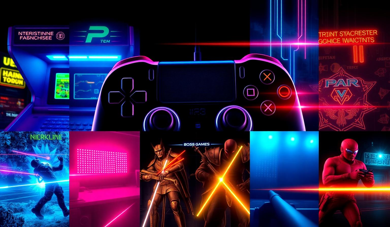
Video game franchise colors are the single fastest brand signal in entertainment. Before a logo resolves, before a title card lands, the color palette tells the player what genre they're in, what tempo to expect, and which emotions to prepare for. A magenta-and-cyan neon flash promises arcade adrenaline. A muted navy-and-gold compass invites a slow RPG. A burgundy gradient narrows the camera into a boss fight.
For designers, these palettes are a masterclass in functional color. Gaming interfaces operate under brutal constraints: instant recognition, minimal eye strain across multi-hour sessions, and color-coded information that has to survive HDR monitors, OLED phones, and outdoor mobile play. The hex codes that win those constraints are worth studying for any digital product — not just games. They show how to pair a dark base with 2–4 saturated accents, how to communicate genre in a single glance, and how to honor accessibility without dulling the mood.
This article breaks down the dominant palette systems used across video game franchise colors, the exact hex codes behind each one, what the psychology actually does to a player, and how to translate it into your own product, brand, or marketing work. For deeper context on interface-specific decisions, pair this with our guides on video game UI color psychology and the broader gaming color psychology design playbook.
The Core Palette Systems Behind Modern Gaming
The fastest way to map video game franchise colors is by palette archetype. Hundreds of franchises remix the same handful of systems — and once you know the archetypes, you can spot them in five seconds.
1. Neon Arcade
| Role | Hex | Color Name |
|---|---|---|
| Base | #0D0221 |
Deep purple-black |
| Accent 1 | #FF006E |
Hot magenta |
| Accent 2 | #00F5FF |
Electric cyan |
| Accent 3 | #8338EC |
Vivid purple |
| Highlight | #FFBE0B |
Bright yellow |
The Neon Arcade palette is the visual DNA of competitive multiplayer, rhythm games, and any franchise leaning into 80s arcade nostalgia. The near-black base lets the magenta and cyan vibrate with maximum chroma without burning the retinas. Use it for short-session, high-intensity experiences — never for slow narrative play.
2. Cyberpunk Night
| Role | Hex | Color Name |
|---|---|---|
| Base | #091833 |
Midnight blue |
| Accent 1 | #711C91 |
Deep purple |
| Accent 2 | #EA00D9 |
Neon pink |
| Accent 3 | #0ABDC6 |
Bright cyan |
| Support | #133E7C |
Navy blue |
Cyberpunk Night replaces the arcade's pure black with a saturated midnight blue, giving the palette a humid, atmospheric feel. Franchises in dystopian sci-fi lean here because the blue base reads as night skyline + screen glow simultaneously. The neon pink-and-cyan duo signals "world built on top of broken systems."
3. Mystic RPG
| Role | Hex | Color Name |
|---|---|---|
| Base | #1B263B |
Deep navy |
| Mid | #415A77 |
Slate blue |
| Light | #E0E1DD |
Light cream |
| Magic | #C17CFF |
Purple violet |
| Reward | #FFB703 |
Gold |
Mystic RPG is the workhorse palette for fantasy, looter-shooters, and any franchise that needs to sustain attention for 40+ hours. Slate-blue mids are deliberately desaturated so loot drops in gold and violet pop without competing. The cream isn't pure white — it softens the contrast for long sessions.
4. Boss Fight Red
| Role | Hex | Color Name |
|---|---|---|
| Base | #16010A |
Almost black |
| Mid | #3D001E |
Dark burgundy |
| Accent | #6B1237 |
Deep crimson |
| Highlight | #A63D57 |
Rose red |
| Skin tone | #F3C4A6 |
Peach |
Boss Fight Red is rarely a permanent palette — it's a state. Franchises shift the camera, HUD, and lighting into this palette when stakes spike. The almost-black base prevents the deep reds from feeling like alerts (those should be pure #FF0000); instead, the gradient burgundy-to-rose communicates "tense, but you can win this."
5. Other Archetypes Worth Knowing
Beyond the four flagship systems above, mature franchises pull from a wider archetype library:
- Retro Console — flat 8-bit pastels and primaries (think SNES purple
#5A4FCF+ Nintendo red#E60012) - Dark Mode Pro — pure
#0E0E10base with monochrome accents for esports and streaming - Pixel Pastels —
#FFE5EC,#A8E6CF,#B5DEFFfor casual mobile and cozy indies - Synthwave Sunset —
#FF6B9Dto#7C4DFFlinear gradients on a horizon - Forest Adventure —
#2D4A3E,#8FBC8F,#D4A574for survival and exploration - Ice Arena —
#0A1929,#C8E6F5,#80D8FFfor winter sports and arctic settings - Loot Box Gold —
#1A1A2E+#FFD700for gacha and reward animations - Tactical Stealth —
#1C1C1C,#3A4A3A,#FF4444for military and infiltration - Medieval Fantasy —
#3D2817,#8B7355,#C9B037parchment-and-gold systems - Neon Jungle —
#0B1E0Ebase under#39FF14and#FF00FFfor biopunk worlds - Space Explorer —
#000814,#003566,#FFC300deep-space + warning yellow
Each archetype is engineered around the same template: dark or muted base + 2 to 4 saturated accents + one warm highlight. That ratio is the structural secret behind almost every memorable franchise palette.
Patterns: What the Color Choices Reveal
Lay the archetypes side by side and the patterns are unmistakable. Strong video game franchise colors share four structural decisions:
Dark bases dominate
Roughly 80% of major franchise palettes anchor on a base darker than #1F1F2E. Dark bases reduce sustained eye strain, make accent colors read with higher perceived saturation, and produce an immersive "everything else falls away" effect on OLED displays. This is the gaming version of the dark mode design colors trend that's now sweeping consumer software.
The 2–4 accent rule
Every successful archetype above contains exactly 2 to 4 saturated accents, never more. Add a fifth saturated color and the eye loses the priority order required for UI scanning. This mirrors the 60/30/10 color proportions rule used in interior design and editorial layouts — gaming just compresses the ratio further.
Genre signals through hue, not just lightness
Hue does the heavy lifting:
- Cool magenta + cyan = competitive, fast, arcade
- Saturated midnight blue + pink = sci-fi dystopia
- Desaturated navy + warm gold = fantasy, long-session RPG
- Burgundy + crimson + peach = boss/death state
- Forest green + warm tan = survival, exploration
Players learn these mappings unconsciously across thousands of hours of play, and they transfer the expectations onto every new title.
Warm highlight as universal reward color
Almost every palette reserves one warm color — gold, yellow, peach, or amber — for rewards, XP gains, and pickups. Loot Box Gold, Mystic RPG's #FFB703, Space Explorer's #FFC300, and Neon Arcade's #FFBE0B all share this role. Warm = good thing happened.
The Color Psychology of Video Game Franchise Colors
The psychology underneath these palettes is well-studied and remarkably consistent across cultures. The four primary emotional drivers in gaming:
Red — Excitement, Danger, Action
Red triggers a measurable elevation in heart rate and reaction time. Franchises use red surgically: boss fights, low-health vignettes, kill confirmations. Overuse exhausts the player, which is why "Boss Fight Red" palettes layer red on top of near-black to channel the response rather than overwhelm it. See our deep dive on the psychology of red logos for the same principle in branding.
Blue — Calmness, Stability, Knowledge
Blue is the default UI color of gaming for one reason: it sits longer in the eye without fatigue. Healing items, mana bars, save points, and tutorial overlays skew blue because the player needs lowered arousal to absorb information. Our analysis of the psychology of blue in design covers why this generalizes far beyond games.
Green — Growth, Nature, Health, Progress
Green is the universal "you are okay" color. Full health bars, currency that's growing, EXP gauges filling — green communicates upward trajectory. Survival and exploration franchises (Forest Adventure palette) build entire worlds around it because the green base passively reassures the player.
Black — Fear, Unknown, Power, Sophistication
Black isn't the absence of color in gaming — it's a load-bearing structural element. It signals premium production value (esports orgs, AAA logo treatments), introduces tension (horror, stealth), and frames every other color so it can do its job. The psychology of the color black is why "Dark Mode Pro" feels like a serious gamer's setup, not a designer's preference.
Why this matters for non-gaming work
These responses don't switch off when the player closes the game. The same hue → emotion mappings drive SaaS website color psychology, ecommerce color psychology, and any product that needs to communicate state in under a second.
Accessibility: Colorblind Players Are 1 in 12
Roughly 8% of men and 0.5% of women have some form of color vision deficiency, which in any major franchise means millions of players. Every palette above survives accessibility audits only if the designer pairs hue with a second signal:
- Brightness coding — a green health bar at 100% should still be visibly brighter than a yellow one at 50%, not just a different hue
- Shape coding — icons, outlines, and silhouettes must distinguish team A from team B without color
- Pattern coding — diagonal stripes for "your team," dots for "enemy," etc.
- Position and motion — a damage indicator that pulses is readable even when its red doesn't register
Validate every gaming-inspired palette with a colorblind simulator before shipping. The WCAG color contrast guidelines translate directly to game UI work.
Designer Takeaways: Translating Gaming Palettes Into Real Projects
Even if you'll never design a game, video game franchise colors are a free training set for high-performance digital palettes. Five takeaways that transfer cleanly:
- Start with the base, not the accent. Pick a base darker than
#1F1F2Efor any product asking for sustained attention — dashboards, editors, streaming UIs, dev tools. - Cap accents at four. Three is better. Anything beyond four collapses the priority hierarchy. This is the same constraint behind the cleanest SaaS pricing pages.
- Reserve one warm color for rewards only. Use
#FFB703,#FFD700, or#FFC300exclusively for success states, XP, currency, or "you did the right thing" moments — never for navigation. The brain learns the mapping faster than you'd expect. - Use red as a state, not a brand. Treat red the way Boss Fight Red treats it: a temporary lens you snap on during critical moments, then release. Brands that wear it permanently (see our psychology of red logos breakdown) earn it through decades, not gradients.
- Test under bad conditions. Mobile games are designed for outdoor lighting because that's where they're played. If your product will be used on a phone, boost saturation and contrast beyond what looks comfortable on your monitor. The screen will eat the difference.
For inspiration-to-implementation, the AI color palette generator can riff on any of the hex codes above, the mesh gradient maker handles synthwave/cyberpunk gradients in seconds, and the color contrast checker catches accessibility regressions before they ship.
Quick-Reference Table: Video Game Franchise Colors
| Palette | Primary Color | Hex Code | Color Name | Psychological Meaning |
|---|---|---|---|---|
| Neon Arcade | Magenta | #FF006E |
Hot magenta | Energy, competition, retro arcade adrenaline |
| Neon Arcade | Cyan | #00F5FF |
Electric cyan | Speed, signal clarity, futurism |
| Cyberpunk Night | Midnight | #091833 |
Midnight blue | Dystopian atmosphere, urban depth |
| Cyberpunk Night | Pink | #EA00D9 |
Neon pink | Rebellion, glitch, counterculture |
| Mystic RPG | Navy | #1B263B |
Deep navy | Long-session immersion, knowledge |
| Mystic RPG | Gold | #FFB703 |
Gold | Reward, loot, achievement |
| Mystic RPG | Violet | #C17CFF |
Purple violet | Magic, rarity, the unknown |
| Boss Fight Red | Black | #16010A |
Almost black | Fear, gravity, focus |
| Boss Fight Red | Crimson | #6B1237 |
Deep crimson | Danger, blood, climax |
| Retro Console | Red | #E60012 |
Nintendo red | Playfulness, family, fun |
| Dark Mode Pro | Black | #0E0E10 |
Twitch black | Sophistication, esports gravitas |
| Pixel Pastels | Pink | #FFE5EC |
Soft pink | Comfort, casual play, coziness |
| Synthwave Sunset | Pink | #FF6B9D |
Sunset pink | Nostalgia, 80s revivalism |
| Forest Adventure | Green | #2D4A3E |
Forest green | Growth, exploration, calm |
| Ice Arena | Cyan | #80D8FF |
Ice cyan | Cold, precision, clarity |
| Loot Box Gold | Gold | #FFD700 |
Pure gold | Reward, premium, dopamine |
| Tactical Stealth | Red | #FF4444 |
Alert red | Threat, ambush, urgency |
| Medieval Fantasy | Gold | #C9B037 |
Antique gold | Heritage, prestige, lore |
| Neon Jungle | Green | #39FF14 |
Bioluminescent green | Wild, alien growth, danger |
| Space Explorer | Yellow | #FFC300 |
Warning yellow | Caution, deep-space alert |
Build Your Own Franchise-Grade Palette
Video game franchise colors aren't accidents. They're the output of decades of player-tested, biology-validated, performance-tuned decisions about how to capture and hold attention in the most visually competitive medium ever built. Whether you're designing a game, a SaaS dashboard, a marketing site, or a brand identity, the structural lessons translate cleanly: dark base, 2–4 accents, one warm reward color, accessibility-first, genre signaled by hue.
Try these palettes in your own work with Coloracci:
- AI Color Palette Generator — generate franchise-inspired palettes from a single seed
- Mesh Gradient Maker — build synthwave and cyberpunk gradients in seconds
- Color Contrast Checker — validate UI readability before launch
- Colorblind Simulator — confirm your palette survives real-world vision
- Light & Dark Mode Generator — ship dual-mode versions of any gaming palette
Want to go deeper into the interface-level decisions? Read our companion pieces on video game UI color psychology and the full gaming color psychology design playbook. The hex codes are the surface. The system underneath is what makes the franchise.