Video Game Color Palettes: 6 Iconic Schemes (Hex Codes + Psychology)
· Coloracci Team
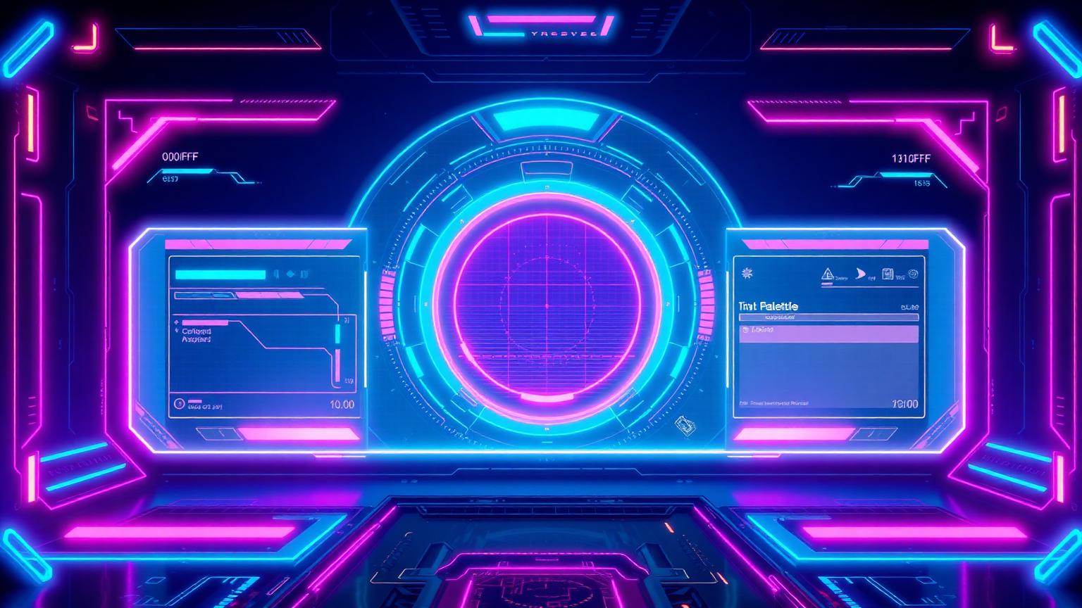
Why Video Game Color Palettes Matter
Video game color palettes are some of the most rigorously engineered color systems in any visual medium. A racing game's HUD must remain readable at 240 km/h. A boss fight needs a single saturated red that screams "danger" before your conscious mind catches up. A loot drop must telegraph rarity in under 200 ms across a noisy battlefield. Color, in games, is not decoration — it is interface, emotion, and game-state communication compressed into a few hundred nanometres of wavelength.
For designers and color enthusiasts, gaming palettes are a goldmine: they pair deep, near-black bases with hyper-saturated accents, balance complementary pairs without visual chaos, and translate cleanly from in-game UI to thumbnails, esports jerseys, social headers, and brand systems. Research suggests that first impressions are roughly 85% driven by color perception, and game studios have turned that statistic into a science.
In this guide we break down six iconic video game color schemes — Neon Arcade, Midnight Neon, Pixel Pastels, Boss Fight Red, Space Loot, and Racing HUD — with exact hex codes, the psychology behind each choice, and how to deploy these combinations in your own work. If you want to build palettes like these in seconds, jump straight to the Coloracci AI palette generator.
The Complete Breakdown: 6 Iconic Video Game Color Palettes
Each palette below uses a low-purity, dark dominant (the canvas) paired with high-purity, small-area accents (the signal). This contrast ratio is the secret sauce behind almost every modern game UI.
1. Neon Arcade — Electric, Playful, High-Contrast
| Role | Color Name | Hex |
|---|---|---|
| Accent A | Electric Blue | #00F5FF |
| Accent B | Violet | #7C4DFF |
| Accent C | Hot Pink | #FF2DAA |
| Base | Deep Navy | #0B0F1A |
| Surface | Off-White | #F7F7FF |
Mood: electric, playful, high-contrast.
Neon Arcade is the spiritual descendant of 1980s cabinet glow. The deep navy base swallows ambient light and forces the cyan-pink-violet trio to "float" — a hallmark of cyberpunk titles, rhythm games, and Twitch overlays.
2. Midnight Neon — Late-Night, Bold, Techy
| Role | Color Name | Hex |
|---|---|---|
| Base | Near-Black | #0A0B10 |
| Accent A | Mint | #15FFB5 |
| Accent B | Cobalt | #3D5AFE |
| Alert | Bright Red | #FF1744 |
| Neutral | Steel Gray | #B0BEC5 |
Mood: late-night, bold, techy.
Built for stealth-action and hacker aesthetics. The mint accent reads as "active system" while red is reserved for failure states. This is one of the most reused palettes in indie shooters and hacking sims.
3. Pixel Pastels — Cute, Nostalgic, Soft
| Role | Color Name | Hex |
|---|---|---|
| Accent A | Light Pink | #FFD6E8 |
| Accent B | Sky Blue | #BDE0FE |
| Accent C | Lavender | #CDB4DB |
| Highlight | Light Yellow | #FFF1B6 |
| Text/Anchor | Slate | #2B2D42 |
Mood: cute, nostalgic, soft.
A cozy-game staple. Inverts the usual gaming formula: light dominant + dark anchor. Pastels reduce visual urgency, which is exactly why farming sims, life sims, and puzzle games adopt them.
4. Boss Fight Red — Intense, Dramatic, Urgent
| Role | Color Name | Hex |
|---|---|---|
| Base | Dark Charcoal | #1C1B22 |
| Primary Alert | Bright Red | #FF3B30 |
| Secondary | Orange | #FF9500 |
| Highlight | Yellow | #FFE66D |
| Counter-accent | Teal | #2EC4B6 |
Mood: intense, dramatic, urgent.
A "warm warning" gradient (red → orange → yellow) with a single complementary teal to keep the eye from fatiguing. This is the classic boss-arena lighting kit — every Soulslike borrows from it.
5. Space Loot — Futuristic, Optimistic, Cosmic
| Role | Color Name | Hex |
|---|---|---|
| Base | Deep Navy | #0B1026 |
| Accent A | Cyan | #00D1FF |
| Accent B | Mint Green | #00FFA3 |
| Rarity | Violet | #A259FF |
| Legendary | Gold | #FFD166 |
Mood: futuristic, optimistic, cosmic.
The textbook loot rarity stack: blue (rare) → green (uncommon) → violet (epic) → gold (legendary). Used across loot-shooters, sci-fi MMOs, and crypto-game UIs.
6. Racing HUD — Fast, Crisp, Futuristic
| Role | Color Name | Hex |
|---|---|---|
| Base | Dark Gray | #0B0C10 |
| Surface | Graphite | #1F2833 |
| Primary | Bright Teal | #66FCF1 |
| Secondary | Dark Teal | #45A29E |
| Text | Light Gray | #C5C6C7 |
Mood: fast, crisp, futuristic.
Monochromatic-teal restraint. Limiting the accent to a single hue keeps the HUD readable when the screen is moving at 200+ fps. Racing, flight sims, and competitive FPS scoreboards live here.
Patterns & Analysis: What These Palettes Reveal
Five structural patterns repeat across every successful gaming palette:
- Dark dominant, saturated accent. Five out of six palettes anchor on a near-black or deep navy. Dark bases reduce eye fatigue during long sessions and make accents physically appear brighter on OLED and HDR displays.
- Small-area, high-purity signal colors. The "low-purity background + high-purity small blocks" rule is what makes a single
#FF3B30boss-health bar feel cinematic instead of garish. - Complementary pairs, carefully balanced. Blue/orange (Boss Fight), teal/red (Midnight Neon), violet/gold (Space Loot). Complementaries sit 180° apart on the wheel and create maximum contrast — but games balance them by giving 80–90% of screen real estate to one and only 5–10% to the other.
- Color encodes game state. Red = damage. Green = heal. Gold = legendary. Mint/cyan = active system. Yellow = caution. Players learn this vocabulary across genres, which is why violating it (e.g. green = poison) requires careful onboarding.
- Hue scaling for rarity and "value." Slight shifts in hue, lightness, and saturation are how games communicate that an item is "better." Gold loot doesn't just look different — it feels more valuable because of saturation, glow, and warmth.
Color Psychology: What These Palettes Communicate
Color is emotion compressed into wavelength. Here is what each accent family is actually doing to the player's brain:
- Cyan / Electric Blue (
#00F5FF,#00D1FF,#66FCF1) — signals technology, water, active systems, and "safe to interact." It's why every "press X to interact" prompt is some shade of cyan. - Violet (
#7C4DFF,#A259FF) — communicates rarity, magic, and luxury. Purple historically signaled royalty because the dye was expensive; games inherited that scarcity association directly. - Hot Pink / Magenta (
#FF2DAA) — disrupts the male-coded gaming aesthetic and reads as playful, rebellious, neon-feminine. Common in rhythm games and indie titles. - Mint / Spring Green (
#15FFB5,#00FFA3) — life, healing, "go." Brighter and more synthetic than nature green, it codes as "digital life." - Saturated Red (
#FF3B30,#FF1744) — danger, anger, urgency. The brain processes red faster than any other hue, which is why it's the universal "boss health bar" choice. Note that red carries very different meanings cross-culturally — in much of East Asia red signals luck and celebration rather than alarm, so global studios often A/B test alert colors per region. - Gold / Warm Yellow (
#FFD166,#FFE66D) — value, achievement, light source. Fast-food brands use the same warm yellow + red combo (McDonald's, KFC) to trigger urgency and appetite; games use it for treasure and trophies for the same neurochemical reason. - Pastels (
#FFD6E8,#BDE0FE) — safety, childhood, low arousal. Hospitals use the same range because pastels lower heart rate and signal stability.
Designer Takeaways: How to Use These Palettes in Real Projects
Whether you are designing a SaaS dashboard, an esports brand kit, or a marketing landing page, these are the gaming-derived rules worth stealing:
- Build on a dark, low-purity dominant. Pick a navy or near-black (
#0B0F1A,#0A0B10,#1C1B22) and let it occupy 70–85% of the canvas. Your accents will look 2× more vivid for free. - Reserve your most saturated color for game state, not branding.
#FF3B30should only ever mean "something needs attention now." Using it as a background ruins the warning system. - Use the 60/30/10 rule, but skewed. For gaming-style interfaces, try 80/15/5 (base / surface / accent). The smaller the accent area, the louder its signal.
- Build a rarity ladder for value. Even outside gaming, the gray → blue → violet → gold ladder works beautifully for pricing tiers, achievement badges, and feature flags. SaaS pricing pages routinely steal this structure.
- Pair complementaries, then mute one. Cyan and red are a perfect complementary pair. Use the full
#00F5FFand a desaturated#B33A3Ainstead of#FF0000to keep the contrast without the visual scream. - Test for color-vision deficiency. Roughly 1 in 12 men has some form of color-vision deficiency. Never rely on color alone — pair every color signal with an icon, position, or shape change.
Master Data Table
| Palette | Primary Accent | Hex | Color Name | Psychological Meaning |
|---|---|---|---|---|
| Neon Arcade | Electric Blue | #00F5FF |
Cyan | Tech, energy, active system |
| Midnight Neon | Mint | #15FFB5 |
Spring Green | Digital life, "system online" |
| Pixel Pastels | Light Pink | #FFD6E8 |
Cotton Candy | Softness, nostalgia, low arousal |
| Boss Fight Red | Bright Red | #FF3B30 |
Scarlet Alert | Danger, urgency, anger |
| Space Loot | Gold | #FFD166 |
Treasure Gold | Achievement, rarity, value |
| Racing HUD | Bright Teal | #66FCF1 |
Electric Teal | Speed, precision, focus |
Conclusion: Steal Like a Game Designer
The reason gaming palettes feel so charged is that every color has a job. Nothing is decorative — every hex code is doing emotional, informational, or hierarchical work at the same time. That is the discipline worth importing into any visual system, whether you ship games, websites, mobile apps, or brand kits.
The fastest way to start? Pick a palette above, drop it into the Coloracci AI palette generator to extend it into accessible tints, shades, and complementary pairs — then explore deeper analysis in the Coloracci blog.
Color is the cheapest, fastest, most under-used design lever you have. Game studios figured that out decades ago — your next project should too.