The Unseen Spectrum: 5 Underutilized Purple Shades to Elevate Your Interior Design
· Coloracci Team
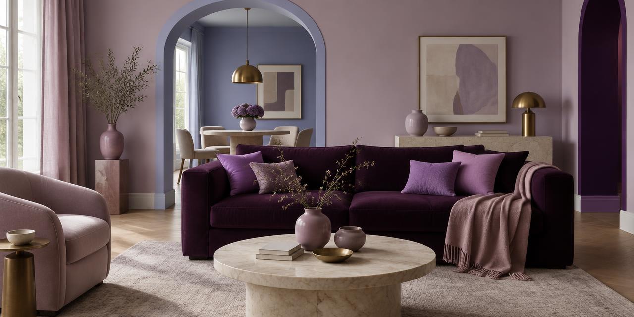
Purple dominates the color conversation in interiors, but most rooms stop at the same predictable notes: a soft lavender nursery, a bold violet accent pillow, or a neutral-ish grey-purple wall. The real opportunity for purple interior design lies in the shades nobody is using yet. This guide answers the question of which underutilized purple shades in interior design deserve a second look, and gives you the exact HEX values, psychological associations, and ready-made palettes to use them with confidence.
The five shades below — mauve, thistle, periwinkle, heliotrope, and tyrian purple — span from near-neutral pastels to dramatic depth. Each one solves a different design problem: adding warmth without pink, creating a calm neutral with character, introducing blue-leaning serenity, injecting creative energy, or anchoring a room with historical luxury. Together they form a toolkit for sophisticated purple paint and unique purple color schemes that feel curated rather than copied.
Why Underutilized Purple Shades Matter in Interiors
Purple is a polarizing color in homes. Use it badly and a space can feel juvenile, gloomy, or theatrical. Use an unexpected shade well and the room suddenly feels edited, expensive, and personal. The problem is not purple itself; it is that designers and homeowners keep reaching for the same five swatches.
The shades in this article have been overlooked for practical reasons. Mauve reads as old-fashioned in small samples but becomes elegant at scale. Thistle is so pale it is mistaken for grey. Periwinkle is dismissed as a nursery color. Heliotrope is considered too bright for walls. Tyrian purple feels intimidatingly dark. Each of these judgments is a missed opportunity. When you understand their undertones and pairings, they become the foundation for pastel purple decor, moody accent walls, and balanced neutral schemes.
A useful principle: purple sits between red and blue, which means every purple carries a temperature bias. Mauve and tyrian lean warm-red. Thistle and periwinkle lean cool-blue. Heliotrope leans magenta-pink. Recognizing that bias lets you place the color where it will behave best. For a fuller look at how purple communicates value and creativity, see our exploration of purple in luxury branding.
1. Mauve — The Nostalgic Neutral
HEX: #E0B0FF
Mauve is a pale, greyish purple with a distinctly vintage warmth. It is lighter than true lavender and more muted than orchid, which gives it a softness that reads as romantic without becoming saccharine. In interior design, mauve is the bridge between pink and purple for people who want neither.
Psychology
Mauve is associated with nostalgia, romance, and calm. It carries the emotional residue of early aniline dyes and Edwardian interiors, so it feels both historical and gentle. In a bedroom or dressing room, it promotes relaxation and a sense of being cared for.
Best Applications
- Bedrooms: Use mauve as the dominant wall color with cream trim and aged brass hardware.
- Upholstery: A mauve velvet chaise or headboard adds color without competing with other textiles.
- Pairings: Cream
#F5F0E8, warm grey#B8B0A8, sage green#A7B69D, muted gold#C9A84C.
Mauve works best with warm neutrals. Cool whites can make it look muddy, while ivory and buttermilk intensify its glow.
2. Thistle — The Quiet Background
HEX: #D8BFD8
Thistle is a very pale, greyish-purple that functions almost as a neutral. It is one step away from a warm grey and one step away from a cool beige, which makes it one of the most versatile underutilized purple shades in interior design. On a large wall, it provides more interest than greige without demanding attention.
Psychology
Thistle communicates delicacy, subtlety, and gentleness. It is unobtrusive enough for shared spaces but has enough color to avoid the flatness of pure grey. For clients who want personality without statement, thistle is the answer.
Best Applications
- Open-plan living areas: Use thistle on every wall and let furniture provide contrast.
- Hallways and transitions: It creates continuity between bolder rooms.
- Pairings: Charcoal
#36454F, navy blue#263445, warm wood tones, crisp white#FAFAFA.
Thistle is particularly effective in rooms with both warm wood floors and cool metal fixtures because it mediates between the two temperatures.
3. Periwinkle — The Serene Pastel
HEX: #CCCCFF
Periwinkle is a pastel purple with strong blue undertones. It reads as a colored blue rather than a lightened violet, which gives it a clean, airy quality. In purple interior design, periwinkle is the shade to choose when you want the calm of blue with the individuality of purple.
Psychology
Periwinkle is serene, cheerful, and quietly youthful. It feels like morning light and open sky, making it ideal for rooms that need optimism without stimulation. It is less sweet than baby blue and more interesting than sky blue.
Best Applications
- Bathrooms and powder rooms: Periwinkle tile or painted cabinetry feels fresh and spa-like.
- Children's rooms: It ages better than primary pastels and transitions easily into teenage spaces.
- Pairings: White
#FFFFFF, soft yellow#FFF8DC, light green#D4F5E9, pale grey#E5E5E5.
Because periwinkle leans so strongly blue, it pairs naturally with greens and yellows for a spring-like palette.
4. Heliotrope — The Creative Accent
HEX: #DF73FF
Heliotrope is a vibrant, pink-leaning purple. It is the most energetic shade in this list and the one most designers avoid at full saturation. That avoidance is exactly why it is valuable. Used as an accent, heliotrope injects personality into minimalist or neutral rooms without the aggression of red or orange.
Psychology
Heliotrope is energetic, creative, and bold. It signals confidence and artistic intent. In small doses, it reads as playful; in larger doses, it becomes avant-garde. It is the ideal color for a deep purple accent wall alternative when you want warmth rather than moodiness.
Best Applications
- Feature walls: A single heliotrope wall in a home office or creative studio sets an optimistic tone.
- Art and objects: Sculptural vases, abstract prints, or a single lacquered chair.
- Pairings: Teal
#008080, black#1A1A1A, silver#C0C0C0, warm blush#F1D4D4.
Heliotrope needs restraint. Pair it with a dark neutral to ground it, or it can start to vibrate.
5. Tyrian Purple — The Dramatic Anchor
HEX: #66023C
Tyrian purple is a deep, rich, reddish-purple with historical roots in royalty. It is not a wall color for the faint-hearted, but it is one of the most effective sophisticated purple paint choices for creating intimacy and gravitas. Its red undertone keeps it warm, so it does not feel as cold as some dark blues or violets.
Psychology
Tyrian purple conveys luxury, power, drama, and historical weight. It makes a room feel intentionally designed and slightly theatrical. In dining rooms, libraries, and media rooms, it creates atmosphere that lighter colors cannot achieve.
Best Applications
- Dining rooms: Tyrian purple walls with candlelight and warm metallics feel instantly formal.
- Libraries and studies: Use it on built-in cabinetry or as a ceiling color for a jewel-box effect.
- Pairings: Emerald green
#50C878, deep brown#5D4037, bronze#CD7F32, cream#F5F0E8.
Because tyrian purple absorbs light, it is best in rooms that are used in the evening or spaces where you want to reduce visual noise.
Complete Color Reference Table
| Shade Name | HEX Code | Description | Psychological Meaning |
|---|---|---|---|
| Mauve | #E0B0FF |
Pale greyish purple, soft and sophisticated | Nostalgic, romantic, calming |
| Thistle | #D8BFD8 |
Very pale greyish purple, nearly a neutral | Gentle, delicate, subtle |
| Periwinkle | #CCCCFF |
Pastel purple with strong blue undertones | Serene, cheerful, youthful |
| Heliotrope | #DF73FF |
Vibrant pink-leaning purple | Energetic, creative, bold |
| Tyrian Purple | #66023C |
Deep rich reddish-purple with royal history | Luxurious, powerful, dramatic |
This table is the fastest way to compare the five shades when specifying paint or textiles. Notice how the psychological meanings move from gentle to dramatic as saturation and depth increase.
Five Ready-to-Use Purple Interior Palettes
1. The Romantic Bedroom
- Walls: Mauve
#E0B0FF - Trim: Cream
#F5F0E8 - Accent: Sage green
#A7B69D - Metal: Aged brass
A restful, feminine-leaning scheme that avoids cliché pink. The sage keeps the palette grounded.
2. The Calm Open Living Room
- Walls: Thistle
#D8BFD8 - Sofa: Charcoal
#36454F - Wood: Warm oak
- Accent: Navy blue
#263445
Thistle acts as a warm grey here, letting navy and charcoal provide contrast without harshness.
3. The Airy Bathroom
- Walls: Periwinkle
#CCCCFF - Tile: White
#FFFFFF - Accent: Soft yellow
#FFF8DC - Greenery: Light green foliage
Fresh and clean, this palette proves pastel purple decor can feel spa-like rather than childish.
4. The Creative Studio
- Feature wall: Heliotrope
#DF73FF - Cabinetry: Black
#1A1A1A - Desk: Silver metal
- Accent: Teal
#008080
For a home office or craft room where energy matters. The black prevents heliotrope from overwhelming the space.
5. The Moody Dining Room
- Walls: Tyrian purple
#66023C - Ceiling: Deep brown
#5D4037 - Trim: Cream
#F5F0E8 - Metal: Bronze
#CD7F32
This is unique purple color schemes at their most dramatic. Use dimmable lighting to let the colors shift from rich to enveloping.
Practical Designer Takeaways
When working with these underutilized purple shades in interior design, keep a few rules in mind.
Test at scale. Pale purples like thistle and periwinkle can look grey or blue in small swatches. Paint a two-by-two-foot board and move it around the room at different times of day.
Watch the undertone. Mauve and tyrian lean red-warm; thistle and periwinkle lean blue-cool. Pairing them with the wrong neutral will make them look dirty. Warm creams suit mauve and tyrian; crisp whites and cool greys suit thistle and periwinkle.
Use saturation as a volume control. The more saturated the purple, the less surface area it needs. Heliotrope works best as a 10% accent. Tyrian purple can handle 30–40% of a room. Mauve and thistle can comfortably cover 60% or more.
Consider the light. North-facing rooms deepen cool purples and can turn them melancholy. South-facing rooms amplify warm purples. West light makes tyrian glow; east light softens heliotrope.
Build from one hero. Choose one of the five shades as the lead, then add one neutral, one contrast, and one natural material. A four-color rule prevents purple interior design from becoming chaotic.
For a deeper look at how violet functions in creative spaces, read our article on violet color psychology. And if you want to understand how pastel tints can be disciplined into professional systems, our guide to pastel colors in modern UI design covers many of the same proportion principles.
Conclusion
Underutilized purple shades in interior design are not rare pigments or fleeting trends. They are simply colors that have been miscategorized as too old, too pale, too bright, or too dark. Mauve brings romance, thistle brings quiet character, periwinkle brings serenity, heliotrope brings creative energy, and tyrian purple brings controlled drama.
The next time a client asks for something different from grey but refuses another beige, hand them a thistle wall. When a bedroom needs warmth but pink feels too obvious, try mauve. When a dining room needs impact, trust tyrian purple. These five shades are the unseen spectrum that can separate a standard interior from a memorable one.
Ready to test them together? Drop any of these HEX codes into the Coloracci palette generator and build a complete, harmonious interior scheme in seconds — then export it as CSS, Tailwind tokens, or a shareable mood board.