Triadic Color Schemes: Bold Design Combinations
· Coloracci Team
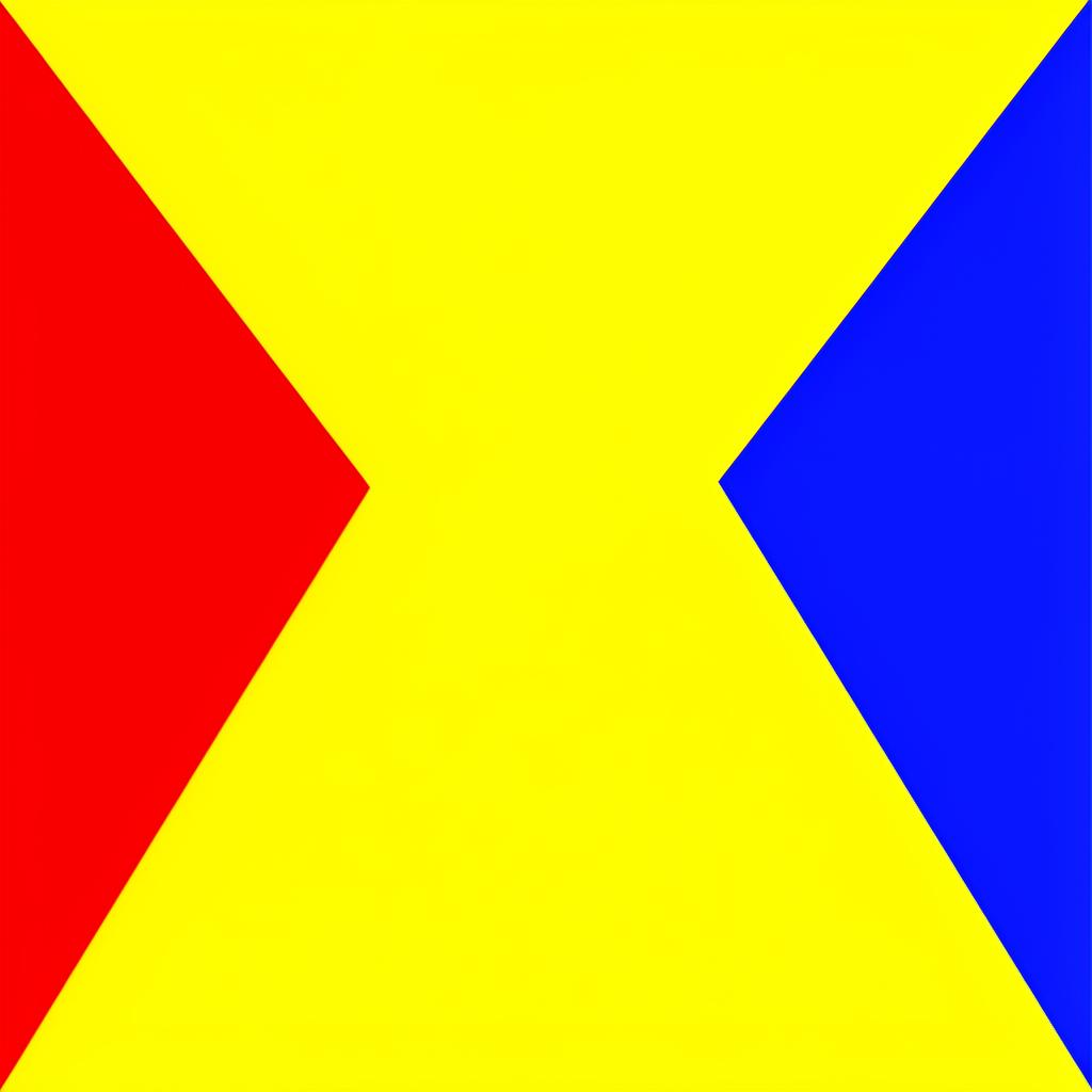
Triadic color schemes are the boldest structured harmony on the color wheel. Three colors, equally spaced at 120° intervals, form an equilateral triangle that delivers maximum chromatic variety while maintaining mathematical balance. No other color scheme offers as much diversity with as much inherent order. Triadic palettes are difficult to execute well — their energy can easily tip into chaos — but when deployed with skill, they produce designs that are vibrant, memorable, and unmistakably intentional.
This guide covers the theory behind triadic harmony, when and how to use it effectively, famous examples from design history and modern branding, and a step-by-step process for building your own triadic palettes.
Understanding Triadic Harmony
A triadic color scheme uses three colors that are evenly distributed around the color wheel, each separated by exactly 120°. This equal spacing creates a balanced tension: no single color is closer to or farther from any other, which gives the scheme a sense of democratic equilibrium.
The primary triadic combinations:
Red – Yellow – Blue (The Primary Triad)
- Red
#E53935(hue 1°) - Yellow
#FDD835(hue 54°) - Blue
#1E88E5(hue 210°)
This is the foundational triad — the primary colors that cannot be mixed from others. It is the most energetic and universally recognized triadic combination, used in children's products, educational materials, and brands that want to communicate fundamental, elemental energy.
Orange – Green – Purple (The Secondary Triad)
- Orange
#FF8C00(hue 33°) - Green
#43A047(hue 122°) - Purple
#7B1FA2(hue 282°)
The secondary triad is more sophisticated than the primary. Each color is a blend of two primaries, giving the scheme a complexity that feels more mature and nuanced. This combination is popular in creative industries, entertainment, and brands targeting adults.
Teal – Coral – Chartreuse
- Teal
#00897B(hue 174°) - Coral
#FF5252(hue 0°) - Chartreuse
#AEEA00(hue 75°)
Cyan – Magenta – Yellow (CMY)
- Cyan
#00BCD4(hue 187°) - Magenta
#E91E63(hue 340°) - Yellow
#FFEB3B(hue 54°)
The CMY triad is the foundation of the print color model. It feels modern and digital, making it a strong choice for creative technology brands, print-focused design studios, and media companies.
The reason triadic harmony works is perceptual balance. When three equally spaced hues are present, no area of the color spectrum is neglected — the warm, cool, and neutral zones are all represented. The human visual system experiences this as completeness, which registers as pleasing even when the individual color combination might seem unexpected.
When to Use Triadic Colors
Triadic schemes are powerful but demanding. They are not suitable for every project, and knowing when to deploy them is as important as knowing how.
Use Triadic When You Need Maximum Visual Energy
Triadic palettes create more visual energy than any other structured harmony. If your design goal is to feel bold, dynamic, and attention-grabbing — a children's brand, a festival poster, a gaming interface, a sports identity — triadic delivers that energy systematically.
Use Triadic for Complex Information Architecture
When you need to differentiate three distinct categories, user types, or data series, triadic colors provide maximum hue separation. Each color is perceptually as different from the others as possible, making it ideal for:
- Dashboard widgets with three data categories
- Navigation systems with three primary sections
- Pricing pages with three tiers
- Status systems (info / warning / error)
Use Triadic When Brand Differentiation Is Critical
In crowded markets where competitors use monochromatic or complementary schemes, a triadic palette immediately stands out. It says, "We are not like the others" — which can be exactly the right message for challenger brands, startups, and creative companies.
Avoid Triadic for Calm, Minimalist Designs
Triadic palettes inherently resist minimalism. Their variety creates visual stimulation that conflicts with the serene, spacious feeling that minimalist designs require. If your brand values calm, simplicity, or understated elegance, choose analogous or monochromatic instead.
Avoid Triadic for Text-Heavy Interfaces
The chromatic variety of triadic schemes can distract from content in reading-heavy applications like blogs, documentation sites, and email clients. These interfaces need their color palette to support content, not compete with it.
Famous Triadic Designs
Superman
Superman's iconic costume — blue suit, red cape, yellow "S" shield — is a perfect primary triad. The combination communicates heroic energy, optimism, and power. The blue provides trust and authority, the red adds urgency and strength, and the yellow brings optimism and visibility. This triadic palette has been instantly recognizable for nearly 90 years, proving that a well-executed triad can be both bold and enduring.
Google's logo uses a modified triadic approach with blue (#4285F4), red (#EA4335), yellow (#FBBC05), and green (#34A853). While technically a tetradic scheme (four colors), it is built on the primary red-yellow-blue triad with green as an addition. The palette communicates playfulness, diversity, and accessibility — core Google brand values.
Burger King
Burger King's branding uses a warm triadic approach: red (#DA291C), yellow-orange (#F5A623), and blue (#0038A8). The warm red and yellow stimulate appetite, while the blue adds a grounding sense of reliability. The combination is energetic and appetizing — ideal for fast food.
FedEx
While FedEx is primarily known for its purple-and-orange complementary scheme, its broader brand system uses a triadic approach across sub-brands: purple for the parent (#4A148C), orange for Express (#FF6600), green for Ground (#00A651), red for Freight (#CC0000), and blue for Office (#003399). This multi-brand triadic system allows each service to have a distinct identity while maintaining family cohesion.
Barcelona FC
FC Barcelona's crest features a triadic combination of deep blue (#004D98), red-maroon (#A50044), and gold-yellow (#EDBB00). The palette communicates passion (red), loyalty (blue), and excellence (gold) — values central to the club's identity. Sports teams frequently use triadic schemes because they need colors that are vibrant and distinguishable from a distance.
Building Triadic Palettes: Step by Step
Step 1: Choose Your Dominant Color
Unlike complementary or analogous schemes where the dominant color is simply the one used most, in triadic schemes the dominant color sets the emotional tone. Choose the color that best represents your brand's primary personality:
- Blue
#1E88E5for trust and professionalism - Red
#E53935for energy and passion - Green
#43A047for growth and health
Step 2: Find the Triadic Partners
Add 120° and 240° to your dominant hue:
Starting with Blue at 210°:
- 210° + 120° = 330° → Magenta-Pink
#E91E63 - 210° + 240° = 450° → 90° = Chartreuse
#7CB342
Starting with Red at 0°:
- 0° + 120° = 120° → Green
#43A047 - 0° + 240° = 240° → Blue
#1E88E5
Starting with Orange at 30°:
- 30° + 120° = 150° → Sea Green
#26A69A - 30° + 240° = 270° → Purple
#7B1FA2
Step 3: Establish Proportion
The critical rule for triadic palettes: never use all three colors equally. Equal distribution creates visual noise. Instead:
- Dominant (60%): Your primary brand color, used for navigation, headers, primary buttons
- Secondary (30%): The supporting triadic color, used for secondary elements, backgrounds, illustrations
- Accent (10%): The third triadic color, used sparingly for CTAs, badges, highlights
For a Blue-Red-Yellow triad:
- Blue
#1E88E5at 60%: Navigation bar, primary buttons, links - Red
#E53935at 30%: Section backgrounds, secondary buttons, illustrations - Yellow
#FDD835at 10%: CTA highlights, star ratings, featured badges
Step 4: Desaturate for Sophistication
Full-saturation triadic palettes can feel overwhelming in professional contexts. Reduce saturation by 20-40% for a more refined result:
- Full saturation: Blue
#1E88E5+ Red#E53935+ Yellow#FDD835— bold, playful - Reduced saturation: Blue
#5C7DA8+ Muted Red#C47A78+ Soft Gold#D4C17C— sophisticated, editorial
Step 5: Build the Supporting System
Each triadic color needs light and dark variants:
Blue system:
- Dark:
#0D47A1— Headers, emphasis - Base:
#1E88E5— Primary elements - Light:
#BBDEFB— Info backgrounds
Red system:
- Dark:
#B71C1C— Error text, critical alerts - Base:
#E53935— Secondary elements - Light:
#FFCDD2— Warning backgrounds
Yellow system:
- Dark:
#F57F17— Badge text - Base:
#FDD835— Highlights, accents - Light:
#FFF9C4— Featured backgrounds
Neutrals (tinted toward dominant):
- Text:
#1A237E(navy, echoes blue dominant) - Secondary text:
#546E7A - Background:
#FAFCFF
Practical Tips
The 60-30-10 rule is non-negotiable for triadic schemes. Without strict proportion control, triadic palettes become chaotic. The dominant color must clearly lead; the accent must clearly punctuate.
Use triadic colors for illustration, not for UI chrome. In web applications, restrict triadic variety to illustrations, icons, and decorative elements. Navigation, buttons, forms, and content areas should use the dominant color plus neutrals. Let the secondary and accent colors appear in visuals.
Triadic works beautifully for data visualization. Three triadic colors provide maximum perceptual separation for three data series, and the built-in harmony prevents the chart from looking random.
Test for color blindness rigorously. Some triadic combinations — particularly red-green-blue — are problematic for color-blind users. Always supplement color with shapes, patterns, or labels in any information-carrying context.
Consider a muted triad for editorial design. Desaturated triadic palettes (
#5C7DA8+#C47A78+#D4C17C) create a rich, editorial feel that works for magazines, portfolios, and content-focused websites without the visual intensity of full-saturation triads.Animate triadic transitions for delight. Transitioning between triadic colors in animations (loading screens, page transitions, progress indicators) creates a sense of completeness and energy. The equal spacing ensures each transition feels balanced.
Triadic color schemes are the high wire of color harmony — thrilling when executed well, disastrous when not. But for designers who master proportion, saturation control, and strategic deployment, triadic palettes deliver a level of visual richness and energy that no other scheme can match.