Color Theory 101: Understanding the Color Wheel
· Coloracci Team
What Is Color Theory?
Color theory is a framework used by artists, designers, and creators to understand how colors interact, combine, and influence perception. At its core, color theory provides practical guidance for mixing colors and creating visually appealing combinations. Whether you are designing a website, painting a canvas, or choosing an outfit, a solid grasp of color theory will dramatically improve your creative decisions.
The study of color dates back centuries. Sir Isaac Newton's experiments with prisms in the 1660s revealed that white light contains a full spectrum of colors. His subsequent arrangement of these colors into a circular diagram laid the groundwork for the modern color wheel — the single most important tool in color theory.
Understanding color theory is not just an academic exercise. It has real-world applications in branding, interior design, fashion, user interface design, marketing, and virtually every creative discipline. When you understand the relationships between colors, you gain the ability to evoke specific emotions, guide the viewer's eye, and create cohesive visual experiences.
The Color Wheel: Your Most Important Tool
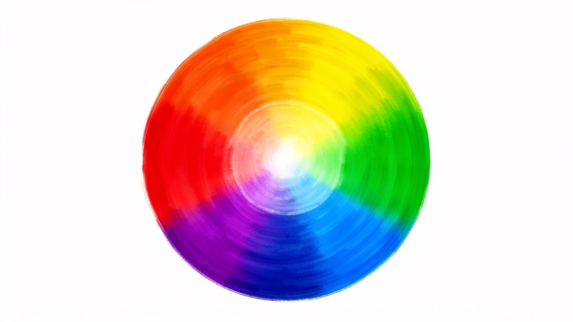
The color wheel is a circular arrangement of colors organized by their chromatic relationship to one another. It was first developed by Sir Isaac Newton in 1666 and has been refined by artists and scientists ever since. The modern color wheel is divided into 12 segments, each representing a distinct hue.
The wheel is organized so that colors that work well together sit in predictable positions relative to each other. This predictability is what makes the color wheel so powerful — once you understand its structure, you can generate harmonious color combinations with confidence.
There are two primary color models that inform how we think about the color wheel. The RYB (Red-Yellow-Blue) model is the traditional model used in painting and fine art. The RGB (Red-Green-Blue) model is used in digital screens and light-based media. For the purposes of design and general color theory education, we will primarily reference the traditional RYB model, though the principles apply universally.
Primary Colors: The Foundation of All Color
Primary colors are the building blocks of every other color. In the traditional RYB color model, the three primary colors are red, yellow, and blue. These colors are considered "primary" because they cannot be created by mixing other colors together — they are fundamental and irreducible.
Every other color on the color wheel is derived from combinations of these three primaries. This makes them the most important colors to understand. In painting, if you have tubes of pure red, yellow, and blue paint, you can theoretically mix every other color in the spectrum.
In the digital RGB model, the primary colors are red, green, and blue. These are the colors of light that your screen combines at varying intensities to produce the millions of colors you see on digital displays. When all three RGB primaries are combined at full intensity, the result is white light.
Primary colors are spaced evenly around the color wheel, each separated by 120 degrees. This equidistant spacing is what gives the color wheel its balanced, symmetrical structure and is the foundation upon which all other color relationships are built.
Secondary Colors: The First Level of Mixing
Secondary colors are created by mixing two primary colors together in equal proportions. In the RYB model, the three secondary colors are:
- Orange — created by mixing red and yellow
- Green — created by mixing yellow and blue
- Purple (Violet) — created by mixing blue and red
Like primary colors, secondary colors are evenly spaced around the color wheel, sitting exactly between the two primaries that produce them. Together, the three primary and three secondary colors give us six of the twelve positions on the standard color wheel.
Secondary colors are incredibly versatile in design. Orange conveys warmth, energy, and enthusiasm. Green suggests nature, growth, and balance. Purple evokes luxury, creativity, and mystery. Understanding the emotional associations of secondary colors helps designers make intentional choices that align with the message they want to communicate.
Tertiary Colors: Completing the Wheel
Tertiary colors are produced by mixing a primary color with an adjacent secondary color. This gives us six additional hues that complete the twelve-segment color wheel:
- Red-Orange (Vermillion)
- Yellow-Orange (Amber)
- Yellow-Green (Chartreuse)
- Blue-Green (Teal)
- Blue-Purple (Indigo)
- Red-Purple (Magenta)
Tertiary colors are named using a hyphenated combination of the primary and secondary colors that produce them, with the primary color always listed first. These intermediate hues provide the subtle gradations that make the color wheel a continuous spectrum rather than a collection of discrete steps.
In practical design work, tertiary colors are invaluable for creating nuanced palettes that feel sophisticated and refined. While a palette composed entirely of primary and secondary colors might feel bold and simplistic, incorporating tertiary colors adds depth and subtlety.
Complementary Colors: Maximum Contrast
Complementary colors are pairs of colors that sit directly opposite each other on the color wheel. The classic complementary pairs in the RYB model are:
- Red and Green
- Blue and Orange
- Yellow and Purple
When placed side by side, complementary colors create the strongest possible contrast. This is because they share no common color components — they are as different from each other as two colors can be. This high contrast makes complementary combinations visually striking and attention-grabbing.
Complementary color schemes are widely used in branding and advertising precisely because of this visual impact. Think of the red and green of holiday decorations, the blue and orange of movie posters, or the yellow and purple of sports team uniforms. These combinations demand attention.
However, complementary colors must be used with care. When used in equal proportions at full saturation, they can vibrate visually and cause eye strain. The key to using complementary colors effectively is to designate one as the dominant color and use the other as an accent. A common approach is the 80/20 rule — use one complementary color for 80% of your design and the other for just 20%.
Warm and Cool Colors
The color wheel can be divided into two halves: warm colors and cool colors. Warm colors — reds, oranges, and yellows — evoke feelings of energy, warmth, passion, and urgency. Cool colors — blues, greens, and purples — suggest calm, trust, professionalism, and serenity.
Understanding the warm-cool divide is essential for setting the emotional tone of a design. A website for a meditation app would naturally lean toward cool blues and greens, while a restaurant landing page might use warm reds and oranges to stimulate appetite and create a sense of excitement.
The warm-cool relationship also affects spatial perception. Warm colors appear to advance toward the viewer, making elements feel closer and more prominent. Cool colors recede, creating a sense of depth and distance. Skilled designers exploit this phenomenon to create visual hierarchy and guide the viewer's attention through a composition.
Applying Color Theory in Design
Understanding color theory is only valuable if you can apply it. Here are practical guidelines for putting these principles to work:
Start with a base color. Choose a single color that represents the core emotion or identity of your project. This becomes your anchor.
Use the color wheel to find harmonies. Once you have your base color, use complementary, analogous, triadic, or split-complementary relationships to build out your palette. Our Fibonacci Color Generator can help you explore these relationships mathematically.
Consider context and culture. Colors carry different meanings across cultures. Red signifies luck in China but danger in Western contexts. Always consider your audience when selecting colors.
Test for accessibility. Ensure sufficient contrast between text and background colors. Use our Contrast Checker to verify your combinations meet WCAG guidelines.
Iterate and refine. Your first color palette is rarely your best. Experiment with saturation and lightness variations to find the perfect balance.
Conclusion
Color theory is a vast and endlessly fascinating subject, but it all begins with the color wheel. By understanding primary, secondary, and tertiary colors — and the relationships between them — you gain a powerful toolkit for creating visually harmonious and emotionally resonant designs.
The color wheel is not a constraint; it is a guide. The most creative and impactful designs often come from designers who deeply understand these fundamentals and then know exactly when and how to break the rules.
Ready to put color theory into practice? Try our AI Color Palette Generator or explore more articles on our blog.