Tailwind CSS Colors: Full Palette Reference & Hex Values
· Coloracci Team
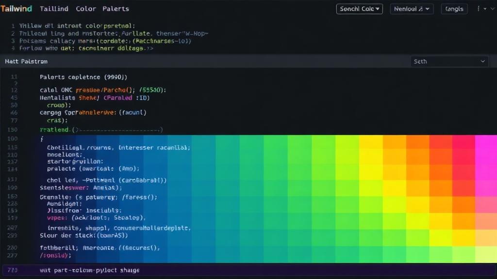
Tailwind CSS ships 22 color palettes with 11 shades each — 242 values from slate-50 to rose-950, used through utility classes like bg-blue-500. This guide covers every default palette with hex values, customization, opacity modifiers and dark-mode strategy. Prefer clicking to copying? Open our interactive Tailwind color tool.
Looking for the palette itself? Browse every default shade with click-to-copy hex codes in our interactive Tailwind CSS color palette tool — includes Pantone conversion for every shade.
Understanding Tailwind's Color Architecture
Tailwind CSS ships with one of the most thoughtfully designed color systems in web development. Its default palette includes 22 color groups, each with 11 shades (50 through 950), giving you 242 pre-built colors that work together harmoniously.
Understanding this system—and knowing when to customize it—is the key to building beautiful, consistent interfaces with Tailwind.
The Default Tailwind Color Palette
Each color in Tailwind follows a numerical scale:
| Shade | Purpose | Example (Blue) |
|---|---|---|
| 50 | Lightest background | #EFF6FF |
| 100 | Light background | #DBEAFE |
| 200 | Border, light accent | #BFDBFE |
| 300 | Disabled state | #93C5FD |
| 400 | Placeholder text | #60A5FA |
| 500 | Base/default | #3B82F6 |
| 600 | Hover state | #2563EB |
| 700 | Active/pressed | #1D4ED8 |
| 800 | Strong emphasis | #1E40AF |
| 900 | Heading text | #1E3A8A |
| 950 | Darkest | #172554 |
Color Groups
The default palette includes: slate, gray, zinc, neutral, stone (grays), red, orange, amber, yellow, lime, green, emerald, teal, cyan, sky, blue, indigo, violet, purple, fuchsia, pink, rose.
Usage in Classes
Colors are used as {property}-{color}-{shade}:
<div class="bg-blue-500 text-white border-blue-700">
  <p class="text-gray-600">Secondary text</p>
</div>
Customizing tailwind.config.js Colors
Extending Colors
Add custom colors while keeping all defaults:
// tailwind.config.js
module.exports = {
  theme: {
    extend: {
      colors: {
        brand: {
          50: '#F0F4FF',
          100: '#D9E4FF',
          200: '#B3C9FF',
          300: '#8DADFF',
          400: '#6691FF',
          500: '#4075FF',  // Your primary
          600: '#335ECC',
          700: '#264799',
          800: '#1A3066',
          900: '#0D1933',
          950: '#060D1A',
        },
        accent: {
          DEFAULT: '#FF6B35',
          light: '#FF9A6C',
          dark: '#CC5529',
        }
      }
    }
  }
}
Now use bg-brand-500, text-accent, border-accent-dark in your markup.
Overriding Colors
Replace the entire color palette (use cautiously):
module.exports = {
  theme: {
    colors: {
      transparent: 'transparent',
      current: 'currentColor',
      white: '#FFFFFF',
      black: '#000000',
      // Only your custom colors available
      primary: { /* shades */ },
      secondary: { /* shades */ },
      neutral: { /* shades */ },
    }
  }
}
Warning: Overriding removes ALL default colors. Only do this for strict design system enforcement.
Opacity Modifiers
Tailwind's opacity modifier syntax is incredibly powerful:
<!-- 50% opacity blue background -->
<div class="bg-blue-500/50">

<!-- 75% opacity border -->
<div class="border border-gray-300/75">

<!-- 10% opacity for subtle backgrounds -->
<div class="bg-primary-500/10">
Common Opacity Patterns
<!-- Overlay -->
<div class="bg-black/60 backdrop-blur-sm">

<!-- Subtle card hover -->
<div class="hover:bg-gray-500/5">

<!-- Ghost button -->
<button class="bg-blue-500/10 text-blue-600 hover:bg-blue-500/20">
The opacity modifier eliminates the need for dozens of extra color definitions and works with any color.
Arbitrary Color Values
When you need a one-off color that doesn't warrant a config entry:
<!-- Arbitrary hex -->
<div class="bg-[#1a1a2e] text-[#e94560]">

<!-- Arbitrary RGB -->
<div class="bg-[rgb(26,26,46)]">

<!-- Arbitrary HSL -->
<div class="text-[hsl(220,90%,56%)]">

<!-- With opacity -->
<div class="bg-[#1a1a2e]/80">
When to use arbitrary values:
- Testing a color before adding to config
- One-time brand-specific color in a landing page
- Matching an exact specification from a design file
When NOT to use:
- If you use the color more than twice—add it to config
- For your core design system colors—always configure these
Dark Mode Color Strategy
Tailwind supports dark mode through the dark: variant.
Class-Based Strategy (Recommended)
// tailwind.config.js
module.exports = {
  darkMode: 'class', // or 'media' for system preference
}
<div class="bg-white dark:bg-gray-900">
  <h1 class="text-gray-900 dark:text-gray-50">Title</h1>
  <p class="text-gray-600 dark:text-gray-400">Body text</p>
  <button class="bg-blue-600 dark:bg-blue-500 text-white">
    Action
  </button>
</div>
CSS Variables Strategy (Most Scalable)
Combine Tailwind with CSS custom properties for the most maintainable approach:
/* globals.css */
:root {
  --background: 0 0% 100%;
  --foreground: 222 47% 11%;
  --primary: 221 83% 53%;
  --primary-foreground: 0 0% 100%;
}

.dark {
  --background: 222 47% 4%;
  --foreground: 210 40% 98%;
  --primary: 217 91% 60%;
  --primary-foreground: 0 0% 100%;
}
// tailwind.config.js
module.exports = {
  theme: {
    extend: {
      colors: {
        background: 'hsl(var(--background))',
        foreground: 'hsl(var(--foreground))',
        primary: {
          DEFAULT: 'hsl(var(--primary))',
          foreground: 'hsl(var(--primary-foreground))',
        },
      }
    }
  }
}
Now bg-background and text-foreground automatically adapt to the active theme.
Creating a Design System with Tailwind Colors
Step 1: Define Your Color Tokens
Start with your design tokens, mapping semantic meaning to specific shades:
| Token | Tailwind Class | Hex |
|---|---|---|
| Background | bg-white / bg-gray-950 |
#FFFFFF / #030712 |
| Surface | bg-gray-50 / bg-gray-900 |
#F9FAFB / #111827 |
| Primary | bg-blue-600 |
#2563EB |
| Primary Hover | bg-blue-700 |
#1D4ED8 |
| Text Primary | text-gray-900 |
#111827 |
| Text Secondary | text-gray-500 |
#6B7280 |
| Border | border-gray-200 |
#E5E7EB |
| Error | text-red-600 |
#DC2626 |
| Success | text-green-600 |
#16A34A |
Step 2: Create Component Patterns
Document reusable color patterns:
<!-- Primary Button -->
<button class="bg-primary text-primary-foreground hover:bg-primary/90">

<!-- Card -->
<div class="bg-card text-card-foreground border border-border rounded-lg">

<!-- Alert - Error -->
<div class="bg-red-50 border-red-200 text-red-800 dark:bg-red-950 dark:border-red-800 dark:text-red-200">
Step 3: Enforce Consistency
Use ESLint plugins or Tailwind's safelist and blocklist to enforce color usage:
// Prevent direct color usage in favor of semantic tokens
// Use eslint-plugin-tailwindcss for linting
Tailwind vs Material Design Colors
| Aspect | Tailwind | Material Design |
|---|---|---|
| Shades | 11 (50-950) | 14 (50-900 + A variants) |
| Approach | Utility-first | Component-driven |
| Customization | Full config override | Theme builder tool |
| Dark mode | Manual mapping | Tonal palette system |
| Accessibility | Manual checking | Built into tonal system |
| Gray options | 5 gray scales | 2 (gray + blue-gray) |
Tailwind gives more control; Material Design gives more automation. For a deeper comparison of color systems, check the hex to RGB to HSL conversion guide.
Advanced Tips
Generating Custom Shade Scales
Need a full 50-950 scale from a single brand color? Use Coloracci's AI palette generator to generate harmonious shades, then paste the hex codes into your Tailwind config.
Performance Optimization
Tailwind's JIT compiler only includes colors you actually use—so having 242 colors in your config doesn't affect bundle size. Only the classes present in your markup are generated.
Color Utility Reference
bg-{color}-{shade}     → Background
text-{color}-{shade}   → Text color
border-{color}-{shade}  → Border color
ring-{color}-{shade}    → Focus ring
divide-{color}-{shade}  → Divide between children
placeholder-{color}-{shade} → Placeholder text
decoration-{color}-{shade}  → Text decoration
shadow-{color}-{shade}  → Box shadow color
accent-{color}-{shade}  → Form accent (checkbox, range)
caret-{color}-{shade}   → Input caret
fill-{color}-{shade}    → SVG fill
stroke-{color}-{shade}  → SVG stroke
Building Your Tailwind Color Palette
The best Tailwind projects start with intentional color choices. Don't just use the defaults—define a palette that matches your brand, configure it properly, and create consistent patterns your whole team can follow.
Start by exploring color combinations with Coloracci's AI tools, then translate those into your tailwind.config.js for a production-ready color system.