Sustainable and Eco-Friendly Brand Color Trends
· Coloracci Team
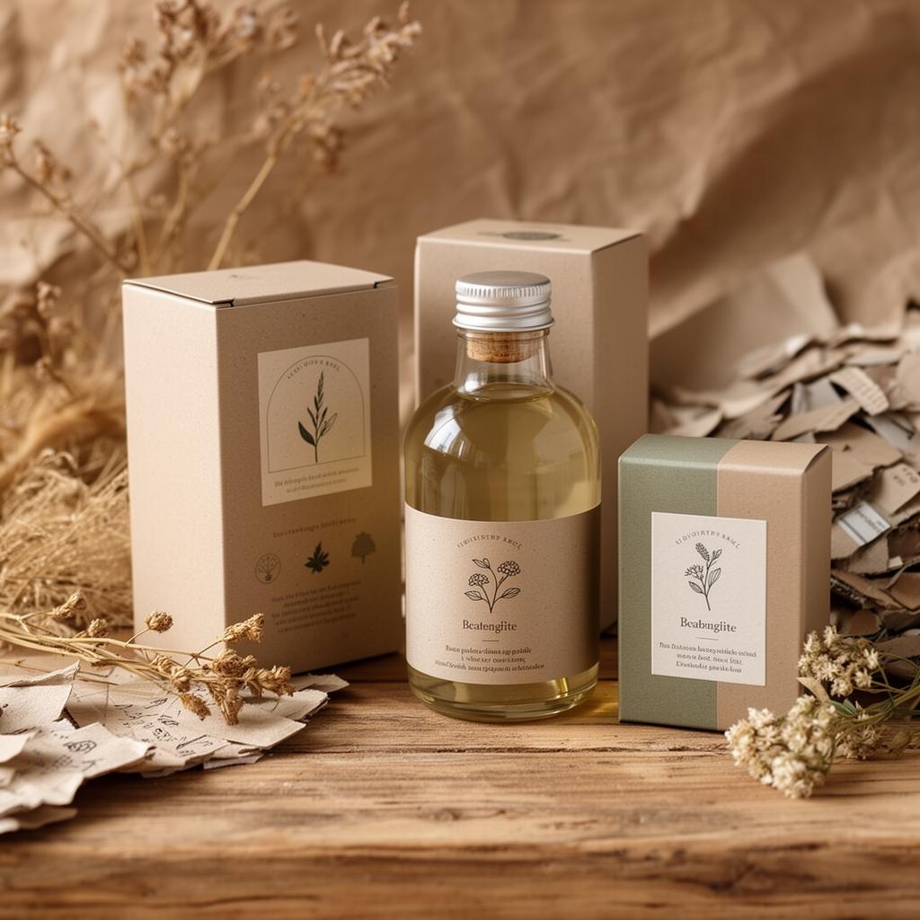
The sustainability movement has fundamentally changed how brands communicate through color. A decade ago, slapping a leaf-green logo on a product was enough to signal environmental consciousness. Today's consumers are far more discerning. They recognize performative eco-signaling instantly, and they reward brands whose visual identity reflects genuine commitment rather than superficial greenwashing.
This shift has produced one of the most interesting color trend movements in modern branding. Sustainable brands are abandoning the clichéd "green = eco" formula in favor of nuanced palettes drawn from raw materials, weathered landscapes, and the honest imperfections of nature. Here's how the landscape is evolving — and how to navigate it without triggering consumer skepticism.
Beyond Green: The New Sustainability Palette
Green remains associated with nature, but it's no longer the default choice for brands with genuine environmental credentials. The most compelling sustainable brands are choosing colors that tell a more specific, authentic story.
Why Pure Green Is Losing Ground
The problem with green — particularly the bright, saturated greens like #22C55E or #10B981 — is oversaturation. Every product claiming to be "natural," "organic," or "eco-friendly" has used some variant of green for the past two decades. The color has become so associated with environmental marketing that it now triggers skepticism rather than trust.
Research from the Journal of Consumer Psychology shows that consumers increasingly view bright green packaging as a potential signal of greenwashing — the practice of making misleading environmental claims. The irony is significant: the color most associated with nature has become associated with dishonesty about nature.
Colors That Communicate Authenticity
Brands with genuine sustainability commitments are gravitating toward colors that feel unprocessed and honest:
- Raw Linen — #D4C9B0 — The color of unbleached fabric, suggesting minimal processing
- Driftwood — #8B7D6B — Weathered, imperfect, and naturally aged
- Charred Wood — #2C2416 — Deep brown-black evoking controlled burns and carbon cycles
- Clay Slip — #C4A882 — The color of unfired ceramics, raw and unfinished
- Storm Cloud — #6B7B8D — A cool neutral that avoids the warmth associated with conventional luxury
These colors share a quality that's difficult to fake: they look like they came from somewhere real. They reference specific materials and processes rather than abstract concepts of "nature."
Ocean and Water Tones
Marine conservation brands and ocean-focused initiatives are developing a distinct color vocabulary:
- Deep Pacific — #1B3A4B — The color of deep water, serious and contemplative
- Kelp Forest — #3D5A4C — A blue-green that references underwater ecosystems
- Sea Salt — #E8E4DE — Off-white with a slight warmth, like evaporated seawater
- Coral Bleach — #F0E6E0 — A haunting near-white that references the crisis of coral bleaching
These palettes work because they're specific. "Ocean blue" is generic; "the exact color of kelp at twelve feet" tells a story.
Earth Tones in Sustainability Branding
Earth tones have emerged as the dominant palette family for brands communicating environmental responsibility. But not all earth tones are created equal, and how you deploy them matters as much as which ones you choose.
The Terracotta Renaissance
Terracotta — ranging from #C2703E to #A0522D — has become the anchor color for sustainable lifestyle brands. Its appeal is multifaceted:
- It references handmade ceramics, suggesting artisanal production
- It evokes sun-baked earth, connecting the brand to landscape and place
- It feels warm without being sweet, avoiding the saccharine quality of peach or coral
- It works exceptionally well on kraft paper and recycled card stock
Brands like Aesop, Le Labo, and numerous direct-to-consumer skincare lines have built entire visual identities around terracotta and its adjacent tones.
Building an Earth Tone System
A complete earth-tone palette for a sustainable brand might look like this:
| Role | Color | Hex | Usage |
|---|---|---|---|
| Primary | Terracotta | #B5603E | Logo, key brand moments |
| Secondary | Olive Stone | #6B6548 | Secondary text, icons |
| Neutral Light | Parchment | #F2EDE4 | Backgrounds, packaging |
| Neutral Dark | Compost | #2E2A24 | Primary text, headers |
| Accent | Lichen | #8D9B7B | Highlights, CTAs |
| Alert | Dried Berry | #8B4049 | Warnings, limited stock |
The key principle: every color should be nameable after something found in nature, and every name should feel specific rather than generic.
Texture Over Saturation
Sustainable earth-tone palettes succeed partly because they pair well with textured surfaces. On a smooth, glossy surface, #B5603E looks like any other orange-brown. On uncoated paper with visible fiber, the same color evokes clay pots, adobe walls, and dried autumn leaves. The texture activates the color's associations.
Digital designers can simulate this effect with:
- Subtle noise overlays (1–3% opacity)
- Paper texture backgrounds
- Matte illustration styles that avoid sharp gradients
Packaging Color Trends for Sustainable Brands
Packaging is where sustainable color choices face their most rigorous test. The materials themselves — recycled cardboard, unbleached paper, plant-based inks — impose constraints that smart brands turn into aesthetic advantages.
The Kraft Revolution
Unbleached kraft paper (#C4A36E to #A08050) has become the default substrate for sustainable packaging. Its warm brown surface changes how printed colors behave:
- White ink on kraft creates a distinctive, premium look that's instantly recognizable as eco-conscious
- Single-color printing (typically black #1A1A1A or a dark green #2D4739) reduces ink waste while creating a clean, confident aesthetic
- No-ink options — embossing and debossing on kraft — eliminate ink entirely while maintaining visual interest
Brands that embrace kraft's limitations rather than fighting them communicate confidence in their environmental commitments.
Reduced Ink Strategies
Sustainable packaging increasingly uses fewer colors. Where conventional packaging might use six-color process printing, eco-conscious brands limit themselves to one or two spot colors:
- Monochrome on natural substrate — One ink color (often a deep forest green #1B3D2F or warm charcoal #3B352F) printed on kraft or recycled grey board
- Duotone — Two carefully chosen colors that create maximum visual impact with minimum environmental cost
- Soy-based and vegetable inks — These inks tend toward slightly less saturated reproduction, which actually reinforces the natural, unforced aesthetic
Colors That Signal Recyclability
Consumer research shows that certain colors on packaging are intuitively associated with recyclability and environmental responsibility:
- Brown and tan tones — strongly associated with recycled materials
- Muted blues and grays — associated with water conservation and clean technology
- Dark greens (not bright) — #2D4739 reads as "forest" rather than "marketing"
- Black and white minimalism — suggests nothing to hide, transparency
Colors that undermine sustainability messaging:
- Metallic foils — signal luxury and excess regardless of other eco-claims
- Neon or fluorescent colors — require specialty inks with higher environmental impact
- High-gloss coatings — suggest plastic lamination, even when they don't use it
Greenwashing Color Pitfalls
Greenwashing — making exaggerated or misleading environmental claims — is a genuine risk for brands, and color choices play a surprisingly large role. Here's how to avoid the traps.
The "Too Green" Problem
Brands that overuse vivid green risk the "protest too much" effect. If your packaging is saturated in #22C55E with leaf motifs and nature imagery, consumers may wonder why you're trying so hard. Authentic sustainability brands tend to let their practices speak and use color more subtly.
Red flag combinations:
- Bright green + brown kraft = trying to have it both ways
- Green gradient backgrounds on websites with no verifiable sustainability data
- "Natural" green tones on products that contain primarily synthetic ingredients
Borrowed Trust Colors
Some brands adopt the visual language of certified organizations without holding certifications. Using colors similar to recognized eco-labels (like the FSC green #5B9E4B or EU Ecolabel blue #0072BC) on uncertified products is a form of visual greenwashing that regulators are increasingly targeting.
Best practice: If you hold a certification, display the actual certification mark. If you don't, make your brand colors distinct from certification colors to avoid implied endorsement.
Transparency Over Aesthetics
The most trustworthy sustainable brands prioritize clear information hierarchy over atmospheric color design:
- Product information first — legible text in high-contrast colors (#2E2A24 on #F2EDE4)
- Sourcing and certification data — prominently placed, not hidden in decorative backgrounds
- Environmental impact metrics — displayed in neutral colors, not highlighted in green as if they're marketing features
- Aesthetic color choices second — the brand's visual identity supports the information rather than competing with it
The Honest Imperfection Principle
Perhaps the most effective anti-greenwashing color strategy is embracing imperfection. Natural materials have variation — the grain of wood, the irregularity of handmade paper, the slight shifts in plant-based dye batches. Brands that allow this variation into their visual identity communicate authenticity more effectively than those presenting a perfectly uniform "natural" aesthetic.
In digital design, this translates to:
- Slightly varied background tones across sections
- Illustration styles that include hand-drawn imperfections
- Photography with natural lighting rather than studio-perfect color grading
- Color palettes with intentionally "undesigned" combinations
The future of sustainable branding color isn't about finding the right green — it's about finding the right honesty. Brands that build palettes from real materials, specific places, and genuine environmental commitments will always outperform those that paint conventional products in eco-friendly colors.