School & University Color Psychology: How Educational Colors Influence Learning, Student Focus & Academic Performance
· Coloracci Team
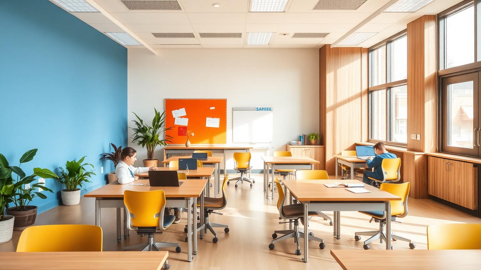
The Hidden Factor in Student Success: Color
Research from the University of British Columbia found that students in classrooms with strategic color design scored 11% higher on standardized tests compared to those in neutral beige and white environments. Another study from the University of Texas revealed that 75% of students reported feeling more engaged in classrooms with intentional color palettes.
The science is compelling: color isn't just decoration—it's a cognitive tool that directly influences attention span, information retention, stress levels, and academic performance. Whether you're designing an elementary classroom, a high school STEM lab, a university lecture hall, or a campus library, understanding educational color psychology can measurably improve learning outcomes.
The Educational Color Framework
Research by environmental psychologist Dr. Ellen Spencer and color theorist Angela Wright identified a four-color system for educational spaces:
| Color | Best For | Hex Code | Cognitive Effect |
|---|---|---|---|
| Blue | Focused learning | #6B8E8A | Enhances concentration, reduces anxiety, improves reading comprehension |
| Green | Sustained study | #9DB5A0 | Reduces eye strain, promotes calm, balances energy |
| Yellow | Creative thinking | #F4D03F | Stimulates innovation, memory formation, idea generation |
| Orange | Active engagement | #E67E22 | Increases enthusiasm, social interaction, physical energy |
Age-Specific Color Considerations
Different age groups respond differently to color saturation:
- Early childhood (3-7 years) — Brighter, more saturated colors support developing visual systems and high energy levels
- Elementary (8-12 years) — Medium saturation provides stimulation without overwhelming developing attention spans
- Teenagers (13-18 years) — Lower saturation, sophisticated palettes respect growing need for autonomy
- University students (18+ years) — Muted, professional tones support mature learning and extended study sessions
Blue for Focused Learning & Concentration
The Research
Blue environments have been consistently linked to improved academic performance:
- Students in blue-decorated classrooms showed 15% improvement in reading comprehension tests
- Blue reduces classroom anxiety by 18%, creating safer spaces for participation
- Blue light exposure during morning classes increases alertness by 12%
- Blue walls reduce off-task behavior by 23% in elementary students
Recommended Blue Educational Palette
| Application | Color | Hex Code |
|---|---|---|
| Primary walls | Soft steel blue | #7B9EB8 |
| Reading corners | Pale blue-gray | #E8EDF2 |
| Bulletin boards | Navy accent | #1E3A5F |
| Desk accessories | Bright blue | #3B82F6 |
Where to Use Blue in Education
- Language arts classrooms — Blue supports reading comprehension and verbal processing
- Testing centers — Reduces test anxiety and improves performance under pressure
- Library study areas — Promotes sustained focus during long reading sessions
- Science laboratories — Enhances analytical thinking and methodical work
- Computer labs — Reduces digital eye strain when combined with proper lighting
The Blue Balance Warning
Too much saturated blue can create a cold, institutional feeling. Balance blue walls with:
- Warm wood tones (floors, furniture)
- Cream or off-white ceilings
- Orange or yellow accent pieces (5-10% of visual field)
- Living plants for natural color variation
Green for Sustained Study & Reduced Eye Strain
The Research
Green is uniquely suited for educational environments due to its physiological effects:
- Green reduces eye strain by 20% during prolonged reading
- Students in green classrooms report 15% lower fatigue levels
- Nature views through windows (green) improve attention restoration
- Green environments lower cortisol by 13%, reducing academic stress
The Science of Green in Learning
The human eye focuses green light directly on the retina, making it the most restful color for vision. This biological fact makes green ideal for:
- Long study sessions
- Exam preparation areas
- Library reading rooms
- Art classrooms requiring color discrimination
Recommended Green Educational Palette
| Application | Color | Hex Code |
|---|---|---|
| Wall accents | Sage green | #8FA886 |
| Plants | Natural green | Various |
| Carpeting | Forest green | #2D5A3D |
| Background accents | Mint tint | #F0F7F4 |
Where to Use Green in Education
- Libraries and study halls — Green promotes extended focus without fatigue
- Special education classrooms — Calming effect supports sensory regulation
- Counseling offices — Creates safe, relaxing spaces for student support
- Teacher lounges — Promotes recovery during breaks
- Hallways and transitions — Eases movement between stimulating classes
The Biophilic Factor
Live plants are the most effective way to introduce green in schools. Research shows classrooms with plants demonstrate:
- 15% improvement in academic performance
- 37% reduction in student tension
- Improved air quality and humidity control
- Enhanced sense of environmental stewardship
Yellow for Creative Thinking & Memory
The Research
Yellow stimulates mental activity and memory formation in educational contexts:
- Yellow environments increase creative output by 12% in student projects
- Pale yellow improves information retention by 8% compared to white
- Yellow accent walls increase participation in class discussions
- The color activates the left brain's analytical creativity
The Yellow Memory Connection
Yellow's association with memory dates to our evolutionary history—ripe yellow fruit signaled nutrition and abundance. In classrooms, this translates to:
- Better recall of information presented on yellow backgrounds
- Increased willingness to take intellectual risks
- Enhanced optimism about challenging subjects
Recommended Yellow Educational Palette
| Application | Color | Hex Code |
|---|---|---|
| Accent walls | Warm butter | #F5D485 |
| Creative supplies | Goldenrod | #DAA520 |
| Memory aids | Soft yellow | #FFFACD |
| Collaborative zones | Amber | #FFBF00 |
Where to Use Yellow in Education
- Art and music rooms — Yellow stimulates creative expression
- Innovation labs — Supports brainstorming and ideation
- Preschool and early elementary — Appropriate for high-energy young learners
- Debate and discussion areas — Encourages verbal participation
- Career counseling centers — Promotes optimistic future planning
The Yellow Warning
Saturated yellow causes:
- Eye strain with extended exposure
- Increased anxiety in high-stress students
- Difficulty with reading text on yellow backgrounds
Best practice: Use yellow as accents (10-15% of visual field), never as primary wall color for learning spaces.
Orange for Active Engagement & Energy
The Research
Orange combines red's energy with yellow's optimism, creating productive stimulation:
- Orange increases enthusiasm for challenging subjects by 18%
- Students report higher interest levels in orange-accented STEM classrooms
- Orange promotes social interaction and collaborative learning
- The color increases oxygen supply to the brain, enhancing cognitive function
Orange in Modern Learning Spaces
Contemporary educational design recognizes that learning isn't just sitting still—active learning, maker spaces, and collaborative zones benefit from orange's energizing properties.
Recommended Orange Educational Palette
| Application | Color | Hex Code |
|---|---|---|
| Active learning zones | Terracotta | #C66B4A |
| Maker spaces | Burnt orange | #CC5500 |
| Collaborative furniture | Coral | #FF7F50 |
| Sports and recreation | Bright orange | #FF6B35 |
Where to Use Orange in Education
- STEM and robotics labs — Energizes hands-on problem solving
- Group project rooms — Promotes collaboration and discussion
- Physical education areas — Appropriate for athletic facilities
- Cafeterias and dining halls — Stimulates social interaction and appetite
- Entrance areas — Creates welcoming, energetic first impressions
Age-Specific Educational Design Guidelines
Early Childhood (Ages 3-7)
Developmental Considerations:
- Visual systems still developing—benefit from high contrast
- Short attention spans require visual stimulation
- Color aids in cognitive categorization and learning
Recommended Approach:
- Primary colors in learning materials and toys
- Bright accent walls balanced with neutral backgrounds
- Color-coded zones for different activities (reading, art, quiet time)
- Maximum 3-4 dominant colors to avoid overstimulation
Specific Recommendations:
- Classrooms: Warm yellow or soft orange for energy
- Reading corners: Soft blue for calming transition
- Art areas: White walls for color learning
- Nap areas: Pale green or blue for rest
Elementary School (Ages 8-12)
Developmental Considerations:
- Developing sustained attention abilities
- Increasing academic pressure and testing
- Need for both stimulation and focus
Recommended Approach:
- Medium saturation colors for balance
- Clear color zoning for different subjects
- Blue-dominant spaces for testing and assessment
- Green accents for stress reduction
Specific Recommendations:
- Main classrooms: Soft blue or green walls
- Computer labs: Blue-gray with warm wood accents
- Science rooms: White with green and blue accents
- Art rooms: Neutral walls with colorful storage
Middle and High School (Ages 13-18)
Developmental Considerations:
- Growing need for autonomy and identity
- Academic pressure increases significantly
- Social dynamics become more complex
- Preparing for professional environments
Recommended Approach:
- Mature, sophisticated color palettes
- Student input on color choices (within guidelines)
- Color psychology education integrated into design
- Balance between stimulation and professionalism
Specific Recommendations:
- General classrooms: Muted blue-gray or sage green
- STEM areas: Clean whites with orange or blue accents
- Humanities: Warm neutrals with artistic accents
- Common areas: Sophisticated palettes respecting student maturity
University Level (Ages 18+)
Developmental Considerations:
- Adult learners with professional expectations
- Extended study periods requiring sustained focus
- Diverse learning styles and environments needed
- Connection to institutional brand identity
Recommended Approach:
- Professional, muted palettes
- Brand color integration with psychological considerations
- Varied environments supporting different learning modes
- High-quality materials and sophisticated design
Specific Recommendations:
- Lecture halls: Neutral bases with institution colors as accents
- Libraries: Sage green, soft blue, warm wood tones
- Study pods: Individual color preference options
- Innovation spaces: Bold accent colors on neutral backgrounds
Specialized Educational Environments
STEM Laboratories
STEM learning requires both analytical focus and creative problem-solving:
Color Strategy:
- Primary white or light gray for cleanliness and visibility
- Blue accents for analytical work zones
- Orange accents for innovation and prototyping areas
- Green for break and recovery spaces
Specific Considerations:
- Safety color coding (red for hazards, yellow for caution)
- Equipment visibility against backgrounds
- Minimizing visual interference with digital displays
Arts and Humanities
Creative subjects benefit from color stimulation while requiring neutral spaces for artwork display:
Color Strategy:
- Neutral walls (white, cream, pale gray) for artwork visibility
- Colorful storage and furniture for inspiration
- Yellow and orange in brainstorming areas
- Blue in writing and analysis zones
Special Education
Students with sensory processing differences require careful color consideration:
Color Strategy:
- Reduced saturation overall
- Avoid bright primary colors that can overwhelm
- Green and blue for calming effects
- Consistent color coding for predictability
Specific Considerations:
- Individual color preferences when possible
- Avoid fluorescent lighting that distorts color perception
- Matte finishes to reduce glare and overstimulation
- Transition spaces with calming colors
University Campus Design
Lecture Halls and Auditoriums
Large learning spaces present unique color challenges:
Color Strategy:
- Darker colors in seating areas to minimize distraction
- Lighter colors at front for instructor visibility
- Institution brand colors as strategic accents
- Blue tones for improved attention during long lectures
Size-Specific Guidelines:
- Under 100 seats: Medium blue or sage green walls
- 100-300 seats: Neutral walls with colored accents
- Over 300 seats: Dark seating, light stage, blue accent lighting
Libraries and Study Spaces
Libraries serve multiple functions requiring color zoning:
Quiet Study Areas:
- Sage green or soft blue for sustained focus
- Warm wood tones for comfort
- Minimal color variation to reduce distraction
Collaborative Zones:
- Orange or yellow accents for energy
- Flexible furniture in varied colors
- Whiteboards and writable surfaces
Social Areas:
- Warmer tones encouraging interaction
- Institution colors for brand connection
- Comfortable, residential-style palettes
Student Housing
Living-learning environments require color psychology for both academic and wellbeing outcomes:
Study Areas in Dorms:
- Blue or green for focused work
- Task lighting to support circadian rhythms
- Minimal visual clutter
Social Common Areas:
- Orange and yellow for community building
- Warm, welcoming palettes
- Flexible spaces supporting different activities
Sleep Areas:
- Blue tones proven to improve sleep quality
- Avoid stimulating colors in bedrooms
- Blackout considerations with color choices
Practical Implementation Guide
The 60-30-10 Rule for Classrooms
Apply this classic design principle to educational spaces:
- 60% — Dominant color (walls): Neutral or calming (blue, green, cream)
- 30% — Secondary color (furniture, floors): Complementary tone
- 10% — Accent color (accessories, bulletin boards): Stimulating (orange, yellow, institution colors)
Lighting and Color Interaction
Color appearance changes dramatically with lighting:
Natural Light:
- Northern exposure: Cooler colors appear brighter
- Southern exposure: Warm colors intensified
- East/West: Color changes throughout day
Artificial Lighting:
- Warm LEDs (2700-3000K): Enhance warm colors, mute cool colors
- Cool LEDs (4000-5000K): Enhance blue and green, wash out warm colors
- Full-spectrum: Most accurate color rendering
Recommendations:
- Test paint colors under actual lighting conditions
- Consider circadian lighting systems for student health
- Avoid fluorescent lighting when possible
- Use dimmable systems for color flexibility
Color and Technology
Modern classrooms integrate screens and digital displays:
Screen Visibility:
- Avoid high-contrast wall colors near screens
- Matte finishes reduce screen glare
- Blue walls can compete with screen blue light
Color Temperature Matching:
- Coordinate wall colors with screen color temperatures
- Warm walls (3000K) match warm screen settings
- Cool walls (4000K+) match daylight screen settings
Case Studies: Educational Color Success
Case Study 1: Singapore's "Colorful Classroom" Initiative
Singapore's Ministry of Education redesigned 50 pilot classrooms using color psychology principles:
Implementation:
- Blue-dominant reading areas
- Green study zones
- Yellow creative corners
- Orange collaborative spaces
Results after one academic year:
- 14% improvement in standardized test scores
- 22% reduction in reported student stress
- 18% increase in student engagement metrics
- Teacher satisfaction up 31%
Case Study 2: University of Michigan Library Renovation
The University of Michigan applied color psychology to a major library renovation:
Implementation:
- Sage green silent study floors
- Blue collaborative zones
- Warm wood and earth tones in social areas
- Institution colors as strategic accents
Results:
- 40% increase in library usage
- Student satisfaction scores improved from 3.2 to 4.6/5
- Extended visit duration (average +45 minutes)
- Reduced noise complaints by 60%
Case Study 3: High School STEM Wing Redesign
A suburban high school redesigned their STEM facilities with color psychology:
Implementation:
- White and gray base with orange innovation zones
- Blue computer science labs
- Green biology spaces referencing nature
- Yellow physics demonstration areas
Results:
- 25% increase in STEM course enrollment
- 19% improvement in AP exam scores
- Student creative project output increased 35%
- Teacher retention in STEM improved
Measuring Color Impact in Education
Quantitative Metrics
Track these metrics before and after color interventions:
- Academic Performance: Test scores, grades, completion rates
- Behavioral Data: Attendance, tardiness, disciplinary incidents
- Engagement Metrics: Participation rates, time-on-task, assignment completion
- Wellbeing Indicators: Stress surveys, sleep quality, health visits
Qualitative Assessment
Gather subjective feedback through:
- Student surveys about learning environment satisfaction
- Teacher feedback on classroom functionality
- Parent observations about student attitudes toward school
- Focus groups exploring specific color preferences
Longitudinal Studies
Color psychology effects compound over time:
- Short-term (1-4 weeks): Immediate stress reduction, novelty effects
- Medium-term (1 semester): Behavioral changes, habit formation
- Long-term (1+ years): Academic performance trends, wellbeing outcomes
Budget-Conscious Color Strategies
Not every school can undertake major renovations. Implement color psychology with these affordable approaches:
Low-Cost Interventions ($0-$500 per classroom)
- Paint an accent wall — Single wall in optimal learning color ($100-200)
- Color-coded organization — Storage bins, folders, bulletin boards
- Portable color panels — Foam boards or fabric on wheels ($50-100)
- Lighting changes — Full-spectrum bulbs, dimmer switches ($100-300)
- Textile additions — Curtains, rugs, cushion covers in target colors
Medium Investment ($500-$5000 per classroom)
- Furniture updates — Chairs, desks in strategic colors
- Technology integration — Color-adjustable LED lighting systems
- Wall treatments — Acoustic panels in educational colors
- Flooring changes — Carpet tiles or vinyl in zone-specific colors
Major Renovations ($5000+ per classroom)
- Full wall repainting with color psychology consultation
- Custom furniture designed for specific learning activities
- Integrated lighting systems with circadian support
- Architectural elements supporting color zoning
The Future of Educational Color Design
Emerging Trends
Biophilic Integration:
- Living walls with strategic plant color placement
- Natural materials introducing earth tones
- Views of green spaces from learning areas
Adaptive Color Systems:
- LED walls with programmable color schemes
- Time-based color changes supporting circadian rhythms
- Activity-specific color presets
Personalized Learning Environments:
- Individual color preferences for study pods
- Wearable technology adjusting ambient color
- Student-controlled micro-environments
Research Frontiers
Neuroscience Insights:
- fMRI studies of color effects on learning brain regions
- Individual genetic variations in color perception
- Age-related changes in color response
Cross-Cultural Considerations:
- Cultural differences in color-education associations
- International student preferences in diverse classrooms
- Adapting Western color psychology to global contexts
Key Takeaways for Educators and Designers
Immediate Actions
- Audit your current spaces — Evaluate existing colors against learning objectives
- Start with one intervention — Paint a single accent wall or add plants
- Involve stakeholders — Get input from students, teachers, and staff
- Measure results — Track metrics before and after changes
- Iterate and expand — Build on successful interventions
Design Principles
- Match color to activity — Blue for focus, green for calm, yellow for creativity, orange for energy
- Consider age appropriateness — Brighter for young children, muted for older students
- Balance is essential — Never overwhelm with any single color
- Test before committing — Use paint samples and temporary solutions
- Integrate with lighting — Color only works with appropriate illumination
Long-Term Vision
Educational color psychology isn't about following trends—it's about creating environments where every student can perform at their best. The research is clear: strategic color choices improve academic outcomes, reduce stress, and create spaces where learning flourishes.
Whether you're a teacher with a single classroom, an administrator planning a new building, or a designer creating the next generation of educational spaces, color is one of the most powerful and cost-effective tools at your disposal.
Use it intentionally, and watch student success grow.
Ready to optimize your educational spaces for learning? Try Coloracci's AI palette generator to create research-backed color schemes for any classroom or campus environment.