Restaurant Color Trends 2026: The 7 Palettes Defining Modern Hospitality Interiors
· Coloracci Design Team
Restaurant Color Trends 2026: The 7 Palettes Defining Modern Hospitality
Restaurant color psychology is no longer a static playbook of "red speeds turnover, blue suppresses appetite." In 2026, hospitality designers are remixing those fundamentals with cinematic moods, biophilic warmth, and Gen-Z dopamine accents — all in service of one goal: making the dining room photograph as well as it performs. This guide breaks down the seven defining color trends shaping restaurant interiors in 2026, the psychology behind each, and exactly how to deploy them with hex-precise palettes.
If you operate, design, or invest in a food-and-beverage concept, the colors on your walls are doing more revenue work than your menu typography. Here's the 2026 brief.
Why Restaurant Color Psychology Matters More in 2026
Three forces have reshaped the field in the last 24 months:
- Phone-first dining. Diners decide whether to enter a restaurant — and whether to post about it — based on a 1.5-second photo grid. Color does the heavy lifting.
- Behavioral pricing. Operators use lighting and palette to manipulate dwell time per cover. A 12-minute swing on a 90-seat patio is a six-figure annual variance.
- Trend compression. TikTok flattens the gap between fine-dining innovation and fast-casual rollout. The 2026 palettes below are appearing in Michelin rooms and ghost-kitchen pickup counters in the same quarter.
The seven palettes that follow aren't aesthetic preferences — they're behavioral instruments.
The 7 Restaurant Color Trends Defining 2026
1. Rich Black — The New Premium Default
| Role | Hex | Name |
|---|---|---|
| Primary | #0B0B0B |
Rich Black |
| Wash | #1A1A1D |
Carbon |
| Accent | #FFD700 |
Gold |
Where it's appearing: Steakhouses, omakase bars, speakeasies, contemporary tasting menus.
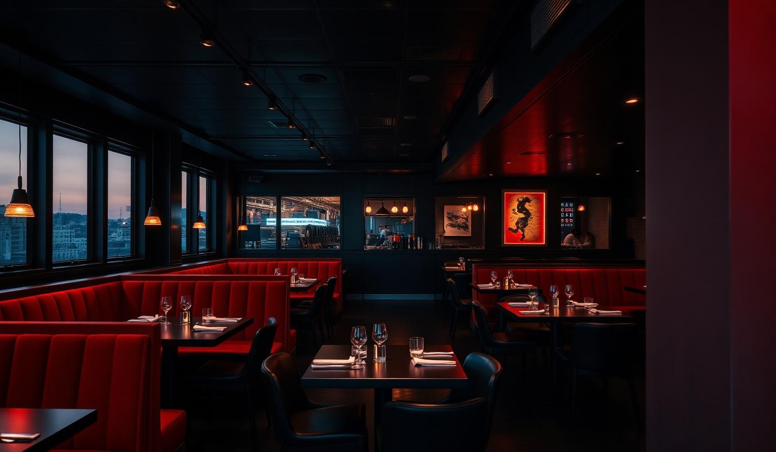
Black has graduated from "moody accent" to dominant surface treatment in 2026. Designers are wrapping ceilings, banquettes, and walls in matte rich black, then puncturing the void with single warm accents (gold, ember, or a single neon sign). The psychology: black compresses spatial perception, forcing diners to focus inward — onto the plate, the conversation, the candlelight. It also signals price; a black room reads premium before a single menu hits the table.
Watch-outs: Black is an appetite suppressant when it dominates the plateware. Keep tableware ivory or warm-cream to preserve food appeal.
2. Fiery Red — Reclaimed from Fast Food
| Role | Hex | Name |
|---|---|---|
| Primary | #DC143C |
Crimson |
| Deep | #7B0A1F |
Oxblood |
| Neutral | #F5F5DC |
Beige |
Where it's appearing: Trendy izakayas, neo-bistros, premium burger concepts, Sichuan and Korean BBQ.
For two decades, red was associated almost exclusively with quick-service: McDonald's, Wendy's, KFC. In 2026, red is being reclaimed by upscale operators using deeper, richer crimsons (#DC143C) and oxblood lacquers instead of fast-food primary red. The behavior is the same — elevated heart rate, faster decision-making, stimulated appetite — but the cultural read flips from "drive-thru" to "destination."
3. Caramel Brown — The Biophilic Anchor
| Role | Hex | Name |
|---|---|---|
| Primary | #A0522D |
Caramel |
| Deep | #635147 |
Umber |
| Highlight | #F5E6D3 |
Cream |
Where it's appearing: Specialty coffee, wine bars, farm-to-table, slow-food concepts.
Caramel brown is the workhorse of 2026's biophilic restaurant movement. It reads as wood, leather, espresso crema, and roasted grain simultaneously — every cue the brain associates with comfort and repeat visits. Operators report higher per-customer return rates in caramel-dominant rooms because brown registers as emotionally safe without being boring.
4. Deep Sea Blue — Ambiance Over Appetite
| Role | Hex | Name |
|---|---|---|
| Primary | #0A2540 |
Deep Sea |
| Mid | #1E3A5F |
Navy Tide |
| Warm offset | #E2725B |
Terracotta |
Where it's appearing: Seafood, raw bars, cocktail lounges, hotel restaurants.
Conventional wisdom says blue suppresses appetite. The 2026 update: blue suppresses appetite when paired with cool light. Pair deep sea blue (#0A2540) with warm 2700K lighting and a terracotta or brass accent, and you get the ocean-evocation of a coastal seafood concept without the food-killing side effect. Thirst stimulation remains — useful for cocktail-driven concepts.
5. Warm Beige — The Quiet-Luxury Backbone
| Role | Hex | Name |
|---|---|---|
| Primary | #E8DCC4 |
Warm Beige |
| Deep | #C9B79C |
Sand |
| Accent | #2D2A26 |
Espresso |
Where it's appearing: Mediterranean concepts, hotel all-day dining, brunch destinations, plant-forward restaurants.
Warm beige is the chromatic equivalent of linen napkins — quiet, expensive-feeling, and infinitely flattering on skin in selfies. It's the dominant 60% in countless 2026 60/30/10 schemes because it lets food, flowers, and people be the visual subject. Diners stay 15–20% longer in warm-beige rooms than in cool-gray rooms, per industry observation, because the palette reads as a living room, not a transaction.
6. Purple Majesty — Theatrical and Identity-Forward
| Role | Hex | Name |
|---|---|---|
| Primary | #4B0082 |
Indigo Royal |
| Light | #9D7AB8 |
Lavender Mist |
| Metallic | #C9A227 |
Antique Gold |
Where it's appearing: Cocktail bars, dessert bars, drag brunches, immersive dining experiences.
Purple is having its loudest restaurant moment since the 1990s. The 2026 deployment is darker and more saturated — true indigo and royal purple rather than millennial lavender. Purple signals theatricality and exclusivity; it's the color of velvet curtains and royal upholstery. Use it in concepts where the experience is the product (themed dining, omakase, private rooms).
7. Candy-Colored Pops — Dopamine Accents
| Role | Hex | Name |
|---|---|---|
| Pop 1 | #FF6FB5 |
Bubblegum |
| Pop 2 | #FFD23F |
Sunshine |
| Pop 3 | #3FE0D0 |
Mint |
| Anchor | #FFFFFF |
Pure White |
Where it's appearing: Bakeries, ice-cream shops, soft-serve bars, dessert cafés, pop-up concepts.
The dopamine-decor movement that swept residential interiors in 2024–2025 has fully landed in food-and-beverage. Candy pops are deployed against neutral backbones (white tile, pale plaster, beige terrazzo) at a strict 10% maximum. They drive the photo behavior that drives the foot traffic — every wall is engineered for a vertical phone shot.
Master Reference Table
| Trend | Primary Hex | Color Name | Best For | Psychological Effect |
|---|---|---|---|---|
| Rich Black | #0B0B0B |
Rich Black | Steakhouses, omakase, bars | Premium signal, focus, intimacy |
| Fiery Red | #DC143C |
Crimson | Trendy bistros, BBQ, burgers | Appetite, urgency, energy |
| Caramel Brown | #A0522D |
Caramel | Coffee, wine bars, slow food | Comfort, return-visit loyalty |
| Deep Sea Blue | #0A2540 |
Deep Sea | Seafood, cocktail lounges | Ambiance, thirst, freshness |
| Warm Beige | #E8DCC4 |
Warm Beige | Mediterranean, brunch, hotel dining | Quiet luxury, longer dwell |
| Purple Majesty | #4B0082 |
Indigo Royal | Cocktail bars, immersive dining | Theatricality, exclusivity |
| Candy Pops | #FF6FB5 |
Bubblegum | Bakeries, dessert, pop-ups | Dopamine, photo virality |
Patterns & Analysis: What 2026 Reveals
Three patterns emerge across all seven palettes:
1. The death of "neutral gray." Cool gray has effectively disappeared from 2026 restaurant interiors. Every dominant trend is either warm-leaning (beige, caramel, red) or saturated and intentional (black, indigo, deep sea). Gray reads as bureaucratic in a category that needs to read as hospitable.
2. The 60/30/10 rule has evolved into 70/20/10. Today's high-performing rooms commit harder to a single backbone — 70% of one trend color — and use the remaining 30% for a single supporting tone plus a 10% pop. Half-measures photograph as indecision.
3. Lighting is now a co-equal design layer. None of the 2026 palettes work under 4000K white office light. Every successful deployment assumes 2700K warm sources, dimmable circuits, and at least one source of living light — candle, sconce, or filament bulb.
Color Psychology: What These Palettes Communicate
Color in restaurants operates on three simultaneous channels:
- Autonomic — heart rate, salivation, perceived temperature. Reds and oranges accelerate; blues and blacks slow.
- Associative — what the brain learned a color means. Green = healthy, brown = roasted, pink = sweet, gold = expensive.
- Social — what the room communicates about the diner who chose to be photographed inside it.
The 2026 trend list is heavily weighted toward the third channel. A diner posting a story from a rich-black-and-gold steakhouse is performing a different identity than one posting from a candy-pop ice-cream bar — and operators are designing for the post, not just the meal.
For a deeper foundation on how color drives emotion and behavior across industries, read our comprehensive color psychology guide.
Designer Takeaways: Deploying These Palettes
Choose one trend, not three. The most common 2026 failure is operators trying to combine rich black, candy pops, and deep sea blue in the same room. Pick one identity and commit.
Test in a single zone first. Before recoloring an entire dining room, repaint one wall, one banquette, or one private dining alcove. Measure dwell time, average check, and Instagram tag rate over a 30-day window.
Build the palette as a system. A 2026-ready restaurant palette is a primary, a secondary neutral, a metallic or warm accent, and a single pop — four colors total, no more. Use our palette generator to assemble the system from your chosen primary, and read how to create harmonious color palettes for the underlying harmony principles.
Match the palette to your service speed. Rich black and warm beige slow diners down; fiery red and candy pops speed them up. If your unit economics depend on three turns per night, don't paint the room beige.
Light the palette correctly. Specify color temperature (Kelvin), CRI ≥ 90, and at least one dimmable circuit per zone. The wrong bulb destroys the right paint.
Conclusion: The 2026 Hospitality Color Brief
Restaurant color psychology in 2026 is more sophisticated, more saturated, and more accountable than ever. The seven palettes above — Rich Black, Fiery Red, Caramel Brown, Deep Sea Blue, Warm Beige, Purple Majesty, and Candy Pops — are not abstract trend forecasts. They are the chromatic systems being deployed in the rooms that are filling tables and dominating feeds this year.
Pick the one that matches your concept's economic model and identity, build a four-color system around it, and light it correctly. That's the entire 2026 brief.
Build Your Restaurant Palette in 60 Seconds
Ready to translate one of these 2026 trends into a complete, harmony-checked palette for your concept? Open the Coloracci Palette Generator and start with any hex above — we'll generate the supporting neutrals, accents, and accessibility-checked text colors automatically.